Tweakity-tweak-tweak. That’s the sound of a little course correction that went on in our house last night. See, our kitchen underwent a little bracket redux. Yup, after taping things off, photoshopping them, and then (ahh!) drilling right through our wall of tile to install our brackets, we were completely sold on their spacing, which we landed on because:
- Functionally, that’s where the wall studs were
- We thought keeping the same distance between the brackets on each side of the hood would create balance on an unbalanced wall
But then we lived with them for a while and more things kept going into the kitchen (new lighting, a new dishwasher, new art, new floors) and with every change we noticed – first just in photos, and then in real life – that the eight brackets on the left side of the hood were – gasp – looking a little crowded.
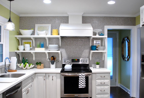
So sad. Especially since a few of you mentioned that you thought six would have looked great on that side after we installed them (but we were too drunk with excitement or adrenaline or whatever it is that gets into your blood when you take a room that looked crazy dark and dated and start updating it). I think it just took some time for our eyes to adjust, so we had to live with things and let the room evolve until it became unbelievably obvious to us. And then we were suddenly right there shaking our heads and saying “oh why did we go with eight brackets on this side when six would have looked soooooo much better?” It’s like when your mom tells you she doesn’t like your tenth grade boyfriend or your best friend confesses those jeans look terrible on you but you’re in denial or just somehow completely blind to it and then later it hits you and you have a what-was-I-thinking moment and ditch the dude/burn the pants.
Thank goodness nearly everything that we’ve done to both our first house and this one can evolve and change as we go (like the living room, for example) or our first house’s paint colors (we painted nearly every room at least twice there, along with painting the trim twice too). Live and learn, right? So the good news is that the whole: “if at first you don’t succeed, try, try again” thing really does have a ton of truth to it when it comes to making your house a home. Just keep your rooms moving and growing and someday they’ll be right where you want them to be! Even if you don’t get it right on the first (or even the fifth) try.
So here’s our kitchen after our little bracket redux. It’s simpler, right? And we actually love how the middle bracket lines up with the line of the counter, so it still has balance since things are aligned so they look intentional. Whew. Note: the middle bracket is in the direct middle of the other two, so if it looks further to the left or right, it’s just the angle of the pic.
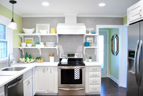
But we drilled through the tile to hang those eight brackets on the left side, so how did we undo that snafu?
Well, first we cleared the shelves (the black stuff is just small pieces of 3M removeable velcro that holds up my Love Life frame).
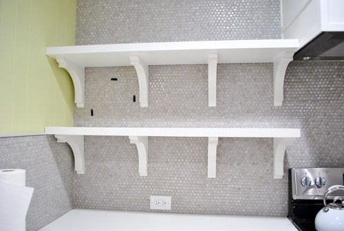
Then we removed the shelves (by unscrewing a few screws that connected them into the brackets) and slipped all the brackets off of the wall screws that they were resting on. You can vaguely see them in this picture below (they look like colons since there are two screws for each bracket).
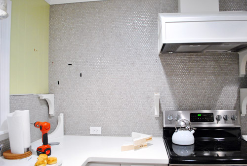
Then we measured and drilled new holes for our middle bracket using a drill bit meant for tile to drive the screw into the wall (these new holes would replace the two middle brackets of yore). Since these screws weren’t going into a stud this time, we used heavy duty anchors in each of the two holes to hold up each of the two brackets (the top bracket and bottom one). Since the outside brackets on each of the shelves go into studs and the heavy duty anchors are really darn strong, each shelf could probably support a few John pull ups. Yup, they’re in there good.
Next we chiseled out the old tiles that had holes drilled into them. I completed this task completely on my own in about five minutes (seriously it was really easy) by using a flat-head screwdriver and a hammer to bang the screwdriver into the grout around each tile that I wanted to remove (sort of creating a chisel).
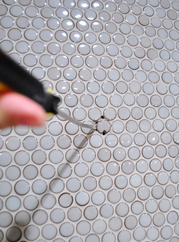
After about four chiselings around each tile, they just popped right out. Oh and see how one of the holes was in the tile (which we removed) but one of them was just in the grout? That happened with each bracket, which was nice because it meant we only had to pop one tile out and just would need fresh grout to fill those second holes.
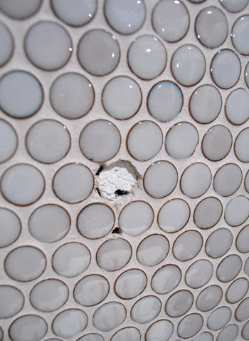
Next I used tile adhesive to stick new tiles right back into those holes:
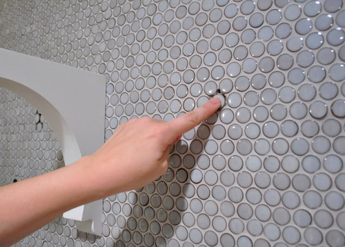
And then all that was left was to mix up a tiny batch of grout to fill those telltale holes around the new tiles.
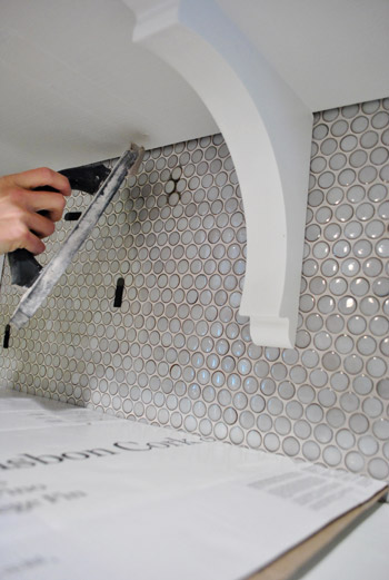
Ta-daaaa! It’s like those extra two brackets were never there!

Well, if you squint you can see that the grout is still drying in these pics, haha. But once it dried it was completely impossible to tell that we replaced a few tiles and moved those brackets. Whew. And as for how much this upgrade cost: zero point zero dollars. Hurrah.
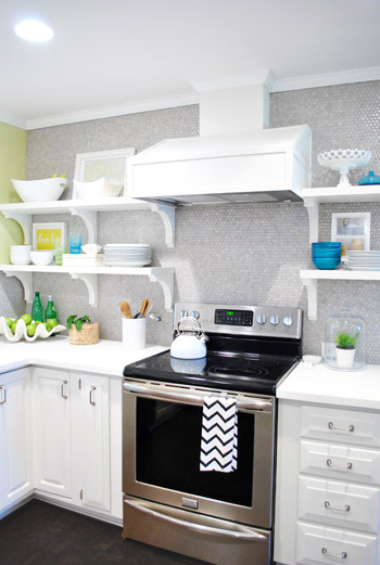
Here are those babies with a little side-angle action going on:
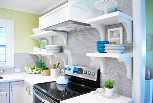
And here they are completely from the side (I love this view, so I always find myself glancing to the right when I walk in the door from the laundry room to gaze).
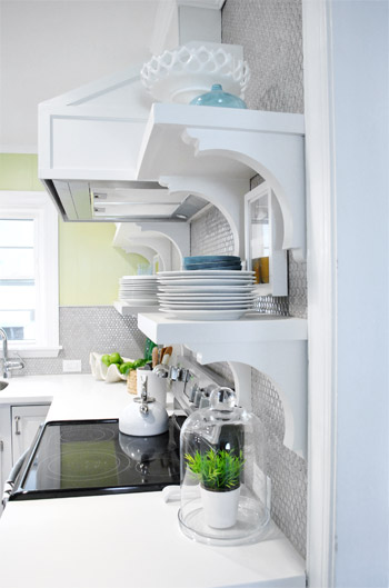
So the lesson is that even if you’re thinking things through, mapping them out on the wall with tape, and relying on photoshop before pulling the trigger – you still might end up tweaking things after you dive in, do something, and live with it for a while. But thankfully there are so many re-DIYable things, that home improvement is hardly ever a one-shot-only endeavor. It’s probably safe to say that every project has at least nine lives, like a cat. And getting started is the only way to get any closer to that elusive finish line, anyway!
What have you guys done and then redone lately? Anything you’ve lived with that has slowly started nagging at you and jumped back onto your to-do list? Have you ever chiseled tiles out? It’s totally my new favorite thing to do. Sometimes it’s just satisfying to bang on something with a hammer and watch the dust fly.

Deb says
I am totally loving this!!
Emily A. says
Hi – this has nothing to do with your current post (although I do like the elimination of the brackets better)… But I just wanted to let you know that I got a ram head from Z-Gallerie! I’ve never been so excited to have a ram head!
And yes, he will move to different spots in the house and he will wear a santa claus hat at Christmas. He’s like that – all spontaneous and stuff!
He’s affectionately known as “RAM”bo in our household!
YoungHouseLove says
Aw, he sounds awesome! Give him a pet for me!
xo,
s
Robin says
yes yes yes!! I couldn’t put my finger on it, thinking the cluttery look was maybe what you had ON the shelves but it was definitely what you had UNDER the shelves. Nice improvement! everything looks beautiful and sunny!
katie s. says
so much better! and i second/third/whatever the folks who think beefing up (and/or lowering) the hood cover would make another huge difference in balancing things out. otherwise the new kitchen is faaaaaabulous – great job!
Benji says
Yes! There is something off about the hood cover. But less brackets= much better!
Melissa says
Good for you for deciding you needed to make a change! I meant to paint our bedroom sage, but somehow it ended up minty green, like a dentist office. Worst part is, my husband refuses to re-paint, so I may have to live with it forever!!
Thalie F says
Wow! It took guts to chisel out those tiles. Though I found your 4 brackets heavy looking, I doubt I would have had the courage to reposition them and risk a tile disaster.
grace Nielsen says
Thank heavens! This is absolutely perfect and uncluttered looking!! I didn’t like it before with the four on each left-side shelf but would NEVER have told you because I usually LOVE everything you do!! Years ago I took a decorating class and she said to try to do things in threes whenever possible – or eyeball it and see how it looks?! – Advice has served me well all these years.
You guys are awesome!!
Laura says
One thing we keep in our head with our projects…*I have the right to change my mind…I have the right to change my mind.* It really takes the pressure off of making the decision and then later admitting we need to tweak something. I’m so glad you shared this!!
YoungHouseLove says
Such a great reminder!
xo,
s
Carrie says
Good call. Something about fewer brackets gives it more the look of open shelving.
Katy @ The Non-Consumer Advocate says
I look forward to seeing those brackets show up in a future post!
And yes, it does look much better now.
Katy
Holly says
Looks amazing! I had to keep scrolling back and forth to make sure you didn’t take lots of stuff off the shelves as well – love the new look!
Jessen says
Yah! Looks much better! I didn’t think that the eight looked bad…but six def- looks better!
Sending Love from LA!
Alicia says
I love your blog so much…I get so much inspiration from it that when you do something that isn’t my favorite (8 brackets) I just keep it to myself…it’s your house but I love the 6 brackets!!
Susan Akers says
Much better! Told ya!! lol! You have done such a great job on the kitchen – the cork flooring makes it! So happy you guys took a vacation – it was well deserved. I so enjoy seeing all the pic’s of Clara. I WANT a grandchild soooo bad, so I get my ‘grandbean’ fix with her!
Angie K says
I just noticed the plant under the glass dome. Does that work like a terrarium and keep the plant moist? Or is it just for the coolness factor?
I have zero green thumb….would love a plant solution that helps me keep them alive longer!!!
YoungHouseLove says
I just love how those glass domes look! It’s actually a faux plant from Ikea, but I’ve had ok success keeping wet plants like ferns alive under there!
xo,
s
Kelly says
I didn’t think it looked cluttered or busy to begin with, but now can see that this change makes it so much more open – love it!
It’s good to know that the anchors make things strong enough to stay up even though the middle bracket isn’t screwed into a stud. Do you think that’s solely because of the goodness of the anchors, or does having the outside brackets screwed into studs help?
YoungHouseLove says
We had long 72″ shelves in our first house (next to the dining table in the corner of the living room) and those were held up entirely by floating heavy duty anchors (not into studs at all) and they held tons of stuff! So I think having the outside brackets into the wall studs helps, but it can be done without it too!
xo,
s
Alena says
AHH!! It looks so.much. better. (plus, your overall bracket count is now five per row, rather than 6, and odd is nearly always better than even [i do enjoy pairs of things, but aside from couples, keep it odd!])
Emma says
YAAAAAAAAAAAAAAAY!
I knew I was right! :)
A Kurtz says
I love the change. Looks much lighter. You do need a more brightly colored tea pot though. Orange, perhaps, like the “fish” in the new painting?
YoungHouseLove says
Ooh that could be fun!
xo,
s
Michele says
good tweaking, guys! i hadn’t thought that corner was busy, but once you mentioned it i couldn’t un-see it. :)
all that to say: well done! it looks great!
Cathy says
I’m sure I’m not the first one to comment on this, but this is absolutely hilarious:
It’s like when your mom tells you she doesn’t like your tenth grade boyfriend or your best friend confesses those jeans look terrible on you but you’re in denial or just somehow completely blind to it and then later it hits you and you have a what-was-I-thinking moment and ditch the dude/burn the pants.
This is why your blog is so wildly successful; you are willing to make course corrections along the way. I know one of your goals is to keep it real, and you do it with style; the post about the red eye flight is a perfect example. When our now 24 year-old daughter was nine months old, she was starting an ear infection (unbeknownst to us), and we boarded a plane from NYC to Houston at 8 pm. We still joke that it’s a good thing that airplane windows don’t open. It was the longest four hours of our lives.
YoungHouseLove says
Aw thanks Cathy, you’re so sweet.
xo,
s
Donna says
SO much nicer! I kept thinking it looked a bit crowded, but I know squat about shelving. It looks 100% more beautiful and zen now! And I love your little pops of color!
Stephanie B. says
Whoa! I never really noticed it before, but now that the brackets are gone, it makes a huge difference! I love everything you do because YOU love it and it’s YOUR house…isn’t the the best part about owning a home? Making it your own…no matter what other people say or think!
Karina says
Looks GREAT! It always amazes me how such little things can make such a HUGE difference. Drives my husband crazy when I notice something “needs” tweaked!!
Erinn says
Wow, it looks so much less crowded. I even scrolled back and fourth a couple times to see if you had replaced all the items exactly as before. I too thought it looked a little busy the first way and love that you guys noticed it and did a little change that made all the difference.
Kristin says
great improvement – it looks so much lighter now!
Christie says
I’m impressed that you were willing to undo and repair. Glad you’re happier with it!
Christie says
I didn’t mind the other way either (I saw three spaces on the left vs. one space on the right), but I like the more open look of the new spacing too. You guys do such nice work!
Ana Lopes says
Dear Sherry and John,
Your kitchen looks fabulous! (as well as the rest of the house!)
Can I just make a small, tiny sugestion?!… Do you loooove the hood over the oven?… Doesn’t it look a bit square and boxy? I keep looking at it and wondering if it would look a bit more elegant if it was longer and leaner…
Love from Portugal!
;)
YoungHouseLove says
Hah, thanks Ana! I think it’s personal preference but we love it! In our first house we had the same kind (exactly the same shape, just stainless) so we like ’em!
xo,
s
Abigail says
I was thinking it would have been better with just 3 across on each side! I’m so jazzed that you went and did it! Odd numbers are usually the best design choice. So now you have an odd number (3) on one side and when you go all the way across you still have it with 5! Yipee!
I’m totally impressed that you went to the trouble to make it so perfect.
Trudy says
Who would of thought it would make such a difference but it really does. Your effort to correct it really paid off.
Barbara says
It looks a million times better! Good for you for taking the time to go back and fix it up – well worth it.
Erin @ One Project at a Time says
Wow! What a huge difference that makes! So, so much better! Like you guys, we purchased a rug that “worked for now…” although if we’re being honest it really never worked. Now we’re sort of on a tour of rugs, they come in and out of our house so fast! Hopefully we’ll find “the one” soon, because this is getting a little ridiculous. http://oneprojectatatime.blogspot.com/2012/03/cutting-rug.html
YoungHouseLove says
Aw, good luck Erin!
xo,
s
helena says
this blog is so sweet, totally love it.
if you wanna check out my fashion one, leave comment!!
laflordelys.com
Lindsey says
I like it much better (although it never bothered me before :)
It’d be fun to see how you switch up the accessories to create a different look. I’m sure you’ll have many chances to do this with holidays, seasons, etc. but a post just on how you can create different looks just by switching out a few things would be fun to see.
YoungHouseLove says
Oh yeah, I bet they’ll keep evolving for a while! I should take pics every month to document how they change over time!
xo,
s
Leanne says
Oh I am so happy you guys did this! I didn’t want to be rude and say anything before but I thought the 8 brackets were a little overkill and now things look perfect!! So glad the tile was easy to fix:)
ryann says
Oh, that looks so much better! Something had indeed seemed ‘off’ with the 8 brackets before, and now it looks just perfect.
Mamaw03T says
Wow! What a difference! I didn’t think it would change the look that much, but was I wrong! Love it.
Diane says
I liked the look before, but it’s insane how much better it looks with just three brackets under each shelf. You guys are so brave!
Heather says
I am so glad you did this! I didn’t want to say anything before… but 6 looks great! I hate re-doing things and admire your willingness to “revise”. :)
Amy @ The Button Casa says
You’re so chipper about tweaking :) I do think it looks better and less cluttered but I probably would have left it since it didn’t really look bad before. In fact, I never really noticed. You guys never seem to be intimidated about that kind of thing though so great job!
Lindsey says
Looks so much better and doesn’t seem like it was too hard to tweak. It was worth the effort for sure!
Amy says
It looks great! One thing I notice is that in the ‘before’ picture, the things on the shelves look very… regimented, if that makes sense. Each shelf (and even the counter under the shelf!) has 3 things (or stacks of things) on it. And the stacks line up neatly between the vertical brackets. Whereas the same exact placement of items on the shelves looks much more casual when there are only two vertical dividing lines.
I do NOT have a knack for styling, so can I get a cookie for figuring out why I liked the ‘after’ better? :)
YoungHouseLove says
Haha- nice! You get three cookies! Never would have noticed that.
xo,
s
Sarah @ OneCraftyHome says
I liked it before but like it even better now!
Ryan says
I thought that the 4 bracket system looked great but, now that you’re down to 3, I agree that it looks less cluttered. Good call! And way to be brave enough to fix it. I would have left it rather than deal with the repair work to the tile. :)
Gina says
I was one of the ones who posted that I wasn’t a fan of the brackets on your original reveal post. However, I am LOVING them now that there are fewer of them. Your kitchen is stunning!!
Katie J. says
I knew that side needed someting… perfect remedy! Looks so much airier now:).
brieanne says
Love it! I was thinking that less brackets would look better, but I kept my mouth shut–you know, to each his/her own. I’m very pleased with the update! Also, a great reminder that we don’t have to live with every decision we make when it comes to DIY
Jen says
That is much better! I thought it was the lack of symetry but it was the crowdishness.
Way to go!
Alexis Smith says
There was something I couldn’t put my finger on, and now I know what it is. The six look perfect!
p.s I didn’t get a chance to comment on the post, but Clara self-soothing outside of the Hibachi restaurant was maybe the cutest, sweetest think I’ve read in a while.
Bob says
Do I even need to say anything? I mean, seriously. There’s good design, and there’s bad design. If you think bad design is good design, you simply have bad taste.
Thank you for seeing the light. Of course you won’t listen to me any more than you already do, but that’s your problem, not mine.
Now… change the floors and the pendants and you’ll have a great looking kitchen.