We found these babies at a yard sale and haggled them down to $10 a pop. Let’s call them our twig & berries.
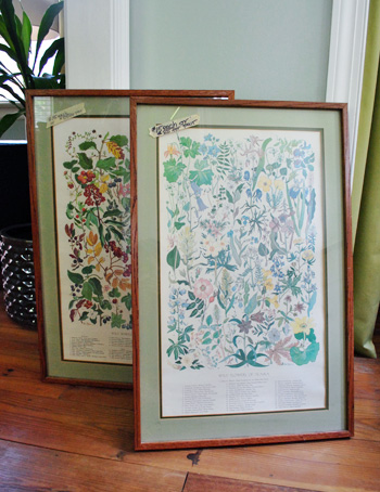
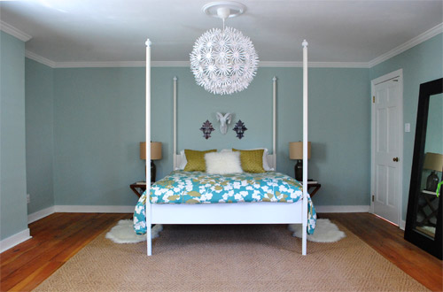
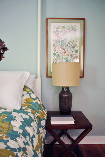
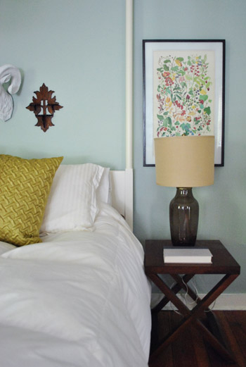
We immediately thought the extra tall shape of the frames would be perfect for either side of our bed above the glass based lamps on the makeshift just-for-now side tables (they’re way too small and don’t have any drawers for storage) on this very unfinished side of our master bedroom:
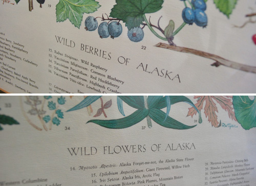
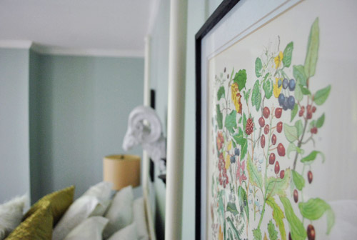
We definitely had plans to change out the art. They’re prints of the berries and wildflowers of Alaska (which is kind of fun and fitting since we honeymooned there) but they felt a bit too grandma for us.
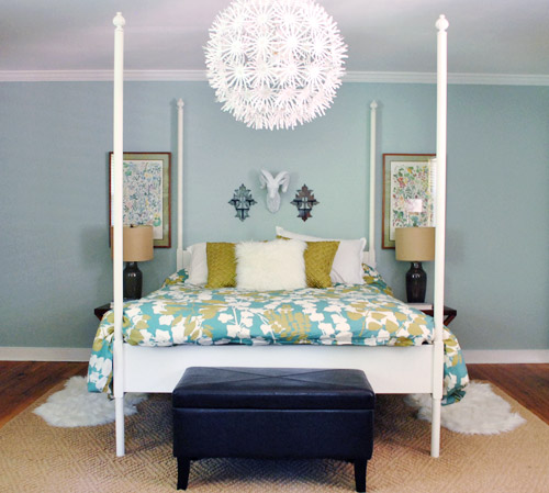
But we loved the long rectangular shape of those $10 frames. So we hung them up, just to see what we were dealing with. Don’t mind all the blank space on either side of the walls, we still have furnishings to add to fill up this cavernous room. And once we change out the side tables we might rehang the art a bit further out from the bed or higher up depending on the new furnishings.
We definitely liked the shape of our new frames, but we weren’t crazy about how the warm wood tones sort of clashed with the darker tones in the thrift store wood candle holders on either side of Sir Ram above the bed…
… along with the leaning mirror, and the leather chair in the corner:
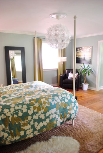
And yes, we’re aware that not all couples aspire to sleep under a giant resin ram head. We are indeed a rare and special breed. Akin to centaurs and unicorns. Speaking of that above-the-bed stuff, we originally mentioned that the maybe-too-small-art might go, but months later it’s still there and has strangely grown on us.
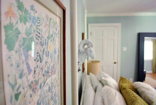
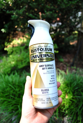
But back to the yard sale frames. I actually decided to do something completely insane for me when it came to them (but totally ain’t-no-thang for anyone else). I opted to spray the frames with oil-rubbed-bronze spray paint. I know you might think that given my recent ORB kick (here and here and here) this isn’t news. But, you my friend, would be wrong-O with a capital O. Why? Because virtually every frame that we own is white (both in this house and our first one) and we must own five million of them! Dark frames have never been our preference. White is my eternal jam..
Until now, apparently. Total curveball. At least to a white-frame loving fool like me.
I’ll spare you the spray painting play-by-play (you can find some general tips here) except to point out these two things:
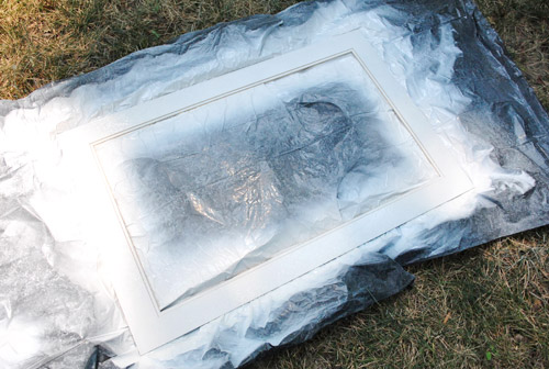
- the glass was so tightly fitted that I worried I’d break it if I tried to remove it before spraying – so I just covered it with newspaper
- I laid each frame up on a big ol’ rock from the yard so the sides wouldn’t stick to the “drop cloths” and peel off the finish when I picked them up
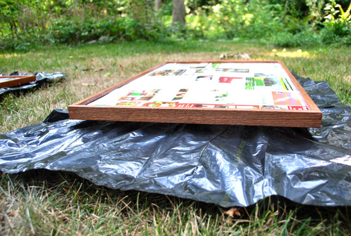
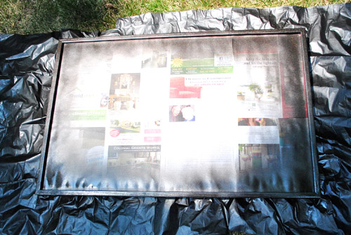
While I was at it I carefully removed the mats and sprayed those white for a cleaner look.
Now brace yourself for the hottest picture you’ve ever seen on the internet:
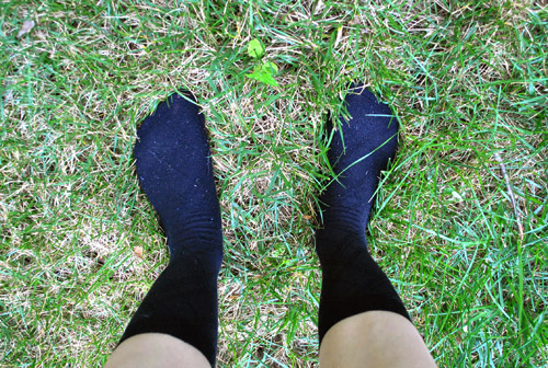
My white mom legs + black dress socks = sexy beast. I can’t believe I’m sharing this, but the whole dark sock thing is actually a spray painting trick I implement nearly every time. Instead of worrying about getting rogue drips on my shoes or flip flops (or my feet, which I could then track into the house) I just don some dark socks, spray to my heart’s content, and slip them off at the backdoor so I don’t track anything in (and don’t have to worry about scrubbing my feet or ruining my favorite shoes/flip flops). As for the rest of my outfit, I’m nude. Just kidding. I wear painting clothes that I do not slip off at the door (big drips only seem to fall on my feet).
A few minutes after snapping that photo was when John and I both started giving each other crazy eyes. Which means we were both having strange and exciting ideas (ideas that are completely unrelated to bedding each other under the ram – get your mind out of the gutter).
John: “What if we put those old botanical-looking prints back into these now that the mat and frame is all updated and graphic?”
Sherry: “Just to be suuuuure we’re completely over them – I agree!”
So we hung them up and we really liked them. So we are in fact completely under them (you know, as opposed to over them as we originally anticipated). Sure, they’re still a little grandma, but they’re also something we could picture in Elle Decor or House Beautiful (with more than a $10 price tag on them). And most of all, they make us smile.
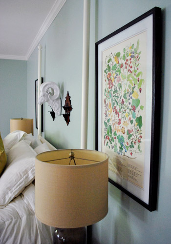
Here’s where I’ll stop to acknowledge that not only is hanging a big white ram head over your bed one of those personal preference things maybe-I’m-crazy things, art in general is definitely a place where all folks on the internet won’t come together and unanimously agree. But we’re loving our twig and berries – er flowers and berries. I mean it’s not like we’ll ever entertain in our bedroom – so we don’t have to worry about what other folks might think. Which I hope is nothing weird and kinky due to the ram. Yikes.
Speaking of weird, we got an embarrassingly huge kick out of hanging the berries on J’s side and the flowers on my side. You know, because ladies have flowers and guys have berries. Too far? My deepest apologies.
Then something crazy and completely unexpected happened (manage your expectations, our lives are not that interesting).
John decided to exercise his veto power on the leafy duvet cover that we ordered around seven months ago.

Didn’t see that coming did you? See, back when the duvet cover was one of the first things we bought for our house (deeply clearanced from West Elm) John agreed that we could get it (we have a full agreement agreement, meaning we’re not allowed to buy things without both being ok with it). But he only agreed with one stipulation: that it wouldn’t necessarily be a forever choice. He reasoned that it was affordable enough and I loved it enough not to keep me from ordering it (I was so worried it would sell out and I’d forever regret it slash hold it against John The Tyrant). But he asserted that if someday he should decide that he no longer liked it I would have to be open to looking for something else that we both could love – especially if the price was right and we could sell this baby on craigslist or something.
At the time I grinned and nodded, never thinking that day would actually come. But wouldn’t you know it, John loved those 10 dolla (holla!) yard sale art infinitely more than the compromise duvet. So he decided we should revisit the whole new-duvet-cover-idea and leave the art as-is (since it was kinda circus-y and compete-y to have them both going on at the same time). And you know what? In an even more shocking turn of events I agreed.
Maybe we’re just sentimental suckers and sleeping between prints of wildlife from the place we honeymooned is our idea of romance? Maybe we think rams and flowers and berries somehow belong together? I don’t know. Either way, the leafy pattern in the duvet cover was fighting with our new leafy art so I stripped things down to our white duvet insert from Ikea and we stepped back to survey the scene.
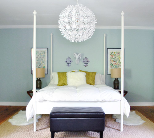
The weird white duvet insert was definitely more compatible with the art than the competing leafy duvet cover, but not quite perfect. Meaning a white duvet cover isn’t going to be what we go for. We’re hoping to find something with less of a bold pattern and more of a subtle texture (like a soft chevron or crosshatched design or something striped or something else entirely). The jury is still out on what will come home with us, but we’re planning a few HomeGoods and TJ Maxx runs just to see what’s out there. And maybe even an Ikea road trip.
The lesson? Grrrrr, don’t compromise. Just hold out to find something you both love. Oh well, hindsight is 20/20, right? And I like to think the Alaska prints “found us” because it was meant to be. And we certainly had our fair share of decorating mind-changing in the first house, so it’s only fitting that we work in a few control-alt-deletes in this house too (look honey, it’s a bad computer joke that I threw in just for you).
So yeah, we’re thinking about selling the old duvet cover on ebay or craigslist. There are some on there for over $100 and we only paid $42 for our king-sized guy thanks to sales and coupon codes. So who knows, maybe we can recoup the entire cost and list it for $45 in great-but-slightly-used condition. We shall see…

As for what the kids think, Clara toddled into the bedroom and gave the new art two thumbs up (not lying, but she does happen to do that gesture a lot). And Burger gave it one paw sideways. He’s such an art snob.
Do you guys have any duvet cover switches or “rewinds” going on? Has anyone else had their man exercise veto power in a surprising but serendipitous-in-the-end way? Does anyone else spray paint while wearing black dress socks or sleep under a white resin ram? Yeah… probably not.

Tawn says
I think they look absolutely wonderful!
Heather says
Love the slightly retro feel of the prints. Let me know if you are selling the duvet!
YoungHouseLove says
Maybe we’ll put it up on craigslist or ebay and give everyone the link!
xo,
s
Kara Joy says
I second the request for an ebay notice. :)
I’ve loved that Duvet cover ever since I saw it on YHL. Are you sure you want to part with it?
YoungHouseLove says
We’ll definitely make an announcement if we decide to let her go!
xo,
s
Anna says
Those frames look great! amazing how the prints pop once they’re not against a light greenish colour!
Arlene says
I’m glad you guys kept the prints! I was kind of sad at the beginning of the post because all I could think was that I actually kind of love them! Glad the two of you ended up loving them too!
Janet Murphy says
I was thinking the same thing. Noticed the prints before the frames. :)
Sophie from France says
Exactly what i was thinking! I love nice botanical prints. I think they’re not grand’ma at all.
beth says
same here. I was thinking me, me, me! Send them to me LOL. They look great.
Samantha says
I LOVE IT!! The prints are awesome and yeah, the plain duvet already looks better. Chevron sounds awesome! I love the vibe of your bedroom now without the duvet. Kinda funky and eclectic. Awesome!
Alison says
I actually really love your prints and how they’re kind of an homage to your honeymoon.
Christy says
Thanks for the laugh! Also, I have a pair of grody old hot pink flip flops that I spray paint in. My husband hates them. He threatens to throw them away on a semi-regular basis.
Nikki says
Very nice! I love the paint color of the bedroom walls — what is the brand + name of it?
YoungHouseLove says
Carolina Inn Club Aqua by Valspar (color matched to Olympic no-VOC paint).
xo,
s
Cameron says
This one made me gigglesnort. Spray painting in nothing but black dress socks, a romantic tryst under the ram’s head, twig and berries, HA!!! You funny, lady!!!
Jennifer says
AGREE!!
Bob says
The verticality of the “art” in your inspiration image works because the room is narrow. It doesn’t seem to work very well in your uber wide room.
I’m really bothered by the lights blocking the “art.”
I think you either need much wider/taller artwork, or just wide.
Sorry… not feeling this at all.
Your video this morning, however, was pretty damn funny. Gotta admit.
YoungHouseLove says
No worries Bob – we promise we won’t invite you over for a sleepover.
That side of the roomour whole house is definitely still a work in progress! And when we add a cabinet to the left of the bed and the door to our bedroom is open on the right, that empty space on either side won’t look so empty anymore. If not, I’ll have to track down more ram heads and jam those babies in there.xo,
s
Bob says
I’ve been eagerly checking my mailbox for a sleepover invite for months. I even have black socks and pasty white legs all ready to go. I’ll fit right in. Come on!!! It’ll be fun!
Still, please don’t leave the light blocking the prints. It looks sloppy.
YoungHouseLove says
Still not entirely convinced it’ll be fun. Might have to sleep on that…
xo,
s
Bob says
So you’re saying there’s a chance. YES!
YoungHouseLove says
Bwahaha. Best movie reference ever. Ok, you can come over.
xo,
s
Stacy says
I think that the lamps in front of the art really works, because it covers the titles/print on the bottom. From a distance they have a subtle wallpaper look to them, that is just lovely for the space. As for the sides, they’re obviously incomplete. Once there is storage or furniture over there, these prints will definitely prove to be the ideal, unobtrusive solution to the blank walls.
Bob says
We’ve come a long way, $herdog. Aren’t you glad you gave love a chance?
YoungHouseLove says
Oh yes, I’m thanking my lucky stars right now.
xo,
s
Bob says
Notice too that I ignored Stacy’s comment. Typically I’d jump all over that. But I’ve learned that there’s just no helping some people.
Aren’t you proud of me?
YoungHouseLove says
Bob- choose love! Remember? I don’t know if proud is the word…
xo,
s
Bob says
No fair… now you’re changing your comments. I can’t keep up.
Choosing love,
Bob
YoungHouseLove says
I am much like a centaur or a unicorn when it comes to proofreading. Haha.
xo,
s
Christine says
You said it, Bob. So glad someone else agrees that the lamps blocking the bottom of the framed prints is irksome. I was all ready at the beginning of this post to email Sherry to beg that you sell the prints to me – so I’m glad you saw the charm in them eventually. Lovely (except for the placement…)
AmyW says
I agree. I don’t like the lamps covering up the art. LOVE the art though!!
YoungHouseLove says
Thanks for the votes everyone! We definitely plan to scootch the frames when we get permanent night stands (most likely up and out- but it’ll depend on the width/height of the new tables)!
xo,
s
Emma says
I think the vertical frames work in this room simply because of the bed. Once the corners are filled I think it will be a good way to separate the bed from the rest of the room. A little oasis, if you will.
I agree, however, about the lamps covering the frames. I kind of get what you guys were going for with the layering, but I think they’re just a tad too low. Maybe if the lamps only covered the mats, and not also the bottom of the prints? This would also lessen the amount of blank space near the ceiling.
YoungHouseLove says
Sure! I think there will be some scooting up once we get side tables that are taller!
xo,
s
tori says
Digging the art and even the naked bed insert. More importantly, this post was the funniest thing I’ve read in a while. You are seriously deranged (and I say that lovingly).
YoungHouseLove says
And I take that as a compliment, haha. So thanks!
xo
s
Ben says
You made the right call scrapping the duvet. Although I thought it was playful and fun, it was a bit too whimsical for the direction of the space (especially with the new Alaskan prints). I also think the ram head and accompanying pieces work better without the West Elm duvet.
P.S. Started a Pinterest today, I have no clue why I waited so long…
Ben says
Also, in one of the pictures it appears you painted the wood candle holders? Or was that just funky lighting? Perhaps a tease of what’s to come?
YoungHouseLove says
Just lighting. We didn’t touch those yet. Not sure if we will someday though. We’re all over the place in there! Haha.
xo,
s
annabelvita says
I saw that they read pretty teal in one of the pics and I actually really liked it.
Annabelvita says
Wow I love it with the plain white! We have a crazy Paisley duvet that I totally thought my boyfriend was going to veto but he loves it http://annabelvita.com/paisley-bed-pie-aka-a-fabric-factory-threw-up phew! (the pics are from my old messy bedroom when we shared a room in a house share, ick)
We did a little bedroom switcheroo this weekend. Feels so good, doesn’t it?
Rachel says
Just goes to show you that a house is always a work in progress! I love changing out duvet covers for a new, fresh look.
kristen says
too far? never!
Julia @ Chris loves Julia says
I LOVE white bedding. It looks so cozy to me. As for our rewinds–they happen often. Really often. Sometimes it is an oops, let’s try that again. And sometimes it is, oh our 17 month old can reach/destroy that let’s try again. It keeps things fun and interesting and I never get sick of anything.
I sell things all the time in the online classifieds. It’s actually how we budget for all of our projects ’round here. It also keeps us clutter free. Out with the old to fund the new. I am currently selling a zebra-print rug that last year I loved, and in our new house…not so much. It’s okay. Actually, it’s more than okay–it’s LIBERATING.
Chris loves Julia
Kimberly says
Sherry/John, I can’t see your photos anymore – either on your website or in my Google reader. I love reading your blog and the pictures totally enhance the experience. Please help!
YoungHouseLove says
So sorry Kimberly! We haven’t changed anything, but a few folks have also been having this problem and have been able to solve it by either clearing the cache on their browser (under preferences) or adapting your anti-virus software to allow our pics (sometimes it blocks them for some odd reason). Here’s a comment from someone who solved it with some directions: https://www.younghouselove.com/nothin-like-a-little-weekend-chaos/#comment-573637
Hope it helps!
xo,
s
Cindy says
Oh my gosh, Sherry, I’m loving this new arrangement, and I’m loving the white duvet. I really am. It lets all of the really cool, and totally random, things in your bedroom stand on their own.
Emily says
Wow, it’s incredible how much better that art looks now! I never would have thought of spray painting a mat. I agree the bedroom looks better and can’t wait to see the new duvet cover you find.
When we remodeled our kitchen last year my boyfriend vetoed the cabinet finishes, pulls, and countertop colors I picked first. Now that the kitchen is done I love it and am so glad he vetoed – we ended up with beautiful, classic choices that are so much more timeless than what I picked out first!
Elizabeth says
Wow! I love the new look. The white comforter looks so fresh in there now.
Marilyn says
I like it! I think you should set a price on your duvet cover and then let everyone who wants it submit their names and you do a drawing with the winner paying the price.
I looked and looked for it awhile back and couldn’t find one reasonable – didn’t want to pay the high price that ebay sellers were asking. You always do a great job.
Rachel says
I’m loving the white duvet. Its much more calming than the floral, even though the floral one is very cute. It think it was just too busy.
Love the long frames beside the bed. Its a great look. We’re sorta rocking the same thing, except instead of art its windows. Similar, yet different.
Hannah says
I’m looking forward to what you guys pick, since the paint color and curtains were all picked based on that duvet! It looks awesome without the duvet (too much pattern with the prints), so it looks like I’m a convert, too.
Paloma says
Yeah, actually, I had that really bright and bold purple/orange/hot pink duvet cover from Ikea on my bed all winter and I recently changed it out for the white one I originally bought and voila, everything feels better. I love that changing one thing can change an entire room. :)
Susannah Hunter says
I really love the art, especially with the updated frames and mats! And I think they are more nerdy botanical than grandma, and that is a compliment. :)
Sarah says
Love the new art! As far as duvet covers go, I have two that I switch back and forth throughout the year. They both match my bedroom decor and it makes me feel like I have a new room every few months!
Hilary says
I like lists and I know you do to. Therefore …
1. Did you purposefully make your title to have another meaning? Because I definitely laughed. And then I got a mental image of some twigs and berries on top of some ..other… twigs and berries.
2. Does it bug you that one painting is slightly more faded than the other?
3. I was sure you were going to paint the frames white (which would have looked fab with other prints and your old duvet) but I do really like the soft wall color with your white bedposts and the ORB frame). You sure are tricky.
4. Would you consider a softer colored ottoman with your new decor?
The end.
YoungHouseLove says
1. Yes. Haha. Glad you got that mental picture. Unless you were offended in which case I apologize.
2. Nah, we’re lovers of most things old and imperfect.
3. Yesss. I’m a sneaky little snake.
4. Absolutely! That’s a just for now guy from our old house.
xo,
s
Erin says
Totally obsessed with those prints. And I cannot believe you got them for $10 a piece. What a wonderful find and a bargain.
Great idea about spray painting the mats for the picture frames. You can get an uniformed look with picture frames from different stores without having to buy all new mats. Love it.
Deanna says
I was secretly and self-centered-ly glad you decided not to stick with the plain white. Maybe when the whole bed area is more “complete” it would look great, but as with the unexpected leaves and berries find, I love seeing how you get creative with color, pattern, and texture. Keep it up!!!
Also, I’m just beginning my foray into the world of spray painting – small house, so there’s not much to spray, so thanks for the tips! :)
Carrie Z says
Awesome! You guys are hilarious, wrong in the best way.
kristin says
i love the botanical prints (and the “wink wink” factor, too!) may i suggest the west elm pintuck duvet? very elegant and adds nice texture. it never looks wrinkly because it’s supposed to be that way! we have the white one and really love it, but they have other soft colors that i think would look great in your room, too. also, ORGANIC cotton! :)
YoungHouseLove says
Oh yeah we love those too! And they fall under “something with texture” so you never know!
xo,
s
Carrie says
I love the square tuck! If it weren’t for the big puppies and long nails I would buy one!
Emily Z says
My parents have a similar bed cover in the “guest room” (I’m the only over-night guest but I’m not allowed to call it my room anymore and no, I’m not bitter) and while it’s gorgeous, it catches on everything. I don’t have raptor claws but good lord if my nails don’t get caught on it. And books. And pens.
Sara says
I love the look of the pintuck duvet. But after sleeping with it for some time every tuck ripped. It was excruciating to try to pull the covers up and hear rrrriiip. It also did some funky color fading thing in the wash. To West Elm’s credit they took it back. But it broke my heart because I LOVED it. My sister-in-law hates it for the same reason.
YoungHouseLove says
You’re the second person to mention that – so sad!
xo,
s
kristin says
oh man! sorry, guys! we’ve heard our tucks ripping a few times when we’ve yanked on the duvet too hard while making the bed, but it hasn’t been a big problem for us. we’ve had it about 9 months, i think. i was thinking it wouldn’t be too difficult to re-sew the ones that come undone if it becomes noticeable, but so far it’s not.
Eileen says
I wondering if the DIY version I first saw on pinterest would hold up better. http://www.projectprettyblog.com/2011/07/diy-pintuckknotted-duvet-cover-tutorial.html Certainly a labor of love since she said it took her a while. But how awesome would it be to casually say you made it?
YoungHouseLove says
Oh yeah that would be awesome!
xo,
s
Molly says
So fun. That Country Living reference is gorgeous.
I like that you stuck with the original art! Especially since they have sentimental value to both you and John. We’re currently debating what to put over our living room sofa. I want a large, modern photo to counterbalance some of our more traditional furniture. And some of the images I’ve pulled are from our wedding and honeymoon.
http://thenestinggame.com/2011/07/08/experimental-art/
Is the print on the left sun-faded or just more muted shades than the one on the right?
YoungHouseLove says
I think it’s a little bit of both. The one on the right gets more natural light, so in the pics it might read as brighter too!
xo,
s
Katreena says
I love the new art! There is something very vintage (and of course sentimental to you guys) about them.
Have you thought about putting the two frames where the ram head and sconces are? It might be a better balance? Just my two cents!!
I love the color palette of your boudoir! So serene!
YoungHouseLove says
Anything big over the bed gets covered by the big dandelion-esque chandelier, so we kind of like the airy-ness above the bed with the bigger art on the side. We’ll have to see where it all goes once we get better side tables, bedding, etc.
xo,
s
Amy says
I love those prints (for I am a total plant nerd) and *really* love them with the darker frames and white mat. That’s what I would done.
We’re currently looking for a new duvet cover! We’ll be moving up to a king bed soon and I’m already on the hunt. I adore white bedding, but we have two cats who shed a lot. :(
cheryl says
I totoally cracked up when I saw your sock picture .. bawhahah .. this is too like me .. and probably everyone else .. lol
Stacy says
THANK YOU FOR KEEPING THOSE ART PRINTS! As soon as I saw them and you said they were “too grandma” and that you would probably replace them, my heart *melted*. They are so rustic and carefree – the perfect artwork to put into a modern house to give it a “We aren’t trying to hard to be super-duper modern, we just work with what we love!” look.
Old-fashioned prints usually only look old-fashioned because of a) their frames, and b) the surrounding furniture/decor. Updating the frames was the perfect idea, and I’m thrilled you two kept the art. LOVE THEM!
Also, a big Y.E.S. to replacing the duvet! I am with John… I think it’s pretty, but a little too “college dorm room” for you folks. I think something subtle (either solid or patterned) will open up your design possibilities in that room. :) Great job!
Jen says
This is pretty much exactly what I was going to write, so — amen, Stacy!
Alexson says
I agree! I’ve been prowling the streets looking for my very own vintage prints and was about to be so sad if you tossed these gems, especially with the honeymoon-connection. And I’m digging the ORB frames!
Kerry says
Oh, Sherry — you crack me UP! You and John are always verbally crafty (in addition to your, you know, CRAFTY craftiness), but you outdid yourself with the puns, wordplay, and altogether fun language in your post today. Hooray for great writing!
Sarah says
Love the after! And I had a feeling those prints would work out… there something very Anthro about them.
The hubs and I finally agreed on a duvet and “look” for our bedroom and I hate it. It’s white walls with a grey duvet and that’s about it (I blame Pottery Barn for making it look so chic on their website). So now I am struggling to make a change and I the duvet might be first since we don’t want to paint. We shall see!
Marian says
Ohh, I just did the same thing! Except our duvet was not such a good deal, meaning it was a someone-bought-the-ridiculously-overpriced-duvet-off-our-wedding-registry price. Eek. I tried to love it; scratch that, I DID love it for all of two months, and then I spent another six months convincing myself I did love it, until it went off to get cleaned, and looking at the bare sheets made me swoon.
It never made it back. It’s now kept in my closet, you know, so when that person does come to visit, I’ll be sure to have it on. Gulp– I hope I remember.
Thanks for making me feel not-so-terrible about
Ctrl-Alt-Deleting!
Marian
shanna says
LOVE LOVE LOVE! Admittedly, I am the biggest sucker with a capital OMG-S for white bedding, but I just love the change in your bedroom by adding those prints and removing the old duvet! The color on the wall looks so different and everything looks so much more soothing and relaxing and just simply lovely, but still manly enough for John and Ram. Nicely done!
YoungHouseLove says
Haha, don’t want to girl it up too much for Ram. John I don’t care about though. Haha.
xo,
s
Devon @ Green House, Good Life says
Yay! I secretly NEVER liked that duvet. Can’t wait to see what you find to replace it!
Devon @ Green House, Good Life says
Just gotta comment on my comment: I secretly never liked that duvet, BUT it’s what got you to the green curtains that are perfect in the room, so I think that’s why fate brought the duvet into your life.
YoungHouseLove says
Agreed! It led us to things like Sir Ram and our horse art and our curtains- so it server its purpose. Haha.
xo,
s
Gudrun says
Love this post! The twigs and berries, hillarious! I love the prints and don’t think they’re too grandma-ish. Those prints have wonderful little details that make them so interesting and the colors are so pretty! Can’t wait to see which duvet you guys pick out!
xo
gudrun
http://gudruns-silverlining.blogspot.com/
Heather says
LOVING the way the white duvet insert looks in your room. LOVE, LOVE, LOVE. We’ve done our guest room in a pale aqua with white bedding, and I absolutely love how crisp and fresh it looks. But, for you guys I know it’s a temporary thing and I can’t wait to see what you end up picking.
Not loving the art, though. Personally, it’s a little too old fashioned for my taste, but taste in art is a very personal thing, so you loving it is what matters. But your bedroom is coming together nicely. I’m always so excited to see what’s next.
(And any post that has a Burger pic is a definite favorite of mine!)
Trista says
I refinished my first picture frame this weekend. I bought a very gold bamboo-ish frame with blue matting and an ugly print, and this weekend I painted it with a shimmery black Folk Art Paint. I left the matting and added a Sharon Montrose Print. It looks awesome now. Just had to share my success too.
YoungHouseLove says
Sounds so pretty!
xo,
s
Autumn says
Thank God I read this. I just posted in my own blog how I spray painted my right foot silver while wearing flip flops and now have “Crypt Keeper” colored feet with sandal lines. THANK YOU for posting the sock trick ! I will so do that next time!!
cori says
seriously adorable! I need to thrift more often….like NOW
Laura @ Hollywood Housewife says
This is my favorite post I’ve ever read here. I think its because of your choice of his/her sides on the grandma art. :)
Love watching the evolution of your rooms.
Sara @The Fat Hydrangea says
Those are SO cute! I absolutely love them and I think they add a lot to your room – just finishes it off perfectly! Our next project is our master bedroom and I have no idea what to do for artwork…
Kacie says
Ooooh those are so cool. I love the way you styled them into your space.
Kacie
http://www.acollectionofpassions.blogspot.com/
threadbndr says
I like the black frame and the white mat – totally updated the art! I love the look of old botanical prints.