We interrupt our normal programming for a bit of blog business. We’ve updated our sidebar! Please, contain your excitement.
It’s nothing major, but enough of you have had questions about the changes that we whipped up over Memorial Day weekend that we figured it warranted a quick explanation (and an apology to those who witnessed any funny business on Monday while we played around). One of my goals now that I’m a full time blogger/father has been to improve some of the function of our site and clean up the design (within my limited coding skills). In fact it was even my resolution this year. So to that end, here are a few of the things that might look a bit different (unless you read us in a reader and have no clue what our sidebar even looks like):
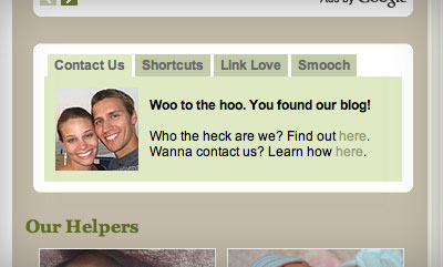
Change #1: A Second Tabbed Window- We’ve condensed some of our sidebar content into another one of those handy-dandy tabbed windows like the search box that we have in the top right corner. You may be familiar with that one, and this additional box resides just a bit lower and contains things like, um, our cheesy smiling mugs.

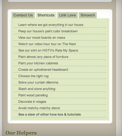
Really it’s just a replacement for our old Contact button. But in the tabs behind it we’ve added things like a new “Shortcuts” window that contains easy links to some of the most frequently asked questions (where did you get that _______ in your house?) along with our most referenced how-to posts.

You’ll also see that we’ve moved our Link Love section (i.e. our blogroll) up into this window so that you don’t have to scroll as far down the page to access it anymore. And we even added a gooey little appreciation tab there on the end that we’ve called “Smooch” because we really do love you guys.
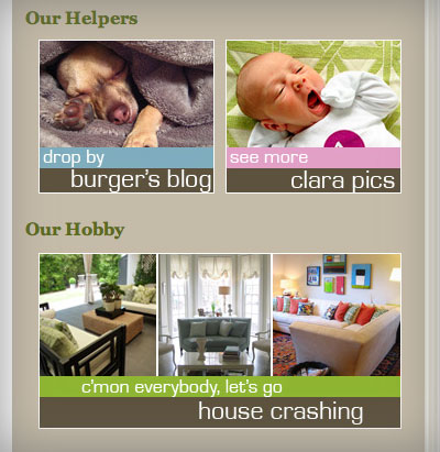
Change #2: New Buttons- Right under that new tabbed window, you’ll also see three new buttons (well, two of them are just redesigned and one is actually brandy new). You can still access Burger’s blog quickly and hop over to a page for browsing all of our House Crashing posts, but now you can also find your way over to a Flickr album of Clara pictures. We figure it’s an easy way for those of you who are hungry for a daily dose of baby to get your fix without flooding our post schedule with “isn’t she adorable” moments (which, if I may brag for a second, there are A LOT of lately).

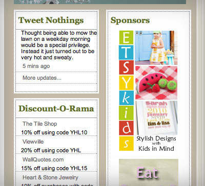
Change #3: New Boxes: This last change is really just about cleaning up a bit of the design. I finally figured out / took the time to learn how to do something simple like add a clean white box around all of our sidebar widgets (like our Twitter feed, Discount-O-Rama listing, We’re Digging items, etc) so everything just looks a bit more consistent. Probably makes no difference to most of you, but it was a sweet sweet victory to me.

So that’s the mini sidebar makeover. Hopefully you guys agree that the changes fall into the “improvement” category, but – as scary as this is to ask – please let us know if you’ve got other suggestions for us. We’re happy to hear all ideas, but please understand upfront that not every suggestion is possible (even if only due to my limited coding abilities). Also – as scary as this is to ask as well – please let us know if something doesn’t look quite right on your computer or if you think something isn’t showing up correctly in your browser. Thanks everyone! Now go click on that Smooch tab up near the Contact Us tab that we mentioned for some virtual love from YHL to you.
UPDATE: Some of you are reporting trouble seeing the changes. The new buttons, like our sponsors’ ads, are coded using a flash advertising software. So if your browser is running some sort of flash or ad blocker (I’m not talking pop-ups, homey don’t play that here) it may be preventing you from seeing the Burger, Clara, or House Crashing buttons. If you can turn that off for just YHL, that should solve the problem (thanks Barbara for figuring this out!) And no, this wasn’t a clever ploy to make everyone view our ads – I just used our ad software so that I could rotate a few versions of the buttons so you guys get served up a variety of Burger, Clara, and House Crashing thumbnails.

Melissa says
‘Who the heck we are?’ – I think the last two words are transposed, unless it’s some phrase I’m not in on, which is quite possible.
YoungHouseLove says
Holy cow! I don’t know how the heck we missed that. Thanks! Off to fix it…
xo,
s
Melissa says
I noticed the new look!! And I love it! I’m a designer so I took to this right away, its clean and easy to access. Definitely note-worthy, so great job, keep up the amazing work.
Michelle says
I really like the Our Helpers part, very cute. I like all of the other changes as well, I think it’s user friendly!
Jill Stigs says
GREAT changes! Love how clean and streamlined it is.
Wow John…….brushing up on a ton of skills. Carpentry, IT/Computers………looking forward to what’s next. :)
Jillian says
I think this is a great improvement! Good job!
Blair R says
Okay, I don’t want to freak you out, but I have nothing under “Our Helpers”, “Our Hobby”, or “Sponsors”. I’m using internet explorer as my browser. I tried refreshing, but nothing. I don’t know if I am the only one with that problem, but just giving you a heads up. The screen shots in the post look great, though!
Renee Smith says
Also brilliant… brag on, dad! I love the Clara pics feature… nice touch for keeping the blog the blog and the baby the baby! I get teary every time I see newborn pics these days… must be that baby in my belly and the toddler that looks less and less like a baby every moment!
I’m already loving the teamwork blog/parenting effort!
Barbara says
I guess it must be my computers, but I can’t access any of those side bars. There is nothing on my screen that looks like the pictures you posted. I miss Burger!!
Mandy says
Hi! The buttons under the headings for Our Helpers, Our Hobby, and Sponsors don’t come up in my browser (Internet Explorer). I can see the headings, but there is nothing to click on underneath them. It could be an issue on my end, since it seems other readers aren’t having this problem :)
Agent Scully says
This might not be super important (since I view your blog mainly from my work computer [shush I tell you, SHUSH!]) however most days it takes me a really long time (OK, over 2 minutes, but now-a-days that’s nearly forever) to load posts. The main page is fine, but when I click on a specific post so that I can comment, it takes for-evah. It’s better at home (where I run Firefox) so I’m pretty sure it’s my work IE plus all the spyware I’m loaded with. But I still wanted to give you a heads up in case anyone else is having the same issue.
YoungHouseLove says
Hey Agency Scully,
So sorry things are taking a while to load! We’ll admit that we’ve never had the fastest loading site (lots of images, plus probably not the cleanest code in the world) but I’m surprised to hear it’s taking that long. You’re right that it probably has something to do with your work computer, but also know that the site is busiest during the work hours so that’s also when it’s slowest. One of my other rainy day projects is to try to improve site load time, so just be patient with us until that rainy day comes. Thanks!
-John
PS: I should add that it might be a bit unusually slow today, since we just prompted everyone to come over and look at the sidebar. Oops!
Carol N. says
I noticed it yesterday and think it is great! Very sleek and timeless looking just like your home! And I can get Burger and Clara fixes whenever I want now with a simple click.
Emily says
Wah- I can’t see the new changes! I’m using Firefox…nothing new shows up for me :(
Heather says
Loooove the white! The only thing I’m not totally digging (if we’re getting really, really persnickety) are the dashes around some of the boxes. They are a little distracting when I scroll, and the simple, solid outlines on other boxes look more crisp to me. Actually, disregard that I even said anything, it’s so minute and I love you guys too much to say anything bad!
Jessica @ How Sweet says
So glad there is a link for Clara pics. :)
Peggy says
The helpers, hobby, and sponsor spots at the top of the sidebar aren’t showing up for me. Just the headings are. Other people are obviously seeing them though (and I can tell there were there because your screenshots show them) so I’ll check back later. :) Firefox doesn’t like me some days.
YoungHouseLove says
Hey Blair R, Barbara, Mandy, Emily, Peggy, Karen and anyone else not seeing the changes:
A couple of people mentioned this yesterday, and our best guess is that it’s a caching issue and your particular browser just hasn’t refreshed yet. We had a similar issue when we launched at our new URL that it took some people 48-72 hours for all of the changes to show. I’m not technie enough to understand exactly why, but all I can offer is please be patient a few days and let me know if it persists. I’ve checked it in Firefox, Safari and Chrome (sorry IE folks, we’ve both got Macs now) and all seems to be good on our end.
It also could be that your browser is running ad blocking software, so if you go into the settings and disable that (for some reason it thinks those buttons are ads) then you should be able to see them quite quickly. Hope it helps!
Thanks for your patience!
-John
Karen says
Weird. I don’t see any of the new changes. I can see where it says Our Helpers, but nothing under it.
I’m not cached or anything. Hmm.
Amy says
NICE! Wow, nothing like making things fresh and new all the time… you guys ROCK!! Someday, I hope to be as cool as you… {{sigh}}…!
Barbara in CT says
I’m also having a problem with “Helpers”, “Hobby” and “Sponsors.” I use Firefox with No Script but I always allow Young House. Yikes, I need a “Clara” fix.
Laura @ youngDCliving says
I think it looks great! I love the new buttons for Burger’s blog, Clara’s pics, and house crashing. Much cleaner and easier on the eyes. Good job-especially since I have a limited (but knowledgable enough) understanding of blog site designing and know it is near impossible and there are often curse-scream moments involved, haha! :)
Timothy says
Well done guys!!! Looks great and the rewards of subtle changes are very satisfying.
Jacquelin Seybert says
I noticed Clara’s Pics yesterday! She’s so beautiful… her expressions are awesome!
Barbara says
AHA!! I found the problem. I run Firefox and have Ad Blocker Plus. If you right click on the red ABP symbol and click “allow Young House Love”, you can see the side bars. My browsers are reading it as advertising and blocking it. Now I can see it, and it looks swell!!!
YoungHouseLove says
Awesome, Barbara! Thanks for digging up a solution. I’m not surprising to hear it was reading it as advertising because I actually used our ad delivery software to program it (it allows me to easily rotate multiple buttons, so you guys get served a variety of Burger, Clara and House Crashing thumbnails). I’ll pass this along to others.
-John
LauraC says
I’ll be patient; I’m using IE, and I’m part of the folks who have no Helpers, Sponsors, or Hobby links. But my handy computer hubby can help me as soon as he as a chance.
YoungHouseLove says
Hey LauraC,
It seems like you have an ad blocker going on. Here’s hoping you can go into your browser’s preferences and disable it which should solve the problem! Hope it helps.
xo,
s
Lori H says
Your site looks very clean and user friendly. It was a little slow loading when I clicked over from Google Reader, but maybe just because you told everyone to come on over :)
liz @ bon temps beignet says
Love the ‘shortcuts’. A lot of the titles listed are phrases I used to search for in the search engine.
Barbara says
Here’s a pic of the AdBlocker Plus symbol so you can tell people to turn it from red to green by right clicking.
http://img692.imageshack.us/img692/5064/abpe.jpg
YoungHouseLove says
Thanks for the tip Barbara! Hope it helps anyone with the same problem!
xo,
s
Michelle says
Ditto what Barbara said. I’m running the AdThwart extension for Chrome, and I had to disable it for your site to see the Clara pics. I had been wondering why you weren’t showing off more of your latest and greatest addition!
Janice says
I noticed the new look yesterday – and checked out your sweet little Bean’s pics. It’s all looking like it should on Mac in both Safari and Firefox.
Ashley @ The Design Thief says
I love the new layout… especially the Clara pictures box! She is one cute and expressive babe.
Carolyn says
I love the title of your post. It made my day – and the day is only just starting here!
Lacey says
Just noticed the Clara link today and I love it! My dearest internet wish is for you two to start an actual Clara blog though! I’ll be keeping my fingers crossed!!!
LCAinRIC says
I’m an IE user and can view it all just fine and LOVE the changes! Well done, youngsters!
Quick picky spelling item: under shortcuts -should be “View our mood boards en masse” (with an e on the end)
YoungHouseLove says
Good catch LCA! Thanks!
xo,
s
Sarah says
I’m using Chrome, and I can’t see the white border you mentioned around the “Tweet Nothings” and “Discount-o-Rama” boxes.
YoungHouseLove says
Hey Sarah,
Hmm, we have no idea why that’s occurring. We viewed the site in Chrome on both of our computers and it seems to work for us. Perhaps it’s a cacheing thing and your computer will reboot things soon enough and you’ll see those changes. Anyone else not seeing those boxes?
xo,
s
Sarah says
You were right: cleared the cache and viewed again, the boxes are there!
The site looks great!
YoungHouseLove says
Whew! That’s awesome. When are we ever right? We’re amazed it worked!
xo,
s
Carmen says
Love the new design. The pictures of Clara are gorgeous. Quick question: do you update your website and through who do you host it and have it? I remember reading about it, but when I went back to find it I couldn’t. Genius idea with the door table. And it looks awesome. Thanks.
YoungHouseLove says
Hey Carmen,
We actually used to use BlueHost for our site (loved them! and the price was right!) but when we got too big they sadly gave us the boot for crashing their server one too many times so we now use LiquidWeb. We love them as well, but they’re nearly seven times more expensive than BlueHost was. And we also use Amazon Cloud to host our images since there are so many that we can’t store them all on our site’s server, even though it’s a lot bigger with LiquidWeb. Ah well, them’s the breaks. It’s worth it to do what we love!
xo,
s
Emily says
Looks great! Yeah for Clara pictures!!
aaroohii says
I would honestly prefer to have you spend time and energy into more home decor posts than making changes to the site.. the site is fine as it is! also can we pleaseee get updates on little miss p? m dying to c more of her pics..
YoungHouseLove says
Hey Aaroohii,
With our office makeover in full swing you can rest assured that we’ll be serving up a slew of home-related projects, posts and ideas. In fact, have you seen this morning’s post about our DIY desk? We still manage to eke out two posts a day and up to 45+ a month so hopefully those will keep you smiling!
And as for your Clara request, we also mentioned in this very write-up that we’ve added a button all about Baby P, so you can see more of her by clicking that sidebar box. Just like we value function and form in our house, we love keeping our site up to snuff in those areas as well. So we occasionally whip up little mini makeovers to make YHL even easier to navigate (so people can find those home improvement and decor-related articles that you mention). Hope it helps!
xo,
s
Joni says
Gaaaaaaaaaaa, love the pics of Clara. She’s adorable, what fun expressions!
Amanda says
I noticed the changes right away, and LOVE them!!! Great job John!!!
Caroline @ youngDCliving says
Oooh, I love the new organization. Great touch-ups!
Meg says
Looks great!
Mrs Soup says
Your new career is already showing off greatly! Congratulations! And hey, it’s the little things that make a huge difference!
Jessica@The Happy Semi-Homemaker says
Love those Clara pictures! She is SUCH a doll.
Samantha says
…..sorry what did you say, got carried away looking a adorable baby pictures…….new button right..ok
Abby says
I hate change and even I love what you’ve done! Change is good! Love love love Clara and all the beautiful pictures you share! Thank you :)
xoxo
jellyfishumbrella.wordpress.com says
Love the new layout! I especially love the easily-accessible link to all of the info on your house. Just keeps getting better and better!
Meghan says
We have a two person desk that we call our “internet cafe” while we browse the net drinking coffee. We just used a piece of plywood (8ft by 2ft), sanded the edges, polyurathaned several coats, attached IKEA legs and we were good to go. 2 people, 2 computers and plenty of space.
YoungHouseLove says
Haha, love the “internet cafe” title!
xo,
s
Deb says
Other than my own two gorgeous baby girls (a-hem!) your Clara is quite possibly the cutest thing I’ve seen :) I’m itching for a “baby with eyes closed and stretching” picture though – those are my favorite. Love the new layout! Great job! And get some sleep ;)
Jamie says
I noticed the new sidebar yesterday and thought that it cleaned up the blog quite nicely. I even popped over to look at the pictures of Clara. She is adorable ( and Burger is, too) :)
Kim says
We moved overseas almost 2 years ago with virtually no furniture. Poor quality and high prices in the stores here motivated my husband to build quite a bit of what we needed. Here are links to the office/bookshelf combo in our study and the wall of bookshelves in our living room:
http://kimfromthesouth.blogspot.com/2010/02/more-than-half-way-there.html
http://kimfromthesouth.blogspot.com/2010/02/check-off-another-project-done.html
He’s also built a number of other pieces. The equivalent here to Lowe’s or Home Depot is sadly lacking in a lot of what we could find in the U.S. but he’s making do with what he can get. He’s REALLY glad he brought all his tools!!! Those alone made the hassle of getting our container through customs worth it :-)