Just like we did in our first house, we find ourselves bouncing around from project to project and from room to room (we’ve tackled the living room, guest room, nursery, bedroom, kitchen, dining room, office, laundry room, patio, deck, etc). But there are still a few completely untouched spaces after two whole years of living here (other than slowly filling them with clutter in some cases)!
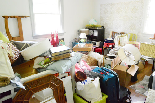
Up until about a month ago they were:
- the sunroom
- the playroom
- the hall bathroom
- the guest bathroom
- the basement
- the carport (which we want to convert to a more curb-appealing structure)
- the front porch (we want to frame out the columns, remove the scalloped trim, etc)
Those are a lot of spaces to leave completely alone (or fill with clutter) for nearly 24 months! But thanks to some scurrying in the past four weeks, we’ve actually started in on the hall bathroom and the basement, which just leaves:
- the sunroom
- the playroom
- the guest bathroom
- the carport
- the front porch
That’s still a bunch of areas that’ll keep us busy, but it feels better to only have five untouched zones on the list instead of seven. And ya know what will feel even better? Starting on the sunroom. Whoop whoop!
And yes, we’re getting excited to tackle Clara’s big girl room, so that’ll be happening pretty soon too. You know us in the winter, it gets cold and we get all crazy and bite off a ton of stuff (as seen here with an update that we also gutted the kitchen last Christmas).
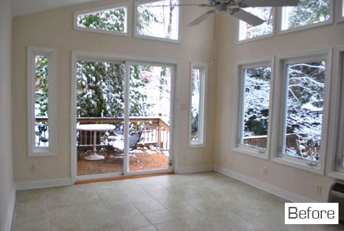
There’s nothing like looking a room square in the eye (the wall? the trim? the window?) and saying “dude, we’re getting on that.” So we officially did that to the sunroom. And then we got started. First here are some shots of the sunroom as it looked yesterday when we started. This is the wall that looks out to the upper patio:
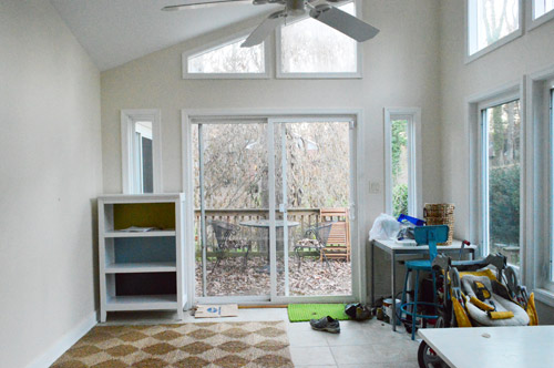
This is the wall to the right of that which overlooks the patio we added on the side of the house (this terribly-out-of-scale sketch of our lot might help orient you more):
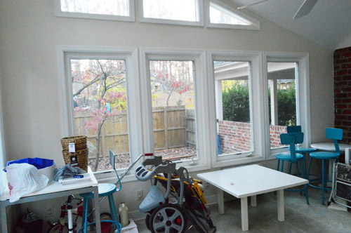
This is the brick wall to the right of that with a window that looks into the kitchen:
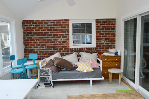
And this is the wall to the right of the brick wall that looks into the living room (here’s a floor plan of our house that might help orient you too):
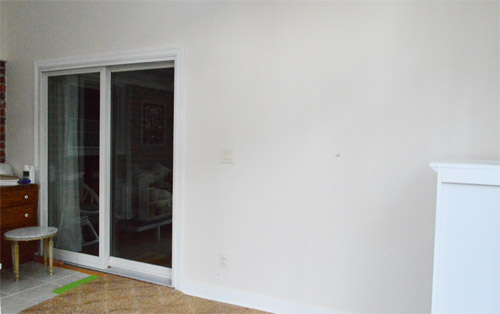
Not much to look at, eh?
And since we all know I’m nothing if not long winded and thorough, here’s a video for ya, just to capture our “before” in 3-D. Well I guess it’s still 2-D, but it paints a better picture than the pictures, if that even makes sense at all. Maybe not? Oh and the video explains why we can’t remove that window between the kitchen and the sunroom since we get that question semi-often:
So the first step after standing in the sunroom and declaring “dude, we’re getting on this already” to no one at large was to draw up a little plan. Not to scale, just more like a brain dump on paper. It looked like this:
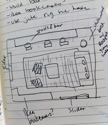
We knew the daybed only worked on one wall (we moved it around a lot when we first moved in and the brick wall just makes the most sense layout wise) and we thought adding a bar overlooking and patio through those giant windows would be cool and then bringing in some sort of storage for the completely bare wall across from them might make sense. We also want to reuse the jute rug leftover from our bedroom and the bright blue stools leftover from our kitchen along with a few other items that we already have (like floor pillows, daybed pillows, etc) because you know we love to work with what we have. Of course there are major things that have to happen like painting and adding window treatments, etc – but in this case we thought figuring out a layout that worked trumps paint, so that’s what we started with since we had so many existing pieces that we wanted to work in.
The first step to seeing if our little floor plan rendering would make sense in real life was to clear out the clutter and either craigslist, store, or donate anything extraneous. After about an hour in there we were left with this:
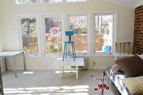
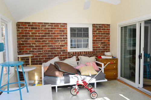
And then after moving some items that would go back into the room into the living room, just to get the room bare enough to look at/place the rug, we were here:
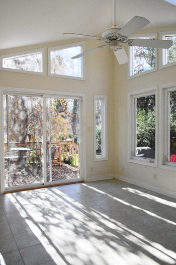
Yup, it looked like move-in day all over again. Except without the snow.
Then we brought the rug in and laid it down with a bit of it going under the daybed to ground everything. It’s a nice size for the room, the jute makes sense in a sunroom, and it cozied up the cold tile floor so we were sold. Although with the butter-cream color of the walls it’s a little off, we’re sure once we paint and add accessories and otherwise complete the unfinished 99% of the room we think it’ll all come together.
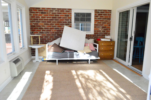
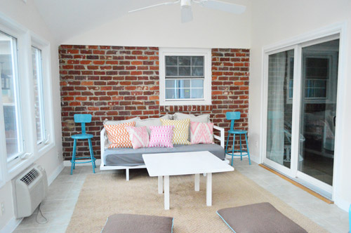
Then because I’m impatient, I tossed down the floor pillows, placed the coffee table, and played with a plethora of pillows. You guys know about me and my pillow problem, right? Oh but don’t mind the orangy-brown drawers to the right of the daybed (those will be craigslisted – they’re leftover from our kitchen reno) and those stacked tables to the left of the daybed (we’ll figure out where those really go someday).
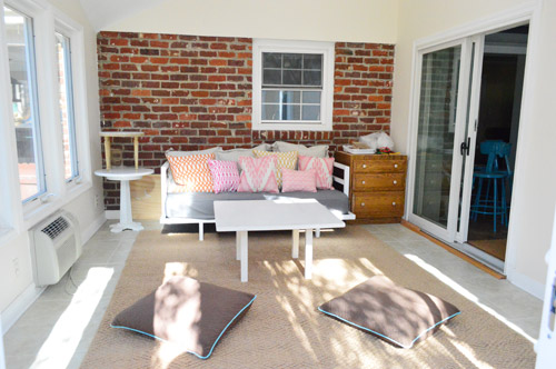
Next we brought in the stools that we envisioned for the bar against the bay of windows overlooking the stone patio and it was like a DJ slammed their hand down on a record. Screeeeech. It just didn’t work. No matter if we scooted the rug over, moved the daybed, or even removed the rug and tried the daybed on another wall – in person they just felt way too cramped and not-really-functional there. Sad face.
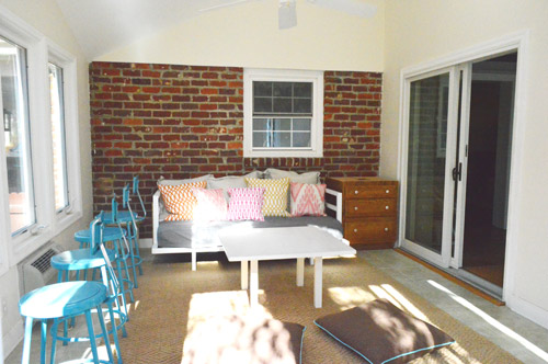
But as we’ve learned about a million times before, sometimes the first idea that pops into your head for a room isn’t the right one anyway, so thinking things through thoroughly (especially in the middle and the end of a project- more on that here) seems to yield a room that works the best (and looks the best). So we have plans to use the stools in another way that will hopefully make more sense of the room and actually be functional without getting all jammed up on the rug/heating unit by the window. And they won’t sit on either side of the daybed, I just stuck them there for now.
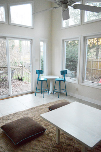
Wouldn’t they look sweet in the corner with a bar-height table in an old beat up wood finish? I think I’ll shimmy the rug under the daybed more to give that corner more room so it doesn’t look quite as squished in there. Unless we change our minds for the third time and things end up somewhere else, which definitely could happen. Sometimes you just have to let things shake out as we like to call it. Haha.
I know it’s hard to picture, so we’ll just share photos and details as we go! So excited to be starting in on yet another untouched space. Smells like teen spirit progress. Are you guys starting in on any formerly untouched rooms? Do you ever sketch things out and then try them in real life and it completely doesn’t work? Oh and do you like how the brick wall stops about seven feet up right at the top of the window? This used to be the exterior of the house and that’s where the slope of the roof started, so there’s no more brick above that. Boo! Wish it went all the way to the ceiling! But we have a few ideas to make it look less jarring and more integrated. Will keep ya posted!
Psst- Wanna see what a typical Thanksgiving looks like for us? Here’s Clara’s rundown on Young House Life.

Maria @ Inspiration Affirmation says
I am so looking forward to reading/seeing more about this room. It really is a room with such potential, and all of that beautiful light is gorgeous! And it looks like you’re surrounded with all sorts of foliage, too! Really, really wonderful.
Jennifer S says
Thanks for the tip about the Nook Book. I already have your hard copy, but I’m excited to now have it wherever I go!
YoungHouseLove says
Aw you’re so sweet Jennifer!
xo
s
Meg says
We live in a 3 bedroom house and have not really done much with our “back” bedroom. Ours has been evolving, and so has the one that we use as an office/den/music room, but the back room has gotten pretty much no love. When we first moved in, a friend of our lived with us and that was his room – so for over a year now since he moved out I feel sort of ashamed to say that it is in a holding pattern.
The bright side is that I have slowly been collecting the things that we will need in there (we have a bed, a dresser, and a smaller dresser to use as a nightstand) so the love should start to flow soon! I firmly agree with your policy of saving pennies and doing what you can with what you have!
Jessi says
Thanks for the heads up on the nook sale! Even though I have your hardcover book, I went ahead and bought the nook version so I can have it with me on my iPad at all times! :) Plus it makes me feel better, since my dog got her paws on your book and chewed the corner of the spine within the first few days of me owning it. I was upset, but luckily had some turquoise duct tape on hand to fix the bind, and it blends in quite nicely lol!
YoungHouseLove says
Aw you’re so sweet! Thanks Jessi!
xo
s
Nicole says
I sent this once, not sure if I sent it right :(
Cement scraped onto a brick wall in spots more then others is a wonderful way to show a aged look. Better then painting for sure since you already like the brick, just will tone it down some. Very New Orleans/ Spain.
YoungHouseLove says
LOVE that tip!
xo
s
nicole says
I can understand using a white-wash on walls most of all on wood!
On brick, A white wash makes more “sence” since it is easy.
Putting more time into it with cement will turn that wall into a work of art! Molding awesome also.
I seen white wash, and paint on bricks. As a interior designer, it cheep looking.
Have you been into older homes where you seen the sheetrock, or plaster broken off of the wall leaving the brick showing, yet still keeping the broken sheetrock almost gone; yet left alone?
There is something so wonderful about that. says history, art, statement, It says home!
YoungHouseLove says
Oh yes we love the idea of a cement finish as well! Will keep you posted!
xo,
s
nicole says
Sense it’s your home, what do you want it so say about your-self, and your family.
I don’t know anything about you, this was on my feed today and got my eye. I very glad I did.
I know this much, the easy way out never works in life.
I wish you and your family the best re~design. It’s so much fun to do things on your own, I know I love it.
Have a wonderful holiday season, your room might not be ready, but well worth the wait!
Very Nice talking to you today
Heather says
Have you considered installing white beadboard above the brick? If you do that and white wash the brick wall, it might help the wall make more sense.
You could also continue the beadboard to the ceiling, but that might be overkill.
YoungHouseLove says
Love that idea too!
xo
s
Allison says
I was also at the book signing last night – first in line crew wahoo! – and I honestly thought with the small store and the huge turnout they really handled it the best that they could. I actually went in planning on buying three extra books, but ended up only buying one extra (I brought my own as well) because I didn’t want to be a line hog haha
I just wanted you to know that I thought overall it was a really positive experience, even though I couldn’t think of anything to say once I finally got to see you! You guys are awesome!
YoungHouseLove says
Aw thanks Allison! We had so much fun meeting you! So glad you had fun – you guys were such an amazing crowd!
xo
s
Kearney says
i have been in my 1950’s brick ranch for 20 years now. many rooms have been done and re done with the exception of the guest room which is still the same off white the landlord painted it when we were just renting the place. if i could just decide on a paint color, the hubs is ready to paint. this place has been and will always be a work in progress. this time last year we were tearing out our kitchen. christmas will be merrier this year without all the construction dust!
love your blog & can’t wait til you come to charlotte!
Gaidig says
Go for it! Paint is one of the least expensive changes, and it’s easy, so if you don’t like it, you can paint over it.
Michele says
Got very excited when I saw your book was the Nook deal today — then found out it’s not available for Kindle, which is what I have. Any idea if it will be available for Kindles in the future?
YoungHouseLove says
We hear that Kindles don’t play well with picture books (they lend themselves more to type books and not image-based books) so I don’t think Kindle is making a version of our book. So sorry!
xo
s
keegan says
SO great to meet you guys last night! I almost chickened out since I was coming alone but am so glad I didn’t! And sorry about the super awkward request for the U-V-A photo, I panicked and didn’t know what to say! My face is soo embarrassed in the picture haha but I’ll stick it on your fb page once I’ve recovered!
YoungHouseLove says
Aw, I’m so glad you came Keegan! It was so much fun to meet you!! And I can’t wait to see the pic!
xo
s
Karly says
So jealous of that exposed brick, I think it adds such interest and character to a room. Can’t wait to see what you guys do with it and the rest of the space!
tjack432 says
The brick and off centered window look so charming to me. I love how you have a window going from one room to another room. I wish we had that in our home.
Here are some inspiration photos:
http://www.houzz.com/photos/48951/Breakfast-Room-traditional-dining-room-birmingham
http://cushandnooks.blogspot.co.nz/2012/03/two-become-one.html
Looking forward to seeing what y’all do.
YoungHouseLove says
Aw, I love those!!
xo
s
tjack says
Here is another one:
http://cdn4.blogs.babble.com/family-style/files/2012/07/194077065162574386_NmyR1xjn_f-e1341816347117.jpg
It would be a cute way to incorporate your blue stools. Not sure where you would put your daybed though since you said it only fits against the brick wall.
YoungHouseLove says
Oh yes I’ve loved that one for a while! Sadly the daybed is more functional than ditching it for stools. We’re greedy and want to work both in :)
xo
s
Kim @ Yellow Brick Home says
I can’t wait to see your sunroom transformation!
Just a quick question – You had a sunroom in your last home, and around here (in Chicago), an extra room like that is really rare – even in the ‘burbs! Is that a common thing to have in Richmond, or was that on your must-have list?
YoungHouseLove says
Oh yes I think it’s just super common – especially on ranches since they’re all one level so they just pop one on the back as an addition in the 70s or something. Hahah!
xo
s
1008 Hollywalk Park says
I love the idea of having a bar table and stools in the sun room. I’ve no idea why I haven’t thought of that idea for my conservatory actually! We also have the constraints of doors in odd places and a very high roof line. Can’t wait to see what you come up with.
Gabriella @ Our Life In Action says
We have several of those rooms in our house…at first it starts with a spare chair of a bag of clothes that you need to donate and before you know it you need to become an olympic vaulter to get through the room. ;-)
Kate says
I know you’ve mentioned your daybed really only works on the kitchen wall because it is too deep. What if you moved it to the blank wall along the living room? It looks like your slider to the outside patio is a right-to-left slider, so the bed wouldn’t block the opening. Then you could put the bar on the kitchen wall. You could even make it an extra deep bar with storage cupboards or bookcases underneath!
Of course, this might be another thing that works on paper/in pictures and just looks super awkward in pictures. But I look at that kitchen window and have always pictured a bar underneath it!
Kate says
Looks super awkward IN PERSON is what I meant to say!
YoungHouseLove says
Hahahahahaha, I knew what you meant.
xo
s
YoungHouseLove says
Yeah we tried the daybed on that wall too but it felt oddly invasive to the slider and off-balance, even though it didn’t technically get in the way. We’ve been wrong before about layouts and come to our sense later though, so who knows where we’ll end up! HAhah!
xo
s
mribaro says
I’m dying to know what color you’re gonna paint the walls of the sunroom! Is it going to be the silver gray like your living room, or some sandy color to go along with the tiles and the carpet? I doubt you’d paint it all white because you like the white of the trim to pop, although all white could look cool too.
YoungHouseLove says
I have no earthly idea! Honestly and truly! I thought Rockport Gray (our bedroom color) would really pop in there but I don’t know if that goes well with the rug/tile, etc. We’ll have to see where we end up!
xo
s
emma says
Can’t wait to see the color palate you’re thinking!
Finally taking the plunge to paint the ceilings (ugh) and walls of our guest room this weekend. xmas visitors are a good incentive to new rooms!
YoungHouseLove says
Ooh good luck Emma!
xo
s
Laura says
I think I’m still on a John-and Sherry high after meeting you last night! :) You guys were funny, charming, and so cute in person – totally worth the wait in the cold. And you seemed genuinely grateful to every person you met. Thankfully I was able to carry on a somewhat normal conversation when it was finally my turn to meet you. Sherry, we know you’re a talker, but John, you surprised me – you were so much more bubbly and outgoing than I expected! haha. You guys have some kind of stamina too – all that small talk, book signing and SMILING for hours on end.
YoungHouseLove says
Aw thanks so much Laura! We had so much fun meeting you last night. Thanks so much for coming! And yes, you guys make us so hyper – really, you give us so much energy! So John and I are pretty much bouncing off the walls by the time we drive home! Haha.
xo
s
Kara says
Yay! I just bought your book for my Nook. :)
YoungHouseLove says
Aw thanks Kara! Hope you love it.
xo
s
Erin C says
I just started watching the video and was thinking about the view you get from the kitchen window into the sunroom. When planning a room such as this, do you think about the view from the kitchen and plan things so they will look nice from the kitchen?
YoungHouseLove says
Oh yes! The key would be just not to put anything too giant in front of the window since if the window isn’t obstructed you can see straight out the sliders behind it to the tree/patio/etc.
xo
s
Gail says
Can’t wait to see the sunroom finished!
Did you think of putting the daybed on the sliders wall?
On that wall it can go against the wall and maybe have a bit more room. That would free up the brick wall for a bar with the stools. Even better use the stools around a high table.
Then put shelves below the windows and where-ever else they would fit in.
Another idea keep the final plan you came up with in the end with the 2 stools at a table and give John 2 stools in his man-cave basement workshop area!
Final thought…Craigslist the daybed or the stools..and get what realy works!
YoungHouseLove says
The daybed is so deep that it cuts into like half of the room (so it’s better on the shorter wall since it butts into the room a lot on the longer walls (the one with the slider or the window wall). Can’t wait to see where we end up though – we’ll definitely keep you posted!
xo
s
Bree says
I appreciate seeing that well laid out plans in your head don’t work sometimes since my hubby thinks you can dream it up, buy it, and it’s done…in a weekend. lol
Will the book be available on Kindle?
YoungHouseLove says
We hear that Kindles don’t play well with picture books (they work best with work-based books and not image-based ones) so we don’t think they’ll be putting out a version of our book. So sorry!
xo
s
Koliti says
Your sunroom is a beautiful space! Love those windows!
Can’t wait to see how you put your signature style on it.
I vote for the pub height table – with two stools on each side. It offers more possibilities – eating lunch, playing cards/games, etc. (The long bar scenario seemed like strangers sitting at a bar and not talking to each other.)
Emily | Sparkle Meets Pop says
It’s so much fun seeing you guys start a brand new project. So many possibilities! Can’t wait to follow along.
Gracie says
I was wondering if you centered the daybed under the kitchen window and scooted the rug over to match the new position of the bed, if that would leave enough room for your barstools on that big wall of windows. You might have to do something else for the coffee table to allow people to walk by, but thought that might work! It looks like it would be really nice to sit there and eat while looking out those windows. :)
YoungHouseLove says
Oh yes, we could try that for sure! Should be fun to see how things shake out!
xo
s
Diane Pesavento says
I saw that you had Ikea bookcases on your list, we just turned two billy bookcases into built-ins and they weren’t fun to paint. I swear the primer just repelled off the cabinets unless you sanded them down so much. If you want to paint the backing, just get a piece of wood to use (so much easier than dealing with the cardboard)!
YoungHouseLove says
Thanks for the tip!
xo
s
Emily R says
I’m in the process of painting some billy bookcases and had really good luck with water based bin primer. Normally I would say oil based, but I didn’t want to deal with the clean up and it seems to be working great. I’m going from black to white so I’ve used about three coats of primer before three coats of finish (BM Advance). It’s also super helpful that it dries so quickly. I could do all the primer coats in one day. Oh, and I did sand, but you may not really need to.
Emily @ FashionablyLateSisters says
Oh my gosh, I just did something like this in our master bedroom! My company downsized me (actually my whole office), which meant it’s time to become a full-time auditioning actor (yay!?). Well, my first day home I realized we had NO home office, and as someone who’s been an office manager for over 13 years, I have to have a desk for command central! So that meant taking a formerly stuffed corner of our room and drastically moving things around over…and over…and over again until I found an office-y layout that worked. Now on to getting work… :)
YoungHouseLove says
Aw, good luck Emily!
xo
s
Carla says
Oooh… I love the room arrangement brainstorming phase where it’s all a whirley-world of possibility! I would love to see how distressed wood planks look above the exposed brick half-wall; I think it would add a nice warm element similar to other rooms of your house. I don’t know, but I wonder if painting the brick would “jar” with the exposed brick you see outside your windows (the carport?)? One way to see would be to tape paper over the brick to get a feel. Other brainstorming ideas… :) My eye is begging (at least in photo-form) to see a round table in front of the day bed…and I wonder if the stools might work in the room better if you cut them down (oh no!) to chair height, allowing a couple of them to be additional seating where the floor cushions are (making a conversation pit)… plus maybe putting one in front of the left side of the slider (facing outside with a tiny side table by it?). Sorry for getting out of control over here; I told you I love this phase! :)
YoungHouseLove says
Haha, yes it’s the best phase! So many possibilities! We’re just getting started so I’m sure a lot of things will evolve as we go and you know we’ll keep you posted!
xo
s
Shauna @Satori Design for Living says
Now that we developed the basement, we actually only have one dump room, which was supposed to be my project/craft room, but it holds everything I don’t know where to put. Currently it’s also home to the Christmas presents until I get the tree up.
Margaret @ This Sold House says
I love your sunroom! Thanks for sharing your work-in-progress and showing us how sometimes the best-laid plans just don’t work out in real life. I love how you are making do with what you have, first, before buying additional furniture. PS – I just posted about our own sunroom remodel (even though it happened over a year ago): http://this-sold-house.blogspot.com/2012/11/warming-up-to-our-sunroom.html Your “how to paint brick” tutorial really came in handy!
YoungHouseLove says
What a pretty space!!
xo
s
Mallory Johnson says
Totally unrelated to this post, a while back you posted about building a garage and losing a window. Both of which just happened to us and I forgot I was going to tell you about it. We are complete do it yourself-ers like you two so we, with the help of my grandpa built a garage. We did have to fill in the window for fire standards and I think my solution which was sparked from your kitchen. Anyhow if you are interested in seeing the process for any reason.
http://www.johnsonslifeonline.blogspot.com/search/label/Garage
Of course they are all backwards in order, but you get it.
Anyhow, love reading your posts.
YoungHouseLove says
Wow- that’s major! Thanks for sharing the link! What an awesome project.
xo
s
Rachel says
Hi guys!
My husband and I built our first house last year and we have vaulted ceilings in our main living area, with two trapezoid windows much like the ones in your sunroom, except they are both on the same wall. Originally, I just threw panels up for the double-hung windows below the trapezoid windows, but now I feel like I want the traezoids to be included with the window treatments….
Do you have an idea of what kind of window treatments you are going to hang? And will they include the high trapezoids?
YoungHouseLove says
I think we’re planning on some patterned roman shades hung inside mounted in the low rectangular windows (and the upper windows will go undressed). You can frost them if you think they let in too much light/glare though! Ours aren’t bad so we’re leaving them open so we can see the trees!
xo
s
Gaidig says
First, you can tick the carport off of the untouched list because you replaced the lantern light. I know it’s a long way from where you want to be, but it’s not untouched!
Second, is there a reason that the daybed has to be against a wall? What if you put the bar against the brick wall, then had a circulation gap, then the daybed, maybe with a console table or shallow book case behind? I understand that the room may not be as long as it seems in photos, but it’s a thought. Or if you wanted the room to have only one zone, you could use the same concept of bringing the daybed off the wall and put it in front of the door to the deck.
Gaidig says
Oh, and I nearly forgot – since I finally got a job offer, I now anticipate doing a lot of things to rooms that haven’t been touched/have barely been touched since I moved in with my BF.
YoungHouseLove says
Hahahah! Funny about the light making it not untouched! As for the daybed it’s really deep so it takes up more of the room than you’d think, but it might be able to end up somewhere else! We’ll have to see where we land!
xo
s
Krista says
Sherry & John, I’ve been combing over your site for a few years now.. (since 09 I think?) and finally have a house of my own!
Your projects are great for larger-ish houses.. but what are your favorite blogs for something smaller? Like a townhouse? Any recs? I’ve looked through your links a few times, but can’t remember anything coming to mind :)
YoungHouseLove says
Apartmenttherapy.com is always fun! We also have some pretty tiny rooms (Clara’s bedroom is 10 x 9′) and our first house was very small (our living room was only 8′ wide!) so the archives might help or our projects page which has lots of townhouse-friendly projects like furniture makeover, quick updates, etc. Hope it helps!
xo
s
Brittany D says
Hey guys! I just wanted to let you and your fans know that your book has been selected as the Barnes & Noble NOOK Daily Find for today. I just picked up the Young House Love NOOK book for $2.99!! http://www.barnesandnoble.com/w/young-house-love-sherry-petersik/1112165072?ean=9781579655242
YoungHouseLove says
Wahoo! We added that as an update to the top of the post. So excited!
xo
s
Carissa says
I was able to get your book for the nook app on my iPad! What a steal, thanks guys!
YoungHouseLove says
Aw so glad Carissa!
xo
s
DeeJay Conley says
Sunroom = Fabulous!
Jessica says
Hi! I’m a long time reader, first time commenter. I wasn’t able to make it out to see you guys in MN a couple weeks ago. How did you like it? Will you do a write-up?
Question about the sunroom – it seems like especially in the winter you guys use the sunroom to let painted things cure or offgas. How will that effect your plans for the room, if at all?
YoungHouseLove says
Oh yes, that’s on the agenda for tomorrow! We do every-two-week tour updates and can’t wait to share! And as for letting things cure/offgas in the sunroom, we have now cleared out the basement (which is insulated pretty well since it’s underground) so we can let things dry in there or roll back the rug and still use the sunroom! Haha.
xo
s
Melissa says
Is that a ghost kitty I see on the pillow? :)
Excited to see how it all comes together!
YoungHouseLove says
Haha, that is a ghost kitty!!
xo
s
Grace@ Sense and Simplicity says
What about building a bar/work area along the wall that backs onto the living room. It is further down from the daybed so the stools wouldn’t seem so crowded. You might only get two stools in, but it would at least be a fun area to do some crafts and a good place to put food for parties.
YoungHouseLove says
Yes that might work (we don’t know if the stools will still overlap the rug in a weird way). Will definitely keep you guys posted!
xo
s
MrsG says
I absolutely love the Nook price! Sadly, I’m a Kindle user! Are there any plans to have a Kindle e-book available in the near future as well?
YoungHouseLove says
Sadly we hear that Kindle doesn’t play as well with picture/image based books, so they do work-based books like novels. Wish they would do a YHL book version, but it doesn’t look like they have any plans to now.
xo
s
Emily R says
The space is starting to look great. The only thing that makes me crazy every time I see the day bed is that the fitted sheet always looks sloppy to me. I just want to pull it down and make it nice and tight!
YoungHouseLove says
Oh yeah, it’s a mess! Someday I’ll get to that! Haha. Finishing touches…
xo
s
Diana says
thanks for the nook book heads up — as a postdoc I’m always on the hunt for deals, and this was a wonderful find! Looking forward to enjoying the fruits of your labors.
Heather says
I love tackling rooms for the first time, it is always so refreshing to have a room start to look functional. Yesterday my husband went out of town on a business trip so I decided to tackle his untouched office as a surprise. All we did was throw his desk in there when we moved in a year ago and since he works from home it was kind of a depressing space. Hopefully it is done by the time he gets back (and hopefully it is a pleasant surprise ;)
Rachel says
I have a sunroom (actually I call ours a “bonus room”, weird right?) very similar to yours in that there’s a separate heating unit and the window to the kitchen. The way the bonus room extends there’s also a set of double windows to the dining room.
Right now the kitchen window is open and uncovered (to let in as much bonus room light as possible) and the dining room has sheer curtains hanging over it. All of the windows themselves are actually left open at all times.
Do you all have any suggestions on weird outdoor windows leading in to indoor spaces? I would love to make it flow a little better than it does right now…
YoungHouseLove says
Hmm, anyone have ideas? It sounds pretty as it is. Maybe you could do woven blinds hung high and wide (so they don’t block much light) on both sides of the window too?
xo
s
Cori says
What about shelves that double as a window seat under the bay window? You could have some fun cushions on top that you could remove for a hard surface when you need it, with some storage underneath.
YoungHouseLove says
That would be fun! We do have a heating unit there that we’d have to work around but it could work. We’ll have to see where we end up!
xo
s
Krystle @ Color Transformed Family says
I am so excited that you guys are tackling the sunroom. It will be interesting to see what you do to merge the two different architectural styles of the house and make it work more as one.
Amanda says
I’ve been a reader for a while but have never been brave enough to reply :)
I just had an idea about the daybed that I haven’t seen brought up yet. What if you move the daybed where you have the floor pillows and then you can have the bar along the brick wall? I’m not sure how much walk around room that will allow, but just thought it was worth a shot.
YoungHouseLove says
That’s totally another idea! I’ll have to play around and see if there’s enough room on each side of it for nice flow if it floats in the room!
xo
s
Kim says
I just had to comment to tell yall that my husband and I contracted to buy a house yesterday! I have been a daily reader of your blog for 3 years and living vicariously through you two while anxiously waiting for the day when I can have my own house, so you two have (unknowingly) been a big part of this whole experience for me. It’s a 1950s ranch and although it’s completely updated (so no big projects), I can’t wait to start on the little projects – something I know your book will help a great deal with! Just wanted to tell yall thanks for letting me live vicariously through you for the past few years and thanks for all the inspiration that I will now finally get to make use of!