Just like we did in our first house, we find ourselves bouncing around from project to project and from room to room (we’ve tackled the living room, guest room, nursery, bedroom, kitchen, dining room, office, laundry room, patio, deck, etc). But there are still a few completely untouched spaces after two whole years of living here (other than slowly filling them with clutter in some cases)!
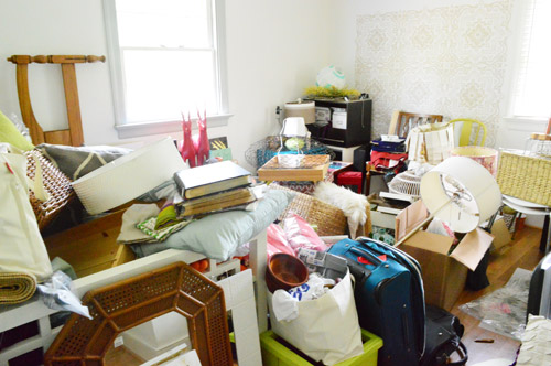
Up until about a month ago they were:
- the sunroom
- the playroom
- the hall bathroom
- the guest bathroom
- the basement
- the carport (which we want to convert to a more curb-appealing structure)
- the front porch (we want to frame out the columns, remove the scalloped trim, etc)
Those are a lot of spaces to leave completely alone (or fill with clutter) for nearly 24 months! But thanks to some scurrying in the past four weeks, we’ve actually started in on the hall bathroom and the basement, which just leaves:
- the sunroom
- the playroom
- the guest bathroom
- the carport
- the front porch
That’s still a bunch of areas that’ll keep us busy, but it feels better to only have five untouched zones on the list instead of seven. And ya know what will feel even better? Starting on the sunroom. Whoop whoop!
And yes, we’re getting excited to tackle Clara’s big girl room, so that’ll be happening pretty soon too. You know us in the winter, it gets cold and we get all crazy and bite off a ton of stuff (as seen here with an update that we also gutted the kitchen last Christmas).
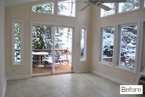
There’s nothing like looking a room square in the eye (the wall? the trim? the window?) and saying “dude, we’re getting on that.” So we officially did that to the sunroom. And then we got started. First here are some shots of the sunroom as it looked yesterday when we started. This is the wall that looks out to the upper patio:
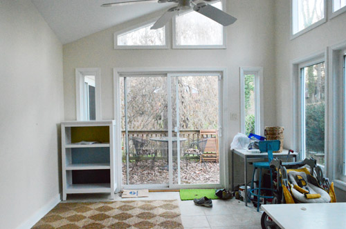
This is the wall to the right of that which overlooks the patio we added on the side of the house (this terribly-out-of-scale sketch of our lot might help orient you more):
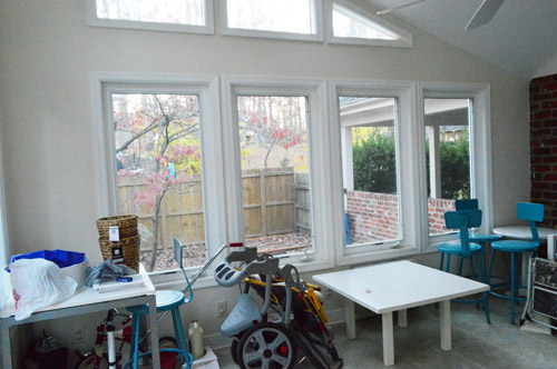
This is the brick wall to the right of that with a window that looks into the kitchen:
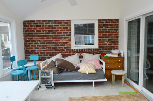
And this is the wall to the right of the brick wall that looks into the living room (here’s a floor plan of our house that might help orient you too):
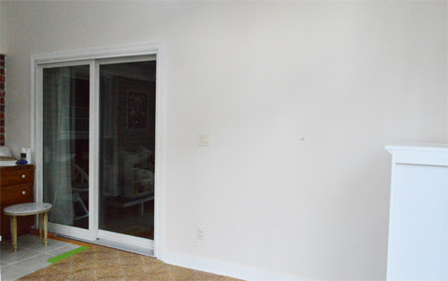
Not much to look at, eh?
And since we all know I’m nothing if not long winded and thorough, here’s a video for ya, just to capture our “before” in 3-D. Well I guess it’s still 2-D, but it paints a better picture than the pictures, if that even makes sense at all. Maybe not? Oh and the video explains why we can’t remove that window between the kitchen and the sunroom since we get that question semi-often:
So the first step after standing in the sunroom and declaring “dude, we’re getting on this already” to no one at large was to draw up a little plan. Not to scale, just more like a brain dump on paper. It looked like this:
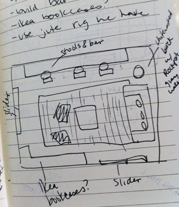
We knew the daybed only worked on one wall (we moved it around a lot when we first moved in and the brick wall just makes the most sense layout wise) and we thought adding a bar overlooking and patio through those giant windows would be cool and then bringing in some sort of storage for the completely bare wall across from them might make sense. We also want to reuse the jute rug leftover from our bedroom and the bright blue stools leftover from our kitchen along with a few other items that we already have (like floor pillows, daybed pillows, etc) because you know we love to work with what we have. Of course there are major things that have to happen like painting and adding window treatments, etc – but in this case we thought figuring out a layout that worked trumps paint, so that’s what we started with since we had so many existing pieces that we wanted to work in.
The first step to seeing if our little floor plan rendering would make sense in real life was to clear out the clutter and either craigslist, store, or donate anything extraneous. After about an hour in there we were left with this:
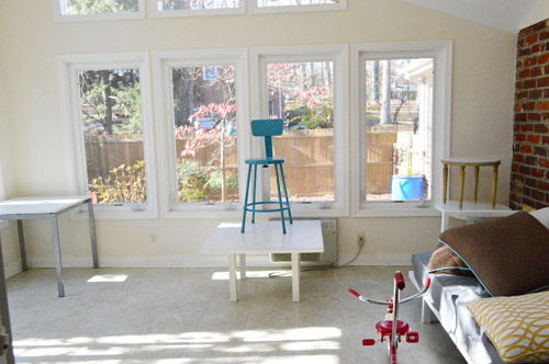
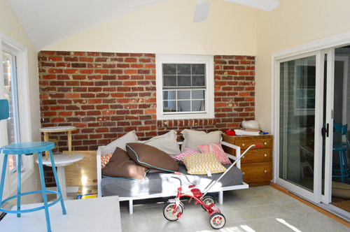
And then after moving some items that would go back into the room into the living room, just to get the room bare enough to look at/place the rug, we were here:
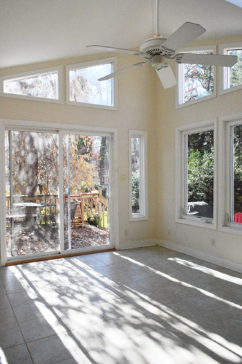
Yup, it looked like move-in day all over again. Except without the snow.
Then we brought the rug in and laid it down with a bit of it going under the daybed to ground everything. It’s a nice size for the room, the jute makes sense in a sunroom, and it cozied up the cold tile floor so we were sold. Although with the butter-cream color of the walls it’s a little off, we’re sure once we paint and add accessories and otherwise complete the unfinished 99% of the room we think it’ll all come together.
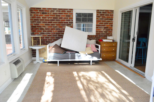
Then because I’m impatient, I tossed down the floor pillows, placed the coffee table, and played with a plethora of pillows. You guys know about me and my pillow problem, right? Oh but don’t mind the orangy-brown drawers to the right of the daybed (those will be craigslisted – they’re leftover from our kitchen reno) and those stacked tables to the left of the daybed (we’ll figure out where those really go someday).
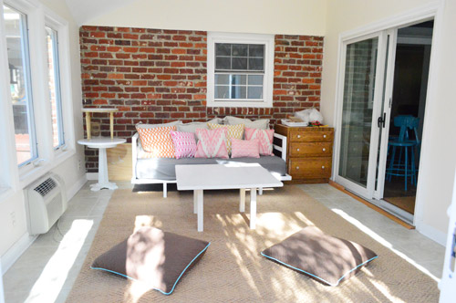
Next we brought in the stools that we envisioned for the bar against the bay of windows overlooking the stone patio and it was like a DJ slammed their hand down on a record. Screeeeech. It just didn’t work. No matter if we scooted the rug over, moved the daybed, or even removed the rug and tried the daybed on another wall – in person they just felt way too cramped and not-really-functional there. Sad face.
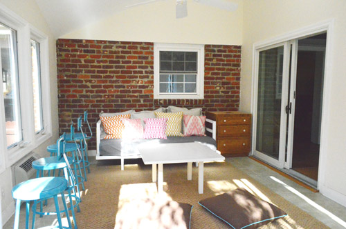
But as we’ve learned about a million times before, sometimes the first idea that pops into your head for a room isn’t the right one anyway, so thinking things through thoroughly (especially in the middle and the end of a project- more on that here) seems to yield a room that works the best (and looks the best). So we have plans to use the stools in another way that will hopefully make more sense of the room and actually be functional without getting all jammed up on the rug/heating unit by the window. And they won’t sit on either side of the daybed, I just stuck them there for now.
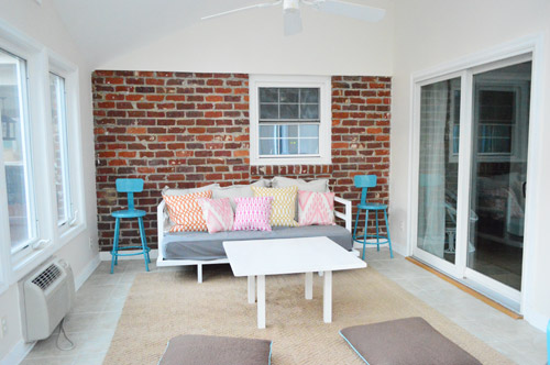
Wouldn’t they look sweet in the corner with a bar-height table in an old beat up wood finish? I think I’ll shimmy the rug under the daybed more to give that corner more room so it doesn’t look quite as squished in there. Unless we change our minds for the third time and things end up somewhere else, which definitely could happen. Sometimes you just have to let things shake out as we like to call it. Haha.
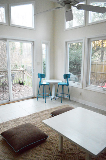
I know it’s hard to picture, so we’ll just share photos and details as we go! So excited to be starting in on yet another untouched space. Smells like teen spirit progress. Are you guys starting in on any formerly untouched rooms? Do you ever sketch things out and then try them in real life and it completely doesn’t work? Oh and do you like how the brick wall stops about seven feet up right at the top of the window? This used to be the exterior of the house and that’s where the slope of the roof started, so there’s no more brick above that. Boo! Wish it went all the way to the ceiling! But we have a few ideas to make it look less jarring and more integrated. Will keep ya posted!
Psst- Wanna see what a typical Thanksgiving looks like for us? Here’s Clara’s rundown on Young House Life.

Kat says
Bought the nook book…now to figure out how to get it on my nook!
YoungHouseLove says
Aw thanks Kat! Good luck!
xo
s
Carol says
I’m not sure if this was mentioned already, but since the daybed is too deep for the short depth of the room, would it fit with its back to the sliders to the deck, but with just enough room behind it to access the outside? Or,give up that access and just use the sliders that go from the living room to the deck? Then you could put the bar on the kitchen wall which would be a great buffet space for warm weather entertaining, even if you can’t open up a pass through to the kitchen.
YoungHouseLove says
That’s a possibility as long as there’s enough flow around it! Will have to see how it works!
xo
s
Sylvie says
It’s great to see how your ideas evolve about what to make of your sun room, which, by the way, is an amazing room, with all those windows and the brick wall that brings some texture. We have been in our house for over four years, and none of the rooms has really been renovated to our taste yet for all kinds of reasons, but we are finally working on the spare room, which we want to use for a home office. I don’t know how many times we have changed our minds about the layout and the choice of furniture in the last few months, but we are finally getting a clear idea of what we want, and it is nice to see that others are going through the same process.
Oddly enough, I didn’t know about your blog only a few weeks ago, until I saw your book advertised on Centsational Girl, and now I come visit everyday and spend my evenings going through your beautiful book. It will be a very useful resource in my decorating projects.
YoungHouseLove says
Aw thanks so much Sylvie!
xo
s
Sara says
Just a follow up to my earlier comment about the booksigning — there is a happy ending — I was able to find the book (last copy) at a nearby Barnes and Noble.
YoungHouseLove says
Yay! So glad Sara!!! So so glad.
xo
s
Clara says
FYI I am preggo and just hopped (ok more like slithered down) out of my chair and hobbled as quickly as possible to my Nook and downloaded your book! I had been procrastinating on buying (don’t hate me) and I just can’t pass up a deal like that. Congrats on the book by the way!
YoungHouseLove says
Aw thanks Clara!
xo
s
Sara says
One more thing — already paged through it and was not disappointed!
YoungHouseLove says
Huzzah! So so glad.
xo
s
Susan S. says
I’d suggest ditching the daybed entirely in favour of building a crafting/seating/watching station along the windows. In the corner between the doors use an L-shaped storage system to hold crafting supplies, books, toys, etc. It would be a wonderful place to work on tabletop projects like art or sewing but also serve as a great place to work/craft but also to look in on your little one when she’s big enough to play outside alone. Plus the space could be used as a serving station whilst you’re entertaining or a kids table with a view and space to colour while eating.
Can’t wait to see what you eventually come up with!!
Lil says
Bought the Nook edition today (in addition to the hard copy from Amazon – complete with book plate from Cinci). Just wanted to say the Nook,version looks good…I think you mentioned you were concerned about that…though it definately helps to have my iPad in the portrait orientation for the pages to look good. I wanted to have a portable copy. ;)
YoungHouseLove says
Aw thanks so much! Whew. So glad!
xo
s
soline dhaussy says
What’s your take on wall paper? Any chance that you might use wallpaper somewhere in the house soon?
YoungHouseLove says
Yes, we’re dying to mess around with a really cool and modern wallpaper somewhere- just trying to decide where. Maybe in the hallway about some wainscoting we want to add.
xo
s
Kristy says
Boo! I was so excited to scratch your book off my Christmas list and buy it early through this deal. I bought it only to realize that it isn’t viewable on the iPad nook app even though it says available for book devices and apps. I guess I’ll have to add it back to my Christmas list.
YoungHouseLove says
Aw man! I have heard from others who have the iPad and bought some free nook app and it worked. So sorry it’s not working for ya! Maybe search for another app to try or restart and see if it works? We just have heard from multiple folks who said with the free app it worked and they were so excited (meanwhile we didn’t even know they made apps to convert Nook things to iPads! Hahah).
xo
s
Em Johnston says
Thank you thank you thank you for mentioning the B&N deal!!! I just gifted copies to my Mom and my Bestie (who I was hoping would be able to make your Chi-town signing).
*happy dance*
As for things on paper not always working out in reality… well, that’s the majority of my TO DO lists. Thankfully the Drying Rack for my Laundry Room has actually been working out and is *almost* finished. The day job and marathon training are really cutting into my power tool time, though.
Also, J – hope to see you at the Disney full some time – most fun 26.2 I’ve ever done! :-)
YoungHouseLove says
Aw, so glad you grabbed those Em! Thanks!
xo
s
Kismet says
I dunno, remember how you always thought your bed could never go on a different wall? And then remember when people told you the posts on the bed didn’t work and you cut them off and now you love your room?
I think it is the day bed that isn’t working out there. It is too ‘bedroomy’ and so the awesome chairs/stools won’t work. Try removing the daybed and see if you get a different vibe.
As an aide, I loved those blue stools at the bar in the house and think the ones in there now look more suited to a sun porch.
Just throwing it out there :)
~K!
YoungHouseLove says
Oh yeah, it’s absolutely possible that down the line the room will evolve and that daybed will be ousted! We just don’t want to dump it off the bat because more often than not we figure out how to work with something if we love it and it has meaning to us (the daybed was a wedding gift to us, and functionally we loved lounging on the daybed in our last sunroom more than a chair or a stool). Should be fun to see where we end up!
xo
s
Anna says
How about a bench under those windows? Cushioned on top with lots of pillows and with some storage bins underneath?
YoungHouseLove says
That would be awesome except we have a heater/air conditioner unit bumping out so we’ll have to see how it goes!
xo
s
Steph says
Oh man! I wish I saw that deal yesterday!! I have a nook and would have loved to scoop up that deal! darn! Still going to get it off amazon though, and I’m thinking it will be a fun book to display :)
YoungHouseLove says
Aw thanks Steph!
xo
s
Catherine says
Yay for the Deal of the Day! I downloaded your book and can’t wait to read it! :)
YoungHouseLove says
Yay!
xo
s
Sasha says
What about putting the second daybed in Clara’s big girl room for sleep-overs?
YoungHouseLove says
Sadly it’s just too tight in there! Our last sunroom was like 20 x 20″ so that’s the only reason it could have two of them (they’re like 3′ deep each – deeper than any sofa we’ve ever owned!).
xo
s
Elizabeth@ Food Ramblings says
love seeing steps in the process and knowing it’s a work in progress!
Marnie Blum says
What about using the barstools as end tables for the daybed? I love the pop of color there and the quirkiness of it.
YoungHouseLove says
It could always end up working! Haha! We never know in the very beginning where we’ll end up!
xo
s
Lisa says
My husband and I just bought our first home a little over a year ago and it’s a DIYers dream–read major fixer upper! We’ve done lots of things so far but I’m feeling a bit overwhelmed with the amount of work that needs to be done. So, I’m wondering…do you guys have a whole house plan? Do you start with a room that needs the least amount of work or the most work? Is there a method to your madness? :) I feel like I’m stuck and would love some input! :)
YoungHouseLove says
We just write out a giant masterlist and circle what’s most necessary. We start there and bounce around wherever we’re excited to go next. Try not to put pressure on yourself – it takes years!!
xo
s
Kate says
Aw, I’m sure it’ll look great, but I’m sad that you are going to paint the brick. I love how the teal stools look against the colors and textures of the brick.
YoungHouseLove says
Nah, we might not necessarily paint it! We might whitewash it or cement it just to fade it a little like an old loft…
xo
s
Michelle DuPuis says
Oooh, we’ve been thinking about putting a corner bookcase in our living room. Long, awkward rooms are so hard to furnish!
Irene Castillo says
Hi guys! Looking forward too seeing you both on the Austin book signing. I have been waiting for the sunroom to get started! My hubby and I are waiting to do our sunroom to see what kinda concept you both come up with! Lol (our sunroom looks very much like yours) For now I have just been contemplating color choices. So far I am stuck on a white that has a hint of blue…care to share what colors you are debating and why? I also wanted to say that we appreciate your blog and dedication to your readers! Being away from your babies is hard enough and although we do not live in Austin we are going up there for support and to show our appreciation. Keep doing what you’re doing! We love you guys!
YoungHouseLove says
Actually we’re debating something darker since there are so many windows (like the color we have in our bedroom with concreted/distressed/whitewashed brick and some old beat up wood around). With crisp white trim and so many windows we think it’ll hopefully pop. Will keep you posted- we’re still changing our minds every second. Hah!
xo
s
Angel says
I know you said you like the sofa on the brick wall, but have you thought about the bar there? It could open to the kitchen which would be cool for parties and things. Here are some things from pinterest that are kind of what I am talking about:
http://pinterest.com/pin/19140367137577137/
http://pinterest.com/pin/19140367137555720/
Just an idea!
Angel says
Oh! And I meant to add that in case you didn’t know, they make really “life-like” brick veneer that is actual bricks just very thin… so if you really wanted you could brick that wall to the ceiling!
YoungHouseLove says
Oh yes I like that idea, although the drywall part overlaps the brick if that makes sense (it bumps out more than the brick under it) so adding thin fake bricks would still stick out more than the ones under them. We’ll have to see where we end up!
xo
s
YoungHouseLove says
Oh yes, we love that but the daybed only works there and it was a wedding present so we’re not quite ready to ditch it yet!
xo
s
Parke says
Are y’all planning to replace the sunroom sliders with french doors? I love how the one leading to the deck turned out!!
YoungHouseLove says
We’d love to someday! Just not in the budget right now since the sliders function/aren’t broken like the deck one. But if I could blink my eyes though, they’d be french doors! Haha!
xo
s
Carrie says
I tried reading through a bunch of comments and checking your source lists, and you may have already answered this somewhere here and if so, sorry! I am LOVING your pillows on the daybed, do you remember where you go them? Old or new? I am looking for pillows similar to these for our sunroom. Any advise would be awesome.
YoungHouseLove says
Aw thanks! They’re all from Bed Bath & Beyond and HomeGoods. Hope it helps!
xo
s
Caroline says
Your blog is our go-to for our (first) house update!!
I LOVE this pillow on the far right of this picture! Where is it/the fabric from?
YoungHouseLove says
HomeGoods!
xo
s