I know it sounds kinda crazy, but after painstakingly removing five different wallpapers from this house… we’re considering putting some up. I think I even passively mentioned it in this post about the nursery mobile.
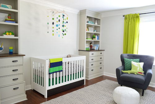
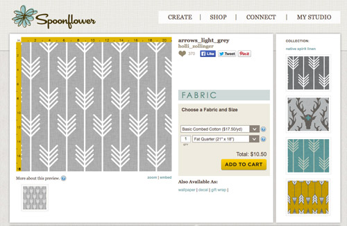
Ever since we imagined the idea of these built-ins, we pictured making the space between the two of them sort sort of accent – either with a color or pattern or treatment of some sort (in our first post we even mentioned a planked wall). Those ideas fizzled a little bit after completing the built-ins and realizing they had a lot of stuff on them (so we didn’t want to clutter up that space between them above the crib too). But neither of us could quite shake the idea of still doing an accent of sorts somewhere in the room. And one night while perusing possible wallpaper ideas for the showhouse, this puppy caught John’s eye.
He went rogue and without even consulting yours truly (cue your outraged gasps) and ordered a sample of it and its darker counterpart, for $5 each. With tax and shipping it was $13 total. Thirteen bucks that would either earn him a sour look from me, or make him a hero.
Well, he got the sour look alright – not for the $13, but because I can still vividly remember the claw-hands I had from wallpaper peeling. The good news is that when he explained that Spoonflower wallpaper is removable, all was right with the world again. And I really liked the pattern too (it feels like something that could grow with the bun, and not be too fleeting or “young baby”). The hero part is still TBD though.
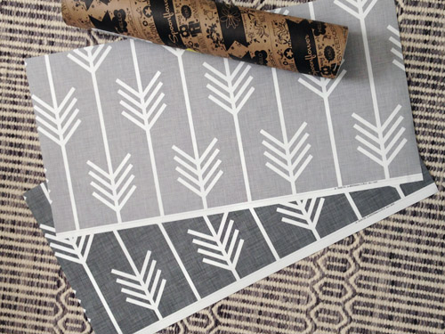
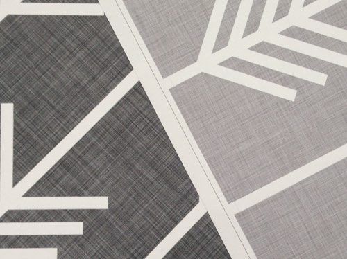
The samples arrived a couple of weeks later. They’re nice and big, and they revealed a detail that John hadn’t detected online: a subtle linen-like texture in the gray tones that I also thought was a nice touch.
We ran upstairs to tape them up on the walls, just to get a feel for them in the room, and John went rogue again and put them on the wall with the bike prints. He must be getting braver (I think it’s the beard, guys). Since we’re both less tempted to mess with the look of the built-in wall, he said he thought that wall might be the answer instead. Forgive the terrible phone pic.
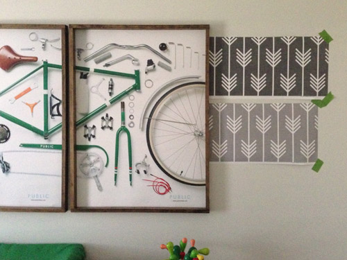
We snapped that with my iPhone so I could mock-up a full-wall version of the space in Photoshop. For those wondering how I did it, I just dragged the photo I shared above into Photoshop and laid it over another picture I took of (almost) the full wall. Then I just adjusted the size of the overlaid detail photo of the wallpaper until the patterns matched up and were the same size (I had the opacity of the top layer down a little so I could see when that happened).
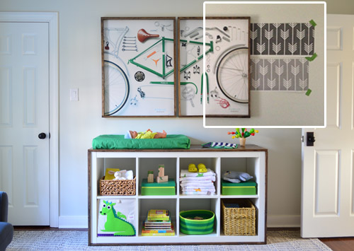
Once I knew the wallpaper pattern was the right scale, I put the opacity back up to 100% and cut out the rest of the iPhone pic so I was just left with a rectangle of wallpaper that I could manually tile until it filled the whole picture. Lastly, I cut out around the objects like the frames, doors, and the changing table (which were still in the image behind the tiled wallpaper) so as I deleted the wallpaper in front of them, it appeared to run behind them.
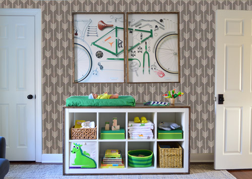
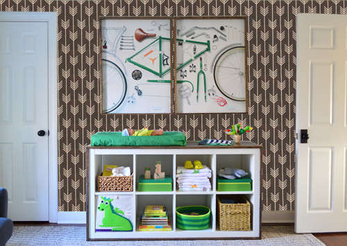
I also tried a version where I adjusted the color to look like the darker sample that John also ordered, but it was pretty clear to both of us that we preferred the lighter one.
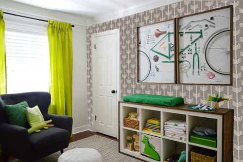
I thought it was a little hard to judge without seeing a plain wall meeting the accent wall to give it context, so I used the same technique to mock things up on this photo that I already had of the room. The colors probably aren’t perfect (the curtains look neon here), but it definitely helped us to picture everything – and it confirmed that the light version wouldn’t clash with the wall color or anything.
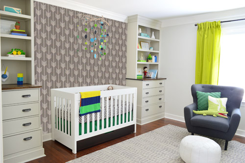
I still wasn’t convinced that was the right wall for an accent (I feared it might look too busy with the bike art in real life) so we also mocked it up on the crib wall to see if our original idea was better. We stared at it for a second, but I think we both prefer the bike wall. It just felt too crazy over the crib with all the items on the built-ins, the mobile, the patterned crib skirt, etc.
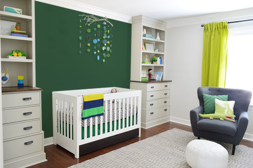
I also tossed some bold green up there just to see if a hit of that above the crib would be fun. It’s not great photoshop (looks pretty flat) but we didn’t really love it.
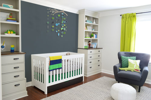
I also tried something sort of charcoal-ish to balance the chair out. This one made both of us do that “eh, not bad” face while staring at the computer. It looks kinda nice with the white crib and the mobile.
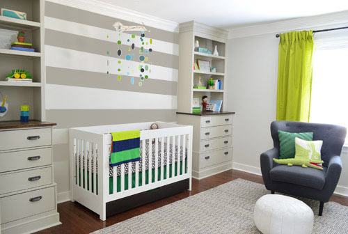
To add yet another possibility to the ring, a sweet reader named Annie had emailed us this quick mock-up she did with some chunky stripes painted behind the crib, which also gave us pause. You know we love a striped wall…
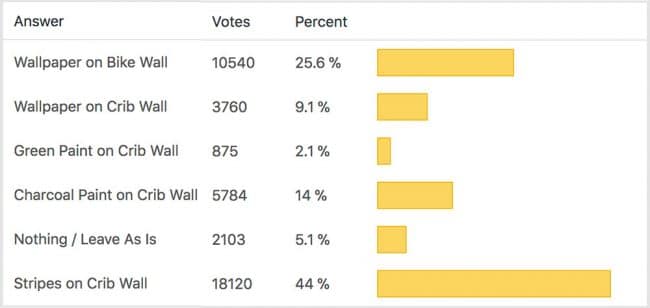
We’re still sort of letting things simmer, but we’d love to hear what you guys would do. Would you go for the wallpaper on the bike art wall? We like that it’s removable, so it’s not too much of a commitment. Do you prefer a solid wall of green or charcoal or even some stripes behind the crib? Or should we just stop being crazy and leave things the heck alone? Part of us is really excited to add one more layer of interest into the room (we’ve never put up wallpaper so that would be a new adventure – and most of the elements in here are really neutral). Then again, we still want this room to be a mixture of playful and cozy (as opposed to that’s-just-straight-up-crazy). What do you think?
VOTING ON THIS POLL HAS CLOSED

lauren says
Not sure if it’s been said, but what about the wallpaper on the wall with the window? So just a couple panels of it, on either side of the window.
I’m not a huge fan of the paper in the other two places. I love me some busy eclectic decor, but that just makes my head hurt.
I also like the white behind the crib – the mobile really pops. Or maybe a lighter gray than the one you tried?
Becky says
So not meaning to go too rogue or anything, but I think it would be neat to see a mock up of the wallpaper behind the chair on the window wall. I think it would look snazzy with those awesome curtains!
YoungHouseLove says
Thanks Becky! A bunch of folks are suggesting that so we’ll have to mock it up to check it out!
xo
s
Jill says
I personally would leave room as is, however… Stripes say “boy” to me more than the wallpaper does. The paper looks more girl.
And if you do like stripes, my friends just did a graduated color striped wall. I wish I had photo. It is 4 or 5 horizontal wide stripes of graduated yellows. It looks awesome. (Darkest at bottom)
Kaelyn says
I was desperately wishing I could ‘check 2’ :) I think the room could handle the stripes & the wall paper w/bike photos . . but I stayed true to my original reaction. I LOVE the stripes. It definitely feels like it pulls the space together without being overpowering. And who doesn’t dig a bold stripe? -K
Dymphi says
What about charcoal stripes on the crib wall?
Amanda says
If I had to pick just one option (which, I guess I did) I would go with the stripes behind the crib. I really like the wallpaper but I think it’s too busy on either wall. If the crib wall was bare, it would be a great accent behind the crib, but is too much with the built-ins. And I think it’s too much on the other wall with the bike print and change table.
The great thing is though, you can always paint over paint, and this wallpaper is removable so have fun playing around with it!
Geertrude says
Hmn, I guess I have very boring taste. I like it the way it is. It seems there’s enough going on (visually) in that room already, but it still feels peaceful.
Wouldn’t adding busy colors and/or more accents prevent the baby from getting to sleep? Or maybe I’m just old-fashioned that way… ;-)
Tara says
What about wallpaper on curtain wall?
Emily B. says
I just stopped working at a paint store and have heard less than rave reviews of “removable” wallpapers. I’ve heard they either don’t stick or aren’t actually removable — seems like two opposites. I don’t have any details on how people were applying them or what kind of wallpapers. Just figured I would pass along what I’d heard around the shop. Have you considered a stenciled painted wall behind the crib instead of wallpapering or a flat wall color?
YoungHouseLove says
Love all the tips and suggestions! Thanks for sharing them guys. We are mulling them all over :)
xo
s
sarah says
didn’t have time to read everything, but i vote for wallpaper on the WINDOW wall!! It looks too busy with the bikes, and I think you could make it sing on the window wall.
Megan P says
Im really feeling like rather than color or pattern there, texture would be the way to go…. You’d mentioned wooden boards, and I wish you’d photoshopped that! I also love what Katie Bower did with the brick in Weston’s room – painted to be muted, but still a little bit of interest. I’d rather see something more like that than a huge strong in your face accent like all these feel like…..
isabelle says
Would you consider putting a mirror over the crib? It would make your mobile seem even bigger and reflect the opposite wall (and whatever wallpaper choice you make – my vote is light grey btw!)
Courtney H says
I vote to leave the walls as-is. I think that if you do anything else to the walls, it might take away from the “stars” already in the room. The mobile and bike art would lose some of their sizzle, I think, against a color or pattern- like they might just get lost in front of different colors or patterns… and you would have at least three walls with different colors/patterns going on. I think it could make the room feel too crazy-busy.
I wonder how it would look on Barnicale’s window wall and/or the wall opposite the window wall? I don’t know.. still leaning towards a nada on that too though.
BUT, I am soooo IN LOVE with the arrowed wallpaper… I think you should 100% try it out somewhere in your house. How about in the study? Oooo! Or somewhere, like in the living room, where you’ve mentioned that not enough pattern is going on?! Or in Clara and Barnicle’s bathroom?!
Courtney H says
IF you decide to do something to the walls, I would definitely only do one of the walls probably. Or I would do something neutral and quiet, like wood planks between the builtins that either match the color of the built-ins or the wood-tone on the dressers and changing table… something more neutral would still allow the mobile and the bike art to be the stars and wouldn’t be too competitive.
Jill says
I love that wallpaper John picked out, but I had to vote for the stripes because of the visual interest they offered without competing with the mobile. But I really hope you guys can find a place to use that wallpaper somewhere in the house. Or maybe you could frame one, or both, of the samples and hang them in the barnacle’s room (or elsewhere). Just a thought. Love how the nursery is shaping up!
Laura says
Love the wallpaper. Agree that its a bit busy with the bike art, and love the bike art where it is. You guys are gonna hate this since you’ve already painted etc, but I’d do the wallpaper color you love on the crib wall and paint the other three walls including the built-ins to match the background of the paper. And paint the built-in trim white to match the room. That lets your green accent colors sing without having too many competing colors/patterns going on. Not a fan of the stripes in that location if you’re planning to use the wallpaper at all in the space. Coming along nicely!
Alexa @ travelmiamor says
we have stripes on our crib wall too and we LOVE them!
Cara M. says
I think charcoal stripes behind the crib would be really handsome in there! I really like the wall paper, but I think it’d be nicer if the arrows were a bigger scale. It looks a little busy the size that they are. But.. This room is so cute, I don’t think any of the options are bad!
Christi Hoehn says
http://embellishmentsstudio.com/miscellaneous-art-by-aaron-christensen.html Aaron Christensen’s work is some of my favorite. These kites and hot air balloons just scream “young house love”!
Linda says
I love the wallpaper on the bike wall, I do not think it looks crazy at all BUT I love the stripes more on the crib wall. I do feel with the built-ins, crib, mobile and stripes it might make that side of the room visually “heavy” though.
Kathryn says
I voted do nothing. I’m a big fan of letting textiles, fixtures, and art do the colour and detail heavy lifting. You still haven’t put up the light in there, and with all of the toys on the bookshelves, the shades of green, the wall art, the light fixture to come… any of these options just seem like gilding the lily to me. I’m a less is more design kinda gal—when I think I’m done, I take one element away. *Then* I’m done.
Sasha says
What about wallpapering the wall with the windows?
Rachel says
What about wallpaper on the window wall?
If that looks horrible, I vote for stripes on crib wall, and wallpaper on the bike wall. Maybe do tone on tone stripes so its not as busy.
Laura says
Sometimes artists on Spoonflower will happily adjust the scale of the design if you request it. A smaller version of the pattern might appear more subtle and a larger one might seem less busy? Might require some more samples. But you could always use the extras to cover some boxes, right? :)
Vanessa says
I’ve loved watching the evolution of this room and am excited to see how it functions when the barnacle arrives. I’m digging the striped wall too!
Question: I saw the Safavieh rug at Home Goods and was wondering how the texture is when it’s actually in use. It seemed scratchy to me but I’ve never had a dhurrie rug(we’re looking at flat-weave rugs for the dining room–same brand, different pattern). Sorry if this has been addressed before – I get a little lost in the hundreds of comments!!
YoungHouseLove says
It seems good so far! We have a flatweave rug in our bedroom as well and it’s comfy – not as scratchy as jute or sisal but not as plush as a thick wool rug. We think it should work out well, but will keep you posted!
xo
s
Vanessa says
Thank you!
Jenn says
Here’s my take: you have too much going on with that room, and no real cohesive theme.
You know how they tell you, when getting ready, to look in the mirror before you leave, and take off one thing? I think that applies here.
Less is more, especially when you’re trying to incorporate so many colors into the room.
If you keep the bike art on the one wall, that IS your focal point on that wall. Don’t add a pattern behind it.
If you keep the mobile above the crib, that SHOULD be your accent for that wall. Either leave that wall as is, or, if you MUST add something to that wall, the color should be something soft and solid, as to not compete with the more vibrant mobile colors, or you could possible get away with the soft gray stripes. But after that, the walls are done. Add nothing else.
Kathryn says
Oh, Jenn. We seem to be in the (vastly outnumbered) minority here. (see my original comment about 5 comments up). I agree with you, though would stop short of advocating anything else at all. With all that’s going on in there, less is much more though I don’t personally think there needs to be a theme, as such.
Any of the photoshopped options just seem a bit on the ‘let’s replicate yesterday’s silly design trends tomorrow’ side of counterproductive effort. Why detract from the fantastic (and I mean fantastic!) custom carpentry and quality furniture, textiles, and art going on in there?
Nicole M. says
I think that the crib wall definitely needs something to tie everything together. I am drawn to the striped wall because I like how it ties into the horizontal lines from the built-in book shelves. It carries your eye along the wall. And those horizontal lines are balanced with the vertical lines of the crib and mobile. I am not sure if it is a painted striped wall, or a horizontal wall paper or even a simple planked wall…but, I definitely like the horizontal concept for that wall :) I would do the crib wall first to determine if the room needs something on the opposite bike art wall to feel balanced. Looking forward to seeing what you do.
britta says
Can I vote chalk board paint behind the crib? And you could draw or write something cute on it. … And it doesnt have to go all the way to the built ins, I think it wOuld look cute if it stopped about a foot beforethe built ins, if that makes sense. That’s my vote. :)
Isabel says
I’m all for accenting the crib wall, not the opposite wall. I think that wall doesn’t really need anything else, the bike prints are the stars. However, I’m not loving that wallpaper option cause it feels very busy; maybe something a little more subtle? I’m not really a fan of stripes so I didn’t vote for that option but I do like the idea of a geometric pattern. You could stencil the wall instead too. Or, if the walls don’t do it, there’s always the ceiling ;-) Happy thinking!
Stephanie @ Whole Health Dork says
I do love the stripes, but what about the wallpaper in the back of the bookcases? Or would that be too busy and dark? I know you’ve painted the insides of your bookcases a different color than the outside, so didn’t know if you were considering that. I’m sure whatever decision you make will look great!
Kati says
I think…
You can do no wrong! From what comments I’ve read, people like infinite variations. They are all excellent choices. Percolate percolate!
I’m taking inspiration from you that you’re able to tie in brown and tan tones with grays and charcoals. Our apartment walls are a nice cheap-looking 80s tan and with all the brown trim going on (that the landlord HAS agreed to paint!!!!!) it makes my palette: colorful based on gray, black and white, hard to come together without looking like a hot mess. So this is reaffirming for me! Thanks for sharing guys!
Jennifer says
Can I vote AGAINST the wallpaper/bike wall? Way too busy! My favorite is the stripes behind the crib, but any option is better than the wallpaper behind the prints and bookcase.
Andrea B says
Stripes on the crib wall AND the wall paper! Gotta balance it I think or else it might feel too heavy on one side. LOVE that wall paper for sure.
Taiwanna says
The wallpaper is way too busy especially with the art on the wall and other patterns in the room. If it hasn’t been said, I think those stripes would be awesome behind that green curtain and would layer in your charcoal chair for a nice impact when you walk into the room. Having a pattern on the crib wall might be a lot for the barnacle’s eyes with the mobile hanging above the crib as well. So keeping the white or maybe just the gray behind the crib would be soothing.
Shannon says
I actually prefer the wallpaper on the wall with the crib.
Hanna Cage says
I actually love the look of the wallpaper on the crib wall, but I would recommend one of two things:
1. Go with really tough, really wipable wallpaper.
OR
2. Be resigned to taking the wallpaper down when he is about eight years old and has run his dirty hands all over it, drawn on it, gouged at it with unidentified objects, had violently bloody noses all over it, and plastered it with transformer stickers. Speaking from experience.
I voted for the stripes, but seeing that spoonflower wallpaper is removable I would change my vote to go for the wallpaper. If you love it, why the heck not? I thought it looked great on both walls.
Cheyenne says
I actually like 2 options together: do the wallpaper on the changing table wall and the grey or green on the crib wall. it won’t feel too dark because you’ll still have the 2 white walls and the big glorious window. The stripes will take away from how unique and colorful the mobile is.
Maru says
I really like the light wallpaper on the bike wall!!! It looks really good and adds a little something extra while being original… The next option would be the stripes on the crib wall, but for some reason I didn’t LOVE it. I felt it clashed a little with the drawers and shelves from the built-ins… I think the light wallpaper on the bike wall is the most original, fun and cute idea! With the added bonus that John will get the “hero” approval!
Abby says
The arrows are awesome but are really busy on both walls. But, you need something on both so I’d do the stripes on the bike art wall and do the crib wall in a slightly darker shade of the color of the side walls. It would add visual interest to both walls without being too busy.
Anonymous says
I’m going to add my vote to the “stripes on crib wall AND wallpaper on bike wall” group. I feel like the busyness on one wall would make the other wall look extra blank if it wasn’t embellished too, and they both look so nice!
Ann says
I love the wallpaper on the changing table wall but I would move the bike prints to the entry door wall. Too busy together. I would paint the crib wall solid grey. My second choice is to wallpaper the crib wall and leave the rest of the room alone. Also wanted to mention that if you line those drapes it would fix the neon color problem. The blog Addicted to Decorating just did an excellent multi-part tutorial on making lined drapes if you are interested.
Vanessa Reiter says
I haven’t read through all of the comments, but what about trying the wallpaper horizontal on the crib wall. Or what about the stripes on the crib wall and the wallpaper on the window wall to change things up a bit. I agree the wallpaper on the bike art wall seemed not quite right. I do like the stripes on the crib wall. You could also do wallpaper on the door wall so its a little surprise when you walk in and you could tie it into the room by having it in the closet as well. Just some alternate ideas. Can’t wait to see what you come up with!
Micalla says
Striped wall behind crib AND lighter pattern on bike wall! ;)
Erica T says
I vote for some kind of textural/wood paneling behind the crib–kind of like that custom wainscoting in your showhouse dining room. Texture and interest but not overwhelming.
xin says
I like either the arrows or the stripes on the crib wall. I rather leave the bike wall alone. There is so much details in those bike arts, and lots of stuffs in the shelf cubes, I just think adding the arrows to the background will make that side too busy. If you really want to use the arrows on that way, personally I prefer the lighter version, not too competing.
Maybe you can do the arrows or stripes on the crib wall, and use the same shade of gray on the bike wall, make it solid gray, to pop out the art work. I don’t like two focus walls competing for attention in one room.
Kate says
The wallpaper print as curtains would have looked fab.
Gracie says
I like the wallpaper on the bike wall, but I would still do something over the crib wall too. The mobile is cute, but just not enough to fill that wall up. It still looks a little bare. I wonder what the grey color in the wallpaper would look like painted on that wall. Kinda like the charcoal color just not as dark???
pam says
I was wondering if the stripes on the built in wall would fight with the lines of the shelves. It doesn’t look bad from the angle you are showing but wondered what it would look like head on. Just a thought.
I vote for the paper on the changing wall and paint behind the built ins.
Candace says
I like the stripes… I also like the (darker, because I’m deep) wallpaper on bike wall.
But more importantly, this: https://twitter.com/judgyfetus
“She’s registering at Buy Buy Baby? I was hoping for Land of Nod. Clearly I’m paying a karmic debt by being born into the wrong social class” LOVING IT (currently 24wks with my first)
JESSICA says
I would put the wallpaper on both the crib and bike wall or do the wallpaper on the crib or bike wall with stripes on the opposite wall.
qs777 says
Not sure if anyone said this, but I like the wallpaper on the bike wall because the white graphic will give the baby something to look at since they see more contrast vs. color. That being said, I do think some paint should be on the crib wall as well. My vote would be the charcoal or stripes. Anything you do will look fab, though.