I know it sounds kinda crazy, but after painstakingly removing five different wallpapers from this house… we’re considering putting some up. I think I even passively mentioned it in this post about the nursery mobile.
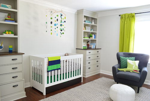
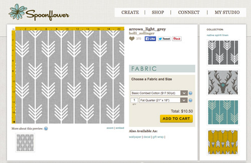
Ever since we imagined the idea of these built-ins, we pictured making the space between the two of them sort sort of accent – either with a color or pattern or treatment of some sort (in our first post we even mentioned a planked wall). Those ideas fizzled a little bit after completing the built-ins and realizing they had a lot of stuff on them (so we didn’t want to clutter up that space between them above the crib too). But neither of us could quite shake the idea of still doing an accent of sorts somewhere in the room. And one night while perusing possible wallpaper ideas for the showhouse, this puppy caught John’s eye.
He went rogue and without even consulting yours truly (cue your outraged gasps) and ordered a sample of it and its darker counterpart, for $5 each. With tax and shipping it was $13 total. Thirteen bucks that would either earn him a sour look from me, or make him a hero.
Well, he got the sour look alright – not for the $13, but because I can still vividly remember the claw-hands I had from wallpaper peeling. The good news is that when he explained that Spoonflower wallpaper is removable, all was right with the world again. And I really liked the pattern too (it feels like something that could grow with the bun, and not be too fleeting or “young baby”). The hero part is still TBD though.
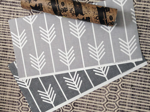
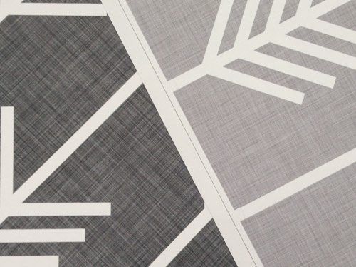
The samples arrived a couple of weeks later. They’re nice and big, and they revealed a detail that John hadn’t detected online: a subtle linen-like texture in the gray tones that I also thought was a nice touch.
We ran upstairs to tape them up on the walls, just to get a feel for them in the room, and John went rogue again and put them on the wall with the bike prints. He must be getting braver (I think it’s the beard, guys). Since we’re both less tempted to mess with the look of the built-in wall, he said he thought that wall might be the answer instead. Forgive the terrible phone pic.
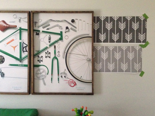
We snapped that with my iPhone so I could mock-up a full-wall version of the space in Photoshop. For those wondering how I did it, I just dragged the photo I shared above into Photoshop and laid it over another picture I took of (almost) the full wall. Then I just adjusted the size of the overlaid detail photo of the wallpaper until the patterns matched up and were the same size (I had the opacity of the top layer down a little so I could see when that happened).
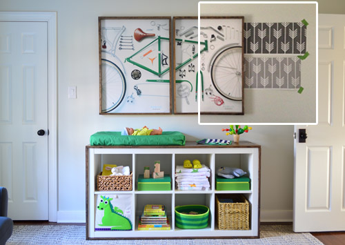
Once I knew the wallpaper pattern was the right scale, I put the opacity back up to 100% and cut out the rest of the iPhone pic so I was just left with a rectangle of wallpaper that I could manually tile until it filled the whole picture. Lastly, I cut out around the objects like the frames, doors, and the changing table (which were still in the image behind the tiled wallpaper) so as I deleted the wallpaper in front of them, it appeared to run behind them.
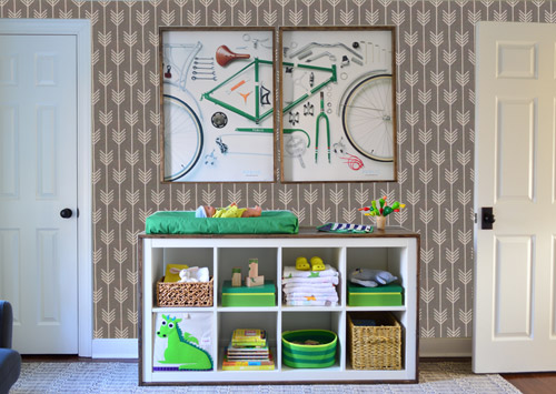
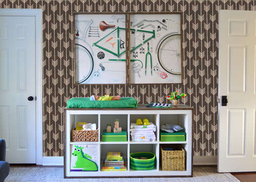
I also tried a version where I adjusted the color to look like the darker sample that John also ordered, but it was pretty clear to both of us that we preferred the lighter one.
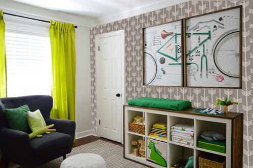
I thought it was a little hard to judge without seeing a plain wall meeting the accent wall to give it context, so I used the same technique to mock things up on this photo that I already had of the room. The colors probably aren’t perfect (the curtains look neon here), but it definitely helped us to picture everything – and it confirmed that the light version wouldn’t clash with the wall color or anything.
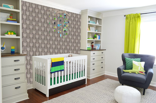
I still wasn’t convinced that was the right wall for an accent (I feared it might look too busy with the bike art in real life) so we also mocked it up on the crib wall to see if our original idea was better. We stared at it for a second, but I think we both prefer the bike wall. It just felt too crazy over the crib with all the items on the built-ins, the mobile, the patterned crib skirt, etc.
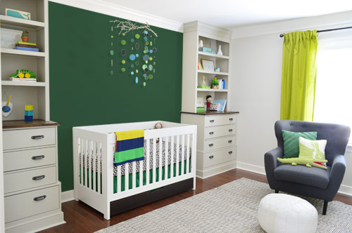
I also tossed some bold green up there just to see if a hit of that above the crib would be fun. It’s not great photoshop (looks pretty flat) but we didn’t really love it.
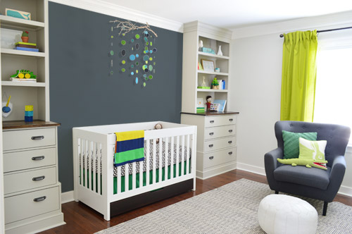
I also tried something sort of charcoal-ish to balance the chair out. This one made both of us do that “eh, not bad” face while staring at the computer. It looks kinda nice with the white crib and the mobile.
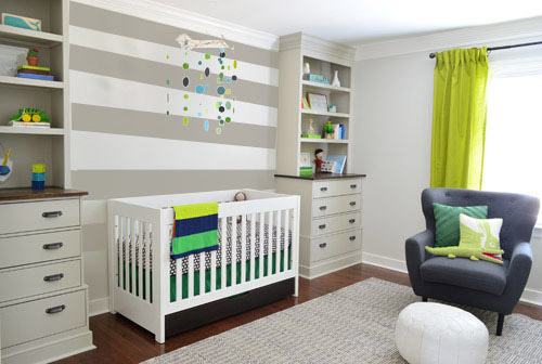
To add yet another possibility to the ring, a sweet reader named Annie had emailed us this quick mock-up she did with some chunky stripes painted behind the crib, which also gave us pause. You know we love a striped wall…
We’re still sort of letting things simmer, but we’d love to hear what you guys would do. Would you go for the wallpaper on the bike art wall? We like that it’s removable, so it’s not too much of a commitment. Do you prefer a solid wall of green or charcoal or even some stripes behind the crib? Or should we just stop being crazy and leave things the heck alone? Part of us is really excited to add one more layer of interest into the room (we’ve never put up wallpaper so that would be a new adventure – and most of the elements in here are really neutral). Then again, we still want this room to be a mixture of playful and cozy (as opposed to that’s-just-straight-up-crazy). What do you think?
VOTING ON THIS POLL HAS CLOSED


Jennifer-Mommy Life After Ph.D. says
Wallpaper on the crib side all the way! I can’t believe it’s not winning in the survey!!!:)
Susan says
I’m in the minority on this one. IMO, stripes over the crib will compete with the vertical lines of the crib and the horizontal lines of the shelves and drawers. I would paint that wall a solid color, but one with a gentler tone, where the baby will sleep. The wallpaper on the bike wall looks great, and I agree that it helps balance all that’s going on with the crib wall. I can’t wait to see what you end up with!
Ellie says
I might be crazy, but I liked the darker wall paper. The bike prints and cool green accents on the shelf really popped. Happy decorating!
Jane Nester says
I love the light grey print on the bike wall, and the stripes are lovely, but I think both would be overkill. Have you thought about matching the bike wall colour and painting that in the crib side? Just a nice lighter grey to set off that gap between the built ins. Just an idea!
Stephanie says
I voted for stripes…going horizontal with the shelves on either side makes sense to the eye. But…if you still like the idea of incorporating those fun wallpaper patterns, you could consider using one in the back of each built-in shelf! Just a thought! (:
Kristin says
Don’t know if anyone has suggested this yet but what about going horizontal with the arrows? Could be fun.
Amy says
Can you turn the wallpaper so that the arrows run horizontally rather than vertically? The way you have it mocked up now makes the bike wall feel a bit busy. Running them horizontally may visually elongate the wall a bit. Not sure if that’s an option though.
YoungHouseLove says
A bunch of folks have asked that and it’s a really fun idea! John thinks we couldn’t do it on a long wall like the bike wall without having a lot of seams since it’s made to be hung floor to ceiling, but for the bike wall and maybe even the window wall that could work I think…
xo
s
Jill says
I think the mobile pops best against a pale, solid-color wall. So what if the current grey behind the crib WERE the accent wall color? What if you painted all the other walls a darker color?
I mocked it up here (very clumsily in Paint) with a dark blue-grey: http://i.imgur.com/d9lqPbX.jpg
I put the grey-blue in the back of the built-ins and painted the built-ins white too. I think it really sets off the grey wall as your focus. And the white shelves of the built-ins echo the crib bars.
You’ll notice I also stole Clara’s curtains — they work so well with the mobile. I move the apple green color of the current curtains to be the closet door color. I have always liked how cheerful that color is, but I think when that color is so close to what should be the focus wall (the crib wall), it unpleasantly competes. I actually tried several colors on that closet door, and they all looked good — orange (like the bits of orange in the bicycle print), dark greens, the same grey as the wall behind the crib, etc.
And this is probably an impossible dream, but I love how the dark wood color you stained the crib drawer works against the pale grey wall. Is there a way to finish the rest so it is also a dark stain?
YoungHouseLove says
So many fun ideas! Thanks to everyone for sharing them!
xo
s
Shay says
I love that wallpaper! It’s actually the same fabric I have picked out for covering the cushion in our built in eating nook.
If it’s easy to remove I don’t really see the risk of putting it up and enjoying it for now. I am also a big fan of the green wall, and since it’s for a little boy I don’t think doing both is too busy.
Nicole says
Not sure if you guys have ever ordered full products from spoonflower before (as in, non-samples) , but my experience with their products has been less than stellar. I fell in love with so many of their designs online (especially holli zollingers stuff…amazing graphics and colors). I had a background color issue with their fabrics on several occasions (on the gray with yellow arrows) where it was one color for about 3 yards and then a totally different background color for the rest of the way. Not cool. And the width of the fabric was several inches smaller than stated on their site…again, not cool. After contacting them, no offer to remedy the situation. I know you’re looking at wallpaper, not fabric, but after being burned a few times (their products aren’t cheap) I will stay away. Such a bummer because I have never found prints I like so much. Hopefully, if you get the wallpaper, you won’t have the same issues.
YoungHouseLove says
That’s a bummer! Thanks for the tip, Nicole!
xo
s
Meghan says
I like the stripes, but I would do something like this and throw in one green stripe:
http://www.designdazzle.com/wp-content/uploads/2013/08/tan-with-one-orange-stripe-nursery.jpg
YoungHouseLove says
That could be fun too! Thanks for all the ideas today guys!
xo
s
Deepa says
I’m sure someone has mentioned this, but why not cut the light grey wallpaper into horizontal (or vertical stripes) and paste on the crib wall? Can you tell I’m not good at choosing between 2 options? ;)
Lil says
Interestingly, when I saw the wallpaper samples with the rug I liked the darker one WAY better, but when I saw them on the wall with the bike prints I immediately changed my mind to the lighter one.
Definately on the changing table wall though…it will help balance the room. Have you thought about painting one of the darker colors between the built ins AND putting the wallpaper on the opposite wall?
The room is shaping up nicely. He’s a very lucky little man.
Lil says
Oh. I forgot…two more things.
I really like the aqua version (realizing that doesn’t go in your room).
MAD photoshop skills! How did you get the angle to read right when you did the picture with both walls!?!
Jennifer says
I think the light gray arrow wallpaper would look awesome in the closet.
Ashley says
I LOVE the wallpaper on the bike wall! I would not do the stripes but do the main color from the wallpaper wall as a solid behind the crib! I think the stripes are too much.
Amy A says
Write-in vote: wallpaper on the window wall
Ashley S. says
What about a navy blue as the accent wall behind the crib?? Either solid or maybe with a little bit of pattern for interest.. something like these?
http://i.imgur.com/sNOx71k.jpg
http://i.imgur.com/9ZYPyiU.jpg
My favorite option y’all have posted is definitely the stripes though!
Stephan says
I like your mock ups.
Lynette says
Have you considered wallpapering the wall with the window? The other two options look a tad too busy to my eye…
Fiore says
I think there ir too much grey. How about adding pops of color on a wall, like Clara´s room? A reader suggested this ;)
lisa says
Your comments are TOO long to read thru today.
But wondering …. what’s with the quilt in the pic today? Where’s your adorable quilt you made?
YoungHouseLove says
We used an old picture for photoshopping purposes, so it was before I had completed the quilt :)
xo
s
E.D.R. says
No time to read all the comments, so forgive me if this is a duplicate, but what about the wall paper on the wall with the window? I love the wall paper AND the stripes, but when you showed the mock up of the corner, I really wanted to see it with the curtains and the windows. Whatever you do, it will either be awesome, or can be redone!
Donna says
I vote do both the stripes on the crib wall and wallpaper on the bike wall. Babies love pattern and contrast!
MidwestTrixie says
Can you do the stripes on the crib wall and the gray paint on the bike wall? I don’t like the wallpaper, too busy of a pattern.
Jill says
I’m getting an error message, so forgive me if this shows up twice. I vote for a shaded stripe wall. like this http://www.pinterest.com/pin/112027109453985782/
I would put it on the bike wall, in tones of gray, using the bookshelf as one color. It would balance the bookshelves.
For the wallpaper, what about a different room? Hall bath, laundry nook, dining room above white wainscoting?
YoungHouseLove says
Love all the links and ideas everyone! We can’t wait to photoshop and mull some more – will keep you posted :)
xo
s
Erica says
What about navy stripes on the crib wall?
Candice says
if you’re intent on using the wallpaper, then would you consider getting rid of the bicycle print? it seems to be limiting your choices and it doesn’t have any sentimental value…
Seren says
I love the wallpaper on the bike wall and charcoal paint on the crib side !
Kate says
My main thought about the crib wall is that in all of the scenarios, it still looks empty to the left and right of the mobile. Have you considered putting up a couple of prints, secured so baby can’t get them down, to help balance out the scale of the mobile to the rest of the wall? I really love the pale grey wallpaper on the changing table wall :)
Kate says
Oh, wait…are you installing light sconces on the wall?
YoungHouseLove says
We think we’ll install those down the line (when the crib is a twin bed so he can use them for reading lights at night).
xo
s
Leslie says
Wallpaper on the crib wall and stripes on the opposite wall! For some reason that seems more balanced to me. I’m not digging the wallpaper pattern with the bike art. But I love the wallpaper!!
Brenda says
Love the stripes! You should frame the sample wallpaper maybe hang it on the window wall?
Catherine says
I vote light arrows on the bike wall. a.) It looks really cool. b.) Selfishly, I’d like to hear about your experience with Spoonflower wallpaper. But I promise I wouldn’t vote for that if b was my ONLY motive!
Also, I agree with the above suggestions of balancing the crib wall with something. I like the idea of a solid linen-y wallpaper or even just color matching paint from the wallpaper. I like the stripes but don’t feel like that wall needs the “oomph” like the other wall does…
Loving the way the nursery is coming together, by the way!
Janine says
I love the stripes idea but not the wallpaper. I think it is too busy. Have you considered large stripes on the dresser wall?
MarT says
either NO wallpaper…
Or flip the chevron -arrowy wallpaper so that it’s pointing up /\ like this. That’s bad feng shui to have sharp stuff pointing down at your baby. When it flips then it’s pointing toward the sky, moon, start/looks like shelter for the little guy.
I would ask the Spoonflower designer to find you a gray in between the 2 grays…the dark is too dark and the light is too light…it’s all print to order anyway, isn’t it?
Victoria says
I come late to the party, but I come with gift in hand… Am I forgiven?
First, I don’t like that wallpaper for a nursery, nor for a kid’s bedroom; too serious, too busy, and clash with everything else already there, and that I love, love, love!
Second, of the 2 plain colors, at best I would go with the dark gray; again, the green looks too busy and competes too much with the rest.
Third, the strips are pretty, could be a great solution with a careful selection of the colors.
And fourth, my option and something you already had in mind, planked wall. I would go with reclaimed wood (for texture), painted with the same color of the builds-in or… something similar to my mocks-up:
– https://lh6.googleusercontent.com/9Lbm70yV_YXeIAEKNFsewOiPt24Rw9Rc-iVx61MG8Xc=w500-h336 – leaving the wood as it’s
– https://lh6.googleusercontent.com/YN68hMhY-FDyLC9h7NxbWJZXePN81ZcromOS8edb2N8=w500-h336 – whitewashing the planks with the builds-in color, the dark stain, and a gray to bring that pretty fabric of the chair to the mix.
I wouldn’t do anything to the wall with the bike prints, anything there competes and the result looks, once again, too busy.
YoungHouseLove says
Love the mock ups and suggestions everyone! Thanks SO MUCH for sharing! We’re poring over every one and can’t wait to see where we end up! Will keep you posted for sure.
xo
s
Manda says
How about photoshopping the wallpaper on the window wall and see how the room would look with the crib and bike walls left alone? Then when you walk the in the door your eye will go right to the wallpaper. Plus the green curtains will pop even more.
YoungHouseLove says
That has definitely been one of the write-in votes for sure! Can’t wait to see how it looks!
xo
s
Tirsa says
Wall paper on bike wall, and another color above the crib. I actually loved the idea of a green there. Maybe the one you used on photoshop wasn’t the right shade of green.
Can’t wait to see how it al ends up.
Jamie says
I am loving the stripes on the crib wall. Love the wallpaper too, but wondering if you were still thinking of painting the closet door? I think if you paint that on the Bike Print wall, that might add enough interest and not be too busy. Loved seeing this room come together!
Victoria says
Oh, yes! I’d forgotten about the closet door. You’re right, painting that green, as Sherry commented doing, would be the perfect final touch for that wall, plus would be a way to tie-in both kids’ rooms leaving the rest to mark the differences.
Jan says
I really like the stripes on the crib wall and the wallpaper on the bicycle wall. I actually have experience using the Spoonflower wallpaper. I used it in my rental apartment and then removed it when I left. It came off the wall very easily in complete strips. I would definitely recommend it.
YoungHouseLove says
SO GLAD TO HEAR THAT JAN!
xo
s
Kelly says
Long time reader, rare commenter here.
I like where you’re going with your wall thoughts but I can’t say I’m in love with the current options as is, nor do they say Perfectly Petersik, if you will. Since there wasn’t an “other” option (thank you for offering poll, is “other” with blank space for comments an option?), what if you painted all walls (or accent wall) the charcoal/steel blue color (slightly lighter?) of the crib wall example with a white pinstripe spaced a foot or so apart either vertically or horizontally?
-The darker wall color is cozy and wraps you (and Barnacle) in a hug
-The charcoal on the closet wall is neutral and balances the greens in the artwork and changing table, especially if you are still considering painting the closet door green
– The pinstripes provide visual interest but not too busy (in full disclosure, I’m not an arrow fan in general but regardless I feel like it takes the design just a bit too far for my eyes with all the fun you already have in the nursery)
-Does Spoonflower offer wallpaper in just the linen?
Related nursery questions for you:
-My mind & eyes want to extend your crib skirt to the floor. Was this ever a consideration?
-What’s happening on the entry wall? I don’t remember seeing it in a photo
-Are you still considering the industrial sconces on the crib side of shelves from original mood board?
Thank you for sharing your decorating adventures.
In my head, You = white ceramic animals and chihuahuas
Wishing you a safe and swift pregnancy!
YoungHouseLove says
Thanks for all the ideas, everyone! We hope to share some more photos/angles of the room (like the entry wall), since that has been requested a few times, and w’re planning to add the sconces on the wall when we put a twin bed in the nook between the built-ins down the line since we think they’ll be great for reading lights (but a baby in a crib won’t need them for reading, haha). The crib skirt can’t go to the floor or we’d lose access to that drawer down there – but it’s a fun idea for those without a drawer!
xo
s
Alexandra says
Call me crazy, but i say do a linen paint effect on the crib wall and leave the bike art wall solid with no wall paper.
Jordan says
I must admit, I’m partial to the stripes above the crib. Our sweet boy’s whole room is striped in white and pale gray, and we adore it and also felt like it was something that could grow with him. Eventually, he will probably want to move to the other bedroom (his current nursery is immediately next to our master, and we know that as he gets older, we’ll all want the distance for privacy’s sake), and his nursery will become out guest bedroom/office, where I will probably still want to keep the stripes! I really do love them. ????
Stephanie in Chesterfield says
I didn’t see my choice as an option. I do like the lighter gray wallpaper, but I’d have to turn the arrows the other way. Because all I can see now is a tulip shape with the way that it is currently oriented. LOL I’m not so sure about the bike art anymore though. But I like the wallpaper better than the bike art. (Don’t you love how things evolve? LOL!)
I think that the stripes over the crib looks too busy with the horizontal lines of the bookcases/built ins. I think a solid would be best there.
katrina says
I already voted (for the wallpaper on the bike wall!) but since the stripes are so far in the lead I feel I have to comment too.
The stripes would WAY too much going on visually. With the subtle changes in color on the built-ins, the mobile, the patterned bedding, the colorful curtains, adding yet another visual element in such a small space would be overwhelming. I think the purpose is for a peaceful and serene space for your little guy to rest. It should be joyful certainly, and I think the wallpaper adds visual interest to a side of the room that could balance what’s already going on with the crib wall.
Good luck with your decision!
nicky says
The charcoal wall looks lovely and ties in to the chair but clashes with the brown behind the arrows. So I’d pick a more brown color for the wall instead.
The arrows look surprisingly good (would prefer them sideways but 100 different ways). However the bike art looks way too busy against it so I’d swap that out. You’ve got so many themes going on in that nursery you don’t need bikes as well.
Aimee says
I think you need this for the changing table if you don’t use the wall paper. https://www.etsy.com/listing/126953211/charcoal-arrow-contoured-changing-pad (not my shop, I just love it!)
YoungHouseLove says
Love that too! Thanks for all the links and ideas guys!
xo
s
lynn says
http://designerbagsanddirtydiapers.blogspot.com/
thought you would love the animals shown on this post
Love, love, love your blog
best of luck and love for your due date!!!
YoungHouseLove says
Cute!
xo
s
Anne says
I’m still loving the idea of the planked wall. It would give the feel of stripes without the busy-ness of them. More texture with the same color. Subtle and rustic and baby-friendly. Hmm. But maybe my 70s ranch just makes me yearn for the farmhouse feel: http://brabournefarm.blogspot.com/2011/12/high-points.html
So, I couldn’t vote for any of your options, and had to leave my first comment after years of following your blog.
But I love that wallpaper. :)
dominique says
i didn’t read all of the comments, but I think the wallpaper on the changing table wall and match the gray color from the wallpaper and paint it on the crib wall….I was really torn though- I like the wallpaper on the crib wall as it is nicely framed in by the built ins and you don’t have the wallpaper corner meeting the non wallpaper corner. Am I making sense? But then the mobile gets a bit lost. It is a fabulous space!!
Kathy says
I don’t usually comment, but I love the wallpaper and really hope you guys use it. I love it on the bike wall and behind the crib. Why not both walls? Maybe its a my generation but I really love wallpaper. I’m glad it to see it come back in vogue. I love your clean polished style but I think the pattern adds charm and character. By the way I love the strips but to me that style is a little dated and even a bit of a snoozer compared to that adorable paper. Anyway, whatever ya’ll do it will look great because it always does.