I know it sounds kinda crazy, but after painstakingly removing five different wallpapers from this house… we’re considering putting some up. I think I even passively mentioned it in this post about the nursery mobile.
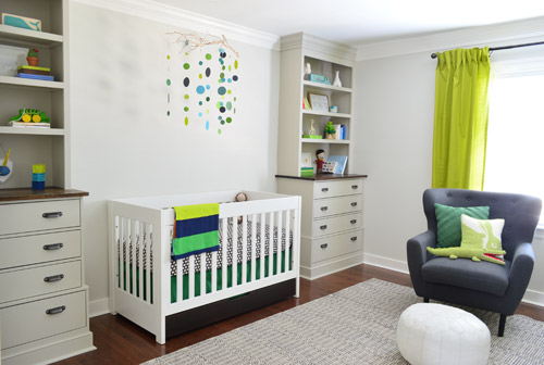
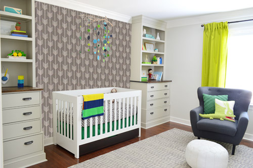
Ever since we imagined the idea of these built-ins, we pictured making the space between the two of them sort sort of accent – either with a color or pattern or treatment of some sort (in our first post we even mentioned a planked wall). Those ideas fizzled a little bit after completing the built-ins and realizing they had a lot of stuff on them (so we didn’t want to clutter up that space between them above the crib too). But neither of us could quite shake the idea of still doing an accent of sorts somewhere in the room. And one night while perusing possible wallpaper ideas for the showhouse, this puppy caught John’s eye.
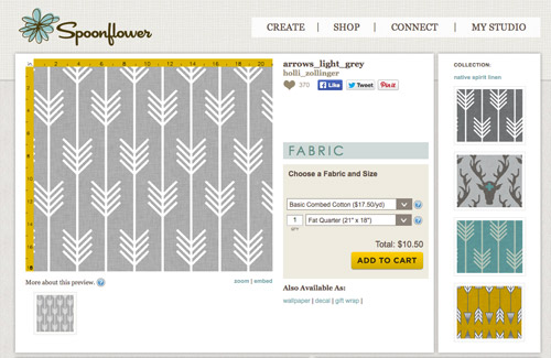
He went rogue and without even consulting yours truly (cue your outraged gasps) and ordered a sample of it and its darker counterpart, for $5 each. With tax and shipping it was $13 total. Thirteen bucks that would either earn him a sour look from me, or make him a hero.
Well, he got the sour look alright – not for the $13, but because I can still vividly remember the claw-hands I had from wallpaper peeling. The good news is that when he explained that Spoonflower wallpaper is removable, all was right with the world again. And I really liked the pattern too (it feels like something that could grow with the bun, and not be too fleeting or “young baby”). The hero part is still TBD though.
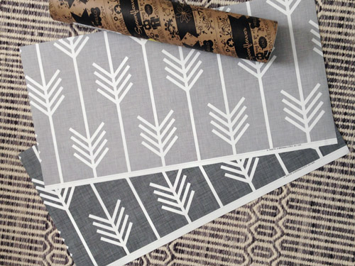
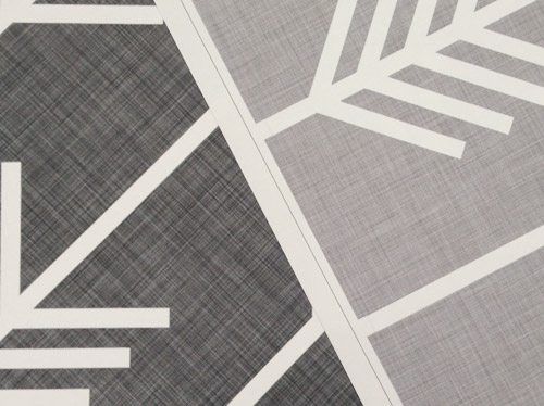
The samples arrived a couple of weeks later. They’re nice and big, and they revealed a detail that John hadn’t detected online: a subtle linen-like texture in the gray tones that I also thought was a nice touch.
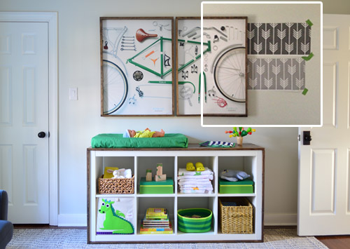
We ran upstairs to tape them up on the walls, just to get a feel for them in the room, and John went rogue again and put them on the wall with the bike prints. He must be getting braver (I think it’s the beard, guys). Since we’re both less tempted to mess with the look of the built-in wall, he said he thought that wall might be the answer instead. Forgive the terrible phone pic.
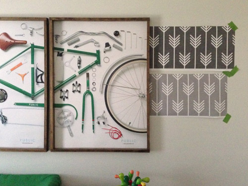
We snapped that with my iPhone so I could mock-up a full-wall version of the space in Photoshop. For those wondering how I did it, I just dragged the photo I shared above into Photoshop and laid it over another picture I took of (almost) the full wall. Then I just adjusted the size of the overlaid detail photo of the wallpaper until the patterns matched up and were the same size (I had the opacity of the top layer down a little so I could see when that happened).
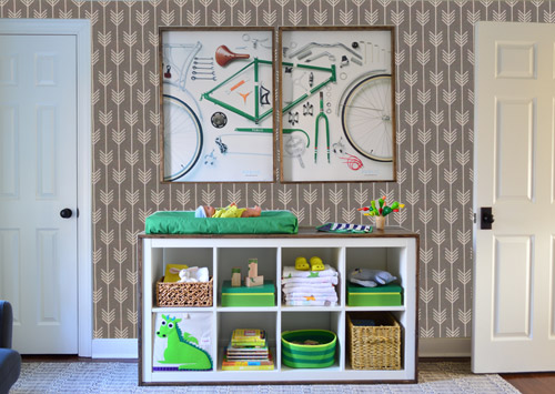
Once I knew the wallpaper pattern was the right scale, I put the opacity back up to 100% and cut out the rest of the iPhone pic so I was just left with a rectangle of wallpaper that I could manually tile until it filled the whole picture. Lastly, I cut out around the objects like the frames, doors, and the changing table (which were still in the image behind the tiled wallpaper) so as I deleted the wallpaper in front of them, it appeared to run behind them.
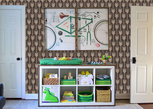
I also tried a version where I adjusted the color to look like the darker sample that John also ordered, but it was pretty clear to both of us that we preferred the lighter one.
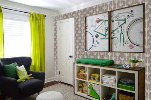
I thought it was a little hard to judge without seeing a plain wall meeting the accent wall to give it context, so I used the same technique to mock things up on this photo that I already had of the room. The colors probably aren’t perfect (the curtains look neon here), but it definitely helped us to picture everything – and it confirmed that the light version wouldn’t clash with the wall color or anything.
I still wasn’t convinced that was the right wall for an accent (I feared it might look too busy with the bike art in real life) so we also mocked it up on the crib wall to see if our original idea was better. We stared at it for a second, but I think we both prefer the bike wall. It just felt too crazy over the crib with all the items on the built-ins, the mobile, the patterned crib skirt, etc.
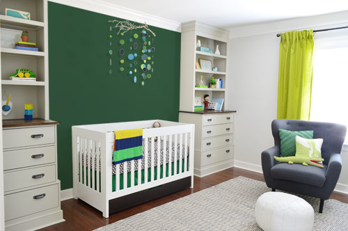
I also tossed some bold green up there just to see if a hit of that above the crib would be fun. It’s not great photoshop (looks pretty flat) but we didn’t really love it.
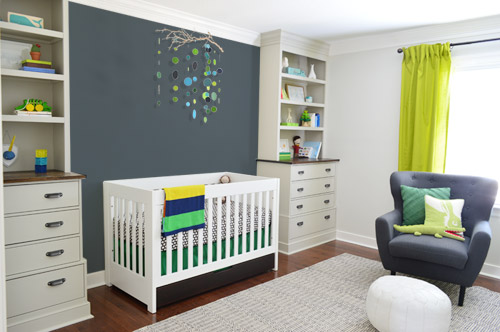
I also tried something sort of charcoal-ish to balance the chair out. This one made both of us do that “eh, not bad” face while staring at the computer. It looks kinda nice with the white crib and the mobile.
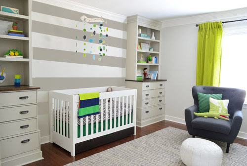
To add yet another possibility to the ring, a sweet reader named Annie had emailed us this quick mock-up she did with some chunky stripes painted behind the crib, which also gave us pause. You know we love a striped wall…
We’re still sort of letting things simmer, but we’d love to hear what you guys would do. Would you go for the wallpaper on the bike art wall? We like that it’s removable, so it’s not too much of a commitment. Do you prefer a solid wall of green or charcoal or even some stripes behind the crib? Or should we just stop being crazy and leave things the heck alone? Part of us is really excited to add one more layer of interest into the room (we’ve never put up wallpaper so that would be a new adventure – and most of the elements in here are really neutral). Then again, we still want this room to be a mixture of playful and cozy (as opposed to that’s-just-straight-up-crazy). What do you think?
VOTING ON THIS POLL HAS CLOSED


Angela says
Love the stripes!! I like the wallpaper John picked, but just don’t really think it fits in the nursery. How about…stripes on the bike art wall !!?? That’s my vote, but there wasn’t a box for me to check! Can’t wait to see what you go with…
Nina says
I love the wallpaper! But for me it would be too busy for both the crib wall and the bike art wall. Why don’t you try it on the window wall? I think it would look lovely and the curtains would calm it down a bit.
Sophie says
Ooooh, I really like the wallpaper! I’m not super keen on it in such a large quantity on that wall though… I do, however, LOVE the stripes on the crib wall! So subtle and sweet but not too baby-ish. Also easy to change when the bun grows a little and has opinions of his own!
Abby says
I think this is the first time that Spoonflower has caught my eye on your blog (newish reader), but I just wanted to put a plug into visiting their space if you are ever in the Durham area. I sorta wedding-crashed their workday once and was so inspired – the hypnotizing printers rolling out yards of unique and bizarre designs, watching the shippers slice it up, everyone bobbing to their music and pointing out cool designs to one another. No pressure to come down and say, hold a workshop :)
JoDi says
I love that wallpaper on the bike wall (nice job John!) but I voted for stripes on the crib wall. The mobile is awesome and adds a little color, but it doesn’t visually break up that wide expanse of blank wall between the built-ins enough. The stripes would keep it clean but add some interest.
I would also do stripes on the bike wall to tie it all together. Stripes on the crib wall and wallpaper on the bike wall would be too busy, and wallpaper on both walls would be too much. The wallpaper is just too busy on the crib wall. So stripes on both walls is my vote!
Lisa says
I love the charcoal wall…but I would do it with blackboard paint. A huge chalkboard in a child’s room? YES! Then you can change the “art” on it whenever you feel like doodling something new…
JoDi says
Just wanted to add a thought about why I think the stripes seem to be the most popular option. All the other options still leave the crib wall as an unbroken expanse. It may be a different color or pattern but it’s still a whole lotta whatever it is. You can’t add art on that wall to break it up because it would interfere with that lovely mobile. The stripes break up that space without interfering with the way the mobile looks against the wall. Once the mobile comes down, I could totally see a solid color on that wall with some art, either one large piece in the middle or two pieces to mirror the bike art on the opposite wall.
Jen_nifer says
Agreed.
Michelle says
I say arrows on the crib wall…the crib will not be there forever and I think the wallpaper really highlights those built-ins! Plus, you can always change the crib sheets and I don’t think the mobile will look that busy in real life.
Have fun!
Cacey says
I love the stripes over the crib! The wallpaper is too cute not to use somewhere in the house as an accent though. I hear you on wallpaper removal, after removing a 1980 style wallpaper from our daughters nursery my husband and I said never again. Good to know there is wallpaper out there that can be removed easily removed if we ever wanted to go that route.
MC Collins says
I love the arrow wallpaper behind the crib, which surprised me. Photoshop is so cool! A close second is the stripe option. Such great ideas!!! I would be conflicted too!
Karen @ a house full of sunshine says
Oh my goodness, that wallpaper is GORGEOUS!!! Definitely wallpaper that bike wall – it looks amazing!!! And yes, the other wall needs something too. I like the stripes or charcoal. This room is going to be the best-lookin’ baby boy room ever! You guys are rockin’ it.
Phyllis Johnson says
I voted for the stripes, but I’d like to add–Make the stripes consistent with your bookshelves. I really liked the stripes but I think it would look ‘cleaner’ and and more soothing looking at stripes (following the lines of the bookshelves) that span the width of the wall.
Therese says
As you know, your son will have a personality and temperament all his own. Why not leave things cozy and quiet for awhile and see who he is and what he’s like before adding more? Your daughter may weigh in on what she thinks he needs, too!
Pat says
While I like the stripes on the crib wall, it reminded me too much of a 30’s jail scene – bars on the crib and convict stripes on the wall. Or maybe it’s just because I dated a prison guard for a while? Anyhow, I like the charcoal behind the crib and I also liked the wallpaper on the bike wall but couldn’t vote or both.
Pat says
I love all the things that you are considering, except, perhaps the green over the crib. But I, too am having trouble choosing for this setting.Would it help your decision if you determined a/the focal point for the room (I mean in terms of decoration,of course!).
I also don’t have a clear idea of the other 2 walls and what they look like.
Other observations/comments:
I noticed there are a lot of ‘lines’ on the crib wall already: shelves, drawers, crib rails. Does this affect your decision at all?
The charcoal grey behind the crib really draws yours eye over there (in case the babe himself will not be reason enough to glance that way!)and highlights both the graphic quality of the crib and John’s great work on the built-ins.The stripes there don’t seem to set them off as well.
Could you do both charcoal behind the crib with wallpaper on a different wall?
Can’t wait to see what you decide. Good luck!
DeDe@DesignedDecor says
I vote stencil on the crib wall, no wall paper. Stencil is easier to change than having wall paper.
Patricia says
I would do both stripes on crib wall and wallpaper on bike wall BUT I would make the stripes a color such as a paler green rather than the grey.
Kimi says
I agree i like a combination of two together wallpaper on one wall whatever wall you choose and paint too!;) Its looking so great in there!!!;)
Lori says
What about a subtle design such as stripes using one color but with flat and glossy alternate. Or a stencil with same process? Just another idea i see something is missing between shelves as well. I know you will land on something.
Anne says
Stripes and wallpaper!!!!
Luisana says
I think you should leave them plain and put the wallpaper where the window is. I am not and expert but I think the other walls look good already..
Lisa says
I have a tech question. You have probably already answered it at some point. Do you use photoshop to change the color and pattern of the walls? Do you have a tutorial somewhere on your site on how to do that? Thanks!
YoungHouseLove says
Here’s a post that hopefully helps with that (we also shared some Photoshopping details for how we added the wallpaper within this post).
xo
s
Monica says
Stripe and wallpaper! You should do a second poll with the top 2-3 poll contenders and a stripe and wallpaperr option.
Kaylin says
Love the wallpaper on the bike wall! The charcoal color looks great above the crib, but how about matching the shade of grey thats used as the background of the wallpaper? That would tie everthing together. Can’t wait to see what you guys end up doing!
Nicole says
I love the wallpaper! I especially love it on the bike wall, but then I feel like the crib remains too empty. I also really like the idea of the charcoal wall or in a similar colour to the wallpaper. Another thing I thought about was chalkboard paint. Rather than charcoal, what about chalkboard?!? It could be a lot of fun. Give you lots of freedom to create pretty sweet art and stuff and that wall. You could do the whole wall or you could flameout the area to make it look like framed art. Anyways, just a thought! I’m certain whatever you choose will be fantastic…but I have to say that, although the stripes are in the lead for the poll, I feel likes it’s a little too expected. There are so many nurseries with stripes that I would like to see something different. :) have fun!
Hilary says
What about a more neutral stripe vía texture?? I´m picturing some horizontal wainscoting that would tie in with the wood of the built-ins, making it like one big item.. almost like an awesome ship cabin for the barnacle!! Like this: http://www.thisoldhouse.com/toh/photos/0,,20413341_20830582,00.html
Meshan Foutz says
I love the wallpaper, but I think it’s too busy for both walls. What if you used the dark gray wallpaper on the window wall? I think it would look great with the green curtains.
Renee Kruger says
I think the charcoal behind the crib makes the mobile pop more. What about using the wallpaper to line the walls of the bookcase?
Cindy says
Is there any way of using the wallpaper in the office? It is a cool paper, but I think I like the striped wall by the crib the best…anything else took away from the neat mobile and that is such a colorful focal point.
Berry says
I love the wallpaper and the stripes, but are you still planning to paint the closet door a bright green? I think that will make a big difference in the “busy-ness” of the changing table wall. Not sure if this has been suggested already, but I think the stripes might be really cute on the changing table wall…
Jen_nifer says
I choose the stripes on the crib wall because it’s lovely, but also because I feel an accent wall should be a wall you might be facing when you walk in a room, and the other option doesn’t fit. The lighter gray wallpaper is lovely in your mockup though.
Erin says
I like the gray behind the crib and the wallpaper in the bookcase.
Diane @ SouthHouseDesigns.com says
So far, so great!
I like the accent to be the crib wall – draws you into the room and highlights those great built-ins, mobile and sleeping babe (no greater sight that a slumbering bundle of love).
I do think the arrows are too much though, but love the linen background and the lighter grey. I would love to see that wall done in a lighter grey but painted with a linen texture.
Amy says
Just wanted to add that if you end up not using those wall paper samples you should totally frame them and put them somewhere in the room.
Pamela says
It would probably be price prohibitive, but I vote for getting the arrow pattern in fabric and making curtain panels, painting the stripes on the crib wall, and painting the closet door green. I just like to throw monkey wrenches.
Suzanne says
I also looked for the ‘both’ vote. Never fear, though. Your readers, through comments, made sure you heard their ideas. One thing to consider – wallpaper next to a crib could get dicey if your baby (once he gets a bit past the infant stage, of course) is a quiet, yet bored ‘picker’….All he needs to do is find one tiny little loose seam and it could be the end of the wallpaper….Love the stripes behind the crib but I’m wondering if they’ll look dated soon? We’ve seen them everywhere for quite a while. How quickly will they go the way of the stenciled borders I did back in the 90s?
Melanie says
I am sure this is in the comments somewhere… but what about a plank wall (where the crib is) that is stained to match the stain in your built-ins? Tie in the nice stain you’ve got there already, and it wouldn’t look too busy, right?
HH says
Ok so I may be the only one, or perhaps not since you have so many comments on each wonderful post… but when I first looked at the wallpaper I thought it was geared, pardon the pun, in a more directional sense. As if the arrows didn’t point up and down referencing feathers – as I read it – but put it up with a right or left directional point. As if giving a nod to the biking John loves. As well as a somewhat southwestern vibe to the mix, cowboys and indians like. Just an idea. Simmer away and have a nice day!
Tatiana says
Hi Sherry and John, I’m loving the nursery posts. I voted for the stripes, but I also liked the charcoal one. I also like to suggest a crazy possibility, if it was possible I would wallpaper the closet door for an accent. xo
Maria says
I do think that something needs to go up on some wall in the space because otherwise it feels like something is missing. I feel though that if you put up the wall paper on the bicycle wall then the crib space will look too empty and vice versa if you put the wall paper or color on the crib side. I think that you should put the light gray wall paper up on the bicycle side and the stripes up on the crib wall. Now since I’ve never actually been in the space and I don’t know how small it is this idea may seem too busy but I think the two patterns would complement each other without the room feeling unbalanced if you will.
Kelli says
I think you should do a gradient paint job in gray behind the crib and mobile, kinda like you did on the dresser for your book. Starting w/ the darkest on the bottom and moving to lightest on top will let the mobile still stand out.
Jessica @ Decor Adventures says
I love the paper, it’s perfect and looks great on the bike wall. Just a suggestion, but have you thought of putting it with the arrows pointing up? Maybe it’s just psychological, but it might kind of signal “upward” instead of downward as they are in the mock ups. Like a positive visual for the bun and the room :-)
YoungHouseLove says
Love all the arrow direction votes guys! They definitely would be more “optimistic” if they went up, so we’re down with that as a possibility!
xo
s
Miffy Barden says
So, of course I love the option of using a great wallpaper in the nursery it any other room in your home. I own Barden’s Decorating, Inc and we specialize in high end wallpapers and all kinda of painting projects, but you must know that if wallpaper is installed correctly you or the next homeowner should have no problems removing. I’ve just recently returned from the Design Bloggers Conference 2014 in Atlanta and would love to talk to y’all! I love, love your blog! Muffy Barden
Anne Weber-Falk says
I like the wall paper on the bike wall best. While those bold stripes behing the crib are nice, everybody is doing that and I find it rather boring now. I say leave the crib wall as is and maybe someday that will be a nice place for family pics and his artwork or whatever strikes his fancy.
Tracey says
I think everyone has given plenty of great opinions, so I’ll just comment on something that MUST be said…. John is way hot with the beard!!! :-)
Rebecca says
Whatever you do with the walls, I agree with the suggestion to switch the mobile and bike frames — frames over the crib and mobile over the changing station.
Alicia says
I used Mur brand wall decals for an accent wall in our nursery and LOVE them! Peel and stick and it looks like paint!
Alicia says
We did triangles like the second photo: http://greenweddingshoes.com/wall-decals-from-mur-and-a-giveaway/
YoungHouseLove says
Love that! Thanks for all the ideas/links/suggestions guys! We can’t believe they’re still rolling in!
xo
s
Kat@junktogem says
I really, really like the stripes between the built-ins! It’s a modern graphic without being too busy–and would either work well for later as your son grows up or can easily be painted over.
I do love the wallpaper, too, but if it were me, I’d probably save that for the guest room or something. The baby’s room is coming together nicely, you guys!!
Jill says
What about this? http://i.imgur.com/eh3W3Rf.jpg
You already have kind of a color-blocking thing going on, so this almost-entirely-turquoise print complements that: http://society6.com/product/Whale-Balloons_Print#1=45
Plus the nautical theme is a cute nod to Captain Barnacle.
The stripes go well with nautical too and help fill up both walls.
And then just swap out the curtains for some white ones (white pleated curtains kind of echo the stripes and don’t compete with the crib focal wall, plus I bet you have some white curtains on hand), and you’re good to go!
I also think the colors in this print (http://society6.com/product/Painting-the-universe_Print#1=45) go well with the room (maybe to put somewhere on the wall with the entrance in it?), and it sweetly evokes possibility for Barnacle — that Barnacle has the whole universe at his fingertips.
Jill says
Oh, I forgot. One more print that goes with the color-blocking and is a cute nod to Captain Barnacle:
https://www.etsy.com/listing/125287821/wall-art-whale-nautical-print-mustache?ref=sr_gallery_29&ga_search_query=nautical+print&ga_ship_to=US&ga_page=3&ga_search_type=all&ga_view_type=gallery