I know it sounds kinda crazy, but after painstakingly removing five different wallpapers from this house… we’re considering putting some up. I think I even passively mentioned it in this post about the nursery mobile.
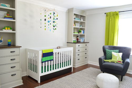
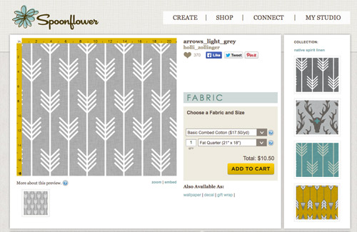
Ever since we imagined the idea of these built-ins, we pictured making the space between the two of them sort sort of accent – either with a color or pattern or treatment of some sort (in our first post we even mentioned a planked wall). Those ideas fizzled a little bit after completing the built-ins and realizing they had a lot of stuff on them (so we didn’t want to clutter up that space between them above the crib too). But neither of us could quite shake the idea of still doing an accent of sorts somewhere in the room. And one night while perusing possible wallpaper ideas for the showhouse, this puppy caught John’s eye.
He went rogue and without even consulting yours truly (cue your outraged gasps) and ordered a sample of it and its darker counterpart, for $5 each. With tax and shipping it was $13 total. Thirteen bucks that would either earn him a sour look from me, or make him a hero.
Well, he got the sour look alright – not for the $13, but because I can still vividly remember the claw-hands I had from wallpaper peeling. The good news is that when he explained that Spoonflower wallpaper is removable, all was right with the world again. And I really liked the pattern too (it feels like something that could grow with the bun, and not be too fleeting or “young baby”). The hero part is still TBD though.
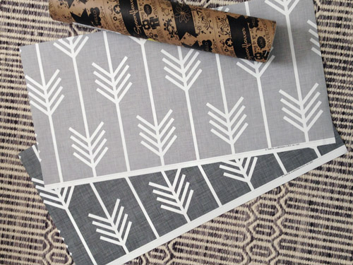
The samples arrived a couple of weeks later. They’re nice and big, and they revealed a detail that John hadn’t detected online: a subtle linen-like texture in the gray tones that I also thought was a nice touch.
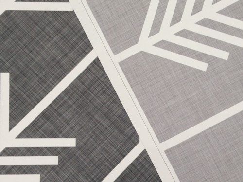
We ran upstairs to tape them up on the walls, just to get a feel for them in the room, and John went rogue again and put them on the wall with the bike prints. He must be getting braver (I think it’s the beard, guys). Since we’re both less tempted to mess with the look of the built-in wall, he said he thought that wall might be the answer instead. Forgive the terrible phone pic.
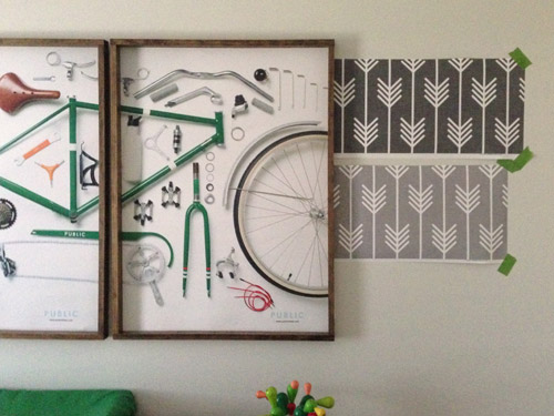
We snapped that with my iPhone so I could mock-up a full-wall version of the space in Photoshop. For those wondering how I did it, I just dragged the photo I shared above into Photoshop and laid it over another picture I took of (almost) the full wall. Then I just adjusted the size of the overlaid detail photo of the wallpaper until the patterns matched up and were the same size (I had the opacity of the top layer down a little so I could see when that happened).
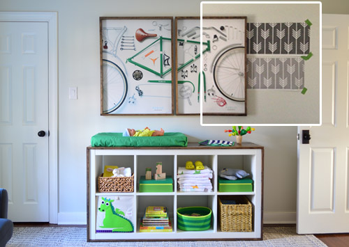
Once I knew the wallpaper pattern was the right scale, I put the opacity back up to 100% and cut out the rest of the iPhone pic so I was just left with a rectangle of wallpaper that I could manually tile until it filled the whole picture. Lastly, I cut out around the objects like the frames, doors, and the changing table (which were still in the image behind the tiled wallpaper) so as I deleted the wallpaper in front of them, it appeared to run behind them.
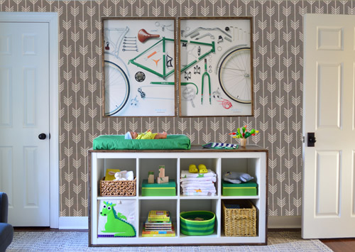
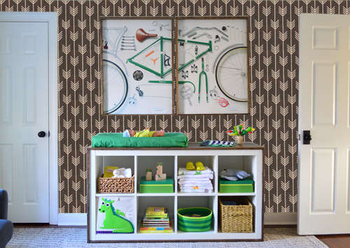
I also tried a version where I adjusted the color to look like the darker sample that John also ordered, but it was pretty clear to both of us that we preferred the lighter one.
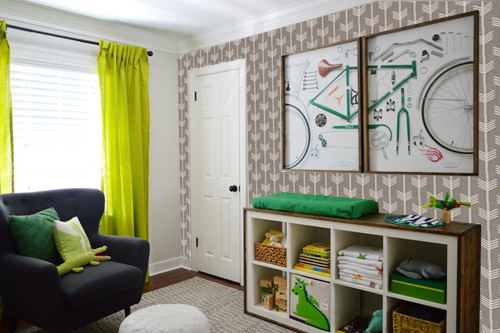
I thought it was a little hard to judge without seeing a plain wall meeting the accent wall to give it context, so I used the same technique to mock things up on this photo that I already had of the room. The colors probably aren’t perfect (the curtains look neon here), but it definitely helped us to picture everything – and it confirmed that the light version wouldn’t clash with the wall color or anything.
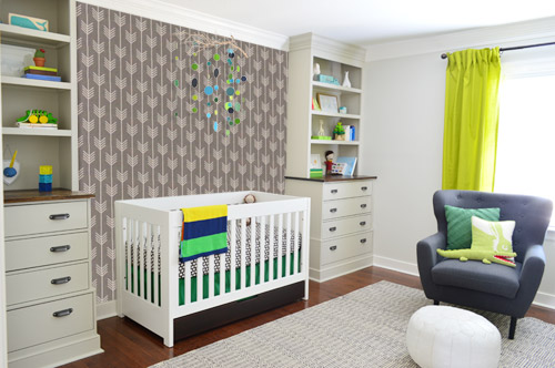
I still wasn’t convinced that was the right wall for an accent (I feared it might look too busy with the bike art in real life) so we also mocked it up on the crib wall to see if our original idea was better. We stared at it for a second, but I think we both prefer the bike wall. It just felt too crazy over the crib with all the items on the built-ins, the mobile, the patterned crib skirt, etc.
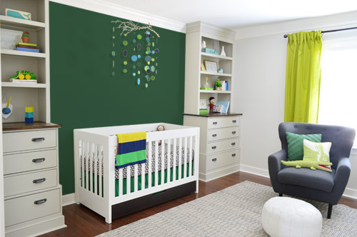
I also tossed some bold green up there just to see if a hit of that above the crib would be fun. It’s not great photoshop (looks pretty flat) but we didn’t really love it.
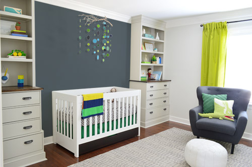
I also tried something sort of charcoal-ish to balance the chair out. This one made both of us do that “eh, not bad” face while staring at the computer. It looks kinda nice with the white crib and the mobile.
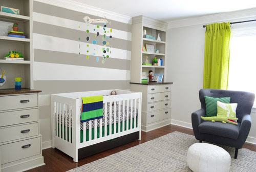
To add yet another possibility to the ring, a sweet reader named Annie had emailed us this quick mock-up she did with some chunky stripes painted behind the crib, which also gave us pause. You know we love a striped wall…
We’re still sort of letting things simmer, but we’d love to hear what you guys would do. Would you go for the wallpaper on the bike art wall? We like that it’s removable, so it’s not too much of a commitment. Do you prefer a solid wall of green or charcoal or even some stripes behind the crib? Or should we just stop being crazy and leave things the heck alone? Part of us is really excited to add one more layer of interest into the room (we’ve never put up wallpaper so that would be a new adventure – and most of the elements in here are really neutral). Then again, we still want this room to be a mixture of playful and cozy (as opposed to that’s-just-straight-up-crazy). What do you think?
VOTING ON THIS POLL HAS CLOSED


Carol @littlecountryhouseonthelake says
I like the idea of the wallpaper on the bike are wall and either a wallpaper with just the linen background of the arrow wallpaper (is that confusing enough?) on the crib wall – or – do a linen paint treatment on the crib wall the color of the background color of the arrow wallpaper. At first I just thought about painting the crib wall the background color of the wallpaper, but I think if you did the linen treatment with paint it would be perfect – a little texture, but subtle.
Marlee says
I voted for nothing/leave as is, because none of those options seems quite right. While I really like the wallpapered bike print wall, it isn’t the right wall to be accenting and leaves the crib wall looking bare. The only way to use it would be to balance it out by adding something to the crib wall. I’d be curious to see the wallpaper on the window wall only, but have a hunch the crib wall will still look too plain. The suggestion of a planked crib wall with a random pattern of brown pieces might be nice. I wouldn’t do long planks that extend clear across for the same reason I wouldn’t do the painted striped crib wall — too many long horizontal lines d/t the shelves and drawers on the built-ins. Eager to see what other options you come up with!
Anne says
What about those same stripes on the bike print wall?
Erin says
Would it be too crazy to do the wallpaper on the bike art wall AND the chunky (but neutral) stripes between the built-ins?(Since they’re on opposite sides of the room, it’s hard to imagine from photos alone if that would be pattern/texture overload in the room or not…) The stripes seem like the best option above the crib, because they ground the space without chopping up the wall with a dark color, and the clean lines keep it from feeling cluttered or competing with what’s on the built-ins. The colorful mobile also plays nicely with the large-scale stripes behind it, and compared to the solid wall colors, I think the stripes actually make the mobile feel larger because there’s not so much “empty” wall space around it, ya know? What a fun nursery this! It feels youthful but sophisticated — a perfect space to grow into :) Well done as usual, Petersik family!
Allison says
I say: put it on the back burner. You’ve got so much going on before he arrives and so many “to-dos”. Once he arrives and you spend some time in there you can always go back and accent wherever feels bland. However, if you are going to do something right now I love the wallpaper on the bike art wall!
Shan says
I think I’d best like the stripes on the bike frame wall.
Stripes on the bike frame wall would also echo the sort of stripe look that the shelves of the built-in give off on the opposite wall. That charcoal/blue color would also be a great addition – it ties the chair in nicely.
That arrow paper is gorgeous, but I think the big bold pattern of the stripe is eye catching while feeling more calm/less of the cluttered and stressful feeling I was getting from the wallpaper… especially with everything else in the room and future toys, etc. to come. The wallpaper felt like it was competing with the smaller details and busyness of the bike print, instead of showing it off.
Debbie says
Really am not feeling the arrows. Too busy and really doesn’t seem to fit a baby’s room. I think the stripes will really add something to the room and the contrast would be great for the baby to look at.
meghan says
I think stripes on Bike wall but it wasn’t an option, the wallpaper is too busy for such a small room. and I love the simplicity of the built-ins plus mobile.
mp says
I know you two are adventurous and far more successful DIYers than me (I haven’t read about post-project ER visits), but I’d recommend investing in a good wallpaper hanger if you decide to go with it.
Laura says
Loving the arrows on the bike wall, reminiscent of Clara’s rain drops but different… if you know what I mean? Good luck regardless, I have a 6 month old and I still have nothing on his walls :/
Pam/Digging says
You didn’t offer an option to choose two treatments in your survey, but I’d do the stripes over the crib and the lighter wallpaper on the opposite wall. That would be a wonderfully patterned room!
Jessica says
I know you love mirrors, Sherry. What about a nice mirror above the crib that reflects the pretty and colorful mobile while adding interest? A nice quatrefoil shape might be nice.
mribaro says
How about painting the crib wall charcoal and then hanging that “All you need is love” painting you already have, in the middle, above the crib? Going with the maritime, barnacle theme… :) Plus, I think the painting might co-exist with the mobile, as they are both airy and undemanding to look at.
Kay says
Where is the “Stripes but more in a dark charcoal scheme” option?
Kathryn says
Hi, Sherry and John (Clara, Burger, and Baby, too)
All of your ideas are great and would look amazing in the little one’s nursery. I especially like the stripes on the crib wall and the lighter arrows on the bike wall (since it is so easily removable….my house is close to yours, so I had/still have the same painted wood/wallpaper challenges you guys are experiencing). I love what you have done and have taken your ideas and tweaked them a little to make them my own for my house. It is great to see the improvements you guys are making on this house and have made on your former homes. So happy that you chose this wonderful city as your home and are contributing with your beautiful show home! All the best! – Kathryn
decoratica says
I like the idea of an accent wall on the bike wall, but it feels to me that the wallpaper pattern is too busy -with or without the bikes. I wouldn’t do stripes again, it feels too last year for me… why not a tone on tone grey wall with some subtle pattern like you did in Clara’s room?
Tina says
The curtains look neon because they are neon!
christine says
I know I’m in the minority, but I’m so anti-wallpaper it’s not even funny. Not THAT wallpaper, just wallpaper in general. I’m also usually not a fan of stripe walls, but I really like it above the crib. I think the bike art on the opposite wall is enough to balance the stripes. I feel like you guys are hesitant about the wallpaper because if you don’t like it, it might be more difficult to reverse than just a bad paint color, which is another reason I’m anti-wallpaper. But if you truly love it, I say go for it!
Cortney says
Such a lovely nursery!! I love all of the elements and that it is not matchy-matchy but it’s still cohesive.
On a side note…while searching for knobs for my daughters dresser makeover, I stumbled upon YHL hooks at Target…is that something new or am I out of the loop? (I am in love with the bee hooks!)
julie clanton says
You didn’t have this as a voting option but I LOVE the light paper on the bike wall and the stripes on the crib wall! I can’t see the view of both walls at the same time as you would walking in the room to tell if it would be too much. Great job guys this room is amazing!
Nicki Lossing says
I am with them on the combo. Lighter wall paper on the bike wall, light charcoal on the crib wall. I am sooooo excited for y’all!!!!!!! :)
Tammy says
Have you considered hanging the wall fabric paper on the window wall? I think it would look really nice with the contrast of the green window treatments. And then you could paint the wall above the crib a coordinating solid grey in either the charcoal or light depending on the color wall paper you choose. The stripes are fun, but may be too busy with the wall paper… But you guys know best. Those who see the space in person always know best, as pictures don’t always do the space justice. =). Good luck and look forward to seeing what you decide!
Betsy Hamilton says
With 908 comments, you are probably DONE reading them, and I am that annoying person who is not reading all the ones above hers and so probably repeating, BUT:
1) Love the wallpaper and love the stripes, but above the doorways the wallpaper is looking bitsy and fiddly to me, so I love it less.
2) I voted for the dark gray paint because I think the light stripes kind of blend with the rug to make it all gray/fuzzy/nondescript… Darker stripes might stand out. I also love the way the dark gray bounces off the chair and makes the apple green bits pop.
3) You have probably already discovered this, but it seems that the whole caboodle of stripy brights that the wooden boxes are part of is now on sale at Target. I had to resist buying lots of baskets that don’t have anything to go in them.
4) I love the way the baby’s room is taking shape. The day before mine was born, I was recovering the rocking chair, and it looked a bit more chaotic than your nursery. What a lovely, cheerful, interesting place to welcome a new person to the world!
Carrie says
There is a shop on etsy called Iviebaby that makes boppy covers and sheets in the same fabric/print as the two wallpaper choices, same colors too. So even if you dont use the wallpaper, you could still incorporate that print in the nursery. Check it out!
Betsy Hamilton says
Oh, I knew there was something else!
http://www.hannaandersson.com/Style.asp?from=SRCH&styleid=41064&simg=41064_45W&mwc=45W
Gray stripes and elephants! It could be like that SNL skit (showing my age) where the whole room is done in giant Laura Ashley florals and then the lady of the house emerges from the sofa in a dress of the same print! But cuter than that.
Jennifer says
Hey guys! So we are expecting #2 any day now and I hate the my house has turned into a kids department store. I know we will move to a new house in the next few years for more space and better schools but in the meantime I want some nice storage solutions. Any suggestions or ideas on universal storage pieces for kids stuff? Ideally I would love a wall if those cubbies and shelves and places for art work but since I don’t know if our next house will allow that I don’t want to but things that won’t work and I’ll need to replace (I’m notorious for that). Since u have moved several times and found ways to reuse pieces I’m curious for suggestions. Thanks !!!
YoungHouseLove says
We love storage ottomans (from places like HomeGoods, Target, Bed Bath & Beyond or Joss & Main) and we also like Ikea stuff (the expedit full of baskets = storage dream). Adding built-ins or cabinetry is also always awesome, and things like a chest of drawers can be brought into rooms other than bedrooms for storage too (ex: the corner of the living room, used as a media cabinet with more storage under it, in a playroom, etc).
xo
s
Megan says
I think you should chalk board the wall behind the crib and draw something.
Stephany says
What you’ve done to the nursery so far is adorable! As well as the rest of the house! I don’t think you could go wrong with any of your choices. I admit, I voted for stripes on the crib wall because it looked crisp and fresh compared to the other pics…but I’m not sure if the stripes will compete with the lines of the bookcase shelves in person? I LOVE the idea of the crib being “tucked away” on a cozy wall, so your suggestion of the wood planks between the bookshelves is the winner in my book. Left rustic or whitewashed, it would be a great texture to add to the room. That would also prevent the super cute mobile you made from disappearing on a darker color or pattern. Coming from a Mom of 3 boys, it would be something he could grow up with and it would never look too young. Good luck! Can’t wait to see what you decide!
Jennifer says
The wallpaper is great on the bike wall and I chose that option. However, the crib wall needs an accent. Paint it the same grey tone as the wallpaper background. Color on the crib wall really makes the room feel complete and highlights your excellent work on the built-ins and mobile.
YoungHouseLove says
Love all the ideas and suggestions guys! Thanks to all of you for sharing!
xo
s
Alyson says
Not sure if anyone has mentioned this yet… but what about the arrow wallpaper on the window/green curtain wall? I think it would look great with the curtains and add some interest to that wall. I love the wallpaper but am afraid that having it on either the crib wall or bike wall would make that wall seem out of balance with the rest of rest of the room, making that wall “interest-heavy.”
My other favorite option, as others have suggested, is stripes on the crib wall AND wallpaper on the bike wall. I think you need the stripes to balance the wallpaper on opposite wall.
Shan says
WALLPAPER ON THE CEILING!!
Thats right, I went there :)
I just saw a great photo on Pinterest (tagged you, Sherry) of a heavily patterned wallpaper on the ceiling of a nursery. It was so different, but also very fresh and modern. The wallpaper looked fantastic framed by the crown molding. It also gave punch to the solid walls that seemed a bit lacking but would be overwhelmed by pattern competing with artwork or shelving.
You did say it was removable if you wish to change it later.
Awesome!
Evie says
I just looked at your wallpaper pics above, and suddenly instead of arrows I saw RAIN CHAINS! Love it now more than ever! (just don’t point them another way LOL) Anyhow, now that I see rain chains, I would vote to at least try the lighter wallpaper on the window wall, and again I vote for the closet door going green. In some wild way, the rain chains tie in with Clara’s raindrops, both on the wall left of the closet…..or something. Love whatever you will do with this!
Lori says
Actually, I love the darker gray wallpaper on the crib wall! And maybe some painted stripes on the bike art wall… The wallpaper is too busy with the artwork, but looks great behind the sime white crib. Then having gray stripes in the same color tone on the opposing wall would bring together a cohesive look, especially with the dark gray chair triangulated. Have fun!
Jess @One English Teacher says
I voted stripes on the crib wall, but I love how the charcoal ties to the chair. Maybe charcoal stripes on the crib wall ?
Dani says
I voted for two – either charcoal behind the crib, or leave everything as is. I’m too worried about overstimulating the baby! Fair enough to add things in 12mths down the track but I think for now there’s plenty to look at, and the bedroom should be a calm place if thats where he’ll be sleeping.
Sherri says
What if one stripe is a different color? https://www.etsy.com/listing/117493674/grey-and-orange-nursery-mobiletangerine?ref=usr_faveitems
sheila says
shouldn’t the arrows point up? like optimism?
Beth says
I like the wallpaper on the bike wall – arrows facing up – but the crib all still needs something.
IMO, the best thing behind the crib would be a solid wall of the darker stripe color. The other colors are too dark. That taupe helps the crib stand out without reading as accent wall-ish.
Alison says
Are you guys aware that there is a seller on Amazon using your photos to sell some of the Ikea Vivan curtains? Their name is “Great Gifts Galore”…I’m sure if you search for the curtains themselves you’ll find it. It’s not the image you see in the search but some the other photos you can see.
YoungHouseLove says
Thanks for the tip Alison! And for all the suggestions/ideas from everyone! We are furiously mulling over here :)
xo
s
Cassie Dearborn says
I like the idea of the charcoal/nothing behind the wall, with some sort of simple wall hanging. I think what I’m envisioning is something like a set darker old style wood picture, almost like this: ttp://threemangoseeds.blogspot.com/2011/02/hand-painted-welcome-sign.html With some sort of painting done on the inside, leaving the outside plain as a frame. Maybe even the wallpaper/wallpaper pattern.
Something seems like it should go there, but big and plain enough so it won’t be too busy competing with the mobile… but no so big it looks unbalanced (like the paint options sort of do.
Evie says
Wow, Cassie. The sign could be a traffic sign saying “Bike Lane.”
Larissa says
A comment above prompted me to search Target.com for Young House Love and aaaaaahhhhhhhhh!!!!!! So exciting for you and us! Congrats!
Lyn says
I was too lazy to read all 928 comments so It’s probably already been mentioned. I think the arrows are upside down.
Also, have you heard of Stikwood, http://www.stikwood.com which I think would be great on the crib wall, or somewhere in your house. I guess I want you to use it first because I want it so bad. They are local to me so I could even go look at the wood in person but don’t know where to put it, also money is a factor so I want someone else to do it so I can look vicariously.
dorothy pinney says
I think you should wallpaper the wall over the changing table and paint the wall behind the crib green. Go big!
Nora says
Sorry, I haven’t read all 900+ comments to see if anyone else has mentioned this but I’m wondering if the wallpaper should be applied with arrows pointing UP instead.
And, personally, I do not love the stripes behind the crib.
Amber says
This wasn’t an option in your poll, but I think I’d prefer keeping the crib wall “as is” and then paint the bike art wall the charcoal gray. I feel like the wallpaper on the bike wall is too competey with the art and the accessories on the storage shelf. I think putting a pattern on the crib wall really detracts from your awesome mobile! Just my 2 cents. =)
Ruth Little says
I love the wallpaper on the bike print wall, definitely in light grey too, and stripes, but I’d go vertical to add cohesion to the arrow paper, and vary the stripe widths so it’s not too Folsom.
Melissa says
What about wallpapering the closet? You’d still get your wallpaper fix and a nice little surprise in an unexpected spot.
Lauren says
I love the combo of the light wallpaper on the bike wall along with the stripes on the crib wall – I think they would play off of each other really well, and with the neutral colors, they would provide a lot of visual interest without being overly busy.
Jillian @ Reshape Your Life says
I think subtle stripes on the crib wall (the same color as the built-ins) would be just enough to keep it from looking empty but not too much to overwhelm the room.
Alison says
Not sure if anyone has made this suggestion, but what if you did your own version of the wallpaper with paint. I love the pattern especially for a baby boy. You could do more grey in between the strips and fewer arrows making it less busy?
The fat stripes feel kind of yesterday.