I know it sounds kinda crazy, but after painstakingly removing five different wallpapers from this house… we’re considering putting some up. I think I even passively mentioned it in this post about the nursery mobile.
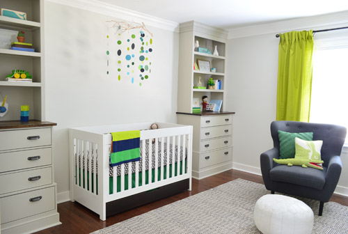
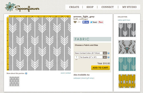
Ever since we imagined the idea of these built-ins, we pictured making the space between the two of them sort sort of accent – either with a color or pattern or treatment of some sort (in our first post we even mentioned a planked wall). Those ideas fizzled a little bit after completing the built-ins and realizing they had a lot of stuff on them (so we didn’t want to clutter up that space between them above the crib too). But neither of us could quite shake the idea of still doing an accent of sorts somewhere in the room. And one night while perusing possible wallpaper ideas for the showhouse, this puppy caught John’s eye.
He went rogue and without even consulting yours truly (cue your outraged gasps) and ordered a sample of it and its darker counterpart, for $5 each. With tax and shipping it was $13 total. Thirteen bucks that would either earn him a sour look from me, or make him a hero.
Well, he got the sour look alright – not for the $13, but because I can still vividly remember the claw-hands I had from wallpaper peeling. The good news is that when he explained that Spoonflower wallpaper is removable, all was right with the world again. And I really liked the pattern too (it feels like something that could grow with the bun, and not be too fleeting or “young baby”). The hero part is still TBD though.
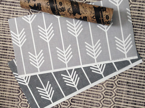
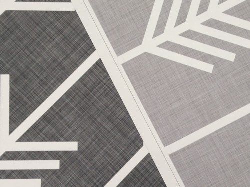
The samples arrived a couple of weeks later. They’re nice and big, and they revealed a detail that John hadn’t detected online: a subtle linen-like texture in the gray tones that I also thought was a nice touch.
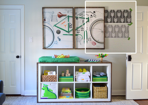
We ran upstairs to tape them up on the walls, just to get a feel for them in the room, and John went rogue again and put them on the wall with the bike prints. He must be getting braver (I think it’s the beard, guys). Since we’re both less tempted to mess with the look of the built-in wall, he said he thought that wall might be the answer instead. Forgive the terrible phone pic.
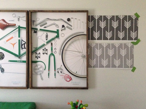
We snapped that with my iPhone so I could mock-up a full-wall version of the space in Photoshop. For those wondering how I did it, I just dragged the photo I shared above into Photoshop and laid it over another picture I took of (almost) the full wall. Then I just adjusted the size of the overlaid detail photo of the wallpaper until the patterns matched up and were the same size (I had the opacity of the top layer down a little so I could see when that happened).
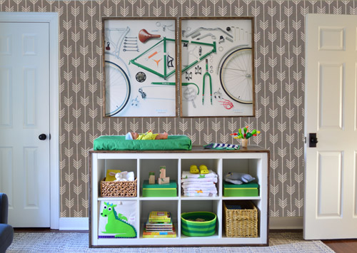
Once I knew the wallpaper pattern was the right scale, I put the opacity back up to 100% and cut out the rest of the iPhone pic so I was just left with a rectangle of wallpaper that I could manually tile until it filled the whole picture. Lastly, I cut out around the objects like the frames, doors, and the changing table (which were still in the image behind the tiled wallpaper) so as I deleted the wallpaper in front of them, it appeared to run behind them.
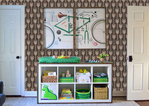
I also tried a version where I adjusted the color to look like the darker sample that John also ordered, but it was pretty clear to both of us that we preferred the lighter one.
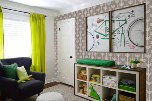
I thought it was a little hard to judge without seeing a plain wall meeting the accent wall to give it context, so I used the same technique to mock things up on this photo that I already had of the room. The colors probably aren’t perfect (the curtains look neon here), but it definitely helped us to picture everything – and it confirmed that the light version wouldn’t clash with the wall color or anything.
I still wasn’t convinced that was the right wall for an accent (I feared it might look too busy with the bike art in real life) so we also mocked it up on the crib wall to see if our original idea was better. We stared at it for a second, but I think we both prefer the bike wall. It just felt too crazy over the crib with all the items on the built-ins, the mobile, the patterned crib skirt, etc.
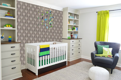
I also tossed some bold green up there just to see if a hit of that above the crib would be fun. It’s not great photoshop (looks pretty flat) but we didn’t really love it.
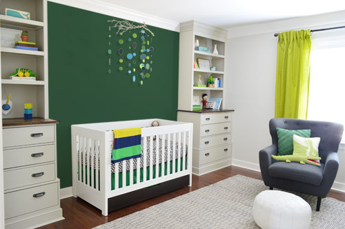
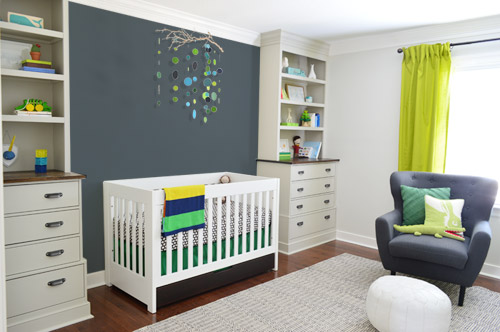
I also tried something sort of charcoal-ish to balance the chair out. This one made both of us do that “eh, not bad” face while staring at the computer. It looks kinda nice with the white crib and the mobile.
To add yet another possibility to the ring, a sweet reader named Annie had emailed us this quick mock-up she did with some chunky stripes painted behind the crib, which also gave us pause. You know we love a striped wall…
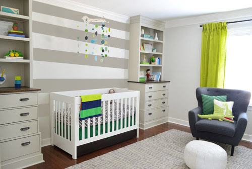
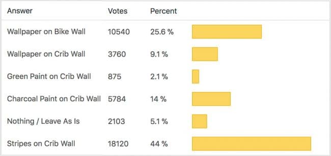
We’re still sort of letting things simmer, but we’d love to hear what you guys would do. Would you go for the wallpaper on the bike art wall? We like that it’s removable, so it’s not too much of a commitment. Do you prefer a solid wall of green or charcoal or even some stripes behind the crib? Or should we just stop being crazy and leave things the heck alone? Part of us is really excited to add one more layer of interest into the room (we’ve never put up wallpaper so that would be a new adventure – and most of the elements in here are really neutral). Then again, we still want this room to be a mixture of playful and cozy (as opposed to that’s-just-straight-up-crazy). What do you think?
VOTING ON THIS POLL HAS CLOSED

Kathy says
I want to love the wallpaper, but it seems too busy. What about on one of the other two walls, though? The window wall? Or the wall with the door? I agree you want something on the crib wall and like either the stripes or the charcoal color.
Janice says
Of those choices, the stripes is the best one. I was excited about a wallpaper there, but that print is too small in scale, and looks too old lady. You need a larger scale paper. I was hoping he had ordered this one for the crib wall. http://www.spoonflower.com/wallpaper/975713
Jen @ Domesticated Nomad says
Normally I love a good apple-y green, but I really think the room would make more sense with a bolder kelly green for the curtains. Wherever you then choose to put the wallpaper (and I vote crib wall) :) it would work sooo much better. Right now the curtains stand out for the wrong reason. But of course, it’s just my two cents and it’s your house. :)
jude says
I love the lighter gray paper but not in this room. How about in a different room?
Alicia says
I love the look of the wallpaper behind the changing table but my only concern would be a diaper changing accident that got on fabric wallpaper. It is unlikely that it will occur but yikes that would be the end of the wallpaper.
Emily says
I’m thinking out loud and on very little sleep – so a dangerous combo! Did you consider keeping the “accent” wall paper on both the bike walls and the window/other side walls – so that the crib wall was gray and therefore like a reverse accent? I know it would be a lot more pattern (and covering up your new paint!) but I tend to think consistency is sometimes less overwhelming/distracting than one stand-out accent wall. (Although, for a non-accent-wall lover, I do like the picture with the wall paper on the bike wall!)
Emily A says
I think the stripped wall is my favorite! I do think the light gray arrows are nice, and but like Lauren said, I think the wallpaper would look better with the arrows pointing up.
Meg says
This is a tuff one because the pattern on the wall paper is so cute that I think it clouds my judgment a little. That said I voted for the Charcoal Paint on Crib Wall because I think it will fit best as the room grows from a nursery to a little boys room. Your guys have such great style I’m sure what ever you come up with will look rad. Thanks for sharing your everyday with us!
Anastasia says
Tough decision!
I really like the wallpaper on the crib wall, but I agree it is a bit too much with the mobile. And you can’t ditch that awesome mobile! So, IMO I would go with the bike art wall, but maybe change the changing pad to a more neutral color? The green is drawing my attention more than the wallpaper, which I think is the star.
Can’t wait to see the outcome :)
Janelle @ Two Cups of Happy says
I like the deep green! I think it might look nice on the bike wall too. I love the wallpaper on it’s own but it seems to be a bit busy in the nursery. I tend to not use patterns in my decor though, so I’m biased toward a more minimal style. :)
E E Faris says
I would put stripes on the crib wall because babies really respond to graphics, it is part of their cognitive development and they love it. The wallpaper would work because it’s graphic too. The wallpaper is awesome, it should go somewhere in the room. Or, do all the walls in the paper.
Emylee says
Hey there! Options are great – I voted for the stripe wall, that’s just too stinking cute. But hey, mid scroll I got an ad that slid across my screen. It was poll for something…didn’t really read it before I hurriedly clicked it away. Just thought you’d like to know!
YoungHouseLove says
Argh, thanks Emylee, we thought we got to the bottom of that yesterday. Will try to hunt it down again!
xo
s
Ruth says
Same ad for me too… in case it helps here’s a screenshot: https://lh5.googleusercontent.com/-lrcvAQ0orGs/UyMf3mHL_QI/AAAAAAAAJT0/qyncB8xR9Gk/s720/Survey%2520popup.jpg
YoungHouseLove says
Ack, thanks Ruth!
xo
s
Autumn says
Really love the wallpaper, especially the texture! Adds a lot of warmth! I’m curious though: if you wallpapered the wall across from the crib with the changing “table,” would you still paint the closet door green? That would be the game-changer for me, personally. Could be really busy with that much color/pattern going on. And though I love the bike prints, I would love to see that wall with the wallpaper and a more simple piece of art, just for kicks. You guys are rocking the masculine, yet fun and colorful nursery! Love the updates!
YoungHouseLove says
I think we’re off the green door just because between the bike art, changing pad color, and curtains/pillows on the other wall it might be too much color all in one corner for us. Although the inside of the closet would be fun in green I think – for a surprise when you open the door.
xo
s
Bethany says
Ooo doing green on the inside of the closet would be so fun! A secret pop of color. I never thought about that before, I’m going to file that away for the future.
Lela says
My husband and I put up wallpaper in our bedroom closet because the top part of the closet shows through in the room. We wanted something special to pop through. My dad warned me that wallpapering together can seriously test a marriage. Ha! Boy was he right. We had some fights about holding it straight and lining up the seams. It got ugly! ;) Just a head’s up…you may need marriage counseling when you’re done! Haha! Have a great weekend…the nursery is looking awesome!
Meghan says
I love the wallpaper itself, but not in the nursery. I think it takes away from the bike art, and is too busy in over the crib. I really do like something over the crib though – it really anchors the built-ins. Personally, I love the stripes! I would put the wallpaper in the closet though, because I do really like it and think it would be a fun surprise.
Amelia says
Love the wallpaper on the bike wall. And would consider color matching the background color of the paper for between the built-ins. Might give a nice balance.
Meg says
What about leaving the crib wall blank and saving the spot for a B&W canvas of the little bun!
But please put the wall paper on the bike wall (dark gray.) I LOVE your bike print :-)
Meredith says
Love the wallpaper on the bike wall. What about doing the angled wainscoting from the showhouse as a full wall treatment behind the crib? Footnote: I may be a little obsessed with that wainscoting now that I saw your showhouse pictures and am trying to figure out a way to put it everywhere in my house.
Christine says
I like the wallpaper, but it is a bit of a busy pattern and I think I would tire of it quickly. I prefer the horizontal stripes but I wondered what that would look like on the bike art wall. Or maybe a solid color on the bike art wall. I would definitely sleep on it for a few nights!
Larissa says
Are you still planning on painting the closet door green? I really like that plan and think it would be just the right pop without adding wallpaper or an accent wall. I am apparently in the minority here, but I’m just not a huge fan of the accent wall trend. It tends to break up a room. The nursery is looking amazing and giving me great ideas for when my babies move into their own room this summer!
YoungHouseLove says
I think we’re off the green door just because between the bike art, changing pad color, and curtains & pillows on the other wall it might be too much color all in one corner for us. Although the inside of the closet would be fun in green I think – for a surprise when you open the door.
xo
s
Larissa says
Or maybe a charcoal door? I just saw that you’re not loving the idea of a green door.
Anna says
I feel like the door being green would be too much green there now. Have you considered doing another color, like orange or navy? (IMHO, I think orange would really pop in a good way!)
YoungHouseLove says
Didn’t even think about that!
xo
s
Nathalie says
Wallpaper window wall!!
Lauren says
I think you should just go all the way and wallpaper the whole room! If the room were bigger, an accent would make sense, but I think in a small room, an accent wall just looks choppy. But I would swap out the curtains for plain white roman shades, too.
kirsten says
I like the light grey wallpaper on the bike wall. I think the grey background color would look nice on the wall behind the crib. I dont think you want to do a pattern on the crib wall because it will compete with your mobile. Overall…looking really cute in there!
Beth says
I think the one with the wallpaper AND the charcoal behind the crib would look nice and masculine. Although, I actually like the darker wallpaper. Really, just have fun with it. It is removable, so if you don’t like it, you can change it.
I know you are afraid of wallpaper after all of that removing, but it really is fun. I used the peony wallpaper from urban outfitters that is currently out of stock (but you can google images for it) to do ALL the walls of our girls’ room. But it was AWESOME! Best decision ever!! Don’t let the bad 80’s flower wallpaper turn you against the idea forever. What John picked out is just perfect. For the wall with the bikes or even over the crib.
Lauren Tal says
I really like the wallpaper but I think it will make the room super heavy on the bike art wall compared to the lighter colors of the crib wall….so…. I would wallpaper both! Or stripe both! Or whatever you choose to do I would do to both walls.
Annelies says
The wallpaper is nice but I think it looks too busy on both those walls, why don’t you try it on the wall with the window?
I would leave the room as it is or prefer the grey wall if you want to do anything, but I would try to work with more art and colour if you want to add something to the room and not change too much two the two walls that are done. But you are the experts and always come up with great ideas and results !
Melissa says
I LOVE LOVE the wallpaper, just not in any of the applications shown (voted for the stripes). But, how about using the darker paper in your guest room? Maybe as an accent wall behind the bed.
Marie says
What about the light grey wallpaper on the wall with the window, or the wall with the entrance door? Hey, what’s over on the wall with the entrance door anyways? I don’t think I’ve seen the room at that angle.
YoungHouseLove says
We’ll have to share a pic of that wall (it just has the doorway into the room and the built-ins cutting into it on the right side) so there’s not much wall space – maybe for a small toy station or grouping of art…
xo
s
Reenie says
Def the stripes on the crib wall. :)
Kelly says
What about stripes behind crib and wallpaper inside bookshelves with same behind bike art? I vote light wallpaper option!
Robin says
I sort of ‘like’ all of them, but don’t love any. It’s not my room so who knows!
Traci says
I LOVE LOVE LOVE!!! that lighter wallpaper on either wall, but I voted for the crib wall. I like the slanty chunky stripes on the crib wall too, however!
Lauren says
I am loving the look of the striped wall. The toned down color makes it seem a lot less busy over there. I worry that charcoal or dark green stripes would be too much though. **And I still want to see that green closet door! I love it so much in Clara’s room…I think it would be neat to have that match.
Shauna says
I’m a sucker for big stripes. They are so classic. Love love love. I’d skip the arrows and do more stripes :)
Melissa @ HOUSEography says
Love the wallpaper idea! Like some others, I would love to see it photoshopped on the window wall. Seems it would give some balance and it’s the wall facing the door when you enter. You’ve got enough going on the other 2 walls.
YoungHouseLove says
We’ll have to try it out on the window wall! We both shied away from that idea since the built-ins chop into it (not even in a straight line) on the left side and the window is not centered on that wall, so we didn’t know if it made for the best accent wall due to the strange non-rectangular outline the wallpaper would have due to the depth of the built-in drawers.
xo
s
Robin says
Just another thought…what about a removable vinyl decal, either with his name or a saying. I am NOT affiliated in anyway but here is one link to a site on Etsy but there are lots of places that sell them, as you well know!
https://www.etsy.com/listing/127532083/name-letters-wall-decal-for-boys-and?ref=shop_home_active_24
Jean says
Could we see the wallpaper on the wall with windows? Just for fun? And what does the fourth wall look like? Maybe on that wall too? The bike art wall looks busy to me already, but adding the wallpaper actually makes me feel anxious when I look at it. Sorry :( I LOVE this room and I LOVE the wallpaper too! It’s so fun to see the different options!
melinda says
The wallpaper does seem busy, but I think it’s because we’re not there in person… I like the light wallpaper on either wall …. have you thought about the lighter blue on the built-in wall? it would be easiy to ‘man-up’ later to a deeper color. :-)
YoungHouseLove says
Love all the ideas and suggestions guys, thanks for sharing!
xo
s
Amber Callahan says
I still like the ideal of the reclaimed wood wall, but I think the strips would be equally fabulous! Have you considered using the wallpaper on the built-ins? it really is a great pattern, so I would try to sneak it in somewhere.
Diana Taylor says
I really like the gray accent wall over the crib. Maybe a little lighter color gray, because it is the focal wall. Having the wallpaper on the bike art wall seems to make the room look un-cohesive to me. Makes it look heavy in the room.
jaclyn says
I love the wallpaper but it is a bit dominant. Maybe just wallpaper the backs of the shelves?
I’m sure you could find a smaller scale arrow print if this one is too big.
Amy says
I voted for gray stripes on crib wall and light grey wallpaper on bike wall. But how about wallpaper on bike wall and a faux brick with a grey-wash look on the crib wall (like your friend Katie Bower did in Weston’s room)?
Jennifer B. says
I’m torn, so I put “nothing/leave as is.”
I LOVE the saturation of the deep charcoal, but I LOVE the stripes. I’m not sure what it would be like to combine the two – probably too busy.
lola says
The wallpaper itself is awesome, but looking at all these the arrows pointing in the same direction would make my head dizzy with optical motion sickness. I remember my own wallpaper in my kid’s room to have a slightly halluzinogenic effect on me, especially when I was ill facing the walls all day.
It looks cool, but I’d prefer the airy white walls. No stripes either.. later you could always group his drawings on the walls if they look too empty..
Shelby says
Hey YHL,
My vote is to go for it w/ the wallpaper on the bike wall. It’s a fun print, goes well w/ what’s in the room, breaks up the green accents and, really, it isn’t too busy! I’m digging John’s insticts here w/ the print and the bike wall instead of between the built ins, though. Either way, you should go for it for sure! Historically you tend to lean on the side of “safe” and “neutral”, so breaking away from that now and again can be really interesting. Plus, removable wallpaper!
Rachel Laree says
I would go with the stripes on the crib wall and stripes on the bike wall. You could also frame those swatches and hang them, just to remind John of his temporary hormonal moodswing towards “wall paper”. :))
Lisa@Double Door Ranch says
That wallpaper warranted an audible “Oh my god, I love it!!” Hope nobody at work heard that…
So I voted for that on the bike wall bc I think it would balance the big stuff you have on the crib wall. But I also really love the charcoal and the stripes on that wall. Ultimately, I think balancing out the room won out. But man, its almost hard to go wrong here.
Christie says
TEAM STRIPED CRIB WALL!!!
Jenna says
I love the dark wallpaper for the bike wall!
Ashley K says
I actually really love the darker colored wall paper. I think it ties in with the edging on the frames and expedite really well. It adds a lot of texture without being overwhelming. I would have loved to have seen the dark one where the two walls meeting, cause it could just be straight that it looks great but when you add in the rest of the room, it’s too much.
Either way, I’m loving the wallpaper. (and I also really like the blue/charcoal wall, it was pretty solid too, but I think it strays from your green accents)