I know it sounds kinda crazy, but after painstakingly removing five different wallpapers from this house… we’re considering putting some up. I think I even passively mentioned it in this post about the nursery mobile.
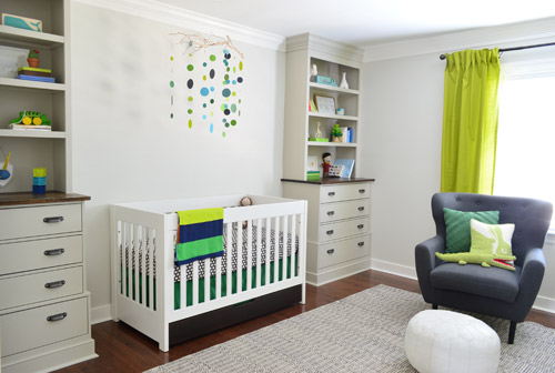
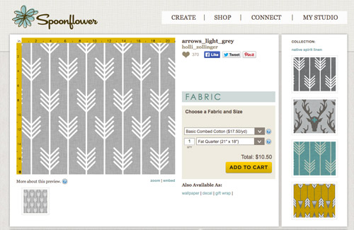
Ever since we imagined the idea of these built-ins, we pictured making the space between the two of them sort sort of accent – either with a color or pattern or treatment of some sort (in our first post we even mentioned a planked wall). Those ideas fizzled a little bit after completing the built-ins and realizing they had a lot of stuff on them (so we didn’t want to clutter up that space between them above the crib too). But neither of us could quite shake the idea of still doing an accent of sorts somewhere in the room. And one night while perusing possible wallpaper ideas for the showhouse, this puppy caught John’s eye.
He went rogue and without even consulting yours truly (cue your outraged gasps) and ordered a sample of it and its darker counterpart, for $5 each. With tax and shipping it was $13 total. Thirteen bucks that would either earn him a sour look from me, or make him a hero.
Well, he got the sour look alright – not for the $13, but because I can still vividly remember the claw-hands I had from wallpaper peeling. The good news is that when he explained that Spoonflower wallpaper is removable, all was right with the world again. And I really liked the pattern too (it feels like something that could grow with the bun, and not be too fleeting or “young baby”). The hero part is still TBD though.
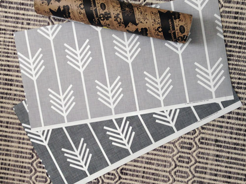
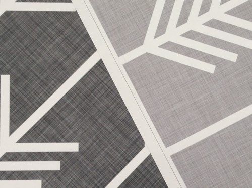
The samples arrived a couple of weeks later. They’re nice and big, and they revealed a detail that John hadn’t detected online: a subtle linen-like texture in the gray tones that I also thought was a nice touch.
We ran upstairs to tape them up on the walls, just to get a feel for them in the room, and John went rogue again and put them on the wall with the bike prints. He must be getting braver (I think it’s the beard, guys). Since we’re both less tempted to mess with the look of the built-in wall, he said he thought that wall might be the answer instead. Forgive the terrible phone pic.
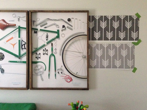
We snapped that with my iPhone so I could mock-up a full-wall version of the space in Photoshop. For those wondering how I did it, I just dragged the photo I shared above into Photoshop and laid it over another picture I took of (almost) the full wall. Then I just adjusted the size of the overlaid detail photo of the wallpaper until the patterns matched up and were the same size (I had the opacity of the top layer down a little so I could see when that happened).
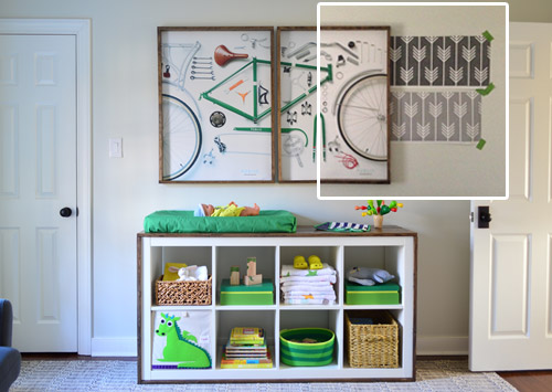
Once I knew the wallpaper pattern was the right scale, I put the opacity back up to 100% and cut out the rest of the iPhone pic so I was just left with a rectangle of wallpaper that I could manually tile until it filled the whole picture. Lastly, I cut out around the objects like the frames, doors, and the changing table (which were still in the image behind the tiled wallpaper) so as I deleted the wallpaper in front of them, it appeared to run behind them.
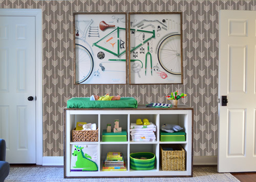
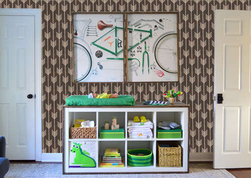
I also tried a version where I adjusted the color to look like the darker sample that John also ordered, but it was pretty clear to both of us that we preferred the lighter one.
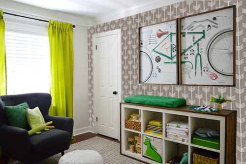
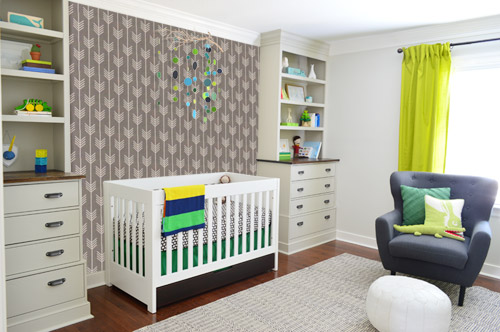
I thought it was a little hard to judge without seeing a plain wall meeting the accent wall to give it context, so I used the same technique to mock things up on this photo that I already had of the room. The colors probably aren’t perfect (the curtains look neon here), but it definitely helped us to picture everything – and it confirmed that the light version wouldn’t clash with the wall color or anything.
I still wasn’t convinced that was the right wall for an accent (I feared it might look too busy with the bike art in real life) so we also mocked it up on the crib wall to see if our original idea was better. We stared at it for a second, but I think we both prefer the bike wall. It just felt too crazy over the crib with all the items on the built-ins, the mobile, the patterned crib skirt, etc.
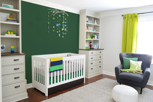
I also tossed some bold green up there just to see if a hit of that above the crib would be fun. It’s not great photoshop (looks pretty flat) but we didn’t really love it.
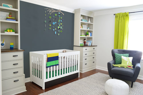
I also tried something sort of charcoal-ish to balance the chair out. This one made both of us do that “eh, not bad” face while staring at the computer. It looks kinda nice with the white crib and the mobile.
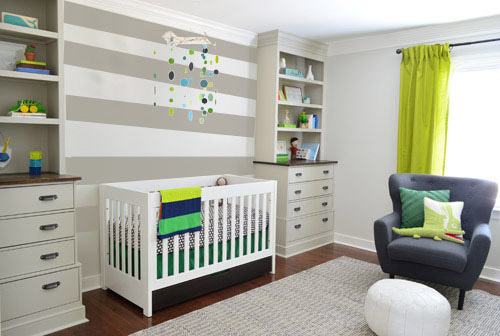
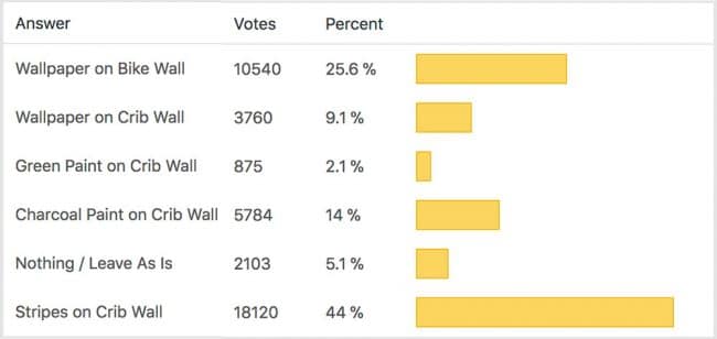
To add yet another possibility to the ring, a sweet reader named Annie had emailed us this quick mock-up she did with some chunky stripes painted behind the crib, which also gave us pause. You know we love a striped wall…
We’re still sort of letting things simmer, but we’d love to hear what you guys would do. Would you go for the wallpaper on the bike art wall? We like that it’s removable, so it’s not too much of a commitment. Do you prefer a solid wall of green or charcoal or even some stripes behind the crib? Or should we just stop being crazy and leave things the heck alone? Part of us is really excited to add one more layer of interest into the room (we’ve never put up wallpaper so that would be a new adventure – and most of the elements in here are really neutral). Then again, we still want this room to be a mixture of playful and cozy (as opposed to that’s-just-straight-up-crazy). What do you think?
VOTING ON THIS POLL HAS CLOSED

Erin C. says
Love the striped wall. Love the wallpaper, but if you do the striped wall, you could always frame the wallpaper sample. You get the beautiful striped wall and an awesome framed pattern.
Constance says
There’s not an option for me to chose the lighter gray wallpaper on both the crib wall AND the bike wall, but at least in pictures that would look SO COOL!
I see the striped crib wall is pretty popular with voters and commenters — it is nice, but I think I’m cooling pretty quickly on that look b/c it seems to be everywhere now. Any of these look great, though.
Shannon says
Even before I saw the stripes, I strongly felt something needed to happen in that space between the built-ins. And those stripes are PERFECT. Not too busy, but enough to make an accent.
As much as I like the wallpaper, I do think it is a bit too busy for your nursery.
Eve says
Here is my vote, though it may be too busy for you guys – I say charcoal on the crib wall and the changing table wall. However, I think just paint between the built ins is a little blah but the wallpaper is too busy (coming from someone is fearless and loves pattern and color to the extreme). I love the wainscoting in the show house and think planking in a V pattern like that on that wall, painted charcoal, would be a nice subtle pattern behind the crib and mobile, and it wouldn’t compete. I could see the painted planking on both walls too – even if you went for a more simple horizontal plank on the changing table wall. But that small arrow pattern is too much with the bike art and its smaller details.
Emily Witvoet says
Love, LOVE the wallpaper on the crib wall!!!
Lauren says
In the photo the charcoal looks colour matched to the blue/grey chair, which looks really pulled together. If you go the charcoal route (although the stripes could pull away with a victory) I think colour matching to that chair is sharp!
Shauna says
I’m sure it’s overwhelming to receive so many opinions, so feel free to ignore my two cents! I adore the wallpaper and I think it adds such a nice texture and layer to the room. I would actually wrap all three walls in it (window wall, bike art wall, and door wall). Then it could be cool to plank the wall behind the crib and paint it a solid shade (I liked both the charcoal and the green) – that way the crib wall still has the stripe texture to give it interest and hold it’s own against the wallpaper, but the solid color calms it down to the let the bedding & mobile stand out. That’s just my opinion – I know I will love whatever you guys decide on!
Megan C. says
I’m not really a fan of accent walls because they read indecision to me. I believe you should go big or go home and wallpaper ALL the walls. I even like the dark pattern best but I also really like the light one too. Be bold! Let the Homearama house be your guide. I loved all your bold decisions that you made there.
Lydia K says
I voted for Charcoal behind the crib – because while I love that wallpaper pattern, it’s so busy that your beautiful mobile disappeared – and I thought it was too much on the opposite wall – or rather, that wall is too big to be an “accent wall.” The stripes are beautiful too, but combined with the bookcases it’s just horizontal line city. Maybe a vertical stripe instead? Your nursery looks amazing already – you’re just icing the cake at this point :)
kerri says
i’m not a huge fan of the wallpaper, just a little too busy for me, but i’m loving the striped wall. :)
Colleen H says
I like the striped wall the best. To me, the wallpaper actually looks a bit like flowers when looking at the whole wall. Perhaps changing the direction of the arrows would change this but I still think it’s a bit too busy. The stripes add interest without standing out too much compared to all the other great things you’ve done in the room.
Megan C. says
Also, that striped accent wall has been done to death.
Katharina says
At first I thought, why change, the room is so clear and pretty as it is. But seeing the pictures, wallpaper/colour do not change that impression. I’d go with the crib side, though, I’d fear the other wall would be too busy (esp. with other possible or future decoration in the room – it could make it limiting). Happy planning!
Carla B. says
Yay for reader Annie! I love the stripes behind the crib. I too am a sucker for stripes, but I think that’s the perfect spot for them. They don’t compete with the fabulous built-ins or the mobile! :)
Amy says
I love the wallpaper behind the bike art. But I think it would leave the crib side looking unbalance. Maybe do wallpaper and paint the crib wall a color? Or is that too crazy?
YoungHouseLove says
Combo suggestions are definitely a possibility! We’re weighing them all and planning to sleep on things for a week or so. Will definitely keep you guys posted when we figure out which way to go!
xo
s
Amanda says
I really like the stripes. It adds interest without being overwhelming or too distracting visually and compliments everything else in the room. The stripes also keep the fresh, “airy” look the room has right now; I think that the colored walls just don’t have that effect.
I actually love the wallpaper itself, but I think it makes things a little too busy, especially combined with the art. If you want to add a pop of color/interest on the wall with the art, maybe you can do that by painting the doors like in Clara’s room?
Wendy says
Love your ideas!!
I was wondering if you could tell me what program you use that allows you to change the wallpaper and paint like that?
Thanks
YoungHouseLove says
We use Photoshop.
xo
s
Crystal says
It is good to go rogue every once in a while!! I told hubby that if he didn’t want to dig all 18+ holes for the impending deck he’d at least have to go get a quote himself to have that part outsourced. Of course he’s also willing to spend twice as much as I am on that step…but maybe that is because he’d be doing all the labor. :)
Lisa says
I like the lighter gray COLOR of the wallpaper. Have you tried that color on the crib wall &/or the bike wall? Much gratitude for your blog????
Amanda B. says
While I was torn between “do nothing” and “wallpaper the bike wall” I ultimately voted for the wallpaper. Why? (a)It’s fun and interesting and your boy will love looking at the pattern. (b)It’s removable, so if it becomes “too much” down the line when you change up other walls/furniture it’ll be easy to go back to a plain wall. Not so easy with painted stripes, I’d fear.
Abigail E says
I didn’t read through all the comments so I don’t know if this was already mentioned…
I’m not crazy about the wallpaper – I think it is too busy. What about strips on both the crib wall AND the opposite wall? If that is also too busy, then I love the strips on the crib wall.
Love your nursery! We are hoping to get pregnant with our first this year and so I’m taking special interest in all your nursery designing!
All the best :)
Abigail E says
and by “strips” I meant “stripes”
geesh :/
SEM says
I think you already have it perfect. I might lean slightly toward the stripes over the crib, but it really is lovely as is. That wallpaper is super cute but makes the wall look too busy. Do they have that pattern in fabric? That would look great for pillows or a pouf! Also, have you considered the removable decals? We just installed triangles decals in our bedroom and they are 100% removable and don’t damage paint. We get the wallpaper effect without doing anything permanent to our rental walls.
here’s how we used them, but they come in tons of shapes and colors:
http://megustaensalada.blogspot.com/2014/01/geometry-in-bedroom.html
Cory Laine says
I love the print and the scale! But, to me, it’s looking a little forced/unbalanced in these pics. I know you have money invested in the curtains already but I really think something in this scal of print would look amazing as the curtains! I also really like seeing a little more contrast between the crib wall and the builtins. This is shaping up toe such a fun room. Can’t wait to see where you guys end up:)
rachel says
Yes! Order fabric with that pattern from Spoonflower for curtains, paint the closet door, and call it done!
Felicity says
Love the wallpaper, but accent walls have always bugged me. Can’t “wallpaper the whole room” be an option? ;)
Lisa E says
Since you are asking…although I liked the wallpaper between the built ins, it stole the show from the mobile which made it a deal breaker for me. When just the two swatches were on the wall, I preferred the darker one. However, thanx to Photo Shop, the light one definitely went better and I did like it on the bike wall. I didn’t vote for the green because it was too in your face, unless you went with a more subdued shade. I didn’t vote for the charcoal because I thought it was too much gray overall. Since we could only pick one, I voted for the stripes because it was more subtle. Another idea, what about subtle circles on the crib wall? I’m attaching a link, but it’s not by itself so you have to scroll down around halfway to see the picture/idea I’m talking about. It’s the green wall. Just another idea. http://www.mekdesigns.com/faux.htm Can’t wait to see what you decide.
Lauren says
Not to add yet another option to the mix….but I think the lighter wallpaper might work behind the crib if you only did the bottom half of the wall and a chair rail. I’m envisionsing it staring just below the first shelf on the built-ins. Not sure how that would work down the line with a headboard, but it was a random thought I had.
Jackie says
Not to throw another option out there, but have you guys considered wallpapering the wall with the window? That’s kind of a ‘blank’ canvas and may bridge the gap between the built-ins wall and the bicycle wall. Just a thought!
Amanda B. says
Or here’s another idea! If it’s all seeming like a bit much, maybe use the wallpaper in the backs of the built-in shelves. Would tone down the pattern a bit but still add some interest. So many great options.
Greta says
I love this idea!
Faith says
I love the wallpaper behind the crib as well as the stripes. Either way I think would be great. For me, the bike art stands out more against a bright color instead of a pattern, so I wouldn’t go for the wallpaper on that wall.
Alison says
The wall paper makes either wall look too busy (to me). I like the solid color wall idea on the crib side, so you can overlay white-frame art on top of it.
If you love to have some pattern on the bike art wall, why not just do the lower half of it apposed to the whole wall? The show house dining room wall looks very elegant. Also, why not decal+paint so it is easier to change?
YoungHouseLove says
The wallpaper’s removable so it feels like less of a commitment to us (like a decal) – we’re definitely still open to other options, like paint, decals, etc. Thanks for all the suggestions guys!
xo
s
Suzi- The Pillow Studio says
Yes! Removable wallpaper- I wish I had heard about this before I spent hours stenciling one feature wall in my foyer. I love the arrows (up or down). :)
Christa says
What about wallpaper on the wall with the window?
Courtney Leigh says
I like the wall paper on the bike wall and I love the stripes behind the crib. (Seriously I said “oooooooh” outloud when I scrolled down to that picture.)
I’m fan of trying both, but then I had THIS crazy idea… What if you used the wallpaper to create large stripes behind the crib? It might look jacked up, but for some reason my brain has grabbed on to it.
Laurel says
I vote those stripes on ALL the walls in there. I love that wallpaper, but without painting the rest of the walls in the I think it will look half done (or a quarter done). I agree with people saying the arrows should point up though — leads your eyes up instead of down, making the room feel bigger.
Anna says
I love the idea of the light arrows on the bike wall and stripes on the crib wall. Two different scales and patterns that will play off each other nicely. Perfect mixture of playful and cozy if you ask me. Love the room so far!
Connie says
I like the wallpaper on the crib wall. I love the stripes but it would drive me mad to see the horizontal stripes not be in alignment with the shelves. So, I think the smaller print of the arrows would be the best choice for an accent wall. Just my two cents though!
Danielle says
Maybe go completely crazy and wallpaper the ceiling? It would be arm-pain intensive but oh, so epic. Y’all could do no wrong in my opinion :)
Laurel says
I agree with a lot of previous commenters – your focal points are losing their power the more that you add competing focal points. The eye doesn’t know where to go first when walking into the room because multiple things are begging to be the highest priority. Choose one, then design all of your other elements to subtly complement and support it. Plus, a feature wall on one of the least dominant walls maybe isn’t the best idea. For many reasons, the feature wall should be one of the most visible when you walk into the room. However, all of that being said, I LOVE the wallpaper and seeing that idea go to waste would be a tragedy. If it were my home or the home of a client, I would probably use it in the closet as a happy, welcoming surprise every time someone opens the door. Best of luck in your choice!
Brenda says
I like all of the crib options, but I went “Ooh!” to the green one. The wallpaper on the bike wall feels super busy (busier to me than the crib wall mock up), but I can’t decide if I like it or not. I sort of want to embrace the crazy, if that makes sense. So many fun options! Can’t wait to see what you finally land on (if anything).
Brittany D says
Have you abandoned your plan to paint the closet door? That may help to add visual interest to the bike print wall.
YoungHouseLove says
A few folks asked about that in earlier comments so you can see that info on the first or second page :)
xo
s
Val says
Loving the charcoal. Maybe even chalkboard paint!!!
jlrva says
I like the wallpaper on the bike wall and the green accent on the crib wall. Go for both! :-)
Jan says
I’m not sure if this was already mentioned, but I think stripes on the crib wall that are the same width as the built-in shelves would look amazing. It would connect the two units even more, and I think I would leave the wall between the dresser part (behind the crib) unstriped. Or continue the shelf width. Just a thought. :)
Krista says
Love both the wallpaper and the stripes….but I think wallpaper wins for me. Could you paint the crib wall the same colour gray as the wallpaper? It will be a little less dramatic than the charcoal, but still give it some interest and tie into the accent wall without competing for attention.
Christiane says
Oooo, that could be interesting, too!
I’m also on team wallpaper AND paint the crib wall. ;-)
Jennifer I says
I love the light wallpaper and the stripes. Maybe, to be counterintuitive, it would be less distracting as an accent wall if you did a wall treatment on all of the walls. The crib wall definitely needs something. Mock up of that, please! I think the stries would work well for the whole room, and the wallpaper could be used in a different room, now that it has been discovered in all of its awesomeness.
Lizzy says
I like the wallpaper on the bike wall because I feel the built-ins with all the cute stuff in them is art on it’s own. If there were stripes and built-ins on one wall, then the big wall would look empty and the room would be lopsided. It’s hard to get a sense of the whole room with pictures, so I’m trying to imagine standing in it (in a non-creepy way). In pictures, I love the stripes on the crib wall, but then I have to remember that the other wall is lonely. :o)
erin says
I like what heather said up — if they have the lighter gray color just plain and put that up on the crib wall… then do the crazy wall paper on the big wall.
Elizabeth says
Would you consider changing out the apple green curtains? I think the wallpaper wall would look much better if the curtains were a deeper green.
Karen says
I like the charcoal or stripes behind the crib and was thinking that the wallpaper might look good on the wall with the window. It’s looking great in there so far, can’t wait to see what you choose to do!
Christina says
I like the wallpaper on the bike wall. I think with a child’s room you could go stripes on the crib wall (which is my preference of the choices) The mobile, while beautiful, seems to be missing something and I think the stripes make the space seem more full. Now is the time to take risks with the baby’s room, it is after all for a child and they need whimsy and fun. Right now the nursery, while still tasteful, feels unfinished and a little plain for a child.(I’m saying this with kindness! Sorry if it comes off any other way)