I know it sounds kinda crazy, but after painstakingly removing five different wallpapers from this house… we’re considering putting some up. I think I even passively mentioned it in this post about the nursery mobile.
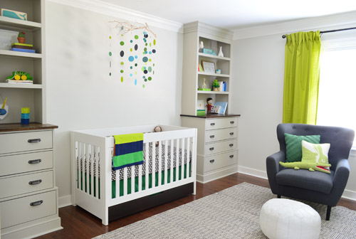
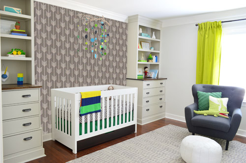
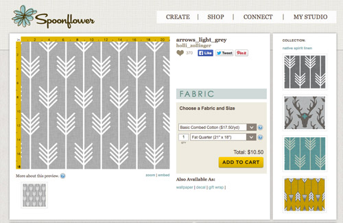
Ever since we imagined the idea of these built-ins, we pictured making the space between the two of them sort sort of accent – either with a color or pattern or treatment of some sort (in our first post we even mentioned a planked wall). Those ideas fizzled a little bit after completing the built-ins and realizing they had a lot of stuff on them (so we didn’t want to clutter up that space between them above the crib too). But neither of us could quite shake the idea of still doing an accent of sorts somewhere in the room. And one night while perusing possible wallpaper ideas for the showhouse, this puppy caught John’s eye.
He went rogue and without even consulting yours truly (cue your outraged gasps) and ordered a sample of it and its darker counterpart, for $5 each. With tax and shipping it was $13 total. Thirteen bucks that would either earn him a sour look from me, or make him a hero.
Well, he got the sour look alright – not for the $13, but because I can still vividly remember the claw-hands I had from wallpaper peeling. The good news is that when he explained that Spoonflower wallpaper is removable, all was right with the world again. And I really liked the pattern too (it feels like something that could grow with the bun, and not be too fleeting or “young baby”). The hero part is still TBD though.
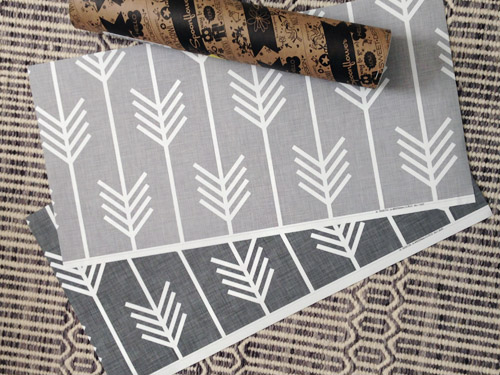
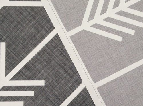
The samples arrived a couple of weeks later. They’re nice and big, and they revealed a detail that John hadn’t detected online: a subtle linen-like texture in the gray tones that I also thought was a nice touch.
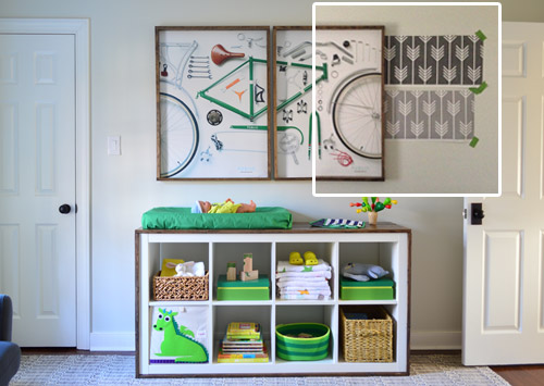
We ran upstairs to tape them up on the walls, just to get a feel for them in the room, and John went rogue again and put them on the wall with the bike prints. He must be getting braver (I think it’s the beard, guys). Since we’re both less tempted to mess with the look of the built-in wall, he said he thought that wall might be the answer instead. Forgive the terrible phone pic.
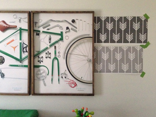
We snapped that with my iPhone so I could mock-up a full-wall version of the space in Photoshop. For those wondering how I did it, I just dragged the photo I shared above into Photoshop and laid it over another picture I took of (almost) the full wall. Then I just adjusted the size of the overlaid detail photo of the wallpaper until the patterns matched up and were the same size (I had the opacity of the top layer down a little so I could see when that happened).
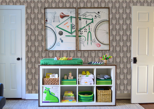
Once I knew the wallpaper pattern was the right scale, I put the opacity back up to 100% and cut out the rest of the iPhone pic so I was just left with a rectangle of wallpaper that I could manually tile until it filled the whole picture. Lastly, I cut out around the objects like the frames, doors, and the changing table (which were still in the image behind the tiled wallpaper) so as I deleted the wallpaper in front of them, it appeared to run behind them.
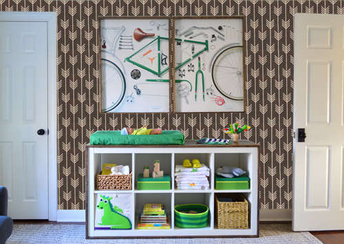
I also tried a version where I adjusted the color to look like the darker sample that John also ordered, but it was pretty clear to both of us that we preferred the lighter one.
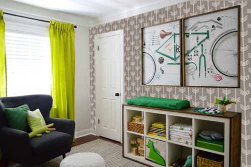
I thought it was a little hard to judge without seeing a plain wall meeting the accent wall to give it context, so I used the same technique to mock things up on this photo that I already had of the room. The colors probably aren’t perfect (the curtains look neon here), but it definitely helped us to picture everything – and it confirmed that the light version wouldn’t clash with the wall color or anything.
I still wasn’t convinced that was the right wall for an accent (I feared it might look too busy with the bike art in real life) so we also mocked it up on the crib wall to see if our original idea was better. We stared at it for a second, but I think we both prefer the bike wall. It just felt too crazy over the crib with all the items on the built-ins, the mobile, the patterned crib skirt, etc.
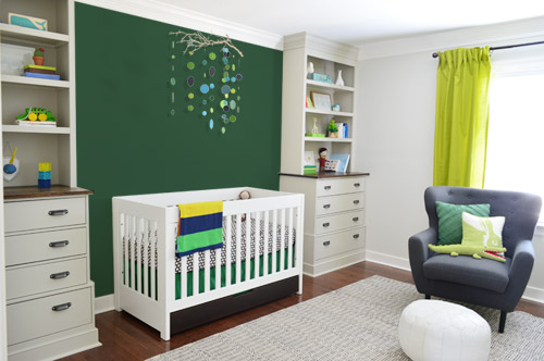
I also tossed some bold green up there just to see if a hit of that above the crib would be fun. It’s not great photoshop (looks pretty flat) but we didn’t really love it.
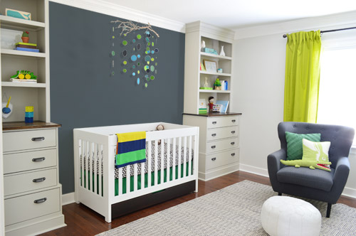
I also tried something sort of charcoal-ish to balance the chair out. This one made both of us do that “eh, not bad” face while staring at the computer. It looks kinda nice with the white crib and the mobile.
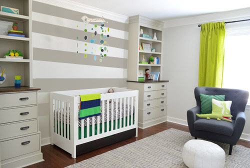
To add yet another possibility to the ring, a sweet reader named Annie had emailed us this quick mock-up she did with some chunky stripes painted behind the crib, which also gave us pause. You know we love a striped wall…
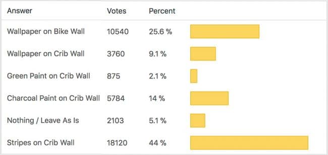
We’re still sort of letting things simmer, but we’d love to hear what you guys would do. Would you go for the wallpaper on the bike art wall? We like that it’s removable, so it’s not too much of a commitment. Do you prefer a solid wall of green or charcoal or even some stripes behind the crib? Or should we just stop being crazy and leave things the heck alone? Part of us is really excited to add one more layer of interest into the room (we’ve never put up wallpaper so that would be a new adventure – and most of the elements in here are really neutral). Then again, we still want this room to be a mixture of playful and cozy (as opposed to that’s-just-straight-up-crazy). What do you think?
VOTING ON THIS POLL HAS CLOSED

Greta says
What about hand-painting some (wallpaper-inspired) arrows in the color of the wallpaper or the charcoal? You would still be adding some visual interest without AS much as the wallpaper would provide. You could add them “randomly” around the room (ooooh, I’m wondering if it would look cool to have a few bleed around a corner?). I am envisioning you hand-painting, but if you could craft a stencil of sorts, Clara could help paint them too! It would add the more organic feel of Clara’s raindrops, which I love. OR you could do a few thinner stripes of that color and strategically place some scattered arrowheads along the stripes.
Susan says
I like the wallpaper on the bike wall and would do a similar lighter gray tone behind the crib to tie it together without making the crib wall too busy.
Virginia says
Maybe both?! Accent wall + wallpaper?!
I love the accent wall behind the crib especially with dark grey. It feels something is missing there.
The wallpaper is pretty cute on the opposite wall, too.
And how about the window wall?
Susan says
The wallpaper makes me dizzy. The stripes are just what you need to finish the room. I agree with the previous comment that the wallpaper takes you into over done land.
Wendie says
I love the wallpaper & that is coming from someone who is very anti wallpaper. When you have removed wallpaper from every wall of an entire house, that tends to happen. I like the wallpaper on the wall with the bike art. However, I still like the idea of a planked wall too.
Liz P. says
I haven’t commented in a while so I thought I’d chime in :) The moody charcoal between the built-ins drew me so much. The room is so light right now (in a good way!) that it adds just that bit of depth for balance. (For what it’s worth, I also liked the stripes–just not as much as the charcoal :) )
The wallpaper is adorable, and while I agree it works better on the changing table wall, I think, for my preference, the bike art + the arrow pattern is a bit overwhelming. However I’d love to see the pattern incorporated somewhere! It seems like it would be an easy-ish template to make–what about using the pattern as a stencil on a pillow or blanket or something similar?
Loving all this nursery progress! And your hallway update!
Liz P. says
Ok, another thought just popped in my head! What about that wallpaper pattern for the back of the built-ins? Since they’re already painted a darker color, you could try the stencil approach.
Petra says
I’m not sure if it has been mentioned/suggested by others, what are you planning to do for the wall with the door from the hallway? Maybe use that as an accent wall instead of by the crib or by the bicycle frame? Just an idea!
Also, what’s up with the beard? Looks great!!! I’m sorry if this is a repetitive question.
YoungHouseLove says
John’s just gone beardy this winter. And I love it. #beardpower
xo
s
Lisa says
I vote for wallpapering BOTH walls. I see it as less busy and adding more continuity for the room. Not wallpapering the other walls gives it that “newer” more modern edge that you (and everyone else) would want.
No matter what you choose to do, it is very exciting to see your vision come to life!
Beth says
I’m not wild about the wall papers either, detracts from the bike prints & shrinks the spaciousness feel. As you know, toys end up cluttering the space anyway. I like the chunk stripe idea behind the crib, but how about a shade or 2 lighter than the curtain color & the creamy white from the built-ins? I think that would tie in better.
Manda Wolf says
I had another idea. What about framing some of the wall paper and putting it on either side of the curtains. A nice 8X10 section with a white matt in a 11X14 frame. Two or three on each side on top of each other would look cool.
Casey says
This may be a crazy idea but what about using the wallpaper to make the stripes? You can have the arrows going opposite directions on each stripe. I would do it on the crib wall. :-)
Casey says
Or maybe the window wall?
Leiann says
Thanks for allowing us to vote! I put my vote in, but just have one general wonderment that I am not sure if you covered before…
I don’t think there is glass on the bike prints, which I love, BTW, but have you thought about what’s going to happen when the little guy decides to shower you guys (and the wall above the pad) while he is getting his diaper changed? I know they have those Pee-pee TeePee things for boys now, but I can’t see people going through the hassle of using them every time the little man gets changed. Anyway, I just thought I’d ask–I wouldn’t want those bike prints to get sprayed! :)
YoungHouseLove says
Oh yes, we chatted about that in the changing table post. We are prepared with lots of advice from those comments :)
xo
s
Monica says
I love the charcoal and I love the stripes. How about charcoal stripes? I love the wall paper, but I think its too busy on the bike wall and takes away from the great mobile you created on the crib wall.
Laura says
You and John make using Photoshop so easy. If you ever decide to teach a class on how to use it, I would be your first student :)
I love the stripe wall, that got my vote. I like the wallpaper, but I think it may be too busy for an entire wall. If you decide not to use it on the wall, think about framing them. I think putting both samples in two different white frames would be a good way to incorporate it into the room without it being too much.
I can’t wait to see what you decide :)
Niki says
I, like most of the others, like the stripes on the crib wall. I think its very sweet of John to be so involved in the nursery that he ordered wallpaper samples on his own. The pattern is really cute, I was thinking you could frame the samples and include them in the room. Ode to ol’ Daddies thoughtfulness.
Helene says
The wallpaper looks too busy with the bike art. But if you really like it you could always make a project out of those samples somehow, frame it and hang it in place of the bike art? Any way you decide, this is a breathtaking nursery. Congratulations!
P says
A couple of suggestions –
Stripe or dark accent crib wall (in colors already being used in the room, like the rug) might work.
Replace the curtains – they don’t match (they ARE neon) and don’t look lined or high quality – they look very transparent in pictures, which an indicator that the material is too thin not to be lined.
I have made mistakes in previous houses, trying to choosing a pattern like wallpaper (for me, it was curtain fabric), after substantial choices have already been made in different colors (wall color, rug, dresser color/top, crib bedding). Did you not originally envision having wallpaper and would like it now, or did you not design first around a patterned piece? I thought you did that in an earlier house with a napkin? I know you’ve jokingly moved the toy cactus into many shots, but that doesn’t have any of the various browns you’ve put in the room. And the bike prints don’t have the colors you are trying to add now. Is that part of what is making this difficult? There is alot going on in this room. Maybe introducing something you really love (like a patterned curtain), and paring back on the items that don’t fit in would help. Rooms definitely evolve over time! :)
Willa says
Whatever you two decide will look super, I know; and I love the wallpaper, but I am so fond of the bike prints that I think you should leave the wall behind them alone, to keep the focus on the bike alone. Maybe the wallpaper could go in another room? Having wallpaper removal experiences of my own makes the fact that it’s removable a really smart choice.
Also, I think the charcoal wall behind the crib makes that spot look so cozy and comfortable, just perfect to visually cuddle your baby without adding any distracting pattern or color.
Kathleen says
I’m kind of tired of stripes, it’s kind of been there, done that. I like the wallpaper on the bike wall, new and fresh!
Jessie G. says
looks like Annie’s mock-up seem to be a winner thus far. It looks really nice although the charcoal was a goodie too!
Pam/Digging says
You didn’t offer the option to choose two, but that’s what I would do: both the horizontal stripes over the crib and the wallpaper on the bike wall. That would give the room some zing!
Terry C says
My vote is for wall paper on bike art wall + the same shade of gray as an accent behind crib.
BUT THE REAL REASON FOR MY COMMENT… OMG, thanks for introducing me to Spoonflower! I have been struggling with wanting to do some sort of wallpaper on the backs of my living room built ins and have been searching for the right thing that I could tie in with pillows that are a complement. I can get the same pattern in wallpaper AND fabric from Spoonflower! And I’ve already seen a few patterns I like in the 2.5 minutes I spent on the website. YAHOO!
Sara Wilson says
I really like the wallpaper on the bike wall and I like the stripes on the crib wall. What about painting some horizontal arrows on the crib wall to coordinate with the wallpaper? It might not look as heavy as the stripes.
Jessica says
I think you should do stripes, but a darker gray to play off the dark gray chair. The wallpaper was a bit busy with the bike art. I am not a fan of the lime green curtains, I think the shade is off too lime, maybe it is the photo and in real life they are more grass/Kelly green.
Mindy says
I like the wallpaper but not on the crib wall, it makes the awesome mobil above the crib disappear. I do like the idea if a solid color there, it makes the crib pop without yelling “it’s a baby’s room!” Just some thoughts.
Dana says
I actually vote to wallpaper the bike wall AND the crib wall. I think it adds a little more zing to the crib wall as well, and having them opposite one another might be nice. Why choose? :)
You could stitch together some shots of the room in a panorama, with the wallpaper on both walls opposite one another, and see what you think. The light color will likely play nice with the colorful mobile. I personally just find it a pleasant choice for both walls. My $.02.
No matter what you choose, I’m sure it will look great. I already love where the nursery is going so far. Great choices, guys!
Cf Betcher says
Hi! I L OVE that wallpaper! I think I prefer it on the crib wall, but did you consider it on the window wall? Then the room won’t be lopsided, it won’t compete with other things on the wall (solid drapes+ solid chair + patterned wallpaper = :)). In general, I think accent walls should be opposite the door, to draw you into the room. Anyway, something to think about…
Jessica Leonard says
I think it would look good as is or painted a solid color, like the charcoal, but with four pieces of artwork flanking the mobile. Two on each side of it. Kind of like this: http://www.pinterest.com/pin/6333255698400037/
but with a gap in the middle to accommodate the mobile.
Francie says
I like it best plain! I do like the accent wall in the space behind the crib but I wouldn’t do it while the mobile is in that space. I love the way the mobile looks in the plain white space. Maybe this is something you can plan for once you’re ready to take down the mobile and convert to a big boy bed!
Karri says
Stripes are so….yesterday :) The wallpaper with the rest of the walls plain is fun and different. No green. That reminds me of the 90’s hunter green fad. Shudder.
Casey Severinghaus says
I have a charcoal and white strip wall in my kitchen and removable wallpaper accent wall in teal and white in my office. Love both!
From your pics, I love the stripes behind the crib.
denise says
I like the paint on the crib wall and the wallpaper on the crib wall. I think the wallpaper with the bike prints is too busy. Also, I think putting the wallpaper on the bike wall is accenting the wrong wall in the room. The crib and the built-ins are clearly the focus of the room. If you accent the opposite wall, your eyes will not be able to figure out where to rest and the room will feel noisy. I do love that wallpaper though!
Angel says
Oh how fun! I opened up YHL this morning and see the exact same pattern I fell for on Spoonflower. I plan on sewing both my girls’ toddler bed sets with the organic sateen they have, and the large, textured, light grey arrows are going to be one side of the comforter. Thank you for turning me onto that site by the way! I was able to order a Seahawks Lego fabric for my daughter’s fifth birthday dress, and you really can’t more specific than that.
I like the idea of walking into the nursery and not sewinf the arrows right away, and then enjoying them as you change a diaper or sit in the comfy chair.
Addie says
Gotta say I LOVE that wallpaper, but I think the space above the crib needs a little something, and I love how the charcoal wall pulls in the chair even more. It makes it cozier, too. I wish I could see how both would look! (I mean together… I think it would be awesome).
Susan Z.F. says
Charcoal crib wall would pop out those built ins, contrast so nicely against the white crib, tie into the chair and bring in the curtains too. I do love the wallpaper — would you regret it on the bike wall if you decide to swap out that art in the future? Baby Barnacle may enjoy looking at it during diaper changes – sort of like a “mobile”
Stripes on the crib wall would be nice but would it give your crib wall too many horizontal lines given the lines of the shelves and the lines of the drawers. Maybe a fewer number of stripes and wider ones would do the trick -? Does Clara have a preference?
Look forward to reading your final choice which will surely fit your fantastic room no matter what you decide or what we suggest!
Angel says
Oh, and I would love to see a Spoonflower YHL discount code!
Liz says
I’m loving the light grey arrows on the bike wall and the stripes behind the crib. I can see how doing both could get too busy. What if you did the stripes behind the crib and painted the bike wall the same color as the grey stripe? So it would be a solid accent wall.
Ashley says
I love the striped wall – have you thought about trying colors from the blanket hung on the crib? Perhaps a nice navy, or kelly green, even a lime green? I’m looking forward to seeing the end result!
Carla says
I’m going to agree with every one who says wallpaper and charcoal accent wall. It would make a nice balance!
Rose says
I like the wallpaper. I wasn’t totally sold until you included the angle with the window wall and chair in it. I thought it gives the room a nice cozy feel and gives you guys something to look at if you’re sitting in the chair nursing or reading the Barnacle a book or whatever.
Although now I want to see what the other wall would look like with the door in it and the wallpaper next to it. :)
Stripes on the crib wall were cute too but I feel like that’s so overdone in nurseries. Whatever makes you guys happy though!! That’s what it’s all about. :)
beth says
i choose a different option! the curtain wall — it would look amazing! and it leaves nothing to balance. :)
Emily says
As a mom of two young boys I wanted to throw out there that if you wallpaper the wall over the changing table, it will get ‘sprinkled’ early and possibly often. I would be a little concerned about how the wallpaper would handle being, ahem, ‘christened’ :p
That being said, I really liked the stripes over the crib or just leaving things as is.
Good luck!
-Emily
tiffany wichert says
as a photographer personally I would like that wall white with a large family print (20×30) hanging in the middle…but that’s just me…hahaha
Amanda says
Love all of the layers! What about doing the stripes on the bike print wall and then a solid wall of the stripe color between the built ins? I’m sure you’ve thought of that one already (or there could be comments on it already), but maybe it would be more balanced without being too busy?
Cindy says
None of them feel quite right to me. There are a few that feel “close”. I know you mentioned the idea of a wood plank wall… I would love to see a mock up of that in the space! I think that would add a “cozy” factor with the room & be just the added touch that you are looking for!
2 Options:
1) White/light wall, similar to what Jessie just did over at Cape27. You could even paint the same wall color, but there would be that subtle texture added. http://www.cape27blog.com/
2) Pallet planked wall, similar to what is seen in this Pinterest picture
http://www.pinterest.com/pin/503136589591152843/
My two cents! Can’t wait to see what you two decide!
Amanda says
I think stripes on the crib wall and on the bike frame wall might be neat.
keely says
I would like to know where you got the print of the bicycle? Thanks.
YoungHouseLove says
That was art at the Gap a while back and we asked if we could have it after they were done with it instead of them throwing it away. John made the frames himself.
xo
s
MM says
I love how the stripes tie in the grey build ins and the white crip. It also compliments the mobile and makes those little colored circles pop. :-) The wallpaper -while it is nice and I like that you are open for sth new- looks a bit too busy for me. How much wood it be to use it on the entire wall? Have you considered to use it on the 4th wall,the one with the entry?
YoungHouseLove says
Thanks for all the suggestions guys! Can’t wait to read through them all again with John tonight! Will definitely keep you posted as we chew on all of these ideas ;)
xo
s
Thais says
I agree with opinions voiced above: don’t like the wallpaper at bike wall at all. It looks too busy with the oversized art and filled Expedit. Of course I don’t know how it looks in person, but to me it made the room look smaller. Also agree it would make crib wall look emptier. Which I think it does look at the moment. Maybe because the built-ins don’t touch the crib? And that’s why I am in love with the stripes idea. I love it!!!! It fills the space in a subtle and elegant way without stealing the thunder from the built-ins, mobile etc.
Btw I found one thing in terms of home improvement that serms to be better here in the UK: most if not every retailer sends wallpaper samples free of charge (not even postage!) I guess it is because people tend to use wallpaper more often here… At least it seems to be the case from what I see from American blogs and magazines.
Misty says
I loooooooooove that wallpaper! I do think you need something on the cub wall, but I LOVE the arrow paper on the bike wall!!!!!!