I know it sounds kinda crazy, but after painstakingly removing five different wallpapers from this house… we’re considering putting some up. I think I even passively mentioned it in this post about the nursery mobile.
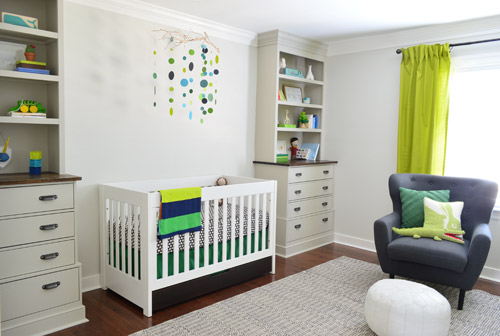
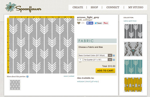
Ever since we imagined the idea of these built-ins, we pictured making the space between the two of them sort sort of accent – either with a color or pattern or treatment of some sort (in our first post we even mentioned a planked wall). Those ideas fizzled a little bit after completing the built-ins and realizing they had a lot of stuff on them (so we didn’t want to clutter up that space between them above the crib too). But neither of us could quite shake the idea of still doing an accent of sorts somewhere in the room. And one night while perusing possible wallpaper ideas for the showhouse, this puppy caught John’s eye.
He went rogue and without even consulting yours truly (cue your outraged gasps) and ordered a sample of it and its darker counterpart, for $5 each. With tax and shipping it was $13 total. Thirteen bucks that would either earn him a sour look from me, or make him a hero.
Well, he got the sour look alright – not for the $13, but because I can still vividly remember the claw-hands I had from wallpaper peeling. The good news is that when he explained that Spoonflower wallpaper is removable, all was right with the world again. And I really liked the pattern too (it feels like something that could grow with the bun, and not be too fleeting or “young baby”). The hero part is still TBD though.
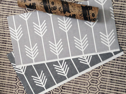
The samples arrived a couple of weeks later. They’re nice and big, and they revealed a detail that John hadn’t detected online: a subtle linen-like texture in the gray tones that I also thought was a nice touch.
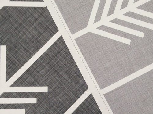
We ran upstairs to tape them up on the walls, just to get a feel for them in the room, and John went rogue again and put them on the wall with the bike prints. He must be getting braver (I think it’s the beard, guys). Since we’re both less tempted to mess with the look of the built-in wall, he said he thought that wall might be the answer instead. Forgive the terrible phone pic.
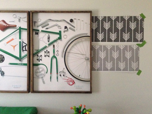
We snapped that with my iPhone so I could mock-up a full-wall version of the space in Photoshop. For those wondering how I did it, I just dragged the photo I shared above into Photoshop and laid it over another picture I took of (almost) the full wall. Then I just adjusted the size of the overlaid detail photo of the wallpaper until the patterns matched up and were the same size (I had the opacity of the top layer down a little so I could see when that happened).
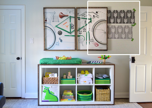
Once I knew the wallpaper pattern was the right scale, I put the opacity back up to 100% and cut out the rest of the iPhone pic so I was just left with a rectangle of wallpaper that I could manually tile until it filled the whole picture. Lastly, I cut out around the objects like the frames, doors, and the changing table (which were still in the image behind the tiled wallpaper) so as I deleted the wallpaper in front of them, it appeared to run behind them.
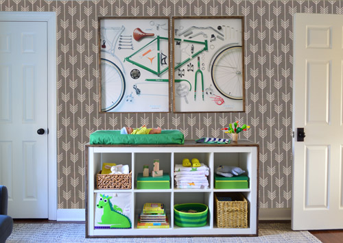
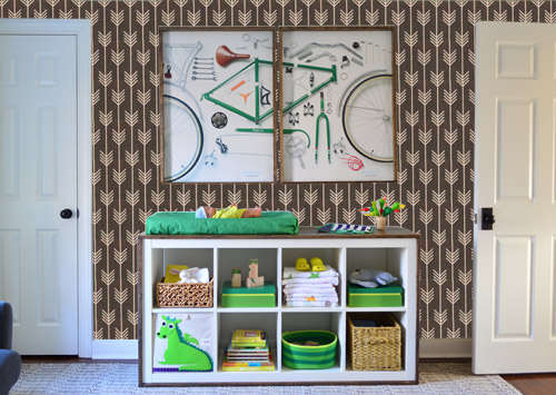
I also tried a version where I adjusted the color to look like the darker sample that John also ordered, but it was pretty clear to both of us that we preferred the lighter one.
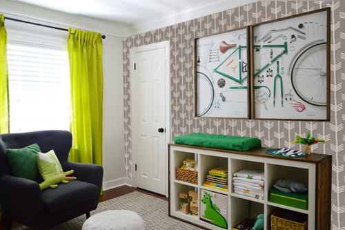
I thought it was a little hard to judge without seeing a plain wall meeting the accent wall to give it context, so I used the same technique to mock things up on this photo that I already had of the room. The colors probably aren’t perfect (the curtains look neon here), but it definitely helped us to picture everything – and it confirmed that the light version wouldn’t clash with the wall color or anything.
I still wasn’t convinced that was the right wall for an accent (I feared it might look too busy with the bike art in real life) so we also mocked it up on the crib wall to see if our original idea was better. We stared at it for a second, but I think we both prefer the bike wall. It just felt too crazy over the crib with all the items on the built-ins, the mobile, the patterned crib skirt, etc.
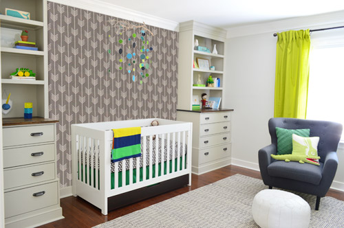
I also tossed some bold green up there just to see if a hit of that above the crib would be fun. It’s not great photoshop (looks pretty flat) but we didn’t really love it.
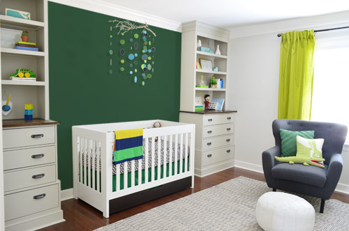
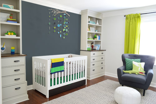
I also tried something sort of charcoal-ish to balance the chair out. This one made both of us do that “eh, not bad” face while staring at the computer. It looks kinda nice with the white crib and the mobile.
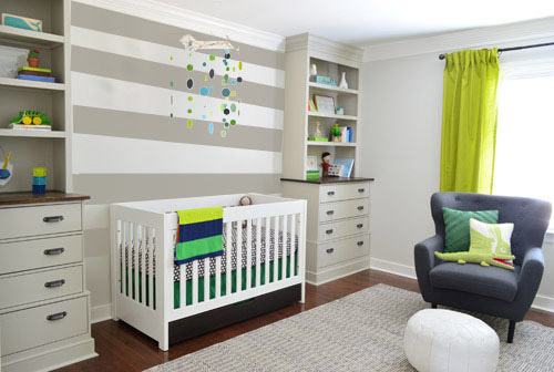
To add yet another possibility to the ring, a sweet reader named Annie had emailed us this quick mock-up she did with some chunky stripes painted behind the crib, which also gave us pause. You know we love a striped wall…
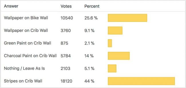
We’re still sort of letting things simmer, but we’d love to hear what you guys would do. Would you go for the wallpaper on the bike art wall? We like that it’s removable, so it’s not too much of a commitment. Do you prefer a solid wall of green or charcoal or even some stripes behind the crib? Or should we just stop being crazy and leave things the heck alone? Part of us is really excited to add one more layer of interest into the room (we’ve never put up wallpaper so that would be a new adventure – and most of the elements in here are really neutral). Then again, we still want this room to be a mixture of playful and cozy (as opposed to that’s-just-straight-up-crazy). What do you think?
VOTING ON THIS POLL HAS CLOSED

Caren says
I know that it is “the bike art wall,” but I agree that the prints look a little busy in front of the paper. Would you consider moving the art to the wall across from the window?
Love the way the wallpaper surrounds the closet – like what you were planning to do with a fun paint color on that door, but in reverse.
I’m learning so much from your design process – thanks!!!
YoungHouseLove says
The wall across the window could only house one bike print (there’s the doorway to the room on that wall and the built-ins bumping into it on the other side, so it’s just a pretty slim strip of wall). Love all the suggestions though guys! Thanks for playing along. I’m sure we’ll change our minds ten million times with all of the awesome ideas flying around!
xo
s
Penny Smith says
Stop apologizing when you take iPhone pictures!! I got the photoshop express app and let me tell you, it rocks!! Worth the extra $ for the noise reduction edit too…
My second choice would be the crib wall wallpapered (I love how it looks) third choice horizontal stripes and art piece with the arrow paper. :)
YoungHouseLove says
Never even heard about that app, Penny! Thanks!
xo
s
Tara G. says
I like the stripes- it seems to tie the whole wall together and would look great when you transition to a big boy bed with the headboard up against it.
Kat@junktogem says
I agree…it would work with a toddler or double bed with headboard later…or can easily be painted over. :)
Jessica says
I think a while back you guys had mentioned doing a green door for the closet… Is that still in the mix? I love the wallpaper, but would really love a bright door like Clara’s too!
Great work, guys!
YoungHouseLove says
We chatted about that on the second page of comments I think (either that or the first). Hope it helps!
xo
s
rachel says
The builtins and mobile already create a feature/focal wall in the room. You don’t need to do more. The lines of the shelves and drawers in the builtins already give a striped effect to that side of the room, so MORE stripes would compete too much. And the builtins are so visually heavy that the wall between them should be left as is. Just let the builtins and the mobile do their thing.
The changing table is already pretty busy, and so is the bike art above it. Patterned wallpaper seems like overkill. And with only one window in the room, wallpaper on the changing table wall would make the room too dark and heavy.
Pat S says
I like the paper on the bike wall and I would like the stripes on the crib wall BUT I would make the stripes vertical to echo the directional print of the wallpaper.
Julianne says
What about doing the wallpaper on the window wall? That way it’s broken up by the window, and doesn’t have busy built-ins or busy bike prints to compete with? Or the wall opposite the window… not sure what that wall is looking like right now.
You guys always do awesome things so I’m sure you’ll make a great choice in the end.
Kirstin says
Would you consider these watercolor mustaches?!
http://www.spoonflower.com/wallpaper/1209293
Kim says
I love the arrows and I love the bikes but I think together they are both too much of the punch that it is too busy – same with the arrows on the crib wall. I like the stripes but again I think it hides the mobile. I like the gray wall it makes the crib and mobile and items on the built ins really pop. It also does something to elevate that wall I cant explain it.
Anna says
I really like the wallpaper on the bike print wall, but I kind of want to see what it would look like upside down…in my mind it would be almost like cool, graphic trees :). I do agree that the crib wall needs something, not sure what though. Maybe some kind of architectural detail like board and batten? That would keep it simple but also add subtle interest.
Tyra says
I voted for charcoal or stripes. Is charcoal stripes an option? Love how it brings out the chair but stripes are so interesting!!!!
Amy J. says
The fun thing with the striped wall is that you can still paint the closet door!
Ann says
I like the striped wall instead of paint or wallpaper. The stripes get the room a fun, light vibe whereas the other options feel heavy and dark to me. That’s just my opinion though!
N. says
They all look good! But I like the wallpaper best. The stripes immediately drew my eye towards all the straight lines in the room (the crib, the bookshelves, the rug, the curtain) and seemed to take some focus off the bookshelves. Where as the wallpaper made that entire wall a focal point and helps the book cases stand out. Just my opinion of course, and in reality they all would be great choices!
Leslie says
Each time I scrolled down I was more like “oooh I REALLY like that one!” so by the time I got to the stripes I was totally sold on them. I did a striped accent wall in my toddler son’s room with BM’s Gray Owl and White Dove that looks pretty much just like the one you showed. It is perfection. I think the arrows are so cool though and I would love to see them used somewhere. Maybe even a small amount to cover a cardboard box to display in the expedit or to line the drawers of the built ins…IDK. I love the stripes though! Two thumbs up on the nursery!
Pei says
What about using the wallpaper as the brown stripes in the striped option?
Shannon says
Stripes on crib wall are good but frankly unnecessary. The wallpaper on the bike wall is MUCH too visually busy. Paint that wall gray? I like the accent wall idea & I actually loved the gray, but not behind the crib. It’s coming together beautifully & already looks great.
Amy says
That wallpaper is gorgeous! Love, love, love it. Like some of the others, I feel like it is a tad busy with the bike prints on the bike wall. Looking at the pics, when the main door is open, the two doors on the bike wall seem to parallel the built-ins on the crib wall, so the room has the illusion of being more balanced and harmonious as is. Using the wallpaper on the window wall or in the closet, as others have suggested, sounds like a great way to incorporate it without making the crib and bike walls seem like they are having a game of tug-of-war for visual interest. :)
Jessica says
Stripes on the crib wall and wallpaper on the bike wall! Choose the two colors from the wallpaper for your stripes!
Julia at Home on 129 Acres says
I like adding some interest to the crib wall… either the stripes or the wallpaper.
I’m sure someone’s already sent you this link, but Sarah Richardson did a nursery with a very similar colour scheme on one of her shows last year: http://www.hgtv.ca/sarah101/episode/?epId=276983.
Rachel Snodgrass says
As much as i LOVE the color and pattern of that wallpaper, it feels very busy and dark to me. Those stripes seem just perfect though, they add interest but still keep the room bright and let the mobile pop! If you don’t use the wallpaper, i hope you find a cute way to repurpose those samples!
sarah says
Stripes and wallpaper! Go with less contrast on the stripes than shown in the picture!
Hilary says
I love the stripe, but I think the arows are more uniquely YOU. Is there a neutral on neutral arrow… a bit lighter? Because then you could put that on the bike wall but it wouldnt be so in yo face so you could still paint the crib wall an accent color.
Susan says
The wallpaper on the bike wall is great!
You could color match the green from the curtains OR from the bike print for the crib wall. Or even do a reclaimed wood wall and stain it the same as the bookcase countertops. That would add warmth and depth.
No more gray-it’s already a bit drab in there. Save that color for when he is a moody teen and you want him to chill LOL.
The stripes are NOT cool ( why do people like these? They are overdone in blogland for sure)…because they compete too much with the horizontal shelves and the horizontal blanket you made. Maybe if they were VERTICAL stripes- then they would mimic the arrows, graphically, and tie in a bit better.
One last idea-you could WP the bike wall, then copy the arrow design in a huge graphic behind the crib. That would be cool b/c the circles on your mobile wouldn’t compete with the hard lines of the arrows. Looking forward to whatever you decide..
PS- LOL, don’t let the public decide-remember how they vote on American Idol-they don’t really have a clue, LOL
Marianne says
I’ve been lusting over that same wallpaper recently! I’m wanting to cover the big ugly black side of my fridge with it. Now that you’ve pointed out the lovely linen background I may have to do it!
I love the wallpaper on the crib wall (sans the mobile). The changing table wall looks too busy and the bike print doesn’t look like the focus anymore. They seem to clash a little.
But then I also like the stripe wall or the charcoal wall.
Tiffany says
Would you consider wallpapering the closet for a fun little surprise when you open it? Also, love the stripes idea behind the crib! Genius!
Christine says
Hope I’m not repeating someone else’s idea – but why not put the wallpaper on the window wall, behind the chair?
Nicole says
I love love love the wallpaper on the bike wall. I think it looks nicely layered in a well designed room kind of way. I thought I would like it behind the crib but I ended up thinking anything behind the crib dwarfed the mobile and it didn’t pop as much as it did before. Can’t wait to see it finished!
Jessica C. says
I like the darker arrow wallpaper on the framed bike print wall (could change those bike prints out to something a little simpler or add a thick white matting) AND the charcoal wall on the crib side. Maybe you could do the charcoal wall with stripes but make them subtle (thick stripes one charcoal matte paint, one charcoal shiny paint).
Ellia says
I voted for the wallpaper on the bike art wall (because it would be awesome!), but I also think that a some plank/wainscoting (like in your kitchen) would be really cool behind the crib. If it was painted the same color as the walls, it would add a little texture but not make the wall too ‘heavy’ visually. Y’know what I mean? :)
Ellia says
(and I meant the entire wall, floor to ceiling!)
Rebecca says
I didn’t see anyone else suggesting this, and my suggestion is for an overhaul.
Paint the whole room the slightly dark kelly green, use the dark arrow paper on the bike wall, and paint the built-ins white. I’d also lose the bike art. I think it just doesn’t really fit with anything else in the room and holding on to it is messing with the room’s design.
Jacki says
The wallpaper behind the bike prints is too busy; it takes away from the prints. I think the stripes on the crib wall ties the two built-ins together nicely while adding a focus to the crib. It is soothing and calming but yet adds some interest.
Carrie says
I loved it on the bike art wall and also on the crib wall! What about doing it all the way on the art wall and then contained within a frame on the crib wall? With the mobile centered it will look like that is the framed art. Just a thought. I also loved the solid gray!
YoungHouseLove says
Thanks for all the ideas and suggestions guys! We’re both going to sit down and read them all tonight together to see what we think (and then will probably continue to change our minds for a while, haha!). Love hearing all the ideas :)
xo
s
Clara Uribe says
I would do the light paper for the wall with the frame, and the gray stripes for the crib!! ?
Erin says
How about chalkboard paint behind the crib? That way it could add a little depth behind the crib and be as clean or crazy as you feel in the moment. And I still love the wallpaper on the changing table wall so each side gets some love and maybe will balance the whole room out.
Stephan says
First time poster. I vote the strips or arrows pointing up. I love the rug and chair as well. Actually, I think the room is great and will work well even for a “big boy” minus the crib of course. Nice to see someone think long term and not a throw away nursery that needs to be redone in a couple years. Good job! I was wondering though if maybe different curtains would work better with the grey (though they look better than with the paint options). The chartreuse seems to distract from the rest of the room’s elements. The blue and darker green look lovely. Just my thoughts. Are you going to paint the built ins a coordinating color or white or something?
rachael says
arrows on the crib wall!
Carolyn H. says
I’m so excited to see how this nursery is coming together!
I’ve read your blog since your first house. I feel weird telling you this but — *sniff* — you guys inspire me! When we had our baby (now 14 months) we bought the same crib you have; your research seemed solid, and you made me think about things like choosing real wood and a style that worked for multiple kiddos. And when it came time to choose diapers, well, we went with cloth.
So… I was just thinking about you guys and how you’re doing disposables until the Bun grows into your existing cloth stash. And I was also thinking of my friend Amanda who has launched this AWESOME line of cloth diapers… She has this new thing where she’ll rent you gorgeous newborn-sized cloth diapers for $25 a month [LINK below]. Give them back when the Bun gets bigger. It’s a cheaper, better-looking option that you probably haven’t considered.
Disclosure: I have no financial connection to Amanda and I don’t profit from my recommendation in any way. I just thought that, you know, she’s awesome and you’re awesome and here’s an option you should know about.
https://www.etsy.com/listing/179655016/newborn-diaper-rental
YoungHouseLove says
Thanks so much for the tip Carolyn! Sounds like a really cool service!
xo
s
Roberta says
I would consider the pale arrow wallpaper on the bike wall. Love the linen texture but maybe too busy. And I like the gray and white stripes on the wall behind the crib. But there is a lot going on vertically on that wall with the built-ins and crib slats and also horizontally with the shelves and drawers. I would consider painting an oversized herringbone pattern behind the crib to mimic the arrow and provide movement. Sort of like the show house dining room wainscoting. Or maybe an oversized silouette of an arrow motif to echo the wallpaper without being busy. I also think I would consider adding molding to the wall and painting the wall white to add more subtle interest and texture, either herringbone or maybe shaker style.
Andrea says
I chose wallpaper on the crib wall, just because I think it would be fun to add some sort of neutral pattern over there. But I’m thinking the arrows are a little too busy. I like the scale of the stripes, but are they overdone? I don’t know? I agree that adding to the bike wall would make the built-in wall look even more empty. You guys don’t sound too excited about either of the choices above, but I know you won’t make a decision until you are confident it will work (you guys are good like that). I’m sure you’ll keep us posted and it will be fabulous!! :)
Jennifer says
I love the wallpaper, and I’d be curious to see how it looks on the window wall as so many have suggested. It does look good on the bike pic wall though. The dark color behind the crib is awesome, but I wouldn’t go as dark as the charcoal.
Clara Uribe says
Even as someone else said, I would extend the light paper to the window wall ????
Reva says
I love the idea of wall paper on the bike wall and I love that pattern, but I worry it’s too high contrast for that small and already art and color filled space, and once there is a little person in there making big messes its going to be even more overwhelming. I personally think a lower contrast pattern would work nicely in that spot. I like the stripes. Maybe stripes on the bike wall?
Jess says
I love the stripes on the crib wall (like many others, I guess!)
Another idea also popped into my head. At Christmas I had some really pretty gray and white faux bois wrapping paper, similar to the first package shown here:
http://sophiasdecor.blogspot.com/2013/12/the-scoop-on-creating-handmade.html
I think something like that would look great on the wall behind the crib! Nice texture/pattern but not too in-your-face. (Assuming you could find a similar wallpaper!)
Chantal says
I am loving the way the nursery is coming together. I voted for the striped wall. It’s subtle so it let’s the mobile shine, but provides a nautical nod of interest to the blank wall. Have ya’ll considered a fish scale wall? Either with wood planks like in the details on gingerbread houses or using felt or paper in the wall color to give texture without being too busy.
I can’t wait to see what you decide!
Thais says
You guys opened a can of worms! We YHL readers certainly are full of ideas and opinions! :)
YoungHouseLove says
We love it! Reminds us of all the ideas on the painted wall for Clara’s room. There were so many good ones it was hard to decide, but we ended up combining a few and asking Clara to weigh in and we couldn’t love that wall more :)
xo
s
sue says
call me crazy, but i love the combo of the wallpaper behind the bikes AND the charcoal wall behind the crib (it makes the mobile the feature & pulls the chair into the scheme better too)… love following your updates!
LMH says
I like the idea of something on BOTH walls, as mentioned by many PPs … what about the dark wall paper on one wall, and the lighter one on the other? Dark on bike, light on crib? Or vice-versa?
Laura says
I like the stripes on the crib wall and the lighter arrows on the bike wall. The wallpaper does make the bike pictures not stand out as well. At least not the frames.
Lisa says
I am torn between the charcoal and the stripes. I’m sorry, but I really don’t like the wallpaper at all. It is just too much.