I know it sounds kinda crazy, but after painstakingly removing five different wallpapers from this house… we’re considering putting some up. I think I even passively mentioned it in this post about the nursery mobile.
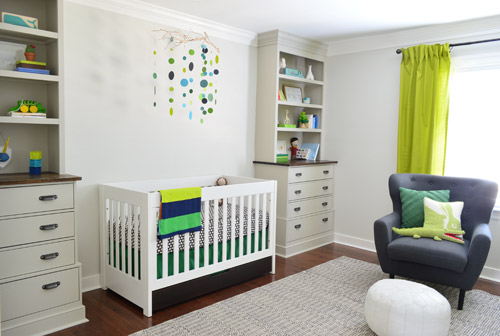
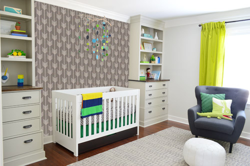
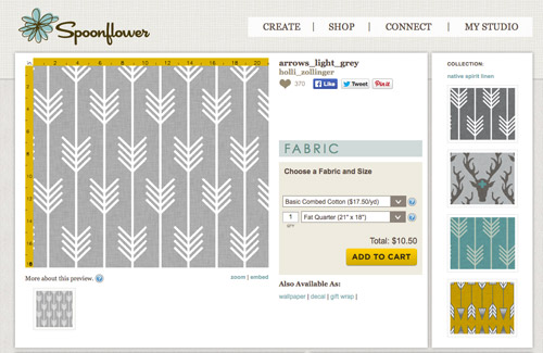
Ever since we imagined the idea of these built-ins, we pictured making the space between the two of them sort sort of accent – either with a color or pattern or treatment of some sort (in our first post we even mentioned a planked wall). Those ideas fizzled a little bit after completing the built-ins and realizing they had a lot of stuff on them (so we didn’t want to clutter up that space between them above the crib too). But neither of us could quite shake the idea of still doing an accent of sorts somewhere in the room. And one night while perusing possible wallpaper ideas for the showhouse, this puppy caught John’s eye.
He went rogue and without even consulting yours truly (cue your outraged gasps) and ordered a sample of it and its darker counterpart, for $5 each. With tax and shipping it was $13 total. Thirteen bucks that would either earn him a sour look from me, or make him a hero.
Well, he got the sour look alright – not for the $13, but because I can still vividly remember the claw-hands I had from wallpaper peeling. The good news is that when he explained that Spoonflower wallpaper is removable, all was right with the world again. And I really liked the pattern too (it feels like something that could grow with the bun, and not be too fleeting or “young baby”). The hero part is still TBD though.
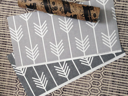
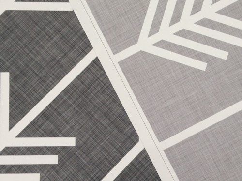
The samples arrived a couple of weeks later. They’re nice and big, and they revealed a detail that John hadn’t detected online: a subtle linen-like texture in the gray tones that I also thought was a nice touch.
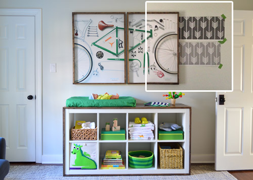
We ran upstairs to tape them up on the walls, just to get a feel for them in the room, and John went rogue again and put them on the wall with the bike prints. He must be getting braver (I think it’s the beard, guys). Since we’re both less tempted to mess with the look of the built-in wall, he said he thought that wall might be the answer instead. Forgive the terrible phone pic.
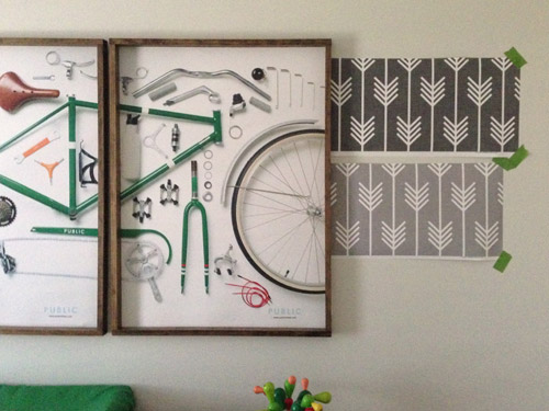
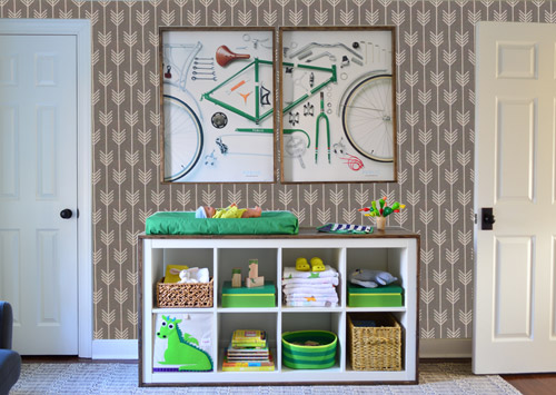
We snapped that with my iPhone so I could mock-up a full-wall version of the space in Photoshop. For those wondering how I did it, I just dragged the photo I shared above into Photoshop and laid it over another picture I took of (almost) the full wall. Then I just adjusted the size of the overlaid detail photo of the wallpaper until the patterns matched up and were the same size (I had the opacity of the top layer down a little so I could see when that happened).
Once I knew the wallpaper pattern was the right scale, I put the opacity back up to 100% and cut out the rest of the iPhone pic so I was just left with a rectangle of wallpaper that I could manually tile until it filled the whole picture. Lastly, I cut out around the objects like the frames, doors, and the changing table (which were still in the image behind the tiled wallpaper) so as I deleted the wallpaper in front of them, it appeared to run behind them.
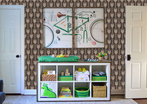
I also tried a version where I adjusted the color to look like the darker sample that John also ordered, but it was pretty clear to both of us that we preferred the lighter one.
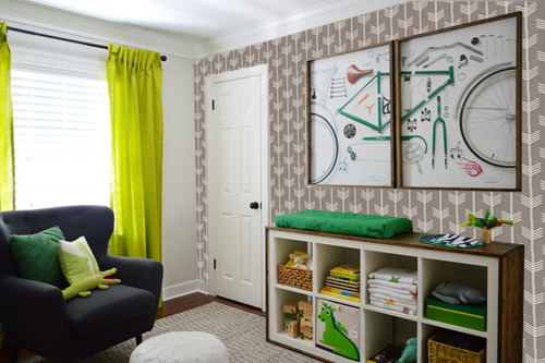
I thought it was a little hard to judge without seeing a plain wall meeting the accent wall to give it context, so I used the same technique to mock things up on this photo that I already had of the room. The colors probably aren’t perfect (the curtains look neon here), but it definitely helped us to picture everything – and it confirmed that the light version wouldn’t clash with the wall color or anything.
I still wasn’t convinced that was the right wall for an accent (I feared it might look too busy with the bike art in real life) so we also mocked it up on the crib wall to see if our original idea was better. We stared at it for a second, but I think we both prefer the bike wall. It just felt too crazy over the crib with all the items on the built-ins, the mobile, the patterned crib skirt, etc.
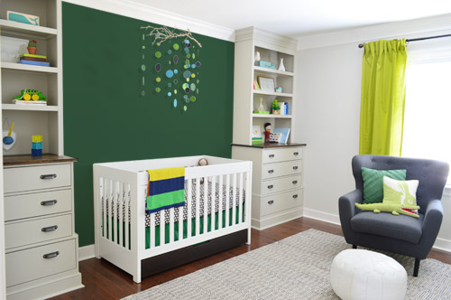
I also tossed some bold green up there just to see if a hit of that above the crib would be fun. It’s not great photoshop (looks pretty flat) but we didn’t really love it.
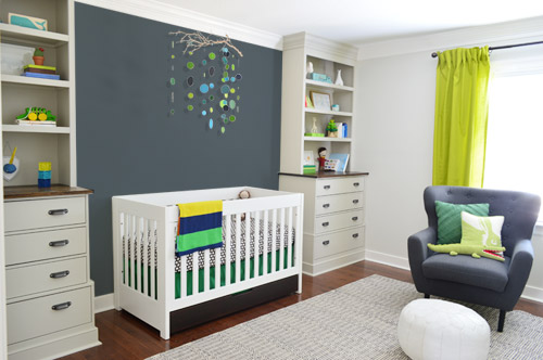
I also tried something sort of charcoal-ish to balance the chair out. This one made both of us do that “eh, not bad” face while staring at the computer. It looks kinda nice with the white crib and the mobile.
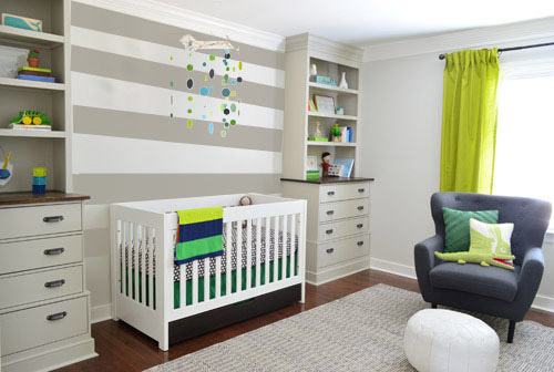
To add yet another possibility to the ring, a sweet reader named Annie had emailed us this quick mock-up she did with some chunky stripes painted behind the crib, which also gave us pause. You know we love a striped wall…
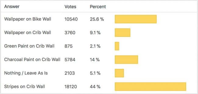
We’re still sort of letting things simmer, but we’d love to hear what you guys would do. Would you go for the wallpaper on the bike art wall? We like that it’s removable, so it’s not too much of a commitment. Do you prefer a solid wall of green or charcoal or even some stripes behind the crib? Or should we just stop being crazy and leave things the heck alone? Part of us is really excited to add one more layer of interest into the room (we’ve never put up wallpaper so that would be a new adventure – and most of the elements in here are really neutral). Then again, we still want this room to be a mixture of playful and cozy (as opposed to that’s-just-straight-up-crazy). What do you think?
VOTING ON THIS POLL HAS CLOSED

Sharon says
Not sure if anyone has suggested this but have you considered stripes on the change table wall and the darker color of the stripe painted solid on the crib wall? This might be another idea to mock up
brett says
My 2 cents …
I think the stripes take away from the amazing built-ins. I’d keep that wall painted white. I think the space above the crib is calling for a very cool large photograph of a tree (maybe black and white) that the branch hangs in front of.
The wallpaper is amazing and looks really great on the wall with the bike print – your little boy will love it!
Jane B says
I hate to say… but really didn’t like the idea of wallpaper, it felt really busy at least for my taste.
But as they say – you do what YOU love and make YOU happy. So just follow your own instincts.
I did like the stripes on the wall behind the crib, or the grayish tone.
On a different note, did I miss the update on the changing table/cubicle? It’s so adorable! Love it! I thought you still had the older wood dresser in there.
YoungHouseLove says
Thanks Jane! Here’s that post for ya: https://www.younghouselove.com/2014/02/changing-tables-and-our-minds/
xo
s
Elise says
The arrows are gorgeous, but they are pretty busy. What if you did something like this with arrows instead? http://www.remodelista.com/posts/diy-stenciled-bedroom-walls-for-kids-room
I think it’s a shame to let go of the patterned idea, it suits the room really well.
YoungHouseLove says
Love that too! Thanks for all the links and ideas, guys!
xo
s
Sarah says
I voted but I was actually thinking, why not do the wall paper on the wall with the window? The mobile and the bike art bring nice pops of color to both sides of the room I feel like that back wall needs something interesting that you see when you first walk in.
lauren says
I agree! Posted that below.
Sandi says
What about stripes on the bike wall?
Jenny says
I love the idea of stripes behind the crib. The wallpaper is awesome, too so I am torn. Where did you get the changing table/storage piece? It really reminds me of an Ikea Expedit, but I love the dark wood trim.
YoungHouseLove says
Thanks Jenny! It’s an expedit that we altered! Here’s that post for ya: https://www.younghouselove.com/2014/02/changing-tables-and-our-minds/
xo
s
Laura says
What about using the wallpaper to line the back of the built-in shelves?
Charlene says
I teach color theory. The most important principle is to look at the way light and dark contrast in a room, because your eye automatically goes to the place with the strongest light/dark contrast. If you put stripes behind the crib, the stripes become the largest, strongest light/dark contrast and that side of the room is all about the stripes. With a solid color, especially a dark one, the wall is about the crib first, as the largest contrast, then about the items on the shelves. Squint at your pictures, and you’ll see what I mean. I think a baby’s room should be more about the crib and toys/books, etc., than the wall stripes. Also, putting the wallpaper up beside the bike prints makes the prints disappear into the busyness of the wallpaper. Not a bad thing, but might not be what you intended.
Courtney H says
I 100% agree with you Charlene. I am no color theory expert, but I saw the exact same thing happen when I looked at the photos.
But Sheri & John, to echo Jane B above, definitely do what you love and what makes you happy!
Sheila F. says
I like the wallpaper on the bike wall and charcoal paint on the crib wall. You could check with the Barnacle also. One k ick means yes two kicks mean no. LOL
Sheila F.
YoungHouseLove says
Hahahaahahahahah! I love this idea.
xo
s
DB says
Yet another “I love the arrows on the changing table wall BUT you need something on the crib wall” vote :)
Aimee says
I love both the wallpaper on the bike print wall and the stripes on the crib wall! I voted for the wallpaper but really I love both. You could also do either the wallpaper or stripes on BOTH the bike print wall AND the crib wall. I’m really torn. I definitely do not care for that dark green on the crib wall. Maybe a different green but not that one. The charcoal gray is ok but the stripes or wallpaper are a lot better. Or how about maybe the wallpaper on the bike wall and charcoal gray on the crib wall? Is that too much? I’m rambling now. Maybe you shouldn’t consider my opinion. I’ve lived in my house for 6 years now and still have only 3 rooms and the entry way painted.
Bonnie says
I like the arrow wall paper on the bike pic side, but agree that it may make the crib side look less balanced. What if you wallpapered the bike pic wall, and added a framed out section, using the same wallpaper, just above the crib? That could fill up the space, without being overpowering.
Pam the Goatherd says
According to the survey results I am definitely in the minority, but I think adding so much pattern to the walls is going to be to crazy in a room where you want a little one to be sleeping. However, I really like that linen texture on the wallpaper and think that if you had wallpaper with just the light grey linen texture, minus the arrows, to put behind the bike posters that would be a nice touch.
I also agree with the others who have pointed out that after The Bun grows out of the crib/mobile stage you can turn the blank wall between the built-ins into a picture collage wall or put up one big, bold piece of artwork over his bed to balance out with the opposite wall.
Nikki says
I think that wallpaper is so adorable, but it’s making me a little dizzy on the bike wall with all of the stuff in the changing table. Normally I would vote for the stripes, because I love pattern on pattern, but I’m being really drawn to the cozy charcoal wall, since you still have so much going on in here. It just seems calming to me. But go with your gut!
Stardancer says
There are some strong opinions about wallpaper here! Allow me to add mine :)
1) I love the wallpaper, and I love it on the bike art wall.
2) I also like the gray wall between the built-ins. My concern is that I’m pretty sure the charcoal wall and the chevron wallpaper clash. You’re already layering all these greens (and to be honest, I’m still waiting to see exactly how that’s going to work), so I wonder if layering grays will also look clashy.
3) I like the gray crib wall because I do think it looks a little lonely with the mobile centered on all that white. Perhaps you could paint it a lighter gray in the same family as the wallpaper? It would be a great visual balance to said wallpaper and would also make the mobile look less alone.
/2 cents
Sayre says
How about painting the crib wall to match the BACKGROUND of the wallpaper color. I think the Green and the Charcoal are a bit dark, but that lighter grey might balance the room nicely.
Afsana says
I would like to see the wall paper on the window wall. That way you see the paper every time you enter/ pass by the room. Gray color behind the crib to pop the crib out.
Courtney S. says
I think I like the light gray wallpaper on the bike are wall and the stripes on the crib wall the most, but I also like just the wallpaper on the crib wall (and nothing on the bike art wall, because that wall is already full with the art and all the color/toys/books/baskets going on with in the changing table.
And, I’m sorry, but I just cannot get on board with the color of those curtains. They don’t go with anything else in the room (maybe I’m just not seeing other things in that color?). Plus, it totally clashes with the other green accents you have. I just don’t understand where you are going with this one and I think the other shade of green you are using would look much better. Just my opinion!
Katie says
I absolutely LOVE an accent wallpaper, but in this case the stripes are a clear winner as far as I’m concerned. They give that “finished” look you’re going for without overwhelming the space, making it too busy or taking away from all of the lovely details you’ve already contributed. (pretend I said all that in a very humble tone so it sounds less pushy ;)
Lisa says
I voted for a striped wall. I think the wallpaper is too busy. I think the curtain color is distracting though…and not in a good way. I think the curtains would look better in more of a kelly or dark green!
Lux says
I say go for it! I love wallpaper! I just did our entire nursery in Cole & Sons Woods wallpaper and it is transforming! I also got some custom bedding with fabrics from Spoonflower-love Spoonflower!
Seriously enjoying the nursery posts since I’m on the same timeline as you with my April EDD. :)
Stefanie says
The wallpaper on the bike wall is so fun, but I think the stripes on the crib wall are needed more. Both would be too much. (I’m afraid the solid charcoal wall plus the wallpaper would make the room too dark, but I know that kind of thing is personal preference.)
Theresa says
I LOVE the wallpaper on the bike wall, but I also really like the stripes behind the crib. It made that wall more interesting, but I think doing both would be too busy. I can’t decide which wall I think needs the accent more….
Michelle says
I love the wallpaper on the bike wall. The lighter colored wall paper. The charcoal paint on the crib wall isn’t bad either. Thing is, it is just paint and if you don’t like it, you can always paint over it. :) Can’t wait to see what you decide.
Tara says
I almost don’t want to type this as it might be one of those ‘once you ‘see’ it, you can’t un-see it’ things, but I see tulips… The arrows look like tulips. Sorry :-( What about turning the paper the other way (although that might make upside down tulips…). Maybe I just have spring fever?
Regardless, I love the room!
JustAng says
What about removable woodgrain wallpaper behind the crib?
Lisa D. says
First time commenting… I feel so exposed. Anyway, is it possible to do the wallpaper with the arrows going from left to right instead of up to down? Just a thought.
YoungHouseLove says
A few others said that too! Love all the ideas!
xo
s
Amber says
I’m having a little trouble with voting (just tells me an error has occurred) but I just wanted to say I vote for stripes on the crib wall!
Wrenaria says
I kind of wish the light grey wallpaper were even lighter, like closer to your grey wall color so it would be a more like a subtle arrow texture behind the bike wall instead of BAM, arrows. It is great paper though! I know you just painted that room, but maybe the other walls could be a slightly darker grey closer to the wallpaper?
I’ve read numerous people voting for doing two wall treatments, but that seems like a lot of different treatments in one room, what with the two other walls being pale grey and the built-ins being yet another color.
lbhunsaker says
I think the wallpaper would look too busy on either the crib wall or the bike wall. However, I think it might look awesome on the window wall with your curtains. Just a thought…
Melissa says
Did you consider the wallpaper on the window wall? It would be nice to see it peeking out from behind the curtains when you enter the room!
Cara M. says
I agree!!
Liz says
I would be tempted to try a less saturated color on the crib wall. I’m thinking robin’s egg blue, but green is a thought.
B says
There’s way too many comments today for me to check if anyone else suggested this, but here’s what I’m thinking:
I love the charcoal behind the crib, and I love the wallpaper on the changing table wall. But I feel like those two walls with nearly white walls between them seem pretty disconnected, and doing wallpaper with nothing on the crib wall seems incomplete. Then I thought about how you originally wanted the built-ins to be darker, and that color was really nice, and also how Dana at House Tweaking has the dark nursery that looks amazing….so I’m thinking what if you wallpaper the changing table wall, and then repaint the nursery in the wallpaper’s background grey color (but leave the builtins color as is)? The darker walls will add visual interest between the builtins and tie together the wallpaper wall. If you still wanted something extra behind the crib, you could use a textured paint technique there to replicate the linen-like appearance in the wallpaper.
Reshma Sanjeev says
Light wallpaper on the bike art wall and strips on the crib wall. I also like the charcoal paint on the crib wall.
April says
Those stripes are great! I do like the wallpaper, but not for that wall (sorry, John). Can we get a shot of the 4th wall in this room?
Jesica says
what about stripes in the charcoal color to bring in the chair?
Kimberly Burkett says
You know, I was leaning towards the stripes on the crib wall, but then I thought about the fact that you’re looking for a solution to grow with your little guy. Eventually, that crib will be replaced with a full-sized bed, most likely with a headboard. I would leave the crib wall non-patterned to allow for any kind of headboard you’d like to choose down the road – wood, upholstered, patterned, etc.
Erin J. says
I voted for the wallpaper on the crib wall, but before you think I’m crazy, hear me out: I see the wallpaper as a more long-term design choice since the mobile/crib won’t always be there. As an alternative, I would say another idea could be to do the wallpaper on the bike wall and then do some accent arrows randomly on the crib wall in the same gray color. Sort of a similar concept to the raindrops on Clara’s walls.
Can you tell that I love that wallpaper? :) Usually I’m a huge proponent of stripes, but I feel like they could be outgrown quicker than the arrows (they seem more nursery-like to me). I just think the arrows accent the built-ins quite handsomely, but I’m sure whatever you guys end up choosing will look great!
Kelsey says
I wish I could have voted for two options, because I love the wallpaper on the bike wall, AND the stripes behind the crib. I voted for the wallpaper because it’s something new and exciting. I will be patiently waiting to see what you guys decide!
Allison B. says
I love that wallpaper! But something about it bothers me with the bike print. What about a big piece of the wallpaper framed like an art piece on one of the walls? Crib wall perhaps? You could even apply the wallpaper to the wall in any size and then affix your own DIY “frame” directly to the wall instead of hanging it like a piece of art? Then no worries about something falling off the wall onto the baby.
Hollie says
Love what others have said about stripes between the built ins and wallpaper opposite. What if you changed the scale of the stripes so that the darker color aligns with the back of the bookcase and the lighter color is a thinner line? That would continue the visual line the bookcases already have and may help keep it from being too much or too busy.
Todd says
wallpaper on the changing table wall and behind the crib, balances the room and makes sense as those walls are parallel. Stripes that she drew compete with the lines of the shelving, so if you do that, I would at least make them all align.
Marie says
I love the lighter wallpaper on the bike wall, but I wouldn’t use it because I think all of the options you’re considering, except maybe the charcoal accent wall, are too gray. Going overboard with gray is the one design mistake I thought you made on your last house (which I thought was great otherwise), and I’d love to see you layer in some color–not just through adding “pops” with accessories. What about painting the backs of the bookshelves either a rich emerald of a dark navy? Or, I think this stencil could be really cute on either a navy ceiling, or with white stars on the crib wall: http://www.royaldesignstudio.com/products/polka-star-stencil
In keeping with the jungle theme, you could even paint trees on the crib wall, maybe sort of like these: http://www.mha-online.org/wp-content/uploads/2013/10/1-Nationwide-Childrens-Hospital%E2%80%93Columbus-Ohio-USA.jpg
I think, in other words, you’ve done gray with pops of color so many times, and you could do really amazing things with the space if you moved out of your comfort zone just a smidge.
YoungHouseLove says
Love all the links and suggestions guys! Thanks for your thoughts!
xo
s
Stephanie B. says
I LOVE the wallpaper. So cool. And I love how it looks on the bike wall. But then I stopped and thought that maybe it would look like 2 accent-type walls facing each other (wallpaper and built-ins) opposite 2 non-accent walls. I also love the accented look behind the crib, but agreed that the wallpaper looks too busy…but the stripes are awesome!
Not that any of my opinion matters and I love what you guys do no matter what – making your house, YOUR home – so I can’t wait to see how it turns out!
Judy Schmidt says
Paint the stripes . . . don’t waste the wallpaper . . . frame it:)
joy says
What about the stripes with an added pin stripe of that bright green in the curtains?
Jeanna Sanchez says
I voted for the light wallpaper on the bike wall, as far as it being too busy, I think the two white doors help break the wall paper pattern up just right, and in addition to the wallpaper, I would paint the crib wall the same back round color as the wallpaper, or a linenish wallpaper in that color. That would add so much interest and contrast!
Mallory S. says
As much as I love the light wallpaper, I do think it’s still a bit busy for the room. The stripes felt like just the right amount of visual interested without being too busy. Might I suggest stripes on the bike art wall too?
Jen in Texas says
I checked the charcoal gray wall, but I’d really like to see a darker version of the built ins there. The built in color feels a bit warmer to me and I’d like to see the color in between reflect that warmth. It is possible that is what you intend and my monitor rendering is a bit off. I really love how the mobile pops against the gray
FWIW I find the arrows to be too visual with the bike art which I love and think deserves to be the focal point by itself. However, I could see putting the gray there as well.