We’re not sure how many of you are knee deep in a turkey somewhere (wait, that sounds terrible) but there’s nothing we like more than a group brainstorming session, so if you’re around, Wendy would love your suggestions. She has an exterior issue and she’s ready to dive right in (you know what that means… after pics! Hopefully really soon!) so here’s her letter:
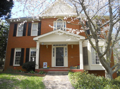
I’ve been a YHL reader since house #1 and I’m so excited that you’ve started this group advice feature! I have a problem I hope you and your readers can help with. We’ve lived in our home for about four years, and the front needs a major paint job. It’s a two-story brick house, and the trim is peeling and in desperate need of re-painting, but we keep putting it off because we can’t figure out the color! I’m not a fan of the off-white color, and our style is not particularly traditional, though that is the style of the house. We have an HOA so we can’t go too crazy, but I’d like to inject some fun color somehow to give it more appeal and personality. Maybe a bright front door?
The one thing that has me tripped up is that our brick is more orange than red. I’d love to hear what colors might work with that for our door, shutters, & trim. I have great fantasies of one day painting the brick, but for now I would love some advice for working with it as-is. Thanks! – Wendy (and Mike, Lucas, and Jackson) Note: for anyone who wants to play around in photoshop, just click the image above this paragraph to enlarge it – and you can share your creation in the comments by linking to it on a free photo-sharing site like Flickr or Pinterest.
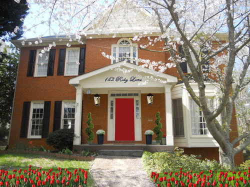
After staring at that before photo for a while, I dragged it into photoshop to see what stuck. Here’s what I did first:
- Made the off-white trim white (this wouldn’t be scary or dramatic, but it’s a little crisper and less traditional, since it sounds like Wendy leans that way – and let’s face it, the HOA probably won’t go for something like blue trim)
- Added a glossy red door (it sounds weird to pair orange-y brick with a red door, but we did that with our first house and for some strange reason it made the brick seem less red/orange by comparison – sort of like how if something looks yellowed but you put a super yellow object next to it, it almost looks white by comparison). We used Fabulous Red by Valspar and loved the look in a nice shiny semi-gloss. It’s bold but still really classic.
- Planted a whole mess of red tulips out front (it would add even more color without annoying the HOA)
- Hung some nice oversized porch lanterns (something like these on either side of the door would look nice and weighty)
- Put some potted plants on the porch
- Added a scripty house number over the portico (spelling out the entire address with black metal numbers and letters could be really charming if there’s room)
- Painted the porch steps a nice neutral mocha color (just to neutralize that red top step)
For my second go, I:
- Tried a rich navy tone on the front door (like Regatta by Sherwin Williams or Hale Navy by Benjamin Moore)
- Went deep charcoal-navy with the shutters (like Rock Bottom by Sherwin Williams – since some people are suuuper anti navy door + black shutters, painting the shutters a few shades darker than the door, so they’re still deep but not quite black should do the trick)
- Hung some sweet and simple house numbers on top of the portico
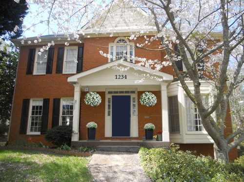
- Added hanging flower baskets on either side of the door
- Put two clean-lined planters on the porch
- Painted the porch steps a nice neutral mocha color (just to neutralize that red top step)
This one is a “squint a little” solution since the photoshopped shutters aren’t perfect, but this time I:
- Went white with the shutters (just to see how they’d look with the white trim)
- Added a spring green color on the door (that’s usually a pretty foolproof-yet-fun choice since there’s SO MUCH green in nearby nature that it tends to tie into that instead of looking like it’s out of left field. Of course this is photoshop, so it doesn’t look as real and layered as it would in real life, but it hopefully gives Wendy an idea so she can hold up some swatches in real life and just see what she likes – maybe try Lemon Grass by Behr and go from there?)
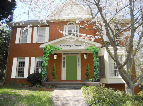
- Brought back the lanterns from my first rendering
- Added topiaries to the porch for height
- Tossed in some greenery to grow up those porch columns (Wendy can just ask what creeping plants don’t harm brick or wood at a nursery and see what they recommend)
- Hung the address above the door (this time I went for the scripty look with the numbers written out)
- Painted the porch steps a nice neutral mocha color (just to neutralize that red top step)
A few other options that came to mind were that Wendy could…
- go for dark charcoal shutters, white trim, and a glossy plum door
- try a robin’s egg blue door with navy shutters and white trim
- add window boxes for more color and interest
- hunt down a really great old doorknocker and doorknob for the front door
And just for fun, here’s Clara’s suggestion. She told me to do purple bushes and grass with blue bricks. Clearly she wasn’t following the “keep the brick as-is” directive. Ah, to see through the eyes of a child…
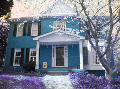
Do you guys have any votes or ideas for Wendy? Are you Team Red? Team Navy? Team Green? Team Edward? Team Jacob? There are tons of other ways she could go, so she’d love to hear everyone’s ideas. Picture me passing you the baton – er, the mic? The keyboard?
Psst – Got a particularly tricky spot or a dilemma in a certain area of your house? Please submit at least three photos of the space along with a quick sketch of the floor plan and a short description about what has you stumped to [email protected].

Cindy says
I like the black shutters. How about (it would be work but would look nice) painting the window grids black. Larger lights on either side of the front door; paint the door a welcoming color; paint the stoop a concrete color; enlarge bed on left side of house and use low evergreen shrubs or something that flowers. I also like symmetry so would have the window treatments all the same style. Maybe a small bench on the stoop and decorative shrubs (like the ones you showed in pics 1 and 3).
Heidi says
My vote is for the green door! I think it looks great with the orangey-brick!!
Sarah says
One big No on painting brick. Red brick is a neutral that can be brightened or subdued by trim and door colors. Once it’s painted, all flexibility is gone and you might as well have vinyl siding.
And please, no script addresses. Emergency personnel appreciate big, easily read, clearly visible numbers.
New flower beds on either side of the walk, curving across the front and around the sides of the house would be lovely. It could be filled with small blooming shrubs, ground covers, perennials and annuals to blend with the new trim and door colors all year round, not just during tulip blooming season. The beds would be a nice contrast to the symmetry of the house.
Katie H. says
Personally, I’m loving Clara’s suggestion :-) A close second is the navy door with the planters.
sydney85 says
I like the orange brick with grey.
Tracie @cleverlyinspired says
What about all black trim…and a celery green door with white and deep green flowering bushes/plants:) I think painting that portico black might be kind of dramatic:)
Kristy says
Here is an idea. We stained our ugly pinkish toned brick, one brick at a time with a single brush. It took a whole lot of patience and time but was well worth the results. Let me know if you’d like more info. If she could stain her brick, the possibilities are endless as to color choices.
Jenn says
Love the blue! Clara inherited your talents!!
nichole says
Wendy needs Maria at Colour Me Happy.she is the expert at specifying color, both exterior and interior.
Katie says
Team Navy!
I love the idea of the green as well, but I think it emphasizes the bright orange, rather than distracting from it.
I’d totally go Navy.
Also, I don’t think you should remove the storm door.
I absolutely couldn’t live without mine. It’s the only way to get a good cross-breeze in our house. To me, functionality outweighs the look of removing it.
Meghan says
I vote for the navy door option. Very classy!
Could you expand on the color you’d use on the front step? I have red brick front steps with mismatching mortar and would love to paint them, but am not sure what color would blend best. I think a mocha as you mention here would work well!
YoungHouseLove says
That’s just a mocha color I pulled from my photoshop palette, but maybe try Taupe Fedora by Benjamin Moore?
xo
s
Lori says
Given that you’ve said the brick color leans orange, and you’re thinking of large scale facelift later, I’d take a ‘less is more approach.’ I think painting shutters a zinc gray color and then carrying that through to your planters and light fixture choices would pull the facade together and provide a balance to the creamy white that you’re not loving, but looks to be in good condition. I think the idea of a green front door is great–a little more acid shade and definitely not hunter green would keep it from leaning more traditional. I’d try to use some of that color in the choice of landscaping materials with variegated hostas, etc. That green color really pops against other landscaping. Finally I’d take inspiration from the Petersik’s bath floor and paint the top step a neutral gray and then paint an area rug on the landing. Good luck!
Jen / Simple Classic Home says
Red wouldn’t be my first choice for colour in my home, but I definitely like the look of it on this house. I also really like the idea of the tulips to add more depth and colour.
Jenn says
So just to rock the boat! I really likes parts of all of them!!!
So here us what I would do.
Navy door, the address and lights from the team red section, the vines from team green, tulips in the front but in yellow and then paint the inset of the veranda and roof top a greuge. Can’t wait to see the after Pict!
Ashley P says
I love this series, guys!
I love the navy, but I have to say that a plum or eggplant would be AWESOME. You may even want to go a bit more muted on the trim – maybe a white with a bit more grey.
Lori says
The bright white trim with red door would be my choice. Plant a ton of tulips (assuming deer are not a problem) yes, but they are fleeting, so bring in some other reds that will go throughout the season, too — geraniums, red-leaved bushes, etc.
I do have to pitch in that I HATE spelled-out house numbers, unless your house number is a single digit. It makes it so much harder to find the address you’re looking for as you’re driving by and trying to read numbers.
Barbara says
I have to say that I like the color of the house the way it is. The off-white looks great with the orangey brick (warm color), whereas a crisp white (which is cool) would not look as good to me. ALL those door colors look awful to me, but that’s just me. I do like the addition of the lanterns and the house numbers on the front of the portico.
Athena Miller says
I also have an orange-ish brick. I went with a peacock blue color with a VERY off white front. My HOA is so awful, they would not let us put up a playset/swingset in the backyard without a fight, they have NO problem with this door color.
http://www.adamathenamiller.blogspot.com/2013/08/a-nose-job.html
I have a fall colored wreath on it right now, and it looks amazing. I have also held up my Easter and Christmas wreaths, and EVERYTHING goes with this. PLUS, it’s a fun color to decorate as a monster for Halloween. =)
My mom painted her front door a brilliant purple, and it looks great. Her house is nearly identical to ours, with an orangeish brick.
jenna says
Clara’s version is my favorite, by far, and I’m not just saying that. I’d like to live in her world, please.
erica says
TEAM RED BABY! Also, in addition to painting the base of the porch (what you see behind that first step up), I’d recommend pulling out the scalloped edging on the left side landscaping. It’s adding more red/orage to the scene that could easily be eliminated. When you look at the original photo, there are three different red/oranges going on. The porch base, the scallop edging and the brick. Eliminating two of the three and adding a bright red door would pull the eye directly to the door!
Stephanie says
Team Navy!
lydia says
Try an eggplant door with celery shutters and a tan or brownish grey for the trim.
Naomi @ Mrs. Fancee says
I just love how something simple like a painted door can transform the entire look! I’m going to have to vote for the blue/navy house. I think the color really contrasts well against the orange-y brick, and… I’m a sucker for hanging plants ;) I also love the creeping vines in the green version!
Kate says
I like the details of Team Red, except I’d go with a the Navy door.
Sara says
My girlfriend has almost the exact same home and it looks gorgeous with teal! Here’s a look at her place:
http://embracemyspace.com/2012/08/08/traditional-meet-teal-front-door-upgrade/
Anne says
Read Maria Killam, mariakillam.com, on understanding undertones. She’s a color wiz. The best education you can get about paint colors that’s out there.
mp says
I sincerely prefer Clara’s version, but for the sake of not waging war with the HOA, I’m on Team Navy.
Laura says
I’m not a big fan of painting brick, generally. It really depends on the age of the house. If it is just face brick, meaning there is a stud wall behind it, it will probably be okay, but brick is porus, and part of how it functions is being able to “breathe”. Most standard paints don’t let the brick breathe properly, which is why it becomes a maintenance issue. The do make mineral paints which bond to the brick and have high breathability – if you go that direction, I think you should talk to a mason. Off of that pedestal.
I am a huge fan of orange and navy. I think that painting the trim a whiter color, the shutters navy, and then go crazy with the color of the front door – raspberry, grass green, teal…
Good luck!
Ammie says
I’m completely team white trim/charcoal shutters/ navy or plum door. I think they’d all give Wendy a nice fresh house facelift without being too bold (read = ticking off the HOA)but still fun. I LOVE this house, beautiful!
Tammy says
Navy for sure.
Michele says
Can I mix and match? Is that an option????
I love the red tulips and the red front door! I also think that a deep teal/peacock blue would look pretty spiffy as a front door color, maybe not an all over color – Clara has a good eye!
I love the more modern look of the house #’s on the portico on the navy blue door pic.
I really like the ultra -mod feel of the two front door planters with perhaps some boxwood bushes – all straight lines.
Maybe then you can have a little bit of traditional with a little funk?
YoungHouseLove says
Love all he ideas for Wendy, guys! Thanks for sharing! Mixing and matching is totally allowed! And thanks to everyone sharing links and paint colors and other ideas!
xo
s
Pat S says
I love red doors … will the HOA go for it?
Mary says
Team Navy – living w/ an HOA myself, I would guess they would go for the more traditional look. Did anyone mention porch railings – maybe something like yours? and definitely some landscaping to hide the bottom of the bay window.
Emily says
When I saw the photo of your house, I immediately thought – arch the front porch roof! I have this pinned: http://www.pinterest.com/pin/263671753156186814/ but there are a lot more traditional front porch arches like this one that I also really like: http://www.pinterest.com/pin/388013324116811247/
I always think they the arch adds a lot of chracter to the front of the home and they should be very HOA friendly. In terms of color, I love the 2nd version with the blue door. It may be because I’m looking to change out our red door to blue that I am drawn to it but I think that the door looks great!
Stasi says
I love the white shutters and green door. It lightens the brick right up.
Courtney says
I LOVE the green! To be fair, I am partial to bright green. If I don’t know what to do with a room or an accent piece, I slap a coat of Valspar’s Jalapeño Jelly on it and voila.
April says
I’m Team Clara.
Diane says
I love the both the red and navy door! I also think replacing those tiny white sconces with something bigger and more interesting would be a great way to add more personality without offending the HOA.
Reenie says
Grey on the house (not the brick) and yellow door…. or turquoise. :)
Ann says
I’m loving reading through all the suggestions- but I do have one thought about the house numbers that I want to throw in! My dad was a firefighter in our area for a long time, and one thing I remember him saying many times is that having the house number “spelled out” – especially in script- is that it is hard for emergency workers to read- especially if it’s dark, lights are flashing, etc. So something small but potentially life-saving to consider!
YoungHouseLove says
Such a great tip Anne! Maybe clear bold numbers on the mailbox helps? So the door ones are just decorative?
xo
s
jeannette says
i’m still reeling from the news that people get rilly rilly exercised over navy and black. wow. obama just signed a nuclear peace accord with iran, people.
Marcella says
Love the blue door one! Always toyed around with the idea of painting our front door that deep cobalt blue after we got back from a trip to Scotland and saw all the fun doors there! Go for it – looks lovely!
Shelley @ Calypso in the Country says
I am loving the navy option with the simple house numbers!
Happy Thanksgiving!
-Shelley
J says
“go for dark charcoal shutters, white trim, and a glossy plum door” was actually what i had in mind, too! Maybe even a light gray instead of bright white trim? I’d like to see those combos in a mock-up, too!
Brigitte says
I love the look of a red door in general, but I think I will have to go with Team Navy. It looks sharp, and with the orangey brick, the red door seems a bit at war with the rest of the house. The blue makes the orange seem warmer, rather than trying to fight with it like the red does. I would not go white with the shutters. The texture will catch dust and they will look dingy without constant cleaning (yuck). I think the idea of a plum-colored door is also good. A more blue, violet purple could look lovely.
One suggestion would be to fill the planter to the left of the door with some perrenials (maybe add some pop with rich-colored flowers) or some hosta (for a lighter green between the shade of the grass and the bush). That side of the house looks a little unbalanced and empty. I would make sure that whatever put there does not cover the window line (the current shrub is bordering on too tall), so the windows aren’t being covered.
Amanda says
When I first saw this picture, before I read one word, I thought WOW that house wood be gorgeous with a dark, stained wood door. I would keep the house paint, I love that color – very unique! I also like the black shutters. I would go with a stained door kind of the same stain look you used on your vanity and hand rail. But, maybe a bit more of the brown. Then I would add huge urns on each side planted with a spike, red geraniums, and something that trails! Good Luck!
Nancy - Chairs with Character says
The Navy is my favorite too!
Alena says
Maybe it’s just me, but the idea of painting the brick just makes me want to chain myself to the front of the house until the owners came to their senses. I know sometimes the brick could be really strange colors, but that is not the case here. It’s such a beautiful brick home that I can’t believe anyone would want to paint it, since you really can’t undo that. But…everyone has their own esthetic
APRIL says
I like the RED, but I hate the modern Bushes. I love the writing on the top and green vine going up the sides. :) FUN.
Cristina says
Team Navy! I painted our front door BM’s Hale Navy and it looks SO GOOD. While being somewhat of a neutral, it looks really polished but still cool and gives a great canvas for colorful flowers and wreaths, etc.