We’re not sure how many of you are knee deep in a turkey somewhere (wait, that sounds terrible) but there’s nothing we like more than a group brainstorming session, so if you’re around, Wendy would love your suggestions. She has an exterior issue and she’s ready to dive right in (you know what that means… after pics! Hopefully really soon!) so here’s her letter:
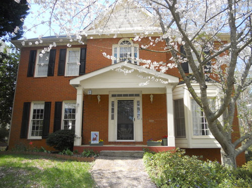
I’ve been a YHL reader since house #1 and I’m so excited that you’ve started this group advice feature! I have a problem I hope you and your readers can help with. We’ve lived in our home for about four years, and the front needs a major paint job. It’s a two-story brick house, and the trim is peeling and in desperate need of re-painting, but we keep putting it off because we can’t figure out the color! I’m not a fan of the off-white color, and our style is not particularly traditional, though that is the style of the house. We have an HOA so we can’t go too crazy, but I’d like to inject some fun color somehow to give it more appeal and personality. Maybe a bright front door?
The one thing that has me tripped up is that our brick is more orange than red. I’d love to hear what colors might work with that for our door, shutters, & trim. I have great fantasies of one day painting the brick, but for now I would love some advice for working with it as-is. Thanks! – Wendy (and Mike, Lucas, and Jackson) Note: for anyone who wants to play around in photoshop, just click the image above this paragraph to enlarge it – and you can share your creation in the comments by linking to it on a free photo-sharing site like Flickr or Pinterest.
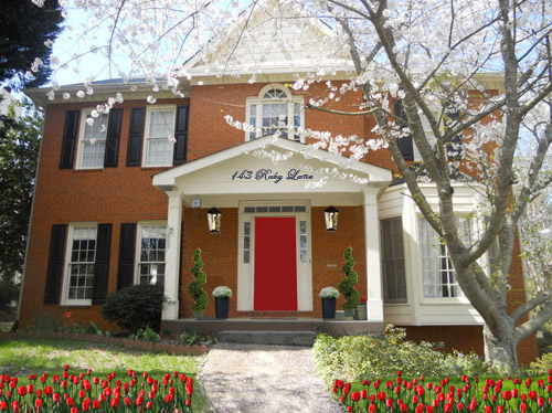
After staring at that before photo for a while, I dragged it into photoshop to see what stuck. Here’s what I did first:
- Made the off-white trim white (this wouldn’t be scary or dramatic, but it’s a little crisper and less traditional, since it sounds like Wendy leans that way – and let’s face it, the HOA probably won’t go for something like blue trim)
- Added a glossy red door (it sounds weird to pair orange-y brick with a red door, but we did that with our first house and for some strange reason it made the brick seem less red/orange by comparison – sort of like how if something looks yellowed but you put a super yellow object next to it, it almost looks white by comparison). We used Fabulous Red by Valspar and loved the look in a nice shiny semi-gloss. It’s bold but still really classic.
- Planted a whole mess of red tulips out front (it would add even more color without annoying the HOA)
- Hung some nice oversized porch lanterns (something like these on either side of the door would look nice and weighty)
- Put some potted plants on the porch
- Added a scripty house number over the portico (spelling out the entire address with black metal numbers and letters could be really charming if there’s room)
- Painted the porch steps a nice neutral mocha color (just to neutralize that red top step)
For my second go, I:
- Tried a rich navy tone on the front door (like Regatta by Sherwin Williams or Hale Navy by Benjamin Moore)
- Went deep charcoal-navy with the shutters (like Rock Bottom by Sherwin Williams – since some people are suuuper anti navy door + black shutters, painting the shutters a few shades darker than the door, so they’re still deep but not quite black should do the trick)
- Hung some sweet and simple house numbers on top of the portico
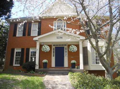
- Added hanging flower baskets on either side of the door
- Put two clean-lined planters on the porch
- Painted the porch steps a nice neutral mocha color (just to neutralize that red top step)
This one is a “squint a little” solution since the photoshopped shutters aren’t perfect, but this time I:
- Went white with the shutters (just to see how they’d look with the white trim)
- Added a spring green color on the door (that’s usually a pretty foolproof-yet-fun choice since there’s SO MUCH green in nearby nature that it tends to tie into that instead of looking like it’s out of left field. Of course this is photoshop, so it doesn’t look as real and layered as it would in real life, but it hopefully gives Wendy an idea so she can hold up some swatches in real life and just see what she likes – maybe try Lemon Grass by Behr and go from there?)
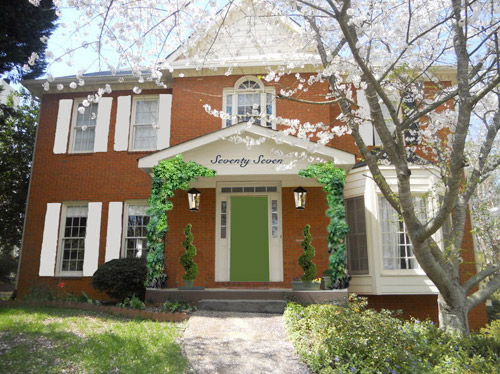
- Brought back the lanterns from my first rendering
- Added topiaries to the porch for height
- Tossed in some greenery to grow up those porch columns (Wendy can just ask what creeping plants don’t harm brick or wood at a nursery and see what they recommend)
- Hung the address above the door (this time I went for the scripty look with the numbers written out)
- Painted the porch steps a nice neutral mocha color (just to neutralize that red top step)
A few other options that came to mind were that Wendy could…
- go for dark charcoal shutters, white trim, and a glossy plum door
- try a robin’s egg blue door with navy shutters and white trim
- add window boxes for more color and interest
- hunt down a really great old doorknocker and doorknob for the front door
And just for fun, here’s Clara’s suggestion. She told me to do purple bushes and grass with blue bricks. Clearly she wasn’t following the “keep the brick as-is” directive. Ah, to see through the eyes of a child…
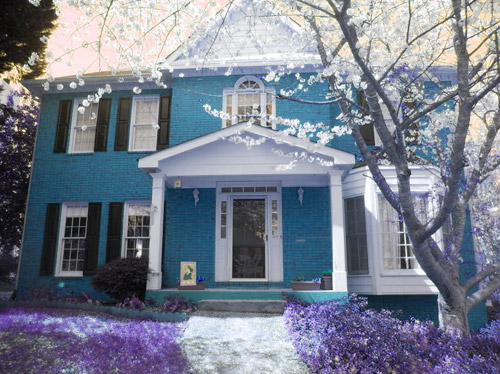
Do you guys have any votes or ideas for Wendy? Are you Team Red? Team Navy? Team Green? Team Edward? Team Jacob? There are tons of other ways she could go, so she’d love to hear everyone’s ideas. Picture me passing you the baton – er, the mic? The keyboard?
Psst – Got a particularly tricky spot or a dilemma in a certain area of your house? Please submit at least three photos of the space along with a quick sketch of the floor plan and a short description about what has you stumped to [email protected].

Emily says
Ew, none of that navy and red crap. It’s so safe and neutral. That’s like being the girl who always wears black, taupe, and navy. If you are being truthful about being non-traditional, you’ve got to go with something more like the green option. The white shutters really make the house; definitely modernizes it. And the green is so nice and different. Don’t be boring; go green! :)
Katie says
I think the red door with the shutters from the other choice would be great!
Amelia@MonogramsNMud says
I have a brick that lens more orange than red and we painted our front door SW oil rubbed bronze and trimmed it out in Sw comfort gray (reads more like a robbins egg blue than gray). it looks awesome.
Here is the link for a visual: http://monogramsnmud.blogspot.com/2013/05/front-door-reveal-tips.html?m=1
Dana@chocolateandsunshine says
I’m Team Red. Think of it — great for Christmas; 4th of July; fall as colors of leaves. They can tell all of their friends that their house is the one with the red door. I’m ok w/ painting it white, too, but if she’d plant some white flowers for summer and add some brushed metal lights, etc., she would tone it down.
Have a great Thanksgiving, YHL!
YoungHouseLove says
Thanks Dana! You too!
xo
s
Michelle says
Love the Navy!
zannteo says
Clara’s vision is so charming… actually like it the best!
Alyssa says
Love that navy! It’s timeless in my opinion! But I have a bright yellow door, which I love and gets tins of compliments on:) good lucky Wendy, keep us posted!
Katherine says
I had scrolled down so that I could see the top of the blue brick picture before I read the part about it being Clara’s suggestion. I think it looks really good. Except for the purple grass. I think I’d stick with green. ;)
Renee says
I would paint the whole trim, side windows and door all one color. Black would be my preference, with the black shutters I think it would pop…and with your options in #1 it would look great I think…
Daphne says
Team navy! I want a navy door too, but we have black shutters. What’s so wrong with the combo? The shutters are 2nd floor and it would be a pain to get up there.
Jill says
I’m torn between options 2 & 3, I think I’d keep the blue door, maybe in a colour to match the shutters? And definately keep the lovely creepers on the porch columns. But at the end of the day, Clara’s version wins hands down!
Stacey says
I love the pure white trim, navy door, and deep navy shutters for the elegance of the combination. Deep navy flower boxes with bright blossoms under the upper windows would break up all that brick on the left. Whichever scheme Wendy chooses I hope she paints the porch to neutralise that top step. Something to consider before painting all that brickwork – it is very high maintenance. Expensive repaints will be necessary every handful of years. I vote ‘work with what you’ve got’. But of course, this is all my opinion and I wish Wendy the very best of luck no matter her choice. Looking forward to the after photos!
JP says
Don’t you dare paint that brick!! haha :)
Look at all the wonderful detail on this house with the bay window, French windows and the little arched window at the top! I think the house is lovely with the black door and shutters with red brick, so Colonial-looking. But rather than off-white paint, I would paint it crisp white.
Maybe add some curvy or chunky trim at the gables. (http://preview.turbosquid.com/Preview/2010/12/08__22_26_00/gable004.jpgac0abcf6-e189-4c56-8f9c-05fa0a2136c7Larger.jpg) It’s less expensive these days when made out of plaster.
Also you could put white railings around the porch up to the steps — giving it kind of a picket fence look. (http://northburnspark.org/wp-content/uploads/2010/06/1503-Camb.jpg)
I would also get large black outdoor fixtures installed considerably lower than what they are now. You can buy fixtures that attach at the top and hang lower. (http://ecx.images-amazon.com/images/I/619pNF9uS2L._SL1500_.jpg)
I think a little climbing ivy would be beautiful, but some people freak out and think it’s going to destroy something.
Very cute house!
cori roberts says
I posted a pic on your FB page of my idea! I hope you like! :)
YoungHouseLove says
Thanks Cori!
xo
s
Gina, book dragon says
I like Clara’s suggestion best (did everyone?) but don’t think the HOA would allow it.
I like the white trim/shutters but would choose a deeper green.
Love, love, love the navy/charcoal navy and am wondering how it would look using plum instead of navy.
Bianca says
I’d paint the trim white, the shutters a nice, deep, glossy navy and the front door a dark, jewel-toned teal, or even a bright yellow.
kristine says
I like the blue door but my eye tends to go right to the bay window and would love to see that painted black to balance the other side. Good luck deciding!
Trish Ford says
Red door and red flowers with fancy address above the door
Pam says
I like the navy option, but maybe that’s because I have a sample of Benjamin Moore hale navy painted on my front door right now and I LOVE it! The navy really makes the colors of my autumn wreath pop. Can’t wait to get the whole door painted and put a Christmas wreath on it.
Amanda says
I love the second option with the navy shutters!
Sandra says
Might have been mentioned but what about a door with a beautiful coloured stained glass panel?
Angela says
I like Clara’s house! I think they bricks should be painted too..maybe grey or taupe. The shudders and trim could be a darker shade or lighter shade of the same color.The door should pop with a bright color of their choice. The house would look updated but still traditional.
Jill says
Team navy most definitely!
Jennifer B says
I think the blue door with white shutters! Blue compliments orange and the white shutters looked fresh.
yobo says
i actually really like clara’s suggestion of blue.
maybe not THAT blue, but blue brick could be cool.
in the interim, though, i like the navy shutters and blue door.
i would also paint the inner trim on the windows in the navy, but leave the outer trim white.
and if there’s room on the pediment, maybe do a small oval medallion, to mimic a cat’s eye window? those are common elements in federal style buildings on the broken pediments, and the house looks to be a modified/modernized federal.
good luck wendy!
Melanie says
I like the Navy door, you could go a little lighter and would consider the trim a soft gray and do a pop of color with the hanging baskets and use a more modern brushed nickel house numbers since you prefer something not traditional. I have to admit the red door and trim and script numbers look to traditional to me.
Good luck with your decision.
Gene says
I’d think about painting the triangle of siding on the attic face (above the second story windows) and the equivalent area of the porch a different colour than the current white. Maybe a few tones lighter than the shutters (if they’re changing or just charcoal to complement the black). I don’t really see any door colour being a losing proposition, anything the homeowner loves would be awesome.
Joanne says
I think Clara’s option is excellent – they could even use a lighter shade of blue to fit in with the HOA (hopefully!). I can’t wait until she’s writing her own YHL posts!
Stephanie says
Loving the option with the red door!
Taryn says
Team navy!
Claire @ Claire K Creations says
I’m not much of a help but I love option one especially with the tulips!
Heather says
Sherwin Williams has a program you can use to check out colors. I’d also paint the portico (the peak on the porch roof)I’d paint it black to match the shudders!
tess says
Clara’s is beautiful, straight out of a fairytale,
Try diffeernt blues for the wood trim, see what snaps/complement the orange brick best
holly says
Wendy, as your sister, my opinion should hold more weight than others.. ;)
Ignore the terrible photoshop. Light greenish whatever on the brick. Pinkish door. Navy Blue Shutters. WORD.
http://i1363.photobucket.com/albums/r705/hollyaracich/1457698_10153544766700311_2033491549_n_zps54a0b719.jpg
YoungHouseLove says
So pretty!!
xo
s
Anne says
Thought green even before I saw the options. It a great contrast and brings the void of nature colors into the scheme.
Susan says
My last house was orange-ish brick. We used a combination of BM Hancock Gray, Providence Olive & Abingdon Putty (on siding) –all Historic Colors with a green-gray undertone. The green toned down the orange/pulled red forward. These colors did not compete with the brick but rather blended the house into the landscape. If you use any form of blue, the orange will be accentuated since blue is the direct complement of orange.
We had a black roof; we used touches of black in ‘accessories’ such as lighting, house numbers. We removed some shutters and used a combination of Hancock Gray & Providence Olive on trim and windows to ’emphasize’ architecture. Looking at Wendy’s house–the big picture–I would consider replacing the front door with 9-light French Door. I think a door similar to the bay window/other windows would create better balance & continuity. A new door could be painted or stained. We had a mahogany door with a dark stain. Adding planters, window boxes would up curb appeal; white flowers worked well for us. Good luck Wendy!
Ashley says
I love the navy door but think the shutters should be white like the green door option. I love this new feature- so fun to see the different possibilities!
Tricia says
Okay, I’m just going to throw this out there because no one mentioned it yet from what I can see. Would it be weird to paint the trim black? Still relatively traditional but definitely out of the ordinary. I’ve seen really pretty houses with red brick, black trim, and a pretty contrasting front door. My favorite was a light robin’s egg blue door with brass hardware. And blue is orange’s complement so it wouldn’t clash or anything.
Maria says
Clara’s version should be a mandatory part of this segment!
Laurie says
I like the green and white option, but I would add red tulips to that. Fabulous.
Melissa says
Another vote for navy here!
Susan says
Love the look of greige with a plum door.
I know you’re not thinking about painting the brick yet, but you might consider whitewashing/lime washing it. It’s such a gorgeous look, really changes the color of the brick without losing the “brickiness” of it. (Note Sherry’s fireplace.)
Beth says
Navy all the way…..with scripted lettering!
Cindy says
Team Red!
Beth H says
We have a house that has 1 set of shutters in the front and they are plastic (ugh). They are the same color as the front door, hunter green. I want to pair the door red but will that make the shutter look out of place?
YoungHouseLove says
Maybe just try starting with the door and see? You could also remove the shutters since you only have one set and maybe that would solve the issue!
xo
s
Amy says
I am so Team Navy, but if Clara’s pick was an option, I would totally go for it. Kid’s got great taste.
Will says
Colors are personal decisions. What catches me about this house is that the siding sections on the dormer, covered entrance and around the windows are all the same color as the trim work. I recommend she change those areas to a color that suits her and works with whatever color she paints her door (it will probably a red door it seems).
The way it is now is like painting your walls white, crown molding white, picture frame crown molding white, with a traditional white ceiling. You end up with a pretty bland result even though you have beautiful hardwood floors (floors in this comparison would be the bricks).
LoriSF says
My favorite is the navy door, followed closely by the red door.
Another option:
White siding, charcoal shutters, plum door.
I wouldn’t paint exterior brick. I would opt for stain instead. It would be tedious to apply but you’d probably only have to do it once!
Kathe says
I have a similar brick color and decided last year that I could no longer stand the peeling paint on my front door. I chose to go bold & current with a peacock blue door. I love it. The blue works as as great contrast to the orange and the color keeps it from being too traditional like a slate or navy would. I vote for Sherwin Williams Oceanside SW 6496. As for the rest, a gray might be nice. Painting the brick sets you up for more maintenance in the future, but I really like how this blogger’s house turned out:
http://www.flythroughourwindow.com/2009/10/exterior-house-details/
She chose Benjamin Moore’s Clarksville Gray for the brick & a darkened version of Texas Leather for the trim.
Megan F says
I also have an orangey brick and wish I could change it! But I would not dare painting it since we plan to resell within the next few years. So… I think the cool tone of the navy helps tone down the warm orange the best. I also like the green tho. The green is really fresh and fun for the nontraditional type.
Meanwhile, in comparison, I think the red door actually emphasizes the orange of the brick as much as the red of it – which is not a good thing imo.