We’re not sure how many of you are knee deep in a turkey somewhere (wait, that sounds terrible) but there’s nothing we like more than a group brainstorming session, so if you’re around, Wendy would love your suggestions. She has an exterior issue and she’s ready to dive right in (you know what that means… after pics! Hopefully really soon!) so here’s her letter:
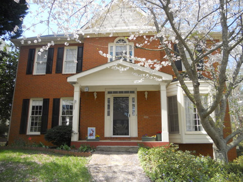
I’ve been a YHL reader since house #1 and I’m so excited that you’ve started this group advice feature! I have a problem I hope you and your readers can help with. We’ve lived in our home for about four years, and the front needs a major paint job. It’s a two-story brick house, and the trim is peeling and in desperate need of re-painting, but we keep putting it off because we can’t figure out the color! I’m not a fan of the off-white color, and our style is not particularly traditional, though that is the style of the house. We have an HOA so we can’t go too crazy, but I’d like to inject some fun color somehow to give it more appeal and personality. Maybe a bright front door?
The one thing that has me tripped up is that our brick is more orange than red. I’d love to hear what colors might work with that for our door, shutters, & trim. I have great fantasies of one day painting the brick, but for now I would love some advice for working with it as-is. Thanks! – Wendy (and Mike, Lucas, and Jackson) Note: for anyone who wants to play around in photoshop, just click the image above this paragraph to enlarge it – and you can share your creation in the comments by linking to it on a free photo-sharing site like Flickr or Pinterest.
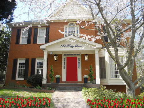
After staring at that before photo for a while, I dragged it into photoshop to see what stuck. Here’s what I did first:
- Made the off-white trim white (this wouldn’t be scary or dramatic, but it’s a little crisper and less traditional, since it sounds like Wendy leans that way – and let’s face it, the HOA probably won’t go for something like blue trim)
- Added a glossy red door (it sounds weird to pair orange-y brick with a red door, but we did that with our first house and for some strange reason it made the brick seem less red/orange by comparison – sort of like how if something looks yellowed but you put a super yellow object next to it, it almost looks white by comparison). We used Fabulous Red by Valspar and loved the look in a nice shiny semi-gloss. It’s bold but still really classic.
- Planted a whole mess of red tulips out front (it would add even more color without annoying the HOA)
- Hung some nice oversized porch lanterns (something like these on either side of the door would look nice and weighty)
- Put some potted plants on the porch
- Added a scripty house number over the portico (spelling out the entire address with black metal numbers and letters could be really charming if there’s room)
- Painted the porch steps a nice neutral mocha color (just to neutralize that red top step)
For my second go, I:
- Tried a rich navy tone on the front door (like Regatta by Sherwin Williams or Hale Navy by Benjamin Moore)
- Went deep charcoal-navy with the shutters (like Rock Bottom by Sherwin Williams – since some people are suuuper anti navy door + black shutters, painting the shutters a few shades darker than the door, so they’re still deep but not quite black should do the trick)
- Hung some sweet and simple house numbers on top of the portico
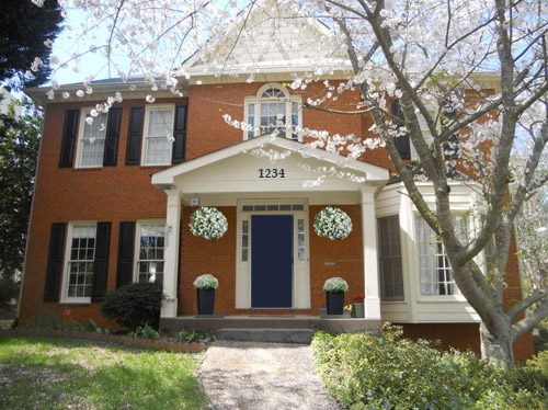
- Added hanging flower baskets on either side of the door
- Put two clean-lined planters on the porch
- Painted the porch steps a nice neutral mocha color (just to neutralize that red top step)
This one is a “squint a little” solution since the photoshopped shutters aren’t perfect, but this time I:
- Went white with the shutters (just to see how they’d look with the white trim)
- Added a spring green color on the door (that’s usually a pretty foolproof-yet-fun choice since there’s SO MUCH green in nearby nature that it tends to tie into that instead of looking like it’s out of left field. Of course this is photoshop, so it doesn’t look as real and layered as it would in real life, but it hopefully gives Wendy an idea so she can hold up some swatches in real life and just see what she likes – maybe try Lemon Grass by Behr and go from there?)
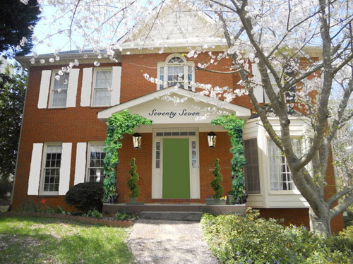
- Brought back the lanterns from my first rendering
- Added topiaries to the porch for height
- Tossed in some greenery to grow up those porch columns (Wendy can just ask what creeping plants don’t harm brick or wood at a nursery and see what they recommend)
- Hung the address above the door (this time I went for the scripty look with the numbers written out)
- Painted the porch steps a nice neutral mocha color (just to neutralize that red top step)
A few other options that came to mind were that Wendy could…
- go for dark charcoal shutters, white trim, and a glossy plum door
- try a robin’s egg blue door with navy shutters and white trim
- add window boxes for more color and interest
- hunt down a really great old doorknocker and doorknob for the front door
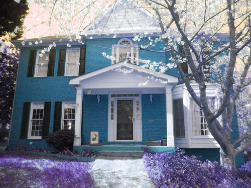
And just for fun, here’s Clara’s suggestion. She told me to do purple bushes and grass with blue bricks. Clearly she wasn’t following the “keep the brick as-is” directive. Ah, to see through the eyes of a child…
Do you guys have any votes or ideas for Wendy? Are you Team Red? Team Navy? Team Green? Team Edward? Team Jacob? There are tons of other ways she could go, so she’d love to hear everyone’s ideas. Picture me passing you the baton – er, the mic? The keyboard?
Psst – Got a particularly tricky spot or a dilemma in a certain area of your house? Please submit at least three photos of the space along with a quick sketch of the floor plan and a short description about what has you stumped to [email protected].

Joseph says
So, this is absolutely no help at all because I freakin love Clara’s suggestion. I would live in that house and love every minute.
Ashley says
I definitely think the glass screen door needs to go and the off white trim needs to change. However I am not a fan of going stark white. I went with a puttied gray color and love the way it looks. Turquoise/teal tend to work well with orange,so I went that direction with the front door.
see the photo here on pinterest.
http://www.pinterest.com/pin/63683782204661062/
I would recommend these light fixtures from restoration hardware forthe front porch
http://www.pinterest.com/pin/63683782204661064/
Shea says
NAVY!!! Especially if the brick is more orange.
Heather says
I love the look of the white shutters (especially with a bright green door), but I’m afraid they would get dirty too easily. Maybe a light grey would hide a lot more sins?
I want to head an HOA someday and make the rules that everyone has to have a brightly colored door, and you get one year free dues if you replant your entire yard with edible plants including either edible grasses or clover or something! Ahhh perchance to dream.
Shanna Paynter says
What program do you use to play with photos like this? I paint furniture and would love to be able to put different design ideas on the computer.
YoungHouseLove says
Photoshop! Love it!
xo
s