We had so much fun showing you the ins and outs of our house’s exterior layout back in June, that we’re back to share Casa Petersik’s actual interior floor plan. We know it’s pretty hard to picture how rooms flow into one another when you’re looking at a series of photos (like the before & afters on our House Tour page), so here’s hoping this makes some sense out of the three bedroom, one and a half bathroom brick ranch that we call home…
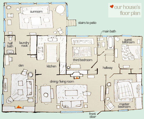
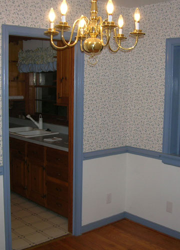
Of course the house didn’t start out as a three bedroom (remember we moved our dining area into the living room and converted the formal dining room into a third bedroom by closing off the old door to the kitchen- which gained us a heckova lot more cabinet space?). Ah those were the days. Just for fun here’s the old dining room we inherited (see that doorway on the left that led into the old kitchen?)
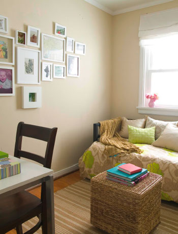
And here’s the same room as a bedroom, with that doorway sealed off and drywalled (it already had a closet so it was practically begging to be converted):
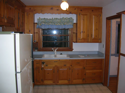
And because we sealed off that doorway from the old dining room that led to the kitchen (see it there on the right in the picture below?) we were able to take an old room that looked like this…
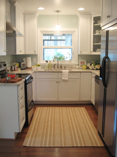
… to an updated kitch with over 50% more counter space & storage now that the door on the right wall was replaced by an entire wall of cabinetry and appliances (including a dishwasher that the original floor plan never would have accommodated).
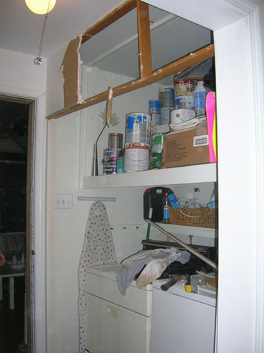
That’s one of the reasons we always encourage people to live in a space for a while before renovating, since it’s a solution we never would have thought of off the bat. Not in a million years. We also probably never would have had the guts to tear down the bifold doors and the wall in the laundry area to create a nice little exposed laundry nook that’s a lot less closed in (as you can see from the floor plan above, that hallway was a bit claustrophibic before we opened things up- just imagine a line where the bifold doors once were). Here are things mid-demo (so you can see where the old doors and upper wall were):
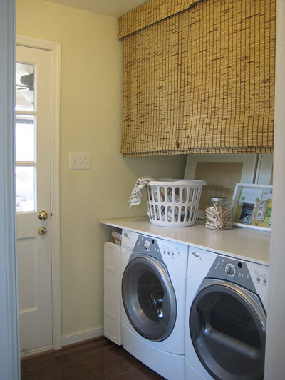
And here are things now, more open and functional (plus you can actually do laundry and have access to the back door which leads to the sunroom (back in the days of the bifold doors, if they were open they blocked access to the back door- frustrating, no?).
As you can see, a workable floor plan really does make all the difference. Not only can it make for a seamless feeling and effortless flow, but it can actually make day to day life easier and your entire house more functional for you and your family. And the glorious thing is that while others might consider a formal dining room a necessity or want to keep their washer and dryer behind closed doors, owning a home is all about personalizing it for the way you live so you love coming home to it every single day. So don’t be afraid to tailor your house to best meet your needs (unless you’re planning to sell, say, next week)… after all you’re the one paying the mortgage!
So what about you guys. Have you altered your floor plan in any way to accommodate something that the original layout was missing? Are you planning any restructuring to add functionality or just plain beauty to your home? Do tell.
Update- Due to tons of room size requests, we’ve added each of our room’s approximate measurements: sunroom: 18′ x 13′, half bathroom: 3.5′ x 5.5′, laundry nook: 6′ x 7′, den: 19′ x 9′, kitchen: 13′ x 10′, living/dining room: 22′ x 12′, third bedroom/nursery: 8′ x 10′, full bathroom: 7′ x 6′, guest bedroom: 10′ x 10.5′, our bedroom: 12.5′ x 11.5′.

Jacci says
Your house is so cute!!! :) I have to admit, I pretty much already knew the layout. You see a little of one room in the corner of a photo and sooner or later it all comes together. The only thing I wasn’t sure about was whether your bedroom or the green-headboard guestroom was at the front of the house. Now I know :)
This little printout w/ accompanying drawings reminds me of something similar I did to see what furniture would fit in the new house. We even printed it and cut out little IKEA couches and chairs to scale to see what would work best. Did you all do that with any of your purchases? Especially couches? I’m a sucker for miniature rooms and furniture to scale :) Maybe a by product of my doll house days?
XO,
Jacci
YoungHouseLove says
Hey Jacci,
We actually don’t usually make little cut outs of furniture with graph paper like some designers but we have been known to sketch out rooms for Design Dilemmas or in-person makeovers (like Carrie’s apartment) so we have a game plan going in. “To scale” isn’t always the goal since I’m more art than math, but it still helps me get a handle on most spaces since proportions of beds and couches are usually pretty straightforward. Plus John’s really good at space planning- scary good actually.
xo,
s
Katherine M. says
I think you’ve done a great job making your house work for you–it’s true that you don’t need as much square footage if only you use your space wisely. We have a fairly large house now and although we use most rooms daily I always wonder about downsizing and improving efficiency! One change we made recently is we converted a downstairs laundry room to a mudroom (w/ cubbies, shelves, etc.) and moved the laundry to what used to be a large unfinished hall closet upstairs–it has double doors and a sink. Best thing we ever did!!
Our next project is finishing part of the attic to make an extra guest bedroom/exercise space….(so much for less square footage).
HopelessChest says
I am so jealous of that comforter in the third bedroom every time I see it!
Amber McBride says
I’m sure you’ve probably already thought of this… I could see carrying the theme of your kitchen cabinets to the laundry nook, in place of the bamboo blinds. And a rectangle piece of your kitchen’s granite above the W&D would look very sleek, as well (a DIY project if you could buy the granite pre-cut?). I realize that these suggestions aren’t cheap…. but, oh, the possibilities!
YoungHouseLove says
It’s true! Oh if only money grew on trees. Someday…
xo,
s
Anna See says
Thanks! I am a floor plan junkie. I love that you added the furniture, too!
threadbndr says
I remember the ‘paint colors’ floor plan, so I knew where the rooms were, but it’s fun to see the funiture on the new diagram.
So far, I haven’t moved any walls around, but I have thought about it. I may very well insulate and finish off a tiny back porch in order to add an eat in area to the galley kitchen in my bungalow. That’s pretty far down the list of house projects.
Megan says
ahhhhhh now i get it. I had it so confused in my head. It is much clearer now with the floor plan. Just love the Kitchen redo. Makes such a huge difference.
Megan says
ahhhhhh now i get it. I had it so confused in my head. It is much clearer now with the floor plan. Just love the Kitchen redo. Makes such a huge difference.
Sorry… forgot to say great post – can’t wait to read your next one!
Marcy Tate says
First, your kitchen re-do is amazing.
Second, the counter you put over the washer/dryer is so smart and functional. What material is it, I couldn’t tell from the picture… is it plastic? I would like to try it on my washer/dryer. Your ideas are so smart and useful, thanks!
YoungHouseLove says
Thanks, Mary! The counter on the laundry area is just a simple piece of wood that we had cut to size by the woodcutting department at Lowe’s. Then we painted it white and then sealed it with a coat of polyurethane to help protect it. And it took keep it from slipping we bought some of those grippy drawer liners and placed them between the appliances and the wood. That way nothing shifts when the washer goes into super high spin mode!
Hope that helps,
John
Janine says
Very nice! But…where is your office? e.g., computer, bills, papers, records. The office clutter! And where are the steps to the basement? Thanks for all you do!
Consultant Calamities says
Our current house has the BEST floor plan, partly b/c of some changes we made. Its a cape, with 2 bedrooms on the first floor, 2 bedrooms on the second floor. we only have 1 child (and aren’t having any more), so we got rid of one of the bedrooms on the 1st floor. we opened up the wall and now it flows into the living room, with the stair case that goes upstairs dividing the 2 rooms. :-) we use the now-open room for an office/craft room. also, our pellet stove is in there. Having the pellet stove in this open layout REALLY helps to heat the house better.
Good thing my hubby is really handy! it was a huge MESS pulling down the conecting wall, and fixing the stairway…but so worth it! I should send you a picture of the “before” and “afters”, VERY dramatic difference!
Also, I do agree with living in a place for a while (several months, even up to a year or more) before taking on huge projects like this. You really get to know the house better and see how you really use it over time.
Lindsay says
My husband and I live in a townhouse built in the early 70s. We had a galley kitchen with a room in the front of the house and a room in the back of the house with a large deck attached. Our kitchen opened up to the back room, but the back room is much larger and works better as a living room. My husband knocked out a doorway from the solid kitchen wall into the front room, creating a second pass through. It makes our once small kitchen seem much more spacious now, and we can actually get from the kitchen to the dining room without walking all the way around the house!
I love what you’ve done with your spaces!
Erica says
I love this layout you made! I used to draw house floorplans all the time when I was a kid for imaginary houses! (Yes, I admit, I’m a nerd!)
There are SO MANY things I want to do to my house! I just bought it, and I’ve began to do some small stuff but nothing major. (OK, refinishing hardwood floors isn’t really small stuff!) I took a room the former owners were using as a living room and am turning it into a dining room, and the room they used as a bedroom back into the original living room. I would absolutely love to move the doorway into the bathroom which would give me a lot more counter space in the kitchen and make the bathroom layout make a lot more sense! My house is a shotgun style house, so the second bedroom is a walk-through bedroom, and I would love to add a wall in the room and create an actual bedroom and a hallway that leads into my dining room. However, that would involve installing a window since the room wouldn’t have one at all, so we’ll see if that happens at all! One step at a time…
Cecily T says
I’m jealous of your washer and dryer combo. I have front-loaders, but the detergent pours into the top so I can’t use that clever trick to turn the tops into a counter!
Erica says
I stumbled onto this site a few weeks ago and have been enamoured ever since. Loving the design, getting re-inspired on my own pending projects. Our weddings were ever so similar in decor- lemons/limes, as well as my degree in fine art + husband John with a Communications degree< weird!!
Anyway awesome to see the floor plan, the house does have amazing flow. To realize how closing off the dining room connected that new bedroom to the 'wing' as the other beds is so nice. While the kitchen sometimes looks so narrow in photos, seeing in right in the middle of the home with very open access to bothing living and den is awesome.
Sally says
Thanks y’all! Your post gave me the inspiration to go home an work on my floor plan.
We’ve got a similar layout (though I like yours better). Our 3 BR, 1.5 BA brick rancher used to have a dining room, but the previous owner closed off the door to the kitchen and made it a bedroom! I’m considering enlarging the opening between the kitchen and living room, but (following your example) I’m going to wait until we’ve lived here for a year.
marcy says
Our house is actually two houses slammed together (in 1911). So upstairs, where they meet there was a bizarre triangle on the ceiling, and beneath that two doors (at a angle) each going into a 7×22′ bedroom. We just barely took that all out and took out the wall inbetween so that the bedrooms will be more like 7×12′ and then giving us a little sitting room at the front instead. The wall with the new doors has yet to be built (we’re thinking barn doors), but we’re on our way.
Toby says
Do you have the dimensions of your rooms somewhere on the blog? I would love to know the size of your kitchen, so I can compare it to mine.
YoungHouseLove says
Hey Toby,
That’s totally on our list, but we haven’t gotten to sharing each of our room’s dimensions yet. Our kitchen is 13.5′ x 11′ though. Hope it helps!
xo,
s
Karen says
Another dimensions question! What is the size of your master bedroom? Thanks!
YoungHouseLove says
It’s about 12 x 13′ (the walls behind and in front of the bed are the slightly shorter ones). Hope it helps!
xo,
s
Erin R. says
The house we just bought is very similar to yours minus the sunroom. We too have a baby on the way and would like to get rid of the door from the dining room to the kitchen to make a nursery. Do you have a post somewhere that details the steps to plastering and closing the door off? I looked around but couldn’t find one.
Ps. Your house is an inspiration, I think my husband is sick of hearing “Honey, look what they did here…”
YoungHouseLove says
Hey Erin,
We actually worked with a contractor to close off that doorway since there were some other load bearing walls that we were dealing with, but the process was basically just framing out the doorway with studs like you would see in a new house before the drywall goes up and then just screwing in some drywall to cover the doorway from both sides. Mudding the joints and sanding things down and painting was the final step. I’m sure you can google around for a step by step tutorial somewhere. Hope it helps!
xo,
s
Shale says
I love what you’ve done with your kitchen. We are about to remodel ours but can’t seem to decide between a few different floor plans. One we are looking at is very similar to your layout. Would you mind listing the measurement between the counters opposite each other? (long counter to long counter) It looks like you have a nice amount of space in there and I wanted to make sure we have at least that much room to move around in.
Keep up the great work!
YoungHouseLove says
It’s about 8 feet between those counters. It’s actually a pretty small kitchen but it works for us! Hope it helps!
xo,
s
GabyL says
Hello YHL,
I looove your blog!!! you guys are inspiring. I live in NYC and have a combo living room, dining room and kitchen all in a 10ft x 12.5ft room. I’ve lived here for a year and I obsess about creating a better functioning floor plan. I’ve tried using floorplan.com as you’ve suggested but I don’t think i know what I’m doing. I’ve pushed everything to the walls (boring) and I wonder if there is a way to set up the room so it doesn’t look like a dorm suite. p.s: the fridge is big and bulky. Any advice?
YoungHouseLove says
Maybe try using graph paper to try different combinations? Here’s a post with a few more floor planning options for you: https://www.younghouselove.com/2010/06/email-answer-space-planning-101/
xo,
s
Hugh says
It’s amazing what you’ve done to this house. You’re a really talented couple! :)
Brittany says
Do you remember specific square footage for each room? We just bought a brick ranch in RVA with a similar layout and I’m definitely using your house for decoration inspiration.
YoungHouseLove says
There’s an update at the very bottom of the post with room measurements for ya :)
xo
s