First things first. Weren’t we talking about how foxes might be the new “it” animal (as in, move over birds and giraffes)? Well, I think this video might be proof that we’re all on to something.
Now that that’s out of the way, on to our regularly scheduled program…
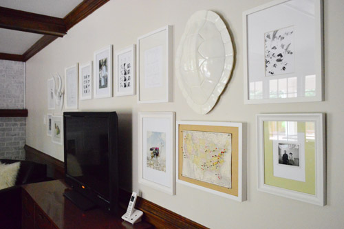
Sherry and I have always been fans of the idea of hanging art around a TV just to soften the big black rectangle that it creates on the wall. And since we have quite the collection of frames to wade through (128 to be exact) it wasn’t exactly a speedy selection process. But after more noodling than I care to admit, we officially hung this house’s first frame collage.
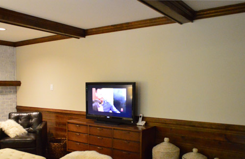
Here’s the bare wall that we started with:
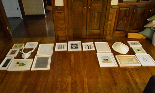
Sherry actually did most of the noodling (credit where credit is due) and she used the floor as her work surface. The big gap in the middle is the space she measured for the TV. In addition to paying attention to the size of the frames, our main goal was to choose art that wasn’t too “visually demanding” (i.e. not too bright or high contrast). We don’t want it stealing the show from the, um, TV shows.
Once the arrangement looked good on the floor, we started transferring it to the wall – starting with the frame right in the middle and being sure to center it on the TV. For some reason even though Clara was sleeping we had Little Einstein on. Nothing like a little Mozart in the background to make frame hanging a joy and a pleasure.
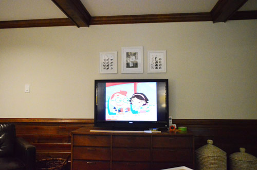
We slowly built out from there on one side, just holding each frame up and eying it. We wanted to maintain somewhat consistent spacing between everything, but weren’t crazy careful about it. We like a bit of imperfection in a frame collage (plus, there’s always time for tweaking later). For example, after taking this photo we noticed that the frame directly to the right of the TV was too close to it, so we made a mental note to inch it out a little after we finished the other side.
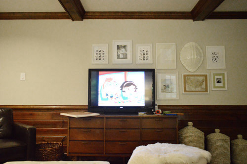
Here’s what it looked like with almost everything up on the wall. Well, everything except for the bottom frame on the far left because [insert facepalm here] we forgot to account for the light switch. And that little screw up made us realize that [get that palm ready again] we totally should have centered the TV on the ceiling beams first. Oh the things you don’t realize when you map stuff out on the floor…
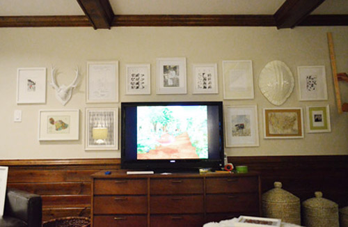
We were less than pleased about the miscalculations, plus I was having deja vu. But having foreseen something like this happening, we thankfully had only hung things with small picture hanging nails at this point (i.e. I hadn’t broken out the anchors and screws for some of the heavier items) so it wasn’t a big deal to shift everything to the right a few inches (eight to be exact). All but one of our erroneous nail holes got covered up in the end, so we were only disgruntled for a short time.
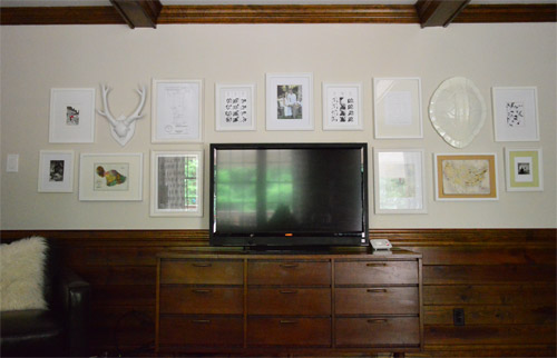
If you scroll back to Sherry’s initial “rough draft” layout on the floor, you’ll notice that everything stayed the same except we opted for two larger frames on the outside edges instead of three smaller ones. It just looked cleaner that way when we eyed things as we got them on the walls.

This room is certainly far from being done, but it really does feel more personal with some of our favorite stuff on the wall. Everything from wedding photostrips to the lot drawing of our first house and a map we brought back from Hawaii last year made the cut. Although I wouldn’t be surprised if we update a few of the frames down the road just for fun.
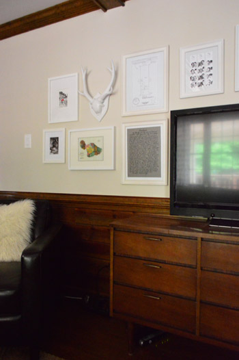
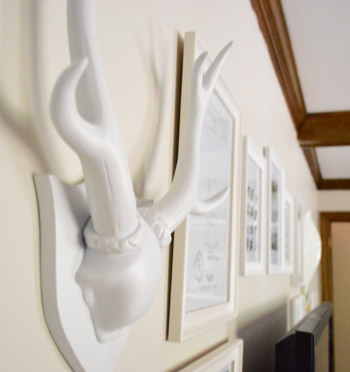
We were most glad to finally hang our pin map in a place of honor (we briefly hung it in the foyer but this art looks better in there). And Sherry’s giddy that she got not one, but two faux white taxidermy items up there. Hopefully the deer that congregate out back aren’t offended.
So that’s the story of two screws, two anchors, thirteen nails, and twenty nine holes in the wall. Any one else put some holes in their walls recently? Hopefully fewer unintentional ones than us…

betty (the sweaty betty) says
I love the antlers and turtle shell.. i’m thinking about getting ones of those cardboard animal heads or some kind of faux head with antlers to put in the living room.
Jodi says
I love the frame wall and am TRYING to do the same around our TV (with the added “bonus” of a vaulted ceiling and an oddly placed door).
However … what the fox? I may have nightmares after watching only two minutes of that video. I am PRAYING that doesn’t become the new Gangnum Style. I couldn’t bear it!
Steph says
I love that you guys moved it because it wasn’t centered. Things like that bother me so much and I’m really glad I’m not the only one.
There’s an AC vent in my house that for some reason was put on crooked. It drives me CRAZY. It’s up on the ceiling above the couch I lay on so I always see it. Who puts a vent on crooked? Like seriously, the wall was RIGHT there to use as a level.
YoungHouseLove says
Haha! That would totally drive me crazy too! It would be something I’d point out to visitors and John would say “why would you mention that, nobody notices that but you!”
xo
s
Steph says
Haha. Sometimes my roommate catches me staring at it and has to tell me to stop obessing.
They also placed the light funny. It’s an open concept entry/living/dining/kitchen and the lights in the kitchen and dining all line up. The entry/living room are side by side instead of 2 lights, or one centered over the living room, they centered it between the two. Looks horrible.
They did some weird things when they built my house. I could go on for days.
Ana Silva says
As I was reading I noticed how the TV wasn’t centered on the beams and I was surprised you didn’t care/notice. And then you changed it. I wouldnt have it any other way either. Looks great! It’s cool that you guys did this. I’ve had it on my Pinterest board for ever and have yet to do it!
Megan says
I’m tackling a gallery wall in my husband’s mancave this weekend. There’s only one oddly low hung picture on the wall right now which seemed to be tilted a different direction every time I walked in the room. Finally realized it’s because one of our cats (I know which one too because the second cat has a stump tail) would walk on the couch underneath the picture and their tail would hit it and knock it off center. So I have a starting height to hang the pictures and not much else. Here’s hoping for minimal nail holes!
Chelsey says
I love these pictures because I think it is the first time that I’ve been able to see the true wall color. It has looked white in all previous pictures, but now I can see the true tone and it will look lovely with white wood below!
Ashley says
Hey Sherry,
I have been thinking about doing the same thing because we have a giant blank wall behind our TV. The only problem is that we have a two story living room so the wall is not only long, but also extremely high. Any suggestions on what to hang to make everything look proportionate?
Thanks!
YoungHouseLove says
I would try to use larger frames and build them up a bit more, maybe a third row up there?
xo
s
Lindsay says
My boyfriend’s last name is Fox. So he’s going to be thrilled when I start playing this every time he walks in the room! Thanks, John!
* And by, “thrilled,” I mean “he’s probably going to throw my computer out the window.”
YoungHouseLove says
Tell him I send him my most heartfelt condolences for the pain I have caused.
-John
Andrea says
I love it! Bet you’re dying to get that trim painted now :-) It’s going to be GOOOORGEOUS!
Andrea says
This is very cool. I don’t mind lots of holes if I’m excited about a project, but filling them in later always makes me wish I’d paused a bit before putting hammer to nail.
This is exactly what I am going to do for a particularly bare wall in our basement.
Emily says
Cautionary tale about putting holes in walls: we just moved into a new (to us) house and inherited a PVC drain pipe with holes in it from the previous owner’s over-zealous use of anchors. Wield your drills carefully; there is actually important stuff behind that sheetrock!
YoungHouseLove says
Yikes! Definitely a smart warning! We generally use small hanging nails that are only about an inch and a half long, so they don’t go fully through the drywall in most cases, just into it enough to catch.
xo
s
Kitty says
Thank you for posting that video. Hilarious!
Jon says
“Who Framed Little Einstein?”
Best. Title. Ever.
Julianne says
That was truly one. Of. The. Weirdest. Music videos I have ever seen! My son loved it though! Lol. Great job on laying out the artwork. I can certainly empathize with how tough it is to get it lookng just right. Actually working on that right now, since most of the walls in this beast are now painted. Great job & what a relief it is to get that done, I’m sure! ;0)
bex says
I FINALLY finished hanging all the art on my baby’s nursery art wall…almost 11 months after she showed up. [insert embarrassed face here] We still have to put art up on two of the other walls, but that side of the room is a work in progress and that’s my excuse for now. :)
Kathy says
Hi guys! The idea of softening the black rectangle is the perfect idea, and one that I deal with all the time as a designer. Texture (antlers & tortoise shell art), a pleasing arrangement (well done), and contrast (either through color or darker and varying shades of grey–oops, sounds like a book, but I digress…)are all necessary. You guys might want to consider the last element a bit more as you experiment with your wall. The colors/tones will soften your big black rectangle for sure.
YoungHouseLove says
Haha, love the shades of gray reference. I was thinking about some dark mats up there (leaving the frames white, but bringing in more contrast with the mats) so we’ll have to see how it goes!
xo
s
Ashley F says
O.M.G. That video. Cannot handle it! Hahaha
Rosie says
Hey Sherry,
I too LOVE faux taxidermy!
Here’s a website with some fun wool faux taxidermy called FAUX FAUNA: http://www.feltfactory.com/?page_id=595
The name gets me every time :)
It’s less clean looking than white ceramic but it could be fun in a kids room!
Rosie
YoungHouseLove says
So much fun!
xo
s
Ethne @ Wom-Mom says
We rent, so I haven’t been putting as many holes in the wall as I’d like. But I have done some photos with 3M hooks, and that’s been partially successful, depending on the weight of the frame. If you judge it right, it’s a great way to hang stuff semi-permanently! I just hung the girls’ kindergarten school calendar – very exciting!!
Rachel says
that video. there are no words. hatee-hattee-hatte-ho.
Matt says
And of course, when you do get around to wall-mounting the TV, this would be perfectly absurd:
http://www.apartmenttherapy.com/maisie-maud-broadheads-cable-a-101834
YoungHouseLove says
Intensely amazing.
xo
s
ELLEN says
Yea for symmetry! I noticed the beams in the picture of the first 3 frames and thought…hmmm, how are they going to balance that out? :) My walls look like swiss cheese underneath each picture because I always have to move frames after their initial, and sometimes, second and third, placements. Ugh!
Kacee k says
Looks fantastic. I am such a sucker for gallery walls. There are two in my house right now and I am fighting the urge to do one in my sons room. Is there such a thing as too many gallery walls in one house?? :)
YoungHouseLove says
Never!
xo
s
Stacey says
While I loved your post as always and am working on my own “gallery” wall (so thanks for the additional inspiration), I especially enjoyed the video. Seriously, made my day. Have a great weekend!
Heather says
Okay that’s too funny – my husband just showed me that video last night, and as soon as our 16 month old heard it, he started dancing around to it and ran off with my husband’s phone. I definitely didn’t expect to see it on your blog today. :p Ha ha.
Melissa says
It looks great! I was wondering if you guys had thought about switching the two small bottom frames so that there is a colored mat on each side. One being the backdrop of your awesome map on the right and the citron-matted black and white pic on left. I’m probably the only nut who would notice something like that!
YoungHouseLove says
Love that idea!
xo
s
Heather says
How big is the map and frame? I’ve been wanting to create a pin map for my husband and I and yours looks like the perfect size. I went back through archives to see if you mentioned it before, but I couldn’t find anything. Sorry, if it’s a repeat question.
YoungHouseLove says
Thanks Heather! The map itself is 12.5 x 9.25? (the frame is larger than that – 15.25 x 11.5″ – so that’s why you see that tan border).
xo
s
Heather says
Thanks Sherry!
Page says
The arrangement of the frames is fine but the all white framing is just not working with the contrasting black tv. I think a little more color needs to be thrown in there, maybe just a few black frames to balance it out. I’m hoping this is just a work in progress for y’all.
YoungHouseLove says
Oh yes, as John mentioned we’re planning to tweak a lot of the art, and I was actually thinking of adding some darker mats. We’d also like to mount the TV on the wall eventually, so it’s definitely a work in progress!
xo
s
Regina says
Finally, after 3 years and 2 complete makeovers (one due to a freak flood a year after we moved in and ahd remodeled the first time) I’ve hung things on the walls! I was a little gun shy this time after most of the house was professionally painted, but I stumbled across these prints on Etsy and I knew they were perfect for my new Guest Room/Office. My love for Philadelphia (it’s near home), hippos (come on, they’re hippos), and a gray, yellow and white themed room made it a no brainer.
http://www.etsy.com/listing/114091031/philadelphia-neighborhoods-typography
http://www.etsy.com/listing/129625389/visit-the-zoo-philadelphia-wpa-poster-3
And if you need some laughter for your Friday, I recommend Conversations with my Two Year Old – The Pants!
YoungHouseLove says
Those prints are so much fun! and as for Conversations With My Two Year Old, it’s so hilarious!
xo
s
Stephanie S says
Great job guys! 128 frames, WHAT?! that’s impressive. Is that the Nate Berkus tortoise shell? I actually found one on super clearance from West Elm last year and I’ve been holding onto it because I wasn’t quite sure what to do with it. I’m definitely drawing on this project as inspiration. I love how you’ve incorporated the faux animals with the white frames. Looks clean and crisp in there!
YoungHouseLove says
Thanks Stephanie! Yes, it’s a NB one from Target. I was so glad I scooped it up since they’re harder to come by these days.
xo
s
Leah says
Your frame walls have inspired me. We just moved into a new place, and I am making a frame wall in my office/guest room. Excuse the ugly wall color — haven’t had a chance to paint. There’s also a pic of our built in bookshelves with an awesome blue pop — thanks for that idea too!
http://penn.typepad.com/penn/2013/08/livin-the-glam-life.html
YoungHouseLove says
They look awesome!
xo
s
Britiney @ Consider the Lilies says
Can I just take a brief moment to say a big fat THANK YOU for not truncating your posts. The fact that the whole post shows up in my feed reader (Feedly btw) makes me giddy. Thanks for that little ray of sunshine in my day. Clearly I’m easy to please.
YoungHouseLove says
You’re very welcome Britiney!
xo
s
bridget b. says
i like it! i especially like the non-picture objects thrown in for variety. would you guys ever consider getting a white tv to make it blend in better with the decor? (http://www.squidoo.com/white-tv ) i wonder if it will catch on.
i recently filled in my tv wall with some art, but i really loved the layered look of this tv stand display at pottery barn-> http://www.potterybarn.com/products/printers-long-low-media-suite/?pkey=cmedia&
YoungHouseLove says
Such a pretty room on PB! As for the TV and blending, I thought some darker frame mats mixed in there might tie in more, so we’ll have to see where we end up!
xo
s
Keisha says
Thank you, thank you, thank you!! We have our tv on a huge wall and I have been wanting to hang pictures around it. Now I just have to figure out how to deal with the wall being 15ft high!
Niki says
128 frames….wow! Where do you find them all? I recently got married and we are in the process of decorating our first home together, which will include a few gallery walls. Needless to say we have nowhere near 128 frames. Tips? :)
YoungHouseLove says
Most of them are just things we got over time from Ikea or Target on clearance as well as some great yard sale finds (you can spray them any color and they look new).
xo
s
Teresa @ wherelovemeetslife says
1. That fox video is strangely appealing and oddly disturbing.
2. I seriously just looked at a pin yesterday about framing your TV with frames. Ironic :) Love the idea!
Roxy says
:-) Can’t help noticing your pin art is severely lacking any pins in the Intermountain West, ie, Idaho, Utah, Montana, Wyoming —- all my favorite stomping grounds (and home). Ya’ll should come for a visit sometime. Clara would love it and I promise there will be plenty of people, including me, showing you around all the sweet spots!
YoungHouseLove says
We’d love to!
xo
s
meaghan says
We just did this too and love how it looks! We did a variety of black and white frames around our tv! Makes me feel like it was a good idea now seeing that you did it too! Thanks Pinterest!
Krista says
The TV console is so perfectly camauflaged in the wood paneling! Haha couldn’t have matched the stain better if you tried. I bet you can’t wait to get some paint on that!
YoungHouseLove says
Isn’t that funny? They’re like long lost siblings!
xo
s
Melissa Maris says
Oh my gosh you guys I have to tell you that I know what foxes say and it’s terrifying! We just bought a house in the “country” this past year and during fox mating season, we can hear them screaming on our property! It sounds like a cross between a ghost and a little kid. It’s not a fun sound to hear at 3 a.m.! I wrote a blog about it and linked to a youtube video that showcases the horror if you feel inclined to listen: http://www.ourlifeofwonderful.blogspot.com/2013/04/an-acre-of-weeds-and-screaming-foxes.html
YoungHouseLove says
Terrifying indeed! I can’t even imagine how freaked out I’d be to hear that in the middle of the night.
xo
s
Carrie says
This isn’t post related, but I just saw this and thought of Clara :)
http://www.amazon.com/Secret-Pizza-Party-Adam-Rubin/dp/0803739478/ref=sr_1_1?s=books&ie=UTF8&qid=1378484223&sr=1-1&keywords=secret+pizza+party
YoungHouseLove says
So cute!
xo
s
Arika says
I love that turtle shell! Where did you get it??
Arika says
Nevermind. I looked above! Target!
Julie Q says
I have a HUGE wall to rearrange. When we moved in The Man was very helpful in that he did his very best to translate my floor arrangement phone photo to the wall, with his own additions. Unfortunately, he decided against half of the stuff I wanted, made some substitutions, and came out woefully under-dressed and off-center. At least we have had something up there for the last year (yes, YEAR), instead of a naked wall! I have bigger plans now too – lots of wall shelves & ledges going glossy navy, framing his leather ceremonial fire helmet with a gorgeous broken antique frame I scored for $5 at an estate sale…he won’t know what hit him! I’ve got this all planned for his out-of-state trip in 2 weeks. Because we can’t have him coming home early and ruining my surprise now, can we?
PS – I’m positive I’ll put as many holes and anchors in my wall as you!
YoungHouseLove says
Haha, good luck with the surprise!
xo
s
Shannon [Our Home Notebook] says
I’m loving the frame art around the tv! They make it so polished and personal.
(I’m totally guilty of having to move frames around after they are on the wall too. At least they are only nail holes :)
Monica says
We did a similar gallery wall around our TV, and we love it! It helps our monster of a TV (thanks, husband!) not stand out quite as badly: http://instagram.com/p/OZ4jRxPNqd/ :)
YoungHouseLove says
Love the thin dark frames!
xo
s
Kathy says
CUTE! But hey, where’s your DESTIN pin?! (I noticed b/c my sister is driving me cra-zy to go to the beach now that it’s cleared out a bit so I am researching).
And OT, but related… did you ever do a post on Haven? I always enjoy hearing about adventures there, and I think I’ve read about a million of them ;) but missed yours, I think?
YoungHouseLove says
We just spent one day there and spoke in one class so it was sort of a mini whirlwind and I didn’t take a single picture! But Dusty (at All Things G & D) did an awesome series of posts about it! And as for that Destin pin it’s in there now. All is right with the pin may world, haha!
xo
s
Kathy says
Sorry if that got asked&answered a million times. I’m blaming my crazy sister for nagging me over my shoulder.haha. Now she wants me to ask, if you had to choose would you go to Bahamas or Destin? Bad Sister. ;)
YoungHouseLove says
I honestly think Destin since it seems more affordable and closer yet it felt like the Caribbean! Of course we’re sure the Bahamas is awesome too!
xo
s
Megan says
For the 10th time (literally) since moving in to this house your post is about exactly the thing that I either just did or am about to do in my own new house. It’s like we’re in a Vulcan mind meld!
Love it. I am normally a symmetry nut but the interesting visual effect of your old frame hallway gave me the courage to go for something more random in my own space. It made the place finally start to feel like home.
One of my favorite things in the frames is a small scrap of the seizure-inducing wallpaper that lined my entire kitchen when I bought the house. It became a running joke with my friends and family so I used it as a backdrop to mount the key that I got at closing (locks since changed).
YoungHouseLove says
So funny! Love the Vulcan Mind Meld.
xo
s
Susan says
Your house transformation is like a great novel….you enjoy it the whole time you are reading it and while you can’t wait to get to the end, just learning about everything as it happens is so much fun! I don’t want it to end!!
All the nail holes made me think of something I learned from a Canadian home show about 20 plus years ago…..white toothpaste can cover tiny nails holes and fill them nicely. I’ve even done it.
Thanks for my daily read!
Susan
YoungHouseLove says
So smart! I heard Dove soap works too (just rub it into the hole). Never tried it though!
xo
s
Emily @ Love, Pasta and a Tool Belt says
I love how you used the frames to take away that big blank space. It looks really good but not too busy. This is an idea I will have to remember for our new bonus room. I love how y’all use frames and frame all sorts of great stuff. I used your calendar artwork for inspiration for my guest room art. Love it!
DIY Calendar Artwork http://lovepastatoolbelt.com/?p=1607
Emily
Caitlin @ Desert Domicile says
Your gallery wall looks great! I’d love to frame my TV in with one but we have these super tall speakers that kind of cut into the wall space and finding skinny prints is a bit tricky.
Also, the Styling Bookcases in your Forum Foursome are actually from me! I’m DesertDomicile, not cassidyjd626 – although I do love that name ;)
YoungHouseLove says
So sorry! We’ll update that as soon as we’re back home! Thankfully anyone who clicks through will see it’s you!
xo
s