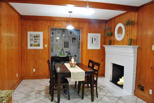
About a week ago (after we painted our brick fireplace) our kitchen looked like this:
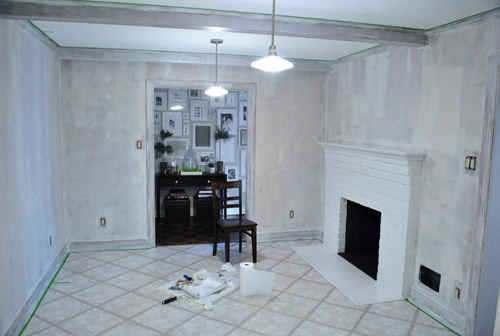
Then we removed the desk and upper cabinet (that will be in the way of our big future doorway to the dining room) and after one coat of not-covering-at-all primer it looked like this:
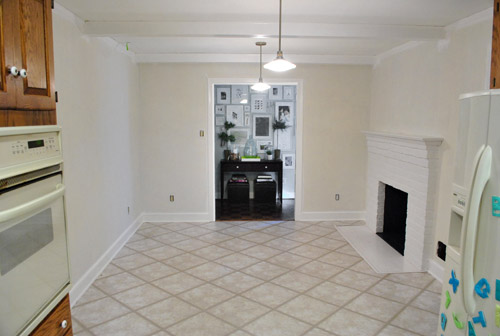
Then we finally got the primer thing right after dealing with maddening bleed-through issues thanks to two days of applying coat after coat and three different types of primer (more on that here):
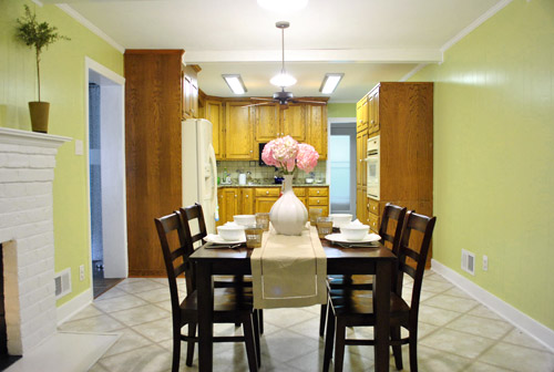
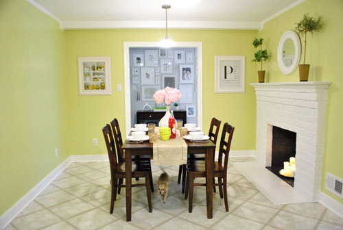
And now it looks like this, although it reads a bit more yellow in these photos than in person (it’s a smidge greener in real life).
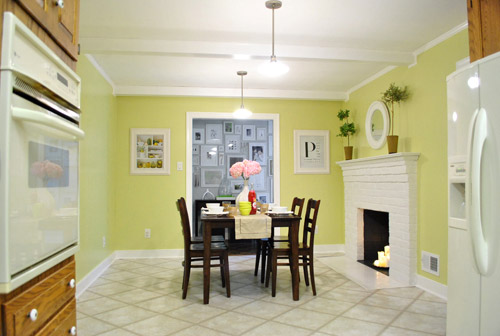
It’s definitely a warm golden green tone (aka: grellow). Sort of like the color of an artichoke heart.
There’s definitely a lot more to do in there, but we’re so glad to have the whole prime-and-paint-the-paneling thing checked off. Here’s a fun little video that encapsulates the entire process in three short minutes. Which is more than a little ironic because it took us just a wee bit longer in real life (you know, just a smidge). Just convert those minutes to days. See it below or here on YouTube.
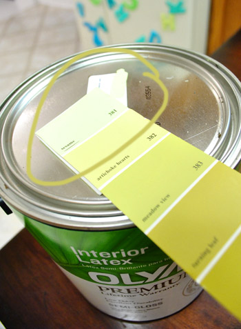
As for the paint color, after a decent amount of debate (and some pretty thorough consideration of the adjoining rooms that will be seen along with the kitchen) we opted for our new favorite color, which turned out to be Sesame 381 by Benjamin Moore (color matched to Olympic No-VOC paint in semi-gloss).
We were inspired by this kitchen (found here via Pinterest) since our cabinets will eventually go white, possibly along with our backsplash.
We chose this warm yellow-green color because we want the kitchen to be bright and happy (there aren’t any windows to the outside world – just one that looks into our sunroom) and it was suuuuuuper dark before we painted that paneling. We also knew the room could take a decent amount of color because:
- it won’t have any big long walls remaining when we add the extra-wide doorway to the dining room across from the fireplace (just slivers of wall here or there will remain, so the color won’t be overwhelming)
- we’ll be painting the cabinets glossy white later in this phase of our little kitchen makeover along with un-busying the backsplash (which will further temper the color on the walls)
- we’ll be adding an island in the place of our too-small table someday (with a different countertop and most likely a non-white base color to keep things interesting and layered)
- this room is surrounded by the dining room, the hallway, and the living room, which all have soft gray walls (so we wanted this space in the middle of them all to have some cheerful color going on)
When it came to our swatch-selecting technique we just hung up a ton of them and looked at them at all times of day to see which one we preferred. As for why we chose this swatch specifically, we decided:
- this golden-green tone will tie into the chartreuse curtain tones in the dining room and the cheerful green tone in our shaggy living room rug without being too matchy-matchy across the board (we didn’t want the exact same tone of green everywhere for fear that it would look a bit too “orchestrated”)
- a warm yellow kitchen is always a classic choice, but this color feels modern and crisp with the green undertones (and it’s not completely terrible with the oak cabinetry, which will stay for a little while)
- this tone is in Sue the Napkin – albeit a bit darker (a sure sign it’ll work with our whole house palette really well)
- unlike some of the other softer greens and greeny-gold tones that we considered, it really makes the white trim pop (lighter swatches didn’t have the same crisp effect next to the fireplace or the trim)
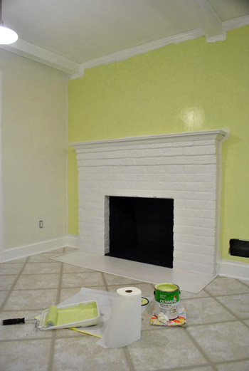
Here’s how it looked with the first coat going up around the fireplace (thanks to all that primer prep– we had really awesome coverage). Again, it’s looking more yellow and less green than it does in person in these photos, but you can really see how the white pops and how it turned a dark and brown-everywhere space into a sunny and bright room in the middle of the house.
We also decided that it was high time we switched out all of the “bisque” colored vents, outlets, and light switches.
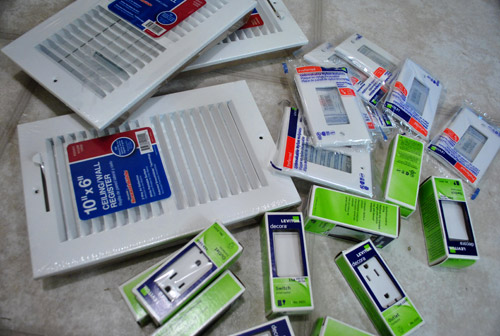
So we grabbed a bunch of crisp white ones from Lowe’s, turned off the power, removed the old ones, connected the new wires the same way they were connected to the previous switches, added the outer switchplates, and turned the power back on. The whole switch swap took about twenty minutes. So much better:
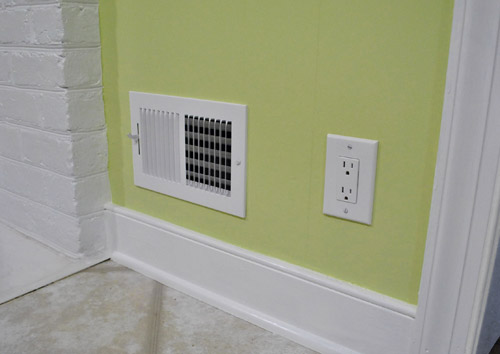
Some people opt to paint their vent covers so they blend in more, but for now we’re happy to leave ours crisp and new since we’re so used to old drippy painted-over covers (clean paint-free ones kind of feel like a luxury). Who knows if we’ll decide to add a few thin and not-drippy coats of paint to blend those vents in later though. We’ll keep you posted.
Oh and it’s really fun to go back and look at our fireplace, which originally looked like this:
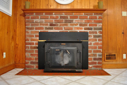
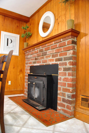
Then we removed the old unused wood stove and painted the brick, and it looked like this:
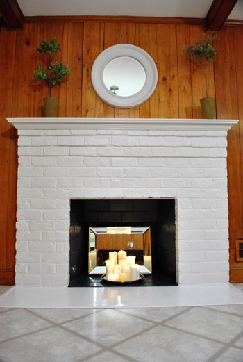
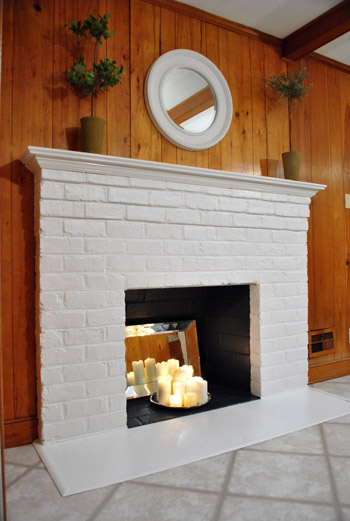
It’s amazing how much painted paneling can freshen things up even more:
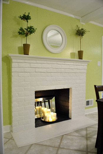
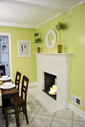
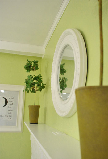
And we love how things like the white frames and the round mirror above the fireplace layer right in with the glossy white trim and beams:
Burger likey (he knows how to work that runway):
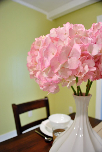
Oh yeah and see those pink hydrangeas? I wish I could say that we grew those, but they’re from the store. We figured to celebrate all that priming and painting we could spring for something soft and sweet, so these little pink snowball-looking-guys had me at hello (that’s an old vase from Target btw):
As for the opening to the dining room, here’s where it’ll be (it will line up exactly with the dining room window on the other side for balance):
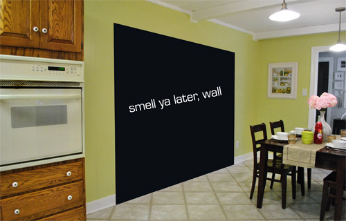
We learned that we’ll need a permit to knock out so much of that load bearing wall, so it sadly won’t be anything we can do very quickly (and we’ll definitely be leaning on some pros for help). But we can’t wait to tackle it as soon as we can get through all the permit business and hunt down the right expert for the job.
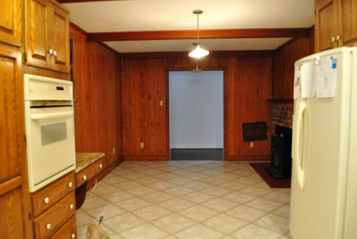
Now for some before & after bid-ness. Just because that’s my favorite part. Here’s the kitchen as it looked on moving day about six months ago:
And here it is now (still can’t wait to add that island, paint those cabinets, and upgrade the floor & appliances someday though):

Moving day again (yes, one of those lights was out):
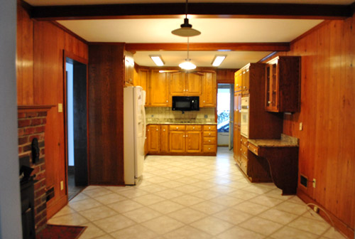
And now:

The crazy thing is that these photos were taken around the same time of day so it definitely demonstrates how much lighter and more cheerful the space feels now that the dark paneling is a thing of the past. Oh and here’s the budget breakdown:
- Olympic Premium No-VOC primer from Lowe’s: $12
- Behr 2-in-1 Primer + Paint (in semi-gloss white): already owned
- Kilz Clean Start No-VOC Primer from Home Depot: $20
- Olympic No-VOC paint (in Sesame by Benjamin Moore) from Lowe’s: $22
- New vent and outlet covers from Lowe’s: $43
- Brushes/rollers/tape/paint tray: already owned
- Total: $97
So there you have it. The kitchen madness has officially begun. As we mentioned here, we’re definitely going to do this in phases (gotta save our pennies and just take things on as we can afford them). But it should be a whole lot of fun. As in, more fun than a barrel of monkeys. And definitely more fun than priming that paneling five hundred times. Do any of you guys have long term kitchen plans like painting the cabinets or adding an island or upgrading the flooring or making some overhead lighting switches (we’re definitely in need of some of that too)? Oh the possibilities…
Psst- We announced this week’s giveaway winner. Click here to see if it’s you.

Meghan says
I’ve learned so much from you two! My husband and I are looking for a new house, and preparing for some DIY projects of our own. We see many homes that have wood paneled rooms and we’ve always been very turned off by them. Now I know how simple it is to transform the whole space with just a coat (or 5!) of paint!
When you knock the big hole in the wall, will it line up well with the fireplace?
YoungHouseLove says
It will line up with the large picture window in the dining room (so there’s a nice balance- hopefully so it looks like it’s always been there). But depending where you stand you’ll definitely be able to see the fireplace framed nicely through the pass-through!
xo,
s
Samma says
I know you’re going for balance with the wall knock out. But have you considered just taking the opening all the way up to the ceiling for an even more open & integrated space?
Its gonna look so much better regardless, just curious. = )
YoungHouseLove says
We want to match the height of the other doorways into the kitchen (like the one that looks out into the frame wall) so that’s why we’re excited to just make it look like another wide doorway into a hopefully-more-open-and-light kitchen.
xo,
s
Caryn says
Looks awesome! All this hard work is going to be so worth it. We redid our kitchen last fall and it was a ton of work, but we are so happy with the results. We had to do a lot of what you all are doing, except for the wall removal part, and it’s rough, but you’ll love it in the end! The tile backsplash was nearly the death of me, but it is definitely my favorite part now. Good luck! Can’t wait to see it as it unfolds!
Spring says
This looks ten thousand times better! I’ve been considering an apple green color for my kitchen (which is also the entry to our house so maybe not). This is very encouraging. :)
Marci says
LOVE it!!!! Totally off topic, I just came across this beehive drink dispensers and thought of you guys…
http://www.amazon.com/Beehive-Glass-Beverage-Dispenser-Gallon/dp/B0028LGSJG/ref=sr_1_24?s=kitchen&ie=UTF8&qid=1309448848&sr=1-24
YoungHouseLove says
So cute! Love it.
xo,
s
Katie Jarvis says
Awesome work guys! Makes a HUGE difference. Can’t wait to see it with painted cupboards. (after the much needed rest I’m sure).
Jen Ells says
Wow! Looks great! Love the paint color!
Liz says
WOW! You guys sure don’t waste any time! haha looks AHMAAAZINGG!! So fresh and so clean.
Lydia says
It looks great!!! You don’t even notice that it’s paneling with the new fresh color.
Have you ever thought about putting in skylights or a solatube to brighten up your interior kitchen more?
YoungHouseLove says
Yup, that’s definitely a possibility down the line. Maybe in Phase 2!
xo,
s
Sara says
Loooovee it!!!! :D
Stephanie says
Love the video!
Also, on a slightly unrelated note, I had a dream last night that you house crashed my (as-of-right-now-un-crash-worthy) home! And Burger was the size of a guinea pig. Too weird.
YoungHouseLove says
Haha- he was about 2lbs when he was born so that’s about right. Too funny.
xo,
s
Gaidig says
Fabulous improvement! I’ve been waiting for this. It just seems like this is one of the biggest impact things that could be easily done in your home.
I painted our cabinets as a stop-gap measure — everything was pink — but we will be moving a door, which will allow us to move the refrigerator, put cabinets next to the stove where the refrigerator is now, and add an entire new wall of cabinets. Not to mention a new floor instead of the peeling sheet vinyl and replacing all of the existing cabinets.
Patti says
*thud* (head hitting desk). Anazingly Awesome. Doesn’t even look like paneling anymore. Can’t wait for more …
linda says
very nice! such a bright and cheery color! the only thing is i despise semi-gloss paint… it’s all about flat for me! (even eggshell has too much sheen for me! *gasp*)
can’t wait to see it after you cut the wall and paint the cabinets!
Ann says
The kitchen looks wonderful. Wish I had the courage to go with that pop of color. Someday…
We are planning to paint our light oak colored cabinets white, change the background paint behind the splash guard (haven’t decided on a color yet) and re-do our currently mauve countertops with this: http://countertops.rustoleumtransformations.com/colors.php in either desert sand or pebbled ivory.
Our kitchen is also very dark even though we have a window. It only gets evening sun and with lots of tree cover outside (that we cannot cut down since we live in a condo), we have to make do with changing the inside.
Ashton says
Looks AMAZING! You guys are so talented. Cheers!
Ames says
It looks amazing! You guys are so brave with color, and it always looks great!
Katharine says
*flails* I LUVVVV THAT COLOR!! It’s going to look so awesome when the cabinets are white. Are you doing that soon, or are you taking a break from painting for a few weeks? (Wouldn’t blame you.)
YoungHouseLove says
Arms. Need. A. Break. Haha. At least for a little while. But we can’t wait to see how white cabinets will brighten things up so it won’t be a year-long break or anything. Haha.
xo,
s
Corinne says
All I can say is WOW!
Tracey @ tropicalhappiness.com says
Wow! The transformation is amazing! I can’t believe how much brighter it looks, just based on the paint color.
I wish you were opening up your wall now, because we are going to be doing that in 2 weeks to our new place. I could have used your inspiration. Ours is basically a huge 16+ wall, and we are cutting a 6 ft wide opening. It will be a bit taller than standard doors, because we are matching it to some windows on a connecting wall.
Question for you… what is your opinion on flat vs. enamel vs. eggshell vs. semi gloss paint in different areas of the house. We are about to paint our entire house, and we keep getting mixed opinions. We’ve been told to stay away from semi gloss because it will be too shiny with so much natural light in our new place. And someone told us to go with eggshell because it is easier to wipe clean, but someone else told us to stay away, because touch ups are extremely noticeable. Any advice or do you have an old post about this that I’ve missed!?
:)
YoungHouseLove says
We use semi-gloss in all kitchens and bathrooms and satin in our living spaces (just for the wipeability). We love that simple method (it’s easier to keep things straight, too) but it’s definitely one of those personal preference things. Good luck!
xo,
s
Laura says
I’ve had several paint companies suggest flat instead of the eggshell I wanted to use. Anything with sheen will show wall imperfections plus can’t touch up like you can with a flat finish. So I’ve changed my mind and I’m going with a flat. Now when I see walls with a shine, I don’t like it. (except in kitchens and baths where the painters do suggest a non-flat paint finish)
Natalie says
My kitechen is grellow too! It’s actually Honeydew (Shewin color, Behr paint)and I re-did my cabinets which were ulgy 90’s oak. Except I did cocoa, using Rustoleum Cabinet Transformations. It worked great! You can see photos on my blog, which I am soon to be unveiling the final final product! http://derricksondish.com/2011/06/the-cabinet-transformation-step-3/
YoungHouseLove says
So pretty!
xo,
s
Ashley @ DesignBuildLove.co says
GORGEOUS!!!!!!!!!!!! Seriously, there is absolutely NO comparison! Way to go guys and I absolutely LOVE the color! It’s so bright and airy now and the kitchen looks like a completely different space all together… not at all the same! And I LOVE that you went with crisp white everywhere. I’m a huge fan of crisp white and always feel like it just gives such a more polished look! NICELY DONE!!!
Angela says
Oh my gosh Sherry… my calves hurt just watching you in that video!! You must have calves of steel by now!
YoungHouseLove says
Haha- I never even noticed I did that tip-toe thing until we watched this video back. The funny thing is that our arms and shoulders are the most sore.
xo,
s
Sandy says
Of all the beautiful photos you showed, I’m curious about the “P” display hanging on the wall next to the fireplace. What does it say?? Curious minds want to know. :)
YoungHouseLove says
That’s a magazine monogram I made a while back. More on that here: https://www.younghouselove.com/2009/10/how-to-make-a-magazine-monogram/
xo,
s
Jessica M. says
There is it! Disregard the previous question…
YoungHouseLove says
No worries!
xo,
s
Lindsey says
Wow… ok so I am inspired to paint. We bought a new house but the walls AND the ceiling are the same shade of TAN.. it is really ugly… I am thinking of doing a light olive green.. You have officially motivated me!
Karen says
It looks amazing! The difference is like night and day. I love the color… it’s so bright and cheerful. Everything looks clean and crisp.
I’m in the middle of a kitchen update myself and plan to paint my cabinets white, too…. when I work up the nerve. I’ll be waiting for step by step instructions when y’all tackle that project. LOL
Stefanie says
Ok, this is just getting weird. I moved into my current first floor rental last May (2010) and luckily, my landlord agreed to let me paint as long as the colors were on the lighter side. I painted my living room grey and my dining room greenish yellow (I think the color was called “Budding Branch”). What the eff, are you stalking me?! Hah, your kitchen looks way better than my dining room though – I still walk in there and think it looks like a color someone would paint a nursery instead of something that’s fresh and modern, which is what I was going for and you guys accomplished (damn you!). Looks great!
YoungHouseLove says
Haha, hope you don’t find the spy cam I hid!
xo,
s
Solveig says
TADAAAA! What a dramatic (and fabulous!) change! I am obsessed with your “new” kitchen! You two are the masters of color and the sorcerers of transformation. Kudos to all of your hard work!
Where did you get your topiaries? I’ve been looking for years for “the perfect one.” Are yours real or faux? I’ve found several topiaries that I’ve fallen in love with, but I can’t seem to find one that’s reasonably priced! Do you have any advice?
YoungHouseLove says
They’re faux from crate and barrel a while back. Maybe try eBay or an outlet?
xo,
s
Kim says
Oooo “sorcerers of transformation”! I think if you ever stop blogging and start a design business, you should SERIOUSLY consider calling yourselves that. Imagine the business cards…
Harinee says
I second that!
Great job picking the colour!!
Sarah says
What an amazing transformation! LOVE it! We just finished “Phase 1” of our own kitchen transformation but I haven’t finished the blog post yet… Phase 2 involves building another cabinet for the dishwasher & a sliding drawer for garbage/recycling and adding open shelving above. Can’t wait to see how you guys tackle your island to get inspiration for building! Any good sites we should check out in the meantime?
YoungHouseLove says
Ana-white.com!
xo,
s
Lindsey says
Ok… Question…. How do you paint in semi-gloss and not get “roller marks”. My bedroom is painted in eggshell and you can even see the roller marks there. I hate it!!! I love the slight shine but the roller marks drive me nuts!
YoungHouseLove says
Thin and even coats are key! Thick applications can show things like brush strokes and roller marks.
xo,
s
meghan says
This may just be my preference…but I prefer the painting “pads” over rollers. It seems everytime I’ve used them–the coverage is so much smoother.
YoungHouseLove says
Ooh never tried those.
xo,
s
meghan says
http://www.lowes.com/pd_40664-1077-00745C_0__?productId=3033154&Ntt=shurline&pl=1¤tURL=%2Fpl__0__s%3FNtt%3Dshurline%26page%3D2&facetInfo=
ok, that’s a long link. But Shurline is the brand I’ve used (i’m sure there are other great ones, don’t listen to the reviews, they used them on decks, and there is a certain “deck quality” pad to avoid those problems!!).
They’re quick, and smooth and bee-a-u-tiful!
Brian says
Wow, looks excellent! It must be a dramatic contrast to face towards the table, where it looks complete, and turn 180 and see the cabinets there. I can’t wait to see it with them painted white. Good luck with that next step thouh, I’m in the process of painting some bookshelves that have doors at the bottom and man is it time consuming! At least the panneling is flat (flat = quick, usually ;) ).
Debbie says
Wowza! You guys amaze me each and every single time. Thank you, thank you, thank you for the inspiration. :)
Shari @ Chicago Cuisine Critique says
Looks great! Can’t wait to see the final product.
Korie says
So beautiful, great color choice! I’d love to see a more close-up picture of the painted paneling, to get an idea of the texture…
YoungHouseLove says
The grooves are visible but subtle. The photo up close of the vent and outlet (and the one of the mirror from the side) are close shots that are pretty accurate. Hope it helps!
xo,
s
Anna says
I looked at this post first thing this morning when I woke up [seriously – I was still in bed], and was so disappointed! It was on my iPhone and the color looked totally YELLOW. No green at all. So I moseyed on into work and checked it out again — and I LOVE IT! It’s the perfect shade of grellow :]
You give me inspiration to keep saving money for an overpriced starter house out here in the Pacific Northwest. I can’t wait to find a place that needs some TLC! Keep up the great work.
Torrie @ a place to share... says
Wow- What a huge difference!! I showed my husband your paneling post last night… We were watching a show (thanks to your design show recommendations) and they were dealing with old paneling… reminded me of you guys :).
Maura says
Love it!!! As always the work you guys do amazes me. Your visions always come out great.
Beth says
I am in love with this transformation so far! I went back and read your “how to paint your kitchen cabinets” post, and that is going to invaluable for us in our “new” house. Can’t wait to give it a shot!
Kellie says
When are you planning the floor re-do!? A grey tile will look so nice!
YoungHouseLove says
Someday we’d love to reveal the hardwoods that (we hope) are running underneath.
xo,
s
Erin says
The cabinet “eyes” look on ferociously as they sense the impending demolotion. Hahah that photo is cracking me up!
What a transformation with the paint job!
Lauren says
Love love LOVE it!!! The white and “grellow” is so clean and refreshing! Great job guys.
I wish we could do our kitchen that color, but our Corian countertops are a forest green (not my choice…thank you previous owners). If only we had a more neutral countertop!!!
georgia says
Love it!!!!!!! I bet u just want to be in there 24/7 now!
Erin says
So gorgeous! I really love how open and fresh it feels now! Fantastic. My arms are sore… from watching the video. Hope your Planning some relaxation for this upcoming holiday weekend. Happy 4th!!!
Liz says
love love love it! way to go, guys! i love that color choice – if it was in my kitchen i think it’d make me want to make more salads. i cannot wait to see when you paint those cabinets… i bet you’re itchin’ to start painting (i mean, once your arms start to feel less sore).
Liz says
oh, and i forgot to say… i was watching that “american pickers” show the other day and thought, “man, that mike wolfe looks like john from younghouse love”. except with darker hair & more age. have you already heard that before?
http://www.antiquearchaeology.com/
YoungHouseLove says
Oh yeah I can see that. John doesn’t (but he never does).
xo,
s
Angela Wilson says
It looks fantabulous!! I think the color reads more green in parts of the video than in these pictures. Excellent choice! I can’t wait to own a home (by the end of this year) and really put into practice all the wonderful ideas from this blog.
P.S. Don’t worry about the cabinets! Take the break you need…if I were you I’d move a patio chair in the kitchen, make myself a drink(s) and just sit and stare…well done!
Lani @ Diapers and Divas says
SO beautiful!! What a difference a little paint makes!! Great job!
Paige says
It seriously looks like a different house! When do you think you’ll tackle the cabinets? And are you going to change out the floor, or leave it?
YoungHouseLove says
Down the line in phase 2 we’ll tackle the floor. Cabinet painting is hopefully phase 1 though, once our arms recover…
xo,
s
Jen says
I’ve never commented before! But I am a daily obsessed blog reader, you’ve inspired so much in my own home and have taught me so much about painting.
The kitchen looks FABULOUS!
Question, is is just me or do you both not seem to get any paint on you? Sherry you were wearing a black shirt! How do I get COVERED in paint and ruin every outfit I paint in?!?!
Love you guys!
YoungHouseLove says
I did! Actually this time I got a big green smear on my chest. Got too close to the wall while cutting in. Haha. Thank goodness for painting clothes (the shorts I had on are covered in smears of all colors if you get close).
xo,
s
vettyv says
WoW!! As usual you all did a bang up job and do not dissapoint! Great Job Guys! You all make a super team!
meghan says
Is it possible to love a Kitchen? Yes. Then I do. This is such a great transformation! Love the color, LOVE the white/grellow contrast.
brett says
nice work. you guys are the masters of paint transformations, no doubt!
while you’re replacing outlets… did you know they make tamper-proof electrical outlets now, look for a “TR” symbol. means you don’t need little clara-proof inserts pushed into them as they have a built-in safety device.
YoungHouseLove says
So smart!
xo,
s