Remember when I shared our possessed painting that jumped off the wall cheap painting that we got for $20 at a yard sale…
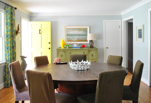
… and mentioned that we:
- mostly liked the size of it and the chunky frame (which actually came with a little dent in it – a total sign that this guy was a trouble-maker)
- weren’t in love with the art itself (it just felt sort of generic and hotel-ish in person)
Yes? Me too.
And then remember when a bunch of you (seriously, like at least a dozen of you guys) recommended that we do some sort of letter stenciling over it like this genius creation by Emily Von Henderson or this masterpiece by A Beautiful Mess (psst – you can check out other awesome painting-words-over-things art projects here, here, and here).
Yes? Me too.
Well… we were sold. And the deed is DONE!
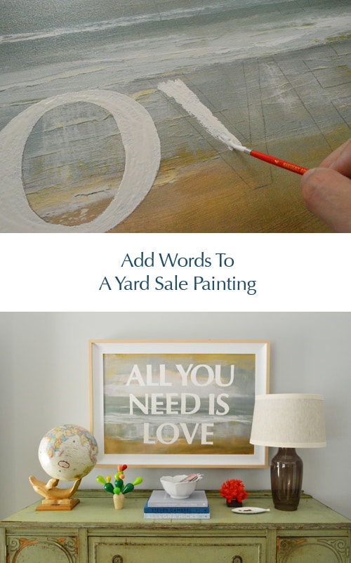
We debated just leaving the letters unpainted and covering the rest of the canvas with white paint, but actually liked the idea of white letters with the painting as the background. And it was actually really simple. Seriously, the hardest thing was deciding what we wanted our dining room wall to be saying to us every day. But we finally landed on an oldie but a goodie: All You Need Is Love. Ain’t that the truth? It somehow has:
- an ode to one of my favorite bands (my dad and I know nearly every word to every album & even watch old Beatles movies together)
- part of our blog name (same last name, haha)
- a positive general message (it’s not a bad reminder for any of us)
- a classic feeling that we hope is timeless (it shouldn’t feel “so last year” like Lady Gaga’s meat dress or The Bieb’s old haircut)
So for all of the above reasons, we went for it. The next step was faking this baby in photoshop first, just to help us picture it. Here’s a quick photoshop rendering that I threw together to see what we liked:
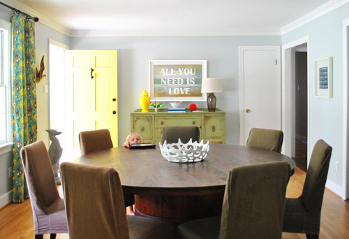
I definitely don’t think you need photoshop to visualize this though. We just had it on hand, but if you don’t I think a free program like gimp could work equally well just for laying type over a basic image and seeing what fries your bacon. Aaaand we’re back to meat.
Anyway, we realized that we wanted each letter to be about 5″ tall and the typeface we preferred was Optima Bold (with a point size of 507 which got it to be exactly 5″ tall). How did we know we needed the letters to be 5″ tall? I just noticed in the rendering above that the stripe of green in the middle of the painting was about the height of those letters on top of it. So I walked over to the painting, asked it not to jump off the wall on me, and very gingerly measured that green stripe. Five inches tall = the answer.
Then I printed each letter out in a very light grayscale ink (to save money/ink) on card stock (only one letter fit on each page, but I saved all my leftover cuttings for Clara-projects so it wasn’t too bad) and I was left with this:
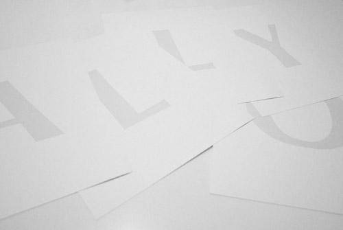
After I cut them each out carefully with a scissors (and an x-acto knife when they had interior sections to cut like the O and the D), they looked like this:
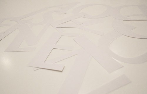
Then I placed them all on my painting so I could figure out the spacing…
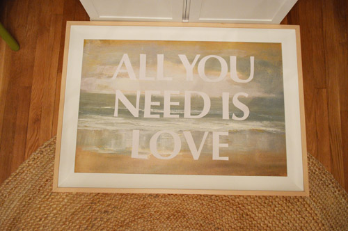
… and used a light pencil line traced around each one directly onto the painted canvas.
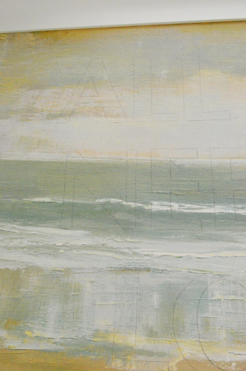
That way when I lifted them off it was literally just a good old fashioned game of fill-in-the-lines, which I did with white acrylic paint and a small craft brush.
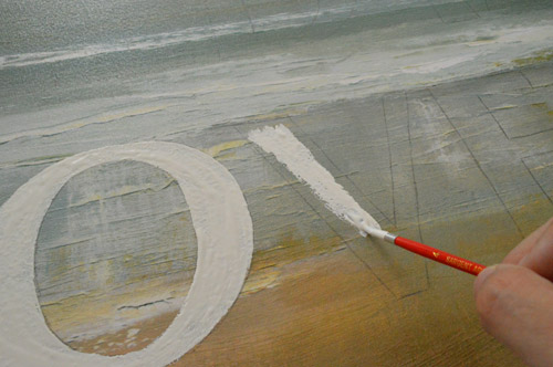
It only took one coat, and that’s all she wrote.
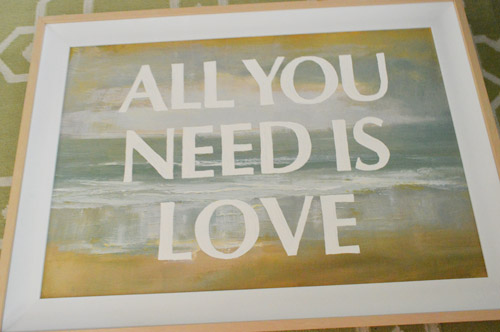
The result = something that feels modern but still has those soft tones and texture behind it. It really is a fun way to update a piece that kinda feels hotel-ish and mass produced. All of a sudden it’s all yours (picking what it says, and even choosing things like the size, the color, and the typeface suddenly makes you feel like it’s sweet and personal).
Oh and I had originally planned to paint the frame white but the wood tones in the frame tie into the exact warm oak-y color of the buffet where the paint is chipping off, so there’s something kind of sweet about leaving him naked. And John was on the No-Paint Frame Train (choo choo) so he further convinced me to leave it be for now. I’m actually loving it as-is.
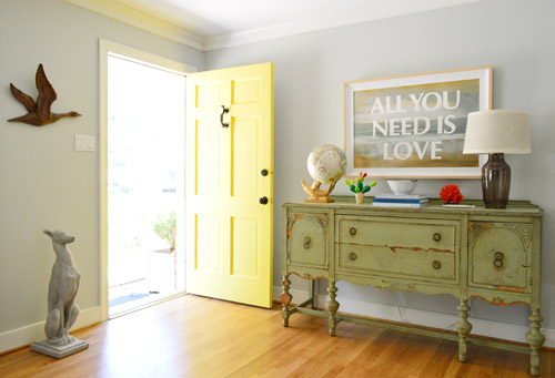
As for the cost, this update was free (since we just used what we had on hand like existing printer ink, white acrylic paint, and card stock from our stash) and the actual project total was $20 if you include the loot we doled out at that yard sale for the art itself. Not bad for a personalized painting that’s over three feet wide, right? Now let’s just hope this guy doesn’t dive off the wall again anytime soon. I like to think he did that out of boredom but now that he’s more entertained by his outfit it’ll be cool from now on.
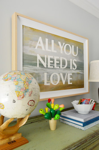
This really was an easy, cheap, and satisfying project. So if you have an old canvas, print, photo, or poster that you’re feeling meh about (or you find something ok-but-not-amazing at a thrift store) a $2 tube of white acrylic paint, a small paint brush, and a printer might be all you need to fall in love with the guy. Oh yeah and a scissors. You need those too. And you need a sentence that you like enough to stare at for a while. But that’s the fun part!
What did you guys do this weekend? Is anyone else painting over art? Were you all out yard sale-ing? It rained for about 70% of our weekend, so I totally want a do-over. Who’s with me?
Psst- Wanna know where we got something in our house or what paint color we used? Just click on this button:


Jaime says
Well done! I really like this idea. But I am curious as to why you traced and then painted the letters, instead of printing in white and gluing what you already had? I assume it just makes it more of a fun project and painterly.
YoungHouseLove says
We talked about gluing but we thought painted lettering would be more flush, wouldn’t bubble or peel, and would have that charming painted texture, so we went for it.
xo,
s
Kathryn says
Brilliant!
Tiffany says
you are brilliant!!! love…love….love it!
brooke @ claremont road says
I have a “meh” flea market painting just SHOUTING to have some words painted on top of it. GENIUS. Thank you!
Julia [life on churchill] says
what a great idea! it looks really good.
Nicole says
This is Brilliant! Really love this! Huge Beatles fan :)
Paige @ Little Nostalgia says
Love this! It works really well with the fuzzy, generic background. See, hotel art IS good for something!
I did the same project (different saying, though) back in June:
http://littlenostalgia.blogspot.com/2012/06/diy-favorite-quote-wall-art.html
YoungHouseLove says
Love it!!
xo,
s
ShellyP says
very very nice. The painting itself was “okay” but adding the text == and something that is personally connected to you == was pure genius.
Ginny @ goofymonkeys says
It looks great! I love the sentiment, too.
Allyn says
Love it! We have a framed print in our living room that says “All they need is love.”
It was actually a shoeboox lid from a pair of Joe’s Jeans shoes that I ordered. We loved the color and the font so much that we cut it out and framed it. Hooray for free/cheap art!
Melody says
I totally took a Pinterest challenge and DIY’ed a purple and white chevron rug. Definitely can’t deny that you guys influenced me. So thanks!
Jen@The Decor Scene says
I LOVE IT!!! I actually liked the painting, it just seemed calm to me, so this was the perfect addition to the piece.
We did some house work, some yard work {until a big spider was on my arm and I was done then. No worries, I didn’t get bite but it was the size of a quarter with it’s legs. OMG} and then we even went to a small classic car show down the block from our house. Oh and we sold a rocker/reclincer that we didn’t have any use for anymore to a first time mom that is going to put it in her nursery. Made us all warm and fuzzy that it was going to a good home with a super cute and like-able couple. ;)
Lindsay says
This is wonderful! Now if that wooden mallard would just fly the coop already the whole room would really “Come Together.”
YoungHouseLove says
All you need is love… for the mallard! Haha.
xo,
s
Michelle says
No way! The duck is duckin’ awesome!
Linda says
Beautiful! Next time, though, you might find it easier to transfer the letters (or an image) the way artists do… using good ol’ fashioned carbon paper. Saves you the time cutting out all those letters, you can just trace them! ;)
YoungHouseLove says
Great tip! I thought about stencils (never even thought of carbon paper!) but just wanted to use what I had on hand :)
xo,
s
jennifer says
You can also use pencil lead and then trace the letter, leaving the lead on your painting…I do it all the time!
YoungHouseLove says
Smart!
xo,
s
Lisa P. says
Love it!!! Now I need to find some art to do this too.
Diana says
That’s lovely. I’m not usually a fan of word art on walls, but this is really cool looking and a great way to update that old painting!
Zuzanna says
I need to do this very soon!
Alison says
Cute idea! I want to do something similar with marker and rhinestones on an old painting.
soiledrotten.blogspot.com
heyruthie says
this is rad.
Stephanie says
Love the pic! It is such a great update to a previously boring painting. It kind of reminds me of an articipe. (Who I’m waiting very patiently from them to start accepting custom orders again. I have a christmas present plotted for my mommy. :) )
I spent all weekend being lazy. I just couldn’t motivate myself off the couch for anything except plans I had already committed to. I will pay for this tongiht in grocery shopping and laundry. :(
Zoë says
It looks great. I’m definitely a Beatles fan (well, I’m English, and I think that it’s actually illegal to not like them). My kids love watching A Hard Day’s Night – I bet Clara would too.
As for our weekend, we’re getting the house ready to sell and have been redecorating the kitchen, which included removing the cabinet doors and painting all 19, as well as five drawers, and the cabinets. Inspired by your adventures in ORBing your front door hardware, I broke out the spray paint to paint the cabinet hinges. They turned out great, as did the cabinets and doors but when we rehung the doors, some now won’t open and/or close properly. Doh! We labelled every door, and all the hinges are identical, so we don’t know what happened. Time to take ’em down and try again, I guess.
AngieC says
That looks incredible! Now I’m kicking myself for all of the artwork I’ve passed over while out thrifting.
Kimberj says
I love the blog, I love you all, but sorry… I hate this project :( now it looks like a cheesy poster from one of those Christian inspiration stores. Still LOVE YOU GUYS especially Miss Clara and the Burgs!
YoungHouseLove says
Aw no worries! Art is such a personal thing, it’s definitely not something everyone would hang in their house!
xo,
s
Meredith @ La Buena Vida says
Cool update! I think I’d probably have a harder time settling on a font that I’d love for years than a saying!
YoungHouseLove says
Haha that’s funny and true! John kept jokingly suggesting things like comic sans and curlz.
xo,
s
Suni says
I love love love love it… seriously you two are just full of fantastic ideas. Gives me lots of inspiration!
Wendy says
Simple. Beautiful. Personalized. Perfect. Well Done.
Our weekend:
*applying for jobs (yay!)
*discussing Brit Romantic authors (looooove that my husband and I share this mutual interest… and how unique were their -mostly- short lives? :-)
*visiting Cox Honeyland in Logan (http://www.coxhoney.com/)
*enjoying the adventures of our wee one!
Anele @ Success Along the Weigh says
Love it!
Jennifer A says
I did something like this once for a friend. But, an easier trick to getting the letters “traced” is to first print them on paper (like you did), then color the back of them with a very “leady” pencil. Then, you can retrace over the letter on the front side and it leaves a very light line. It may be harder to space them that way, but it saves A LOT of tedious cutting.
YoungHouseLove says
Making a rubbing! I used to love doing that as a kid! Great tip!
xo,
s
Laurie says
Love this idea! It turned out great. I appreciated the full shot of the buffet because I really needed a point of reference with only one lamp. I refurbished an old credenza for my entry way and found a great green glass lamp at Home Goods this weekend. I wanted two but alas it wasn’t meant to be. I wasn’t feeling it with one lamp but I put 3 recycled glass jars of varying colors and sizes on the other side and I like it much better with the balance. Your lamp with the whale globe made me realize I can pull this off. As for the rest of the weekend…in the midst of a tile project in the bathroom…..doing tile halfway up the walls with a glass mosaic border and a tile chair rail. I am also making some paint chip art for the wall in the entry way but so far it does not look good! :(
YoungHouseLove says
Aw man, it’ll come around I’m sure!
xo,
s
Karla@{TheClassyWoman} says
I think adding the words adds SO much more than how the painting was before. What a great message for people to see upon entering your home. It’s so obvious that your home is filled with love. :) XO
YoungHouseLove says
Aw thanks guys. You’re all so sweet!
xo,
s
Amy E. says
looks great!
we spent our saturday cleaning out the garage! very refreshing to have it decluttered (got rid of 2 huge garbage cans full, plus bulk items that didn’t fit in the bins), and we were able to do it while TS Isaac rained on us.
Krystle @ Color Transformed Family says
This makes me want to go yardsaling. What a great piece of art you have now. I love projects that are free but cause you to fall even more in love with stuff you already have.
We didn’t tackle any projects this past weekend but we did revisit our childhood. My husband and I joined in the fun at my nephew’s birthday party by roller skating. Happy to say I didn’t fall!
emilymarion says
Love, love, love is all you need.
Hanging out with Isaac this weekend in FL.
School was canceled. It’s a FL snow day! Perfect weather for some painting & this was just the motivation I needed.
YoungHouseLove says
Haha, yay Fla snow day!
xo,
s
Emily says
I love it! Such a great idea to make it your own!
Katie says
I love it! I have been listening to the Beatles all weekend :)
Tanya says
Have been following you for years. LOVE your style, energy and fab ideas, and ALWAYS rooting for you!! But this time I have to say I dont like the set up. The table is SO beautiful, nothing on it or above it is making it the charming focal point it should be, the painting and the urn has taken over. I would put 4 black and white photos in dark wooden frames there, an elegant look that blends rather than pops, and on the actual table, a lovely white orchid with 2-3 pretty bowels or 1-2 pretty boxes Sorry guys. I have always loved what you do, feel so mean to even type this. And as if it has anything to do with me anyway….
YoungHouseLove says
Oh no worries Tanya! After five years of sharing our home we’ve learned that art is certainly one of the most personal/subjective things! But there’s something awesome about that since every house will never be in danger of looking the same! Just gotta put your stamp on your place with art that ya love and make your house work for you, you know?
xo,
s
amybeth says
I dunno about putting bowels out as decor, no matter how pretty. lol. I’m not usually the grammar police but that one is just too funny.
Jocelyn Pascall says
I love it! Looks really great, and such nice words to live by :)
Mandy says
So glad you decided to take our suggestion! hehe.
I love it! :)
I, too, vote for a do-over of this weekend. Though I did get one project partially completed. I used your iron-on hem tape tutorials to hem my beansie’s curtains. They haven’t gone up yet, but hey, I’m one step closer…and will hopefully get them up there before she graces us with her arrival in November. :)
Thanks for all the help you didn’t even know you gave me. ;)
Koliti says
You’ve now created your own private beach with your message written in the sand. Dip your toes in any time – heck, go body-surfing!
Stacey says
All you need is love…and I am in love with this!! That whole wall has really come together!
I’ve spent all morning at work (yikes!) trying to come up with a quote I love so I can do this at home, too! Thanks for the inspiration!
Chelsea says
That is such a great idea! I feel so inspired! And I have that same quote in a frame in my daughter’s room.
Kasia Johnson says
Awesome.
Also, I saw this and thought of your egg chair:
https://www.onekingslane.com/vintage-market-finds/product/839521
YoungHouseLove says
Fun!!
xo,
s
Sheri says
Awesome!
Teresa says
I really, really do love this idea and your’s turned out beautifully.
Tyra says
Love the art! Actually did some word-art myself. Stenciled ‘a home is not a home without a dog’ on a canvas….and hung it above my dog’s bowls. Apparently I think she can read? Oh well, every living thing likes homemade art, right?
YoungHouseLove says
Haha so cute!
xo,
s
Emily says
ahh! I’m now in love with that painting!!! I wasn’t impressed when you first got it, but, meh.. it’s not my house… :) haha! But now, I need my own hotel art so that I can make something awesome!!! :)
Christi says
I work in sales at a hotel and I completely thought your painting/framed art thing was a fire sale item! It looks great and personalized now but I cannot believe Joss & Main are selling it for over $300.00!!!
Congrats on a good find! I am now going to search my hotel for the next big art thing!
Kiki says
I love this! I’ve seen the projects over at A Beautiful Mess and wanted to do it then, but now I really really really want to make my own! That quote is perfect. And I love the tip about testing it out on Photoshop.
I think I’ll have to make a stop at Goodwill or something in the near future. :)
Kelly Morley says
LOVE!!!!!!!
Nicole says
Speaking of art, I saw this posted on ourhumbleabowedblog.com by Amanda and thought it was totally your style:
http://www.etsy.com/listing/105166735/stained-glass-honeycomb-drops-set-of-10
Keep up the good work! I love watching the transformation from house to home.
Nicole
YoungHouseLove says
Ooh I love that!
xo,
s