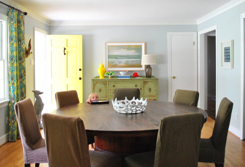
Remember when I shared our possessed painting that jumped off the wall cheap painting that we got for $20 at a yard sale…
… and mentioned that we:
- mostly liked the size of it and the chunky frame (which actually came with a little dent in it – a total sign that this guy was a trouble-maker)
- weren’t in love with the art itself (it just felt sort of generic and hotel-ish in person)
Yes? Me too.
And then remember when a bunch of you (seriously, like at least a dozen of you guys) recommended that we do some sort of letter stenciling over it like this genius creation by Emily Von Henderson or this masterpiece by A Beautiful Mess (psst – you can check out other awesome painting-words-over-things art projects here, here, and here).
Yes? Me too.
Well… we were sold. And the deed is DONE!
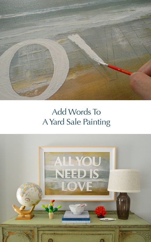
We debated just leaving the letters unpainted and covering the rest of the canvas with white paint, but actually liked the idea of white letters with the painting as the background. And it was actually really simple. Seriously, the hardest thing was deciding what we wanted our dining room wall to be saying to us every day. But we finally landed on an oldie but a goodie: All You Need Is Love. Ain’t that the truth? It somehow has:
- an ode to one of my favorite bands (my dad and I know nearly every word to every album & even watch old Beatles movies together)
- part of our blog name (same last name, haha)
- a positive general message (it’s not a bad reminder for any of us)
- a classic feeling that we hope is timeless (it shouldn’t feel “so last year” like Lady Gaga’s meat dress or The Bieb’s old haircut)
So for all of the above reasons, we went for it. The next step was faking this baby in photoshop first, just to help us picture it. Here’s a quick photoshop rendering that I threw together to see what we liked:
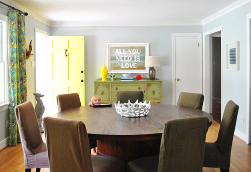
I definitely don’t think you need photoshop to visualize this though. We just had it on hand, but if you don’t I think a free program like gimp could work equally well just for laying type over a basic image and seeing what fries your bacon. Aaaand we’re back to meat.
Anyway, we realized that we wanted each letter to be about 5″ tall and the typeface we preferred was Optima Bold (with a point size of 507 which got it to be exactly 5″ tall). How did we know we needed the letters to be 5″ tall? I just noticed in the rendering above that the stripe of green in the middle of the painting was about the height of those letters on top of it. So I walked over to the painting, asked it not to jump off the wall on me, and very gingerly measured that green stripe. Five inches tall = the answer.
Then I printed each letter out in a very light grayscale ink (to save money/ink) on card stock (only one letter fit on each page, but I saved all my leftover cuttings for Clara-projects so it wasn’t too bad) and I was left with this:
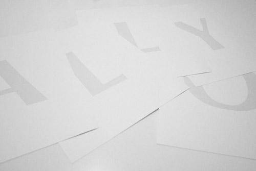
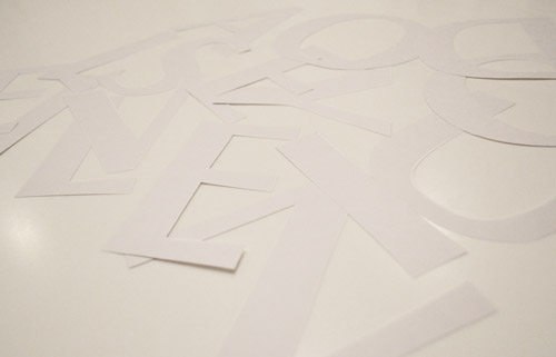
After I cut them each out carefully with a scissors (and an x-acto knife when they had interior sections to cut like the O and the D), they looked like this:
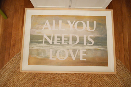
Then I placed them all on my painting so I could figure out the spacing…
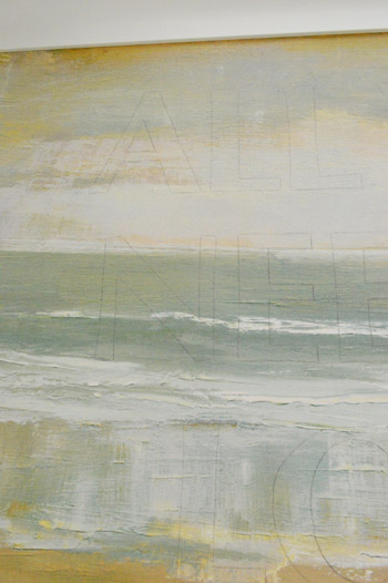
… and used a light pencil line traced around each one directly onto the painted canvas.
That way when I lifted them off it was literally just a good old fashioned game of fill-in-the-lines, which I did with white acrylic paint and a small craft brush.
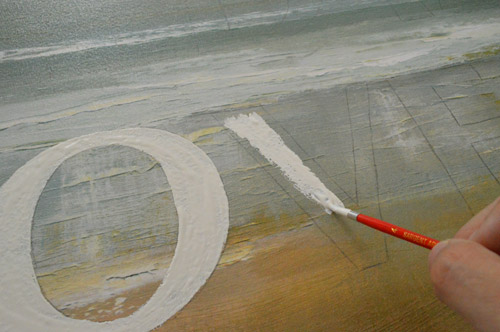
It only took one coat, and that’s all she wrote.
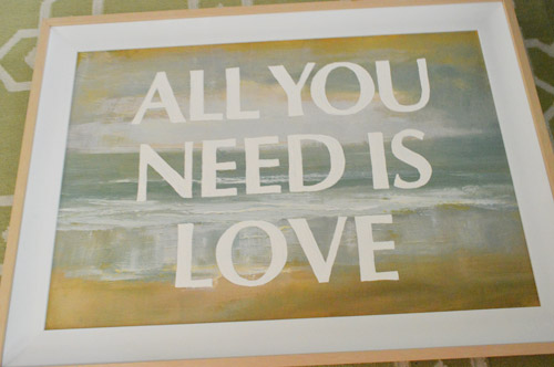
The result = something that feels modern but still has those soft tones and texture behind it. It really is a fun way to update a piece that kinda feels hotel-ish and mass produced. All of a sudden it’s all yours (picking what it says, and even choosing things like the size, the color, and the typeface suddenly makes you feel like it’s sweet and personal).
Oh and I had originally planned to paint the frame white but the wood tones in the frame tie into the exact warm oak-y color of the buffet where the paint is chipping off, so there’s something kind of sweet about leaving him naked. And John was on the No-Paint Frame Train (choo choo) so he further convinced me to leave it be for now. I’m actually loving it as-is.
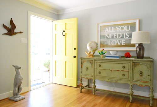
As for the cost, this update was free (since we just used what we had on hand like existing printer ink, white acrylic paint, and card stock from our stash) and the actual project total was $20 if you include the loot we doled out at that yard sale for the art itself. Not bad for a personalized painting that’s over three feet wide, right? Now let’s just hope this guy doesn’t dive off the wall again anytime soon. I like to think he did that out of boredom but now that he’s more entertained by his outfit it’ll be cool from now on.
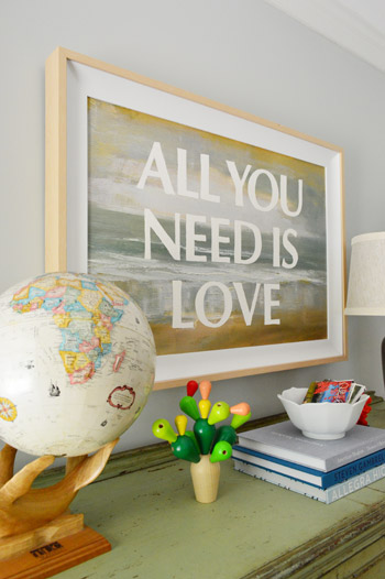
This really was an easy, cheap, and satisfying project. So if you have an old canvas, print, photo, or poster that you’re feeling meh about (or you find something ok-but-not-amazing at a thrift store) a $2 tube of white acrylic paint, a small paint brush, and a printer might be all you need to fall in love with the guy. Oh yeah and a scissors. You need those too. And you need a sentence that you like enough to stare at for a while. But that’s the fun part!
What did you guys do this weekend? Is anyone else painting over art? Were you all out yard sale-ing? It rained for about 70% of our weekend, so I totally want a do-over. Who’s with me?
Psst- Wanna know where we got something in our house or what paint color we used? Just click on this button:


Shannon says
Love the update! Such a good idea. Also, I love your cactus esque statue in front of it. Where did you get it?
YoungHouseLove says
That’s actually Clara’s stacking toy! Haha. It’s made by Plan Toys and we bring it down and play with it a lot!
xo,
s
Erin says
I’m not gonna lie, I always sort of fancied that painting since you got it — the colors just looked so right for the space. The wording is fabulous and totally makes it unique (which I feel is what it lacked before). Good call!
Cady says
Nicely done Sherry! We had a decent amount of rain in DC so I spent some quality time knitting :) I did do a small art project and painted this 5×5 canvas to put the baby’s medical tag on. I had seen that as part of your wall of frames and loved the keepsake idea.
YoungHouseLove says
So cute!
xo,
s
Lilian Garcia says
absolutely fabulous, perfect, love, love, love it!!! Now it can be in an Art Gallery (and I would buy it, for sure!).
Looks like a kind of DIY project by The Novogratz, so
pop art!
Vicki says
What a fun way to make that art your own! And so easy to do as well. I do love your choice of type, though as a graphic designer, all I can see is the lack of kerning! (sorry, typography nerd here!)
YoungHouseLove says
Haha the funny thing is I was telling John that my typography teacher would have been all over me for kerning & tracking. Haha. I decided to embrace that homemade/imperfect thing. Haha.
xo,
s
Jen says
Love it!! Also love where you moved Clara’s globe ;)
candace says
Such a cute idea! Way to transform that hoo-hum painting into something personal and awesome!
Kristin C. says
Thought I loved the before, but nope, definitely LOVE the after much more!
Scoot says
Love this! I have a whole mess of cheap paintings I bought when I got my first apartment….this may be just the thing!
Wrenaria says
Love it! Cheap, and easy, and awesome.
sarah says
I love this! We had all Beatles music at our wedding, so their songs are extra-special for me :]
liz says
i love how this project turned out. nice job. i’m curious though if you have any plans for that closet door in the dining room. i love the bright yellow front door on the left and thought it might be cool to have that closet door painted yellow or in another equally fun, bright color. i’m excited to hear your plans.
YoungHouseLove says
The back of our front door is white so it balances with the white closet door, but you never know where we’ll end up!
xo,
s
Karla says
It looks nice as is, but it would be fun to remplace with a vintage yellow screen door! That’s what I’m doing with my coat closet, but I’m painting mine tomato red!
YoungHouseLove says
That’s so sweet!
xo,
s
Cate O'Malley says
Love how the picture turned out! I’ve had that project pinned forever – need to finally break down and make it. Did The Color Run in NYC with friends this weekend – way.too.much.fun.
Amber says
That’s what we did for our pinterest challenge this summer! We even chose a song lyric too! Love how yours turned out! We had too many words to paint on, so we just used adhesive letters!
http://www.willscasa.com/2012/07/summer-pinterest-challenge-1/
YoungHouseLove says
Fun!
xo
s
Heather W says
I actually got busy on my own paint chip art project and it is hanging in my living room. I love it. Thanks for the inspiration guys!
Lauren says
This is GORGEOUS! Just like your family :) I can’t get over how great it looks! I’m stealing the idea… thanks Sherdawg.
Stephanie says
I went to a local high school band’s yard sale (fundraiser) where everything is donated and prices are cheap! I copied something off of you all and looked for hardback books with nice colors on the spine to use for decoration only. At $.50 each I couldn’t pass them up. I also got a 1970’s looking wooden owl napkin holder. I might spray paint him something bright! I think I may have caught the yard sale bug!
YoungHouseLove says
Love that!!
xo,
s
LARY @ Inspiration Nook says
This is awesome. The fact that you also read A Beautiful Mess made me smile too. I celebrated my birthday this weekend, took today off to recover! :)
Becky says
Love it! I’ve been wanting to do a reverse version of this using newspaper and spray paint but maybe I’m making things too difficult…yours is very cool.
I love that that you also have to print out your letters, cut them out, and trace them to get stenciling done. That’s how I do so many projects, like this doozy, and MAN it can take a long time! Makes me crave one of those cool and very expensive Silhouette machines. Ahhhhh, maybe someday.
YoungHouseLove says
That’s fun! Thanks to everyone who linked to their projects!
xo,
s
Monica says
Where did you get that wooden cactus? It looks like an art piece from Bunny With a Toolbelt.
YoungHouseLove says
It’s a Clara toy from Plan Toys. We love that thing!
xo,
s
Dana says
I love that so much! My Dad and I are also that way with The Beatles! My Dad and I danced to “I Will” at my wedding. And, in leiu of favors we made a donation to an cat rescue, so we had a sign that said ‘All you need is Love…and a Cat”.
YoungHouseLove says
Haha cute!
xo,
s
Rebecca @ the lil house that could says
This is a great idea! I have a tshirt from Old Navy that says all you need is love :)
And after seeing the picture that includes the chairs I’m thinking the chairs would look great white… though I know that idea sounds completely high maintenance and scary!
YoungHouseLove says
Yeah we are so over those chairs! Maybe someday we’ll get them right!
xo,
s
Erin says
I agree with you on the chair note! You did the best you could to try and DIY the fugly out of them but i think its time to bit the bullet and buy some pretty leather ones.
YoungHouseLove says
Haha, it’s definitely not outside of the realm of possibility!
xo,
s
elsie (A Beautiful Mess) says
Oooh! Love your wall art! Super pretty.
We’re big fans of your blog. :))
YoungHouseLove says
Aw thanks Elsie!! You guys are an inspiration!
xo,
s
Ally says
Clara, the cute-pie photo-bomber, strikes again! iPad in hand :)
Great project!
If “All You Need Is Love”, then the Petersiks have it in spades :)
xox
Kaitlyn says
Oh! I really love it! I was thinking before “that paining is lovely, why do they want to touch it?” but it just turned out beautifully. I like that you didn’t cover up the painting too much. KUDOS!
Ashley@AttemptsAtDomestication says
Love. I absolutely love it! Reminds me of Moulin Rouge!
Pamela says
Super wacko question, but looking at the pics … how did you decide WHERE to hang the painting? Like, how far up from the buffet? Was it just eyeballin’ it? Is there a formula to this (x should be y from buffet and z from ceiling)?
Thanks!
YoungHouseLove says
Totally just eyeballed it while looking at other art in the room to try to keep things balanced. In general hanging something 8-18″ above something like a buffet or sofa helps it connect and relate instead of riding high and feeling like it’s floating. Hope it helps!
xo,
s
libby says
so good! i love how the painting that looked kind of cheap hotel-ish to begin with got super awesome.
i too just got bit by the wall word art. it seems to be contagious these days. http://hopingforrocketships.blogspot.com/2012/08/sharks.html
YoungHouseLove says
Hahahaha, I love it!
xo,
s
Deirdre says
So ironic, I just watched that exact episode of Secrets From a Stylist last night online! Love what you guys did, and especially love the Beatles lyric! :)
Jess says
Loooooove this!
Morgan says
This is awesome! I am doing a little something like that in my master bedroom with music lyrics and art. But this is pure genius!
http://livingyoungwildfree.wordpress.com/2012/08/23/i-art-to-fill-in-the-frames/
YoungHouseLove says
That’s so charming!
xo,
s
Lesley@ChaoticallyCreative says
Sherri, I think we are either connected telepathically or long lost sisters because I swear to goodness this is about the 5th post you’ve done that I have almost the exact project going on at the same time. I just finished a “Beatle’s” painting with a line from “Hey, Jude” which is going in my son Jude’s room. I am almost done but have one more step. When it’s finished I’d love to share my version. I love what you have done as well. And like you we have a connection with family members, memories and the Beatles. Which will all be revealed in my upcoming post. Thanks for sharing. Lesley
YoungHouseLove says
That’s so funny! I love it! Maybe we share a brain. Haha.
xo,
s
Katrina says
Looks so good!
Shayli says
Random question totally unrelated to this post sorry….im looking for shelves like the ones in clara’s room above her dresser. Do you know what kind and where you got those????
YoungHouseLove says
We built those! John did it all, actually. If you click on our projects page they should be in the kid section or you can search (on our sidebar): nursery shelves kreg jig – and that post should come up.
xo,
s
Addie Klein says
Oh my gosh, I love this! I wonder if my husband would let me do this to some of his artwork from his bachelor pad that is languishing in the basement? I want a huge statement piece in our bedroom, and this would be a great way to do it.
Jenna at Homeslice says
I love it! I’ve always been a beatles fan too, so I’m all about the quote! You’re right, it definitely feels more like “you” now. Hooray!
Lindsay Huff says
Love love loveee this! Awesome idea! Dad and I are Beatles fan’s too. I’m thinking this may be a Copy-Cat Dad birthday present..
Meena @ LittleDinos says
What a fantastic update! The painting looks great with the message. Thanks for sharing this idea.
Amy says
Love this! I’m a huge fan of both the Beatles and text as art so this is right up my alley. I also ran into this version today and thought you might like it as well:
http://aestheticoutburst.blogspot.com/2010/01/unoriginal.html
Same idea, but on a globe. So fun!
YoungHouseLove says
Gorgeous! I love that typeface!
xo,
s
Katie C says
I totally saw you guys on the downtown mall in Charlottesville today! I was way too embarrassed to stop you and say hello, but I creepily stared at you several times…sorry! It was a real-life celebrity sighting and it made my day!
YoungHouseLove says
No way!! You should have said hi!
xo,
s
Kate says
Love the painting. I might consider looking for one myself to do something like that with! I was thinking “Love Endures All Things” – it’s a quote that my friend used at her wedding (to an active duty Marine in between two tours in Iraq) years ago, and I still have on a keychain from her wedding. I just love that quote.
My in-laws and SIL came into town and we all went to a Jimmy Buffett concert on Saturday (the husband’s family are big fans). It was a fun weekend, but I’m glad that it was our last busy weekend of the summer – I’m looking forward to some relaxing/crafting/working on our future nursery!
Allyson M says
umm.. I know this is totally unrelated, but what IS that little wooden cactus-y thing?? It’s adorable!
And, you’ve given me a really good idea for a huge canvas print that we have hanging that just doesn’t “fit” for us! Hoorah!
Thanks!
Allyson
YoungHouseLove says
It’s Clara’s toy but we totally play with it. Haha. It’s made by Plan Toys and we got it on amazon.com a while back. Hope it helps!
xo,
s
Stacy says
Have been a die-hard reader of YHL since 2009…love your blog! I have a question – I know you update freebie winners on the post itself, but do you send an email to winners to let them know as well?
YoungHouseLove says
We email them but sometimes it goes to spam so many winners find out from the post!
xo,
s
Sara says
Awesome idea, love how it turned out. However, I just wanted to ask if you considered doing a transfer rubbing instead of cutting each letter out? You basically color with chalk or pencil on the BACK of the paper, then lay the paper down on the painting/wood/whatever. Then trace over the outline of each letter, pressing kinda hard. When you lift up the paper, the chalk/graphite is transferred only in the places you traced. This is my go-to, fool-proof method to transfer stuff. You probably already know this method, and just couldn’t use it for some reason (texture of painting?). But I just wanted to throw it out there in case you didn’t.
BTW, been reading your blog for years, I think this is my first non-prize-related comment! Yay!
YoungHouseLove says
So smart!
xo,
s
Jess says
Um, so this has nothing to do with this post (although I love what you did with the painting, it’s fantastic!) but I have to tell you this, because it’s so weird. Last night I had a dream that you both launched ‘Young House FIT’ and dedicated a whole area of your site to being fit and eating etc I guess that’s what I get for browsing your website before I go to bed, and think about exercise and diet before I nod off to sleep, haha!
YoungHouseLove says
Haha- that’s hilarious! Especially since I went to FIT (an art college in NYC) so when I see FIT in caps I always think of my school!
xo,
s
Josh says
Great post and idea! I hope I’m not duplicating someone else’s question, but who makes that awesome wooden faux-cactus? I have a friend who would really love a cactus like that! Thanks for your blog and keep keep keep it up!
YoungHouseLove says
That’s from Plan Toys! It’s Clara’s but we totally play with it too. Haha.
xo,
s
paintergal says
I love that! I completely painted over a canvas that I got at the dollar store a few years ago. Bought it just for the sizeable canvas knowing I would paint it. So much fun.
kim says
you guys – that’s very ed ruscha of you – i am blown away & totally inspired. you took a cheezy garage sale throwaway & made it cool & interesting. thanks!!!!!!!!!
Sarah says
I try to conserve my ink with these types of projects too. Since you’re using photoshop, use white for your font color and then just add 2-3 pixels wide stroke. Easy peasy and save your monies.
YoungHouseLove says
So smart!!
xo,
s
Jennifer Allwood says
I love, love, love this! I am so impressed you did the letters by hand and spaced them yourself. I use The Mad Stencilist for all of my words…..cuz I am lazy like that! LOL! (PS. met you at Haven!)
YoungHouseLove says
Aw, so good to hear from you Jennifer! It was so nice to meet you at Haven!
xo,
s